Home design & decorating tips about architecture, color schemes, paint colors, interior styles, and so on.
Decorating
Ecru, which is a shade of beige color, comes from the French word “écru” meaning “unbleached. As a nearly neutral shade, it works fairly well with many colors. In this article, we’ll explore what ecru color is, what it means, and some colors that match with ecru.
Chartreuse, which is used as a herbal liqueur and for making cocktails, is an attractive green color with yellow undertones. Let’s discover what this color means, some similar colors, and how to use it for great effects in your home.
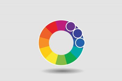
Learning how to pair colors is an art that each of us should know. They will come in handy greatly when you want to match clothes and decorate your homes. One of the most popular color schemes is the analogous color scheme. In this article, we’ll explore what it is and how to use it in decorating.
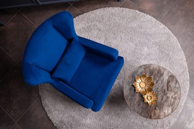
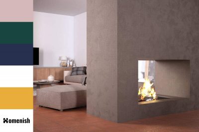
Sapphire blue is a heavily saturated blue color that is named after the gemstone of the same name. This color is darker than royal blue but not as dark as navy blue. It is currently an extremely popular shade in interior design and is being used in a wide range of styles.
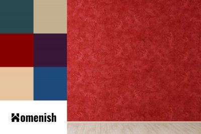
Red has been an intense color tone and one of the most popular and saturated of its shades is cherry red. Learning the right use of cherry red will improve the aesthetics of your home and your life quality. Here we’ll learn all about cherry red, how to use and pair it in your home.
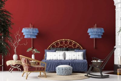
Crimson is a bright shade of red that is synonymous with love, passion, and affection. It can also be considered a brutal or violent color since it is the same shade of red as blood. It is widely used in interior decoration during the holidays as it is a color traditionally associated with festive celebrations.
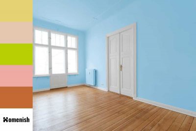
Sky blue is a light to medium shade of blue, which is named after the color of the sky on a clear day. Blue, in general, is known to be a calm and tranquil color that puts people at ease and allows them to relax, and the fact that sky blue is associated with the sky on a clear day further accentuates this because a clear sky has the effect of making most people feel serene.
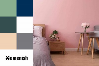
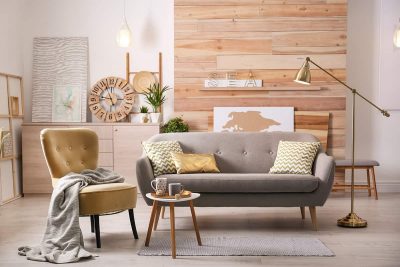
Blush pink is a color that has descended upon the interior design and fashion world in a big way over the last decade, becoming a mainstay shade. It can be used in so many different ways to achieve different styles, and as a soft and muted shade, it works really well with a wide range of colors. Here we look at how to use blush pink in home decor and which colors it will pair best with.
When it comes to choosing colors and working out the ratio of colors in the room, there is a simple method that many interior designers follow. This is the 60:30:10 color rule, and it can make your renovation project dramatically easier and also give you professional level results in your home decor.
Using gray for home decor is never a bad choice. As a neutral color, it works with any colors either as accents, furnishings or accessories. One of the best shades of gray is dove gray. In this article, we’ll explain what dove gray color is, how to use it for the best results in home decor, and some best colors schemes to use with dove gray.
Chantilly lace is a paint shade by Benjamin Moore that is a white color. Chantilly Lace OC-65 was designed to evoke images of simpler times, with connotations with soft linens and pure silks. It is a crisp and fresh shade of white that has virtually no undertones, which makes it a reliable choice of color that won’t look yellow when you paint it on the walls.
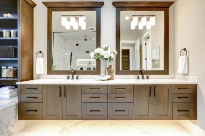
Bathroom cabinets are the main piece of furniture in a bathroom, and the color of the cabinet is going to be the biggest deciding factor on whether the cabinet is a bold feature in the room or fades into the background.