Explore popular colors that are used in home decor and ways to pair colors together with our in-depth ideas and tips
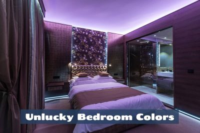
If you’re a believer in superstition or agree that some colors can promote misfortune, then you might be interested to know which colors should be avoided in the bedroom. The luck status of many colors can be traced back to their associations in different cultures, so cultural backgrounds and traditions can play a big part in whether or not colors are perceived as unlucky in the bedroom.
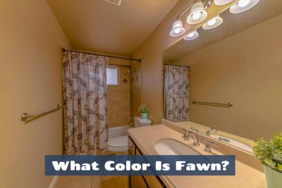
Fawn is a pale yellowish-brown or tan color, often described as a light, muted brown with a hint of yellow or beige. The term “fawn” is commonly used to describe the color of the coat of certain animals, such as deer, which can have a light brown or tan coloration similar to this shade. Here we look at similar colors to fawn, and how this shade can be implemented in home decor for a stylish effect.
Cerise is a shade of pink that can have undertones of red or purple to give it a more complex color. Compared with other shades of pink, cerise falls on the warmer side of the color spectrum due to the obvious presence of red. Here we explore everything you need to know about the color cerise.
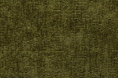
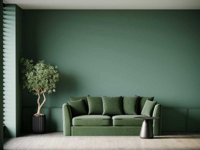
Loden is a shade of green that has been around for centuries, based on the fabric worn by peasants in Austria, however, it is a shade that has recently become increasingly popular in fashion and home decor. Here we explore everything you need to know about loden green.
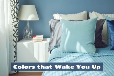
Colors can have a psychological and physiological impact on your mood and energy levels, which can affect how awake and alert you feel. While individual responses to colors can vary, some colors are generally associated with helping people feel more awake and energized. Here we explore some of the best colors and color combinations to help wake you up.
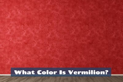
Vermilion is a bright red-orange color. It is often described as a vivid, reddish-orange hue and is commonly used in art and home decor to create bold designs. The color gets its name from the mineral cinnabar, which was historically used to produce the pigment vermilion. Here we explore the characteristics of the color vermilion and look at how it can be used for the best effect in interior design.
Muted colors are subtle than their more saturated counterparts, and they can be used in a number of ways in any area of the home.
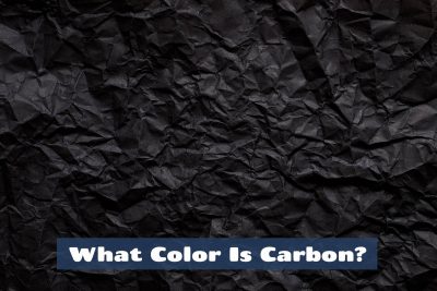
The color known as ‘carbon’ is an intense and dark shade of gray that will appear black in most light. Although the color isn’t strictly black, it is considered a shade of black by most people since it is so dark that it would be hard to distinguish it from true black. You could also consider carbon to be a shade of off-black. Here we look closer at the color carbon and explore the best ways to use it around the home.
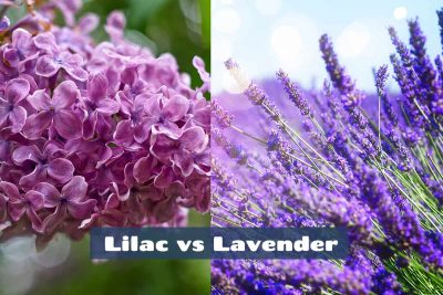
While many people mistakenly assume that lilac and lavender are interchangeable, they actually have subtle differences that mean they can create totally different responses and atmospheres.
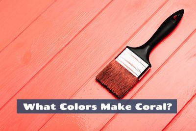
Coral is a vibrant and playful color that’s essential for any summery color palette. It is a cross between orange and pink, and can be used to contrast against cool tones or add personality to neutral color palettes.
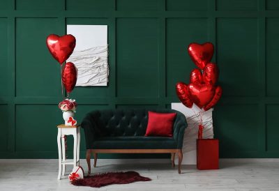
Red is a bold and vivid color that can be used in various ways to sybolize different meanings. The colors used alongside red will have a large impact on how the mood of red is perceived, for example when red is paired with green it will look festive, while red paired with pink will look flirtatious or romantic.
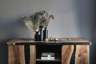
The meaning of gold and its link to glamor and decadence makes it a good choice for creating a luxurious style in fashion and home decor. Here we explore the psychology and meaning of gold and look at the ways this can be implemented into interior design color schemes to achieve a sense of wealth.