Chartreuse, which is used as a herbal liqueur and for making cocktails, is an attractive green color with yellow undertones.
Let’s discover what this color means, some similar colors, and how to use it for great effects in your home.
Table of Contents
What Color is Chartreuse?
Chartreuse is a color named after the liquor of the same name, which has a predominantly green color with yellow undertones. There is some disagreement over this color and whether it is a greenish-yellow or a yellowish-green.
True chartreuse leans more towards green, like the color of the liquor. Chartreuse yellow or yellow chartreuse is the name of the color when it has more predominantly yellow tones. The color is heavily saturated and very distinctive.
What Does Chartreuse Mean?
Since chartreuse sits right between green and yellow, it possesses the energy of both of these colors, with a fresh and revitalizing appeal from the green hues and a bright cheerfulness from the yellow hues. The result is a lively and zesty color that feels positive and fun.
The color chartreuse has a long and interesting history that dates back to 18th century France. A medicinal liquor was produced by Carthusian monks in 1737, which was named after their Grande Chartreuse Monastery, the headquarters of their religious organization.
The monastery was slightly north of Grenoble in France, based amongst the Chartreuse mountains. The liquor was said to be a treatment for a long and healthy life, containing 130 herbal ingredients, which still remain a secret to this day.
The alcoholic drink produced by the monks is green with a hint of yellow, and this is the color now known as chartreuse. Despite being intended as a medicine, chartreuse is now a popular liquor used in cocktails, which is sweet and strong tasting.
Similar Colors to Chartreuse
Lime green

Lime green is a close relation of chartreuse, so much so that the colors can get easily confused with each other. Lime green is also a shade of green with yellow tones in it, so you can see why this might happen.
The key difference between the two colors is that lime green is more vibrant and energetic, while chartreuse has a very mild murky look to it.
It is not as intense as lime green, so it can be a good substitute if you want to decorate with lime green but feel it might be too bold.
Chartreuse and lime green can go with a lot of the same shades, though chartreuse does have a slightly warmer temperature than lime green, which can alter the types of spaces it works well in.
Olive green

Olive green is another shade of green that has yellow undertones, which is why it is comparable to chartreuse. However, olive green is the muddier cousin of chartreuse, with a more earthy tone, and when you set these two colors next to each other, chartreuse is going to look like the bolder and brighter shade of the two.
In many ways, chartreuse could be regarded as a halfway point between lime green and olive green, as it has some of the intensity of lime green with some of the earthiness of olive green.
Pear green

Pear green is named after the color of the skin on this fruit. It is a medium to light green color with yellow undertones, which makes it very similar to chartreuse. Pear green has a fresh appeal that isn’t too overwhelming or bold, a lot like chartreuse.
How to use Chartreuse in Home Decor
Accent furniture
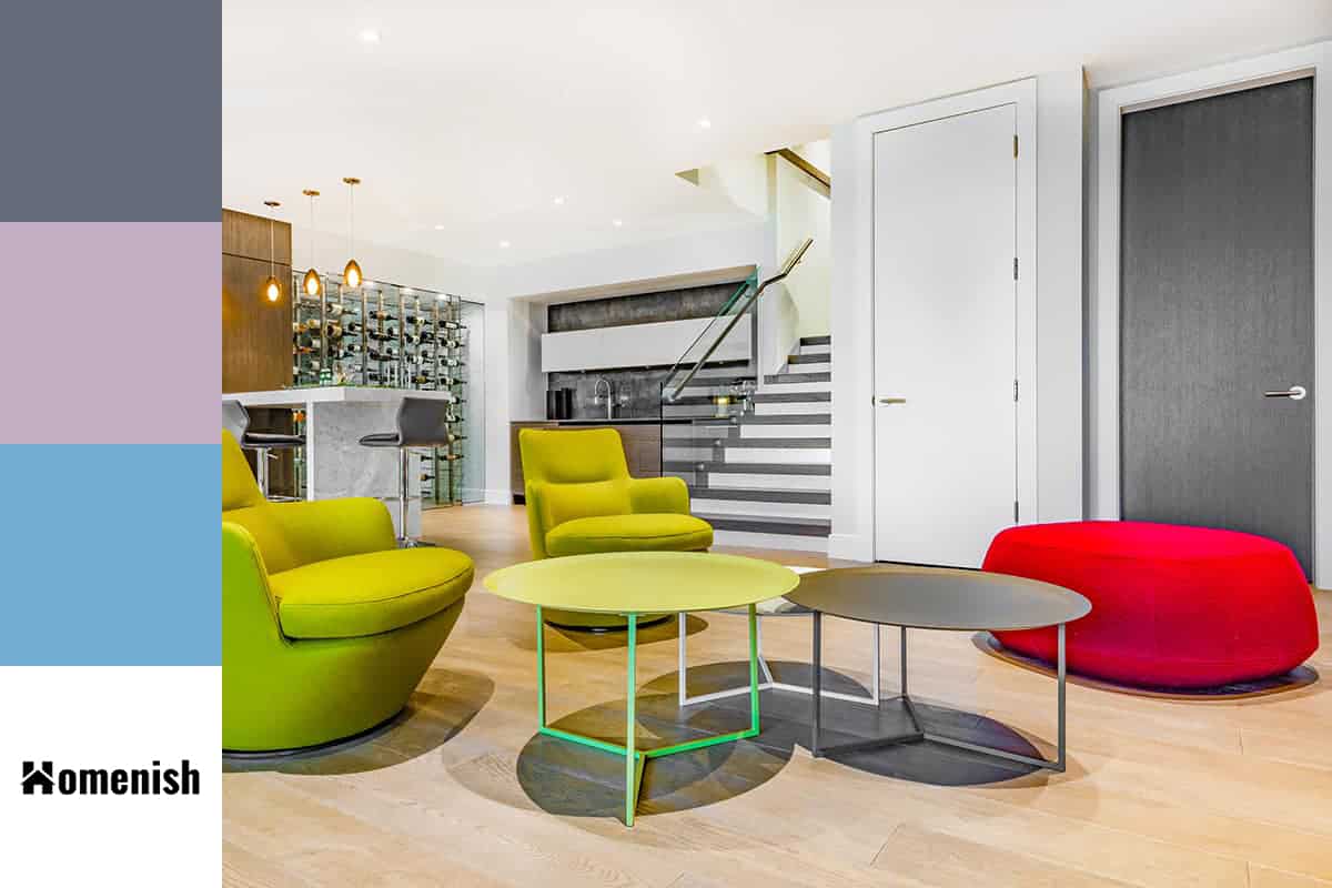
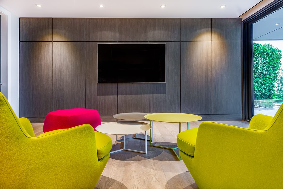
Chartreuse is a fun color to play with for accent furniture in an eclectic or vintage-style room. Paint walls in blush with eggplant accessories and set two striking velvet chartreuse armchairs on either side of a sofa for a bold statement. This is a look that can work well in any room.
For example, in a teal dining room, choose chartreuse upholstered dining chairs, or set a chartreuse chaise longue underneath a window in a lilac bedroom.
Accessories
If you want to add chartreuse to your color scheme, then doing it with accessories is a safe way to approach this idea so that you don’t have to paint a whole room in the color or buy large and expensive pieces of furniture.
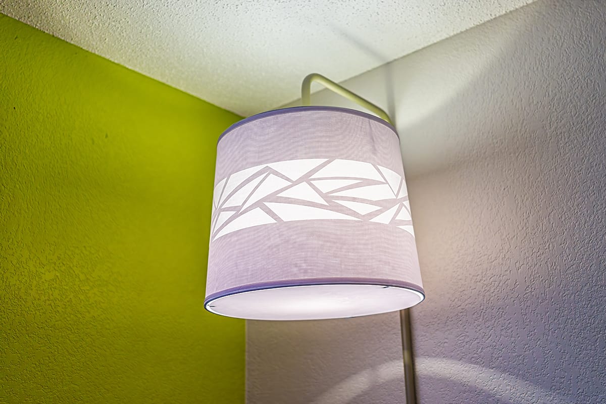
Opt for smaller accessories if you want to create a subtle accent, such as candle holders, ornaments, and the spines of books lined up on a bookshelf. If you want to make more of an impact, opt for accessories that take up more space, such as chartreuse lamp shades or a large chartreuse vase.
Soft furnishings
Chartreuse can be used to create a modern and refreshing feel with soft furnishings. Select light linen curtains in chartreuse for a breezy and casual style or heavy chartreuse suede drapes for a more mature and intimate look.
Use a chartreuse rug to give a shot of energy to an earthy living room, or chartreuse cushions on a white sofa to add some vitality to a neutral space. In a bedroom, add a silky chartreuse comforter to the end of the bed and match it to chartreuse velvet lamp shades for a contemporary glamor, or consider floral bed sheets featuring chartreuse elements for a country cottage vibe.
Soft furnishings are a great way to explore chartreuse if you change up the color scheme in your home frequently since they are easy to add to a space and equally easy to remove. You might want to add chartreuse cushions to a living room during summer for a bright and refreshing feel and swap these out for burnt orange cushions when fall rolls around, and you want to feel cozier.
Cabinetry
Chartreuse cabinetry will never fail to make a bold impact in a room. In a dark bedroom with charcoal walls, paint closet doors in chartreuse to create a striking contrast, or opt for a chartreuse vanity unit door in a beige neutral bathroom to give it a flash of vibrant color.
In a kitchen, chartreuse cabinet doors can be used to create a fresh and zesty feel that works really well in this space. Paint walls in white or a soft shade of pale gray, and set this against chartreuse cabinets with gold handles and white or gray marble countertops. This will create a cool and crisp feel in a kitchen that will also be classically modern.
You could also choose teal or sky blue to use as an accent color in a kitchen with chartreuse cabinets for a calming effect. Select blue roman blinds at the kitchen windows, and set a bouquet of flowers in a blue vase on the kitchen counters.
Patterned finishes
Since chartreuse can be quite a strong color, you can dilute it slightly by choosing patterned surfaces. One way to do this is with wallpaper.
Select a print of wallpaper that features chartreuse as the dominant color for a bold look that isn’t overstimulating, or go for a more muted look with a wallpaper print that features small amounts of chartreuse, and then tie this into your color scheme in a room with some chartreuse accessories.
Wallpaper doesn’t just need to be reserved for walls, and you could also cut out some wallpaper samples and frame them before hanging them on your wall as artwork that matches your color scheme. Wallpaper can also be used to line the back of bookcases or glass units to give a unique look to these pieces of furniture and also help to tie them into the broader style of the room.
With fabrics, opt for patterned prints, including chartreuse elements, to elevate the style of the space and prevent it from looking too basic. Avoiding solid chartreuse fabrics will also help to ensure the color doesn’t overwhelm the space. An example of this could be choosing a chartreuse and white striped rug instead of a solid chartreuse rug or floral curtains with chartreuse leaves instead of solid chartreuse curtains.
Wall paint
Chartreuse is a striking color that can work well as wall paint, especially in small rooms such as a den or powder room. Opt for chartreuse walls when you want to add enlivening energy to a space, for example, a home office, since this color feels inspiring. You could also use chartreuse as a paint color for an accent wall if you don’t want to use it across a whole room.
Colors that Go with Chartreuse
Gray
| Shade | Hex Code | CMYK Color Code (%) | RGB Color Code | Color |
| Chartreuse | #c0db01 | cmyk(12%, 0%, 100%, 14%) | rgb(192, 219, 1) | |
| Gray | #646a78 | cmyk(17%, 12%, 0%, 53%) | rgb(100, 106, 120) |
Gray and chartreuse work really well to create a modern and stylish space, with gray working to tone down the bold elements of chartreuse. Opt for dark gray for a more intense look or pale gray for a crisp effect.
Purple
| Shade | Hex Code | CMYK Color Code (%) | RGB Color Code | Color |
| Chartreuse | #c0db01 | cmyk(12%, 0%, 100%, 14%) | rgb(192, 219, 1) | |
| Purple | #c3b0c4 | cmyk(1%, 10%, 0%, 23%) | rgb(195, 176, 196) |
Purple is the contrasting color to yellow, and as such, it provides a really nice look next to chartreuse with its yellow undertones. Opt for lilac with chartreuse for a relaxing yet fresh style, or aubergine and chartreuse for a more dramatic look.
Blue
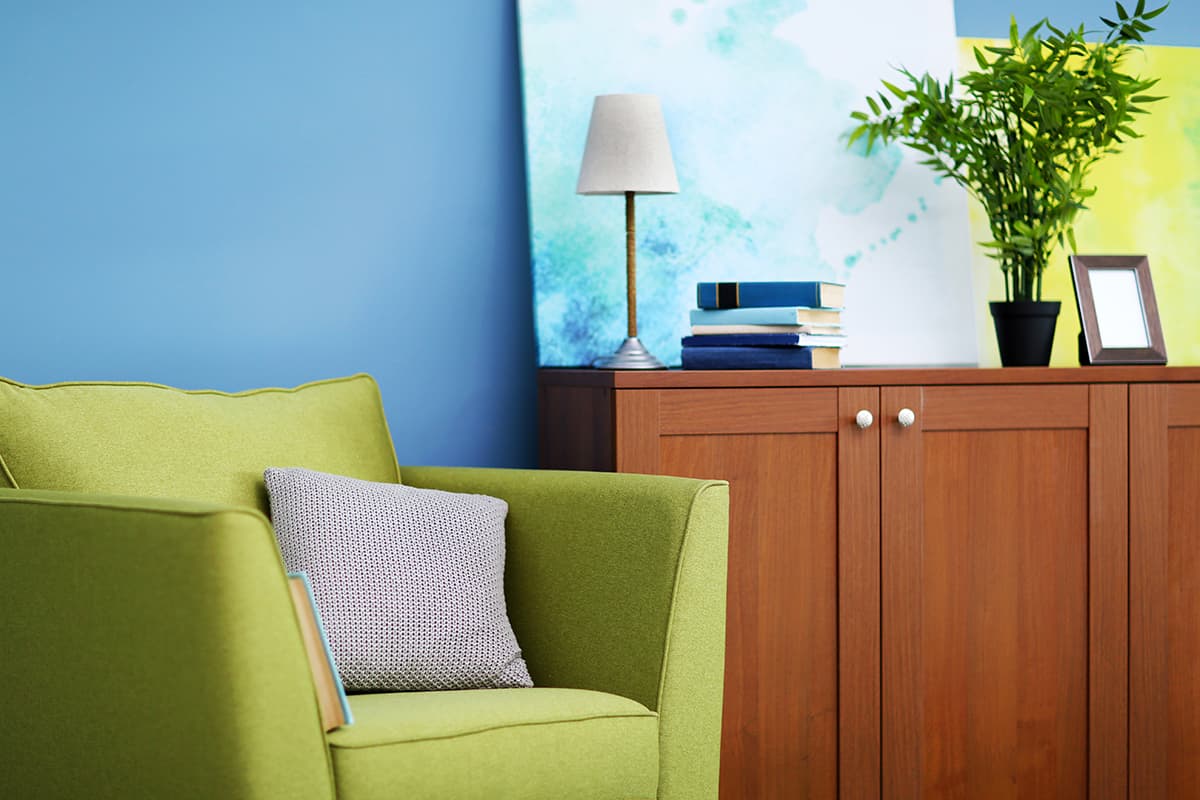
| Shade | Hex Code | CMYK Color Code (%) | RGB Color Code | Color |
| Chartreuse | #c0db01 | cmyk(12%, 0%, 100%, 14%) | rgb(192, 219, 1) | |
| Blue | #72acd1 | cmyk(45%, 18%, 0%, 18%) | rgb(114, 172, 209) |
Blue and green are easy color combinations that always look right together. Use pale blue with chartreuse for a calming effect or navy to create a bolder contrast.