
If you want to take out of the guesswork of selecting colors for your home project, you can choose some proven color schemes from the color wheel.
We already discussed the analogous color scheme; so in this article, we’ll go into details about the triadic color schemes as well as giving you some tips on how to make the best use of them in home decorating.
Table of Contents
What is a Triadic Color Scheme?
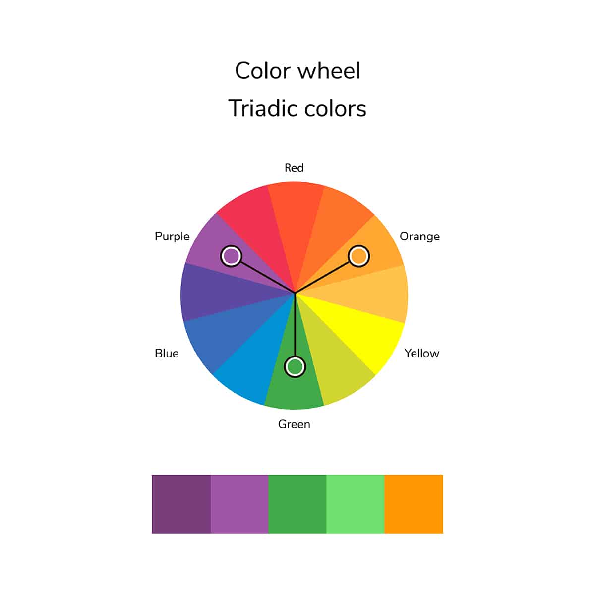
A triadic color scheme comprises three colors that are equally spaced around the color wheel. These colors can be used in varying quantities across a color scheme, or they can be used in equal quantities across a neutral backdrop.
To find three colors that will belong to a triadic color scheme, you will need to have a color wheel on a page and draw a perfect triangle over the wheel. The colors that are at the three points of the triangle and three colors that will work for a triadic color scheme.
A ‘perfect’ triangle refers to an equilateral triangle in which each point of the triangle is equidistant, with all three interior angles of the triangle measuring exactly 60 degrees.
An obvious triadic color scheme would be the primary colors of red, blue, and yellow, or the secondary colors of purple, orange, and green. However, there are so many other shades on the color wheel, including in-between colors such as blue-green or yellow-orange.
One way to choose your triadic colors is to start with a color you know you like or that you’re sure you want to use in your interior decor color scheme.
For example, you might choose pink as your starting point. Then you’ll need to draw your equilateral triangle, ensuring one of the points of the triangle is pointed at pink. This will reveal your triadic color scheme of pink, aqua blue, and yellow-orange.
Triadic color schemes tend to be very bold and vibrant, which can be great if that is the look you are going for, but most people will want a slightly more muted color scheme for a relaxing space that is easy to live with.
For the most appealing triadic color scheme, alter the shades of the colors you have chosen until the whole color scheme resonates with you. For example, rather than having three intensely saturated colors, tone them down to lighter shades or make them deeper and darker.
If you have a triadic color scheme of purple, orange, and green, you might choose to make the green darker to a forest green and lighten the purple and orange tones to soft lilac and a pale peachy-colored orange. The result will be a more subtle take on the original colors, but you still get the effect of a triadic color scheme, ensuring the colors all balance and harmonize with each other nicely.
How to Use a Triadic Color Scheme in Decorating
A triadic color scheme can be a useful basis for choosing your own color scheme, especially if you struggle to put colors together successfully for an interior designer-inspired look.
Using a triadic color scheme will take the guesswork out of choosing colors and help you to settle on a color scheme that is guaranteed to work well in any space.
Vibrant Summery Bedroom
Triadic color schemes are perfect for creating a fresh and vibrant feel in a room because the three colors work together to achieve an energetic atmosphere. For a bright and cheery feel in a bedroom, opt for the triadic color scheme of blue-green, pink, and yellow. Opt for teal as your shade of blue-green, with magenta pink and joyful daffodil yellow.
To ensure the room feels vibrant without being overwhelming, choose yellow or teal as your base color and also work in some white details to help balance out the intensity of all of the colors. Choose daffodil yellow for your wall paint color and a teal headboard or upholstered bed frame.
White and teal bed linen in a large geometric pattern will add bold energy to the space, and top this off with magenta tasseled cushions and a yellow jug on the nightstand of bright magenta flowers.
Teal lampshades will help to tie the color scheme together, along with white curtains on a wooden curtain pole that has magenta-pink finials at either end. This is a great look for a summer-fresh guest bedroom or a teenager’s bedroom.
Despite using shades that are all of the fairly equal intensity, the color scheme works because they have been used in varying degrees. Yellow is the dominant color and is used most heavily across the space, while teal is the secondary color, and magenta is the accent shade.
The presence of white as a neutral also helps to maintain balance to prevent any of the colors from clashing or competing for the limelight.
Red, yellow, and blue are primary colors and an easy triadic color scheme. When used without a fourth neutral color, they would create a very bold and intense style; however, when used sparingly across a white space, they will look modern and edgy.
In a dining room with a Scandinavian decor theme, paint the walls in a crisp, pure white paint color. White will be the dominant color, while your triadic color scheme can be used for all of the accent shades. Avoid using one color too heavily, and instead try to balance them out for a contemporary, artsy feel.
Paint wooden dining chairs in blue, and set bright red placemats on a white dining table, with a yellow vase in the center of the table. Choose white curtains to frame the window, with a yellow stripe or geometric print pattern on them. Fix some art prints to the wall, which feature red, blue, and yellow, and frame them in white or black simple frames.
Keep the room fairly minimal to define the space as a utilitarian, highly functional room free from clutter. By using the triadic primary colors in small hits across the space, they actually make more of an impact than if they were used heavily.
The result is also more palatable and interesting, rather than being overstimulating and headache-inducing. This is a look that would work well in any room in the home and is especially well suited to contemporary-style spaces such as loft apartments.
Luxury Jewel Tones
Take the triadic color scheme of green, purple, and orange, and convert these shades to the rich and elegant jewel tones of emerald green, amethyst purple, and citrine orange. These are all deep and highly saturated colors that work really well together since the dark quality of them means that they are presented as quite muted.
Emerald green has such depth that it can almost be used as a neutral, while the sultry deep orange-yellow hues of citrine offer a rich warmth.
To achieve a luxury space, use these colors in soft and sumptuous fabrics. Paint a living room in emerald green and select a velvet citrine sofa with silk amethyst cushions.
Elegant Pastels
Triadic color schemes don’t have to be intense. If you want a more subtle effect using a triadic color scheme, select pastel versions of each of your colors. For a green, purple, and orange triadic color scheme, select shades of pastel mint green, pastel lilac, and pastel apricot orange. These can work beautifully in a soft and elegant bedroom.
Paint walls in a pale apricot shade that has a heavy white content, and choose pastel mint-colored bed sheets with pale lilac cushions. A fluffy pastel lilac rug and some art prints of mint-colored foliage will help to complete the look and tie all of the colors together.
Coastal Casual
You can use a triadic color scheme to add an unexpected pop of color to a casual coastal style decor. To do this, use white or off-white as your dominant color and then use primary colors for your triadic color scheme accents.
This will work best if the primary colors are used at a 60:30:10 ratio, with blue as the most prominent accent shade, yellow as the secondary accent shade, and red as the tertiary accent shade.
Set a blue sofa against white walls, with blue and white striped curtains at each window. Use a yellow rug on the floor to add a bright shot of color, and coordinate this with yellow cushions on the sofa. For your final red accents, opt for small pops of color, such as a red plant pot on the windowsill and white blanket draped over a sofa with a red trim.
Glamorous Grandeu
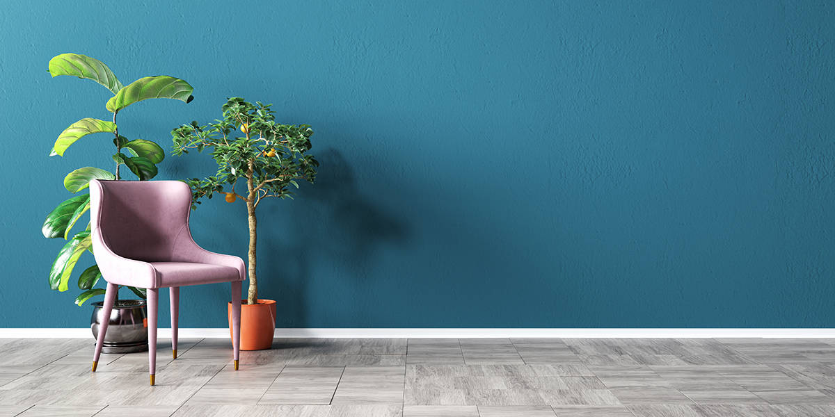
With a triadic color scheme of pink, blue, and orange, choose blush pink, navy blue, and copper as your shades. Use these in a dramatic dining room or bedroom to create a glamorous and imposing style that will feel contemporary and yet timeless.
Paint walls in dark navy blue to give the room a sense of depth, and set blush pink velvet drapes at the windows. Choose a glass table with a copper metal base and dining chairs with upholstered blush pink seat pads and copper metal legs and frame. A navy blue vase in the center of the table holding some blush pink roses will complete the sensuous and glamorous decor style.