Crimson is a bright shade of red that is synonymous with love, passion, and affection. It can also be considered a brutal or violent color since it is the same shade of red as blood. It is widely used in interior decoration during the holidays as it is a color traditionally associated with festive celebrations.
It is a warming color that can add a cozy feeling to home decor but can be overwhelming in large quantities since it is so intense. Here we will look at how to incorporate crimson into home interior design and which colors it works best with.
Table of Contents
What Color is Crimson Red?
The word crimson was derived from the ‘kermes’ scale insects, the females of which produce a red dye. The insects are a type of parasite that lives on the Palestine Oak trees and Kermes Oak trees, both of which are native to the Mediterranean region.
The dye from the dried bodies of these tiny insects was originally used to create the kermes dye, which was popularly used during medieval times for dying silk. The dye dates as far back as Ancient Egyptian times and was regarded as a color that symbolized wealth and prosperity since only the most upper-class members of society could obtain it.
In the 16th century, kermes insects fell out of favor for producing crimson dye since other methods were found to be more lucrative, such as cochineal, which produced a more potent dye and therefore meant smaller amounts were required to achieve the same results.
When crimson is used with other medieval colors, such as dark green and gold, it takes on a regal appeal that feels dramatic and vintage. However, crimson can also be used effectively with other shades to achieve a more modern style.
Using Crimson in Home Decor
Add warmth
One of the main reasons crimson gets used in interior decor is to create a sense of warmth in a space. Crimson is a color that is associated with fall, along with burnt orange and bronze, since these are the colors that the foliage of deciduous trees transforms to in the fall.
These colors are linked to cozy times of year, and the warm temperature of the shades also means they make people feel snug and comfortable, so they are ideal for creating this kind of atmosphere in a home.
Use crimson soft furnishings to accentuate the warm and cozy feeling, such as plush sofas upholstered in red suede or red corduroy for a soft and comfortable texture or heavy crimson woven drapes to make a space feel grounded and safe.
Crimson cushions and blankets will add a sense of warmth and security to a living room or bedroom, as well as a thick crimson area rug. A beige room could have its warmth accentuated with red accessories, or a gray cool room could be balanced out with the addition of warm crimson accents.
Draw attention
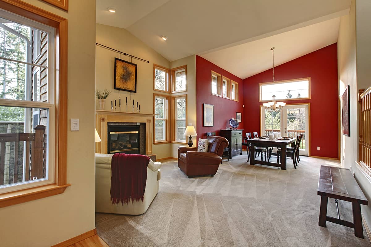
Crimson is a striking color, so if you want to draw attention to a particular area of the room or a specific object, then it’s a good choice of shade. Paint a crimson feature wall if you want to direct the eye line to a certain end of the room, or choose a crimson rug under a sofa if you want to highlight this area of the space.
You could opt for a crimson red picture frame if you want to draw attention to the art or photo inside it, or opt for crimson bedsheets if you want the bed to be the focal point in the bedroom.
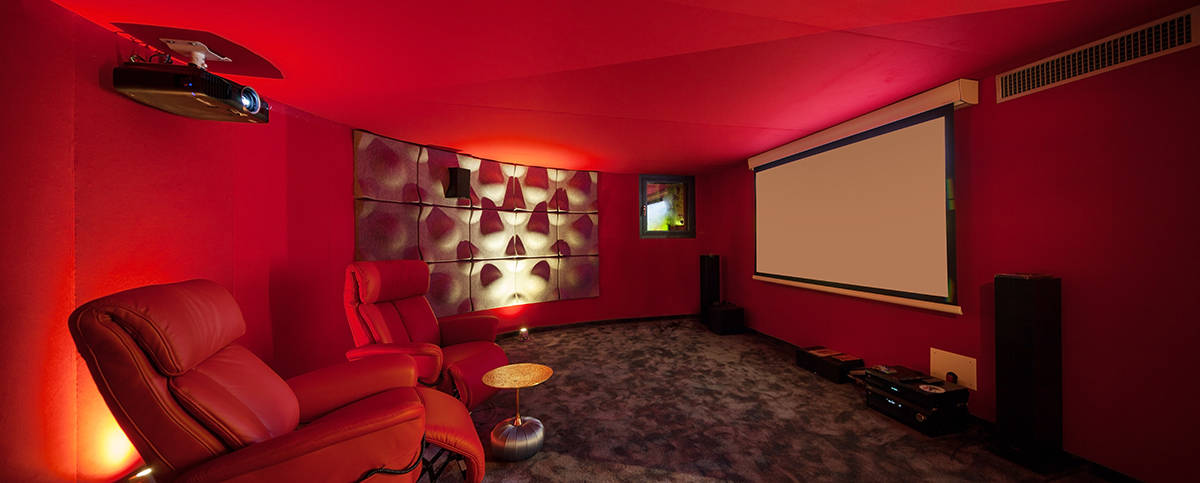
Add atmosphere
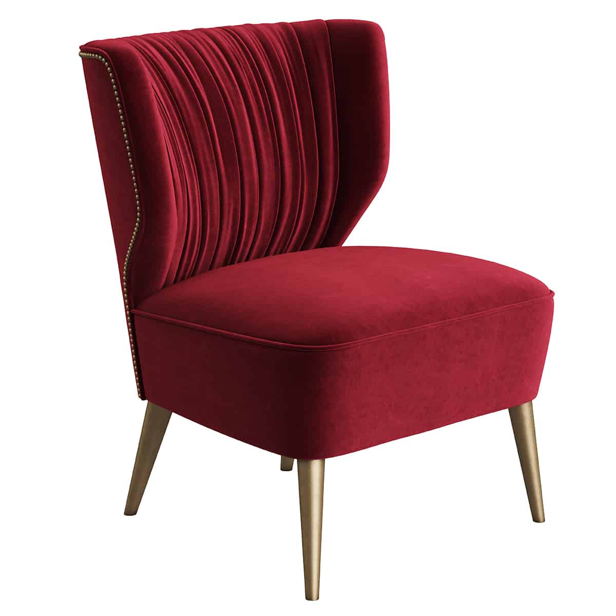
Crimson is a very distinctive color that can be used to create a specific atmosphere in a room. It is known to be an intense shade that can invoke feelings of passion or temptation, so use it in a sultry bedroom to create a romantic atmosphere.
An example of this could be crimson silk cushions or crimson velvet lampshades. The texture of crimson accents is also important in helping to define the atmosphere. If you are trying to create a seductive vibe, then tactile fabrics are essential.
Crimson is also a striking and stimulating color that can be used to create a modern and hip atmosphere in home decor. To achieve this look, stick to sleek surfaces in crimson, such as glossy red kitchen cupboards or a red glass backsplash.
Shiny red leather can also work well as an upholstery material for armchairs or dining chairs in bold, modern atmospheres.
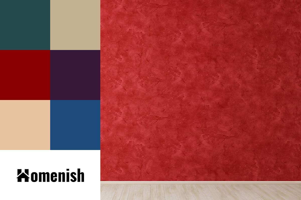
Colors to Use with Crimson
Forest green
| Shade | Hex Code | CMYK Color Code (%) | RGB Color Code | Color |
| Crimson Red | #940000 | cmyk(0%, 100%, 100%, 42%) | rgb(148, 0, 0) | |
| Forest Green | #26494b | cmyk(49%, 3%, 0%, 71%) | rgb(38, 73, 75) |
Forest green is a deep shade of green that can be used to create a vintage feel with crimson. Use these two colors alongside dark brown woods like walnut or mahogany in classically styled spaces. For example, paint walls in forest green and opt for crimson velvet upholstered dining chairs with a rich brown wooden dining table and dark hardwood floors.
Embroidered surfaces also work well in this kind of theme, for example, crimson curtains embroidered with bronze yarn. Forest green can also provide balance against crimson because it is a cool color, but since it is quite dark and muted, it won’t create an overwhelming feel.
Green and red are opposite shades on the color wheel, which also means that forest green and crimson will contrast nicely against each other to add interest and make each shade more intense.
The two colors are also great in more contemporary spaces, for example, a botanical-themed space. To achieve this, paint walls off-white and use forest green and crimson as accent shades. Paint wooden furniture such as dining chairs in crimson, and add forest green seat pads and forest green botanical artwork fixed on the wall.
A simple glass vase in the center of the dining table could contain a dried floral arrangement of dark green foliage and deep red berries or blooms to help tie the whole theme and color scheme together.
Find more details about forest green color and how to pair with it here.
Bronze
| Shade | Hex Code | CMYK Color Code (%) | RGB Color Code | Color |
| Crimson Red | #940000 | cmyk(0%, 100%, 100%, 42%) | rgb(148, 0, 0) | |
| Bronze | #c4b191 | cmyk(0%, 10%, 26%, 23%) | rgb(196, 177, 145) |
Bronze is the ideal metallic color to use against crimson because it highlights its warmth. Bronze is a less yellow, more muted shade than gold, so it won’t create overstimulation next to crimson. Bronze can make crimson feel classier and more elegant, while gold or silver with crimson can make it appear cheap and tacky.
In a vintage-inspired space, opt for bronze table lamps with crimson shades or crimson cushions with bronze tasseling. If you are going for a more modern style, such as a mid-century modern look, then bronze can also be really appealing with crimson. Opt for an armchair upholstered in crimson cotton, with bronze metal legs, set on a parquet hardwood floor.
Maroon
| Shade | Hex Code | CMYK Color Code (%) | RGB Color Code | Color |
| Crimson Red | #940000 | cmyk(0%, 100%, 100%, 42%) | rgb(148, 0, 0) | |
| Maroon | #890000 | cmyk(0%, 100%, 100%, 46%) | rgb(137, 0, 0) |
Maroon is a much deeper shade of red than crimson, but the two colors can work really well together to create a tonal effect in a space.
The maroon color scheme with crimson red can look really sultry when the two shades are layered, for example, maroon bedsheets with a variety of crimson and maroon cushions stacked on top. These colors will create a subtle depth and definition against each other.
Eggplant

| Shade | Hex Code | CMYK Color Code (%) | RGB Color Code | Color |
| Crimson Red | #940000 | cmyk(0%, 100%, 100%, 42%) | rgb(148, 0, 0) | |
| Eggplant | #361736 | cmyk(0%, 57%, 0%, 79%) | rgb(54, 23, 54) |
Eggplant is a dark shade of purple that can be used in traditional or country cottage style decor styles to great effect with crimson. Consider eggplant suede sofas with crimson cushions or a crimson and eggplant patterned wallpaper on a feature wall, with the remaining walls painted in cream.
As these are both very intense and saturated shades, they benefit from a third neutral color, which could be a warm neutral like cream or beige for a cozy environment or a cool neutral such as pale gray for a more modern effect.
Crimson and eggplant checked prints will work well in a farmhouse or country style theme for curtains or other textile accessories like tablecloths or placemats.
Beige
| Shade | Hex Code | CMYK Color Code (%) | RGB Color Code | Color |
| Crimson Red | #940000 | cmyk(0%, 100%, 100%, 42%) | rgb(148, 0, 0) | |
| Beige | #e7c49d | cmyk(0%, 15%, 32%, 9%) | rgb(231, 196, 157) |
Beige works as a good base color against crimson because it is a warm neutral, highlighting the cozy aspect of red. Choose this shade as a background for festive decorations, or a comfy space like a snug, with crimson accessories like blankets and curtains.

| Shade | Hex Code | CMYK Color Code (%) | RGB Color Code | Color |
| Crimson Red | #940000 | cmyk(0%, 100%, 100%, 42%) | rgb(148, 0, 0) | |
| Navy Blue | #1c4b7b | cmyk(77%, 39%, 0%, 52%) | rgb(28, 75, 123) |
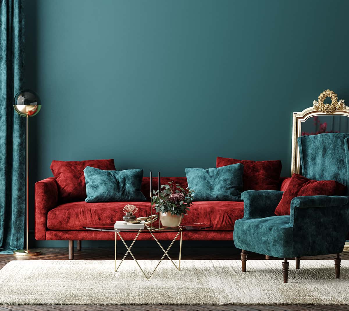
Navy blue looks great with crimson because it works as a contrast that is not too bold. Since navy is a dark color, and it isn’t precisely opposite to red on the color wheel, the contrast between warm and cool shades in this instance is quite subtle yet obvious enough to create interest.
Navy blue and crimson can be put to good use in American heritage-themed spaces, for example, with navy blue and crimson plaid wallpaper, navy blue bed sheets, and crimson cushions.
This color scheme is also commonly employed for nautical or beach-themed spaces, with navy blue and white utilized as the main colors and crimson offering an accent against them. To achieve this look, paint walls in white and opt for navy blue sofas on top of a white rug, and add small red details to the space, such as red cushions and a red plant pot.