Decorating a room in your home can be an overwhelming process, even when you’ve done it several times before. You might have no idea where to start, or you may have a specific look in mind, or you might hover somewhere between the two.
However you feel about the process of decorating a space, it is extremely useful to have a specific plan or blueprint you follow to keep yourself on track and ensure that the project doesn’t run away with itself.
When it comes to choosing colors and working out the ratio of colors in the room, there is a simple method that many interior designers follow.
This is the 60:30:10 color rule, and it can make your renovation project dramatically easier and also give you professional-level results in your home decor.
Table of Contents
What is the 60 :30: 10 Rule?
When decorating a room, it can be really easy to go too heavy on one color. For example, you might decide you want a calming pastel blue space that reminds you of a tranquil ocean, and paint the walls in pastel blue, with pastel blue bed sheets and a pastel blue rug.
Though it might sound like it coordinates in theory, in reality, it is going to look too overwhelming and a little flat because there is too much of one color.
You can also easily go too far in the opposite direction and buy accessories in a variety of different colors because they were on sale, or because they looked good in the store, only to find that the resulting look of your room is a bit mismatched and chaotic.
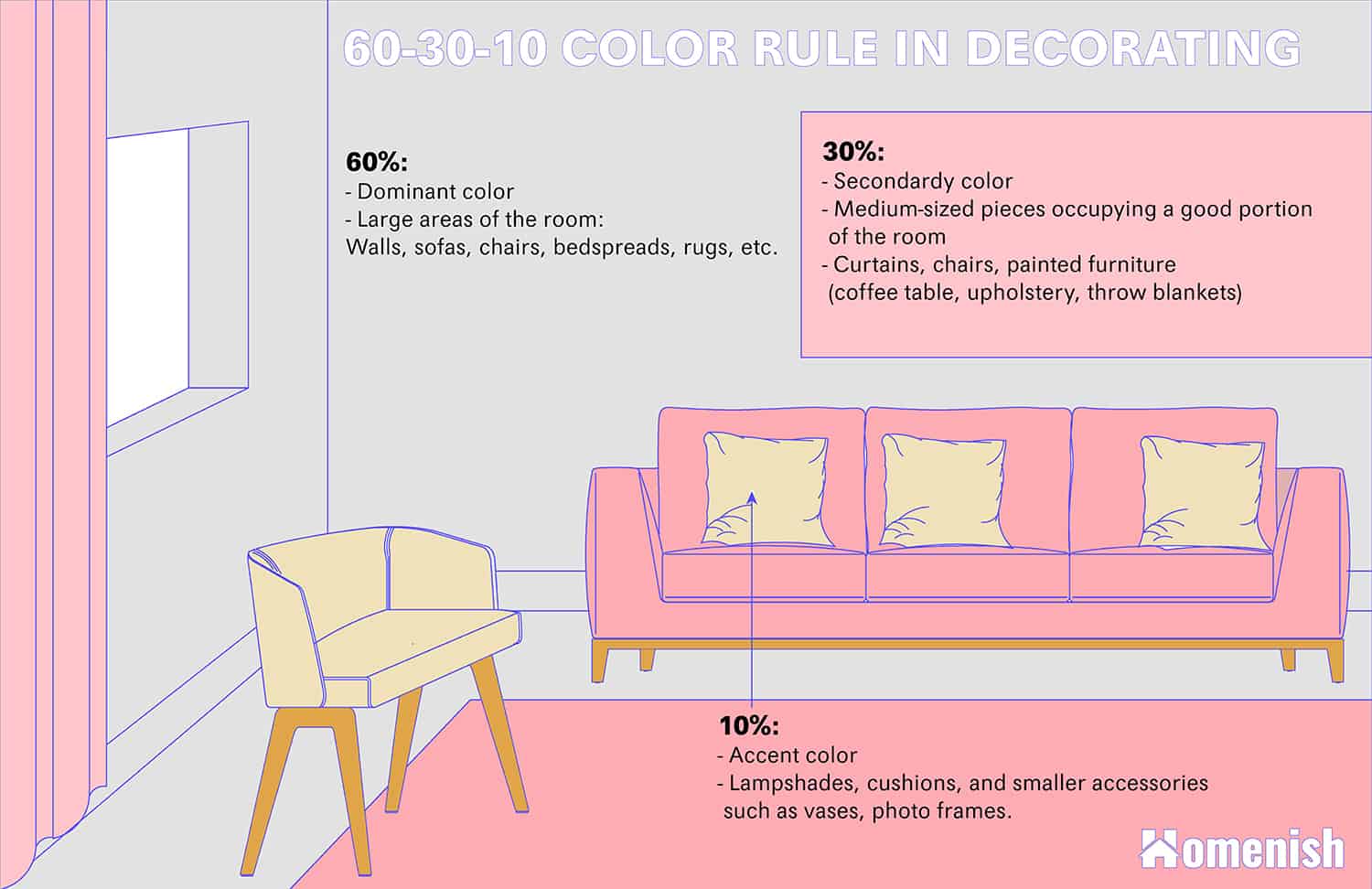
The good news is that there is a really simple method to follow to keep you on the right track, and this is the 60:30:10 rule. The numbers mentioned in this rule relate to the ratio of color you are going to use in the room.
Assign a color to each number, for example, forest green to 60, dove gray to 30, and blush pink to 10. This means that forest green is your dominant color, and you are going to use it across approximately 60 percent of your space. Typically this will mean it is used as a wall color, as well as some other small items like cushions and candles.
Dove gray is your neutral shade that works as a leveler to make sure the other colors in the color scheme don’t become too overwhelming. Use this color across 30 percent of the space, for example, a large dove gray area rug, an upholstered dove gray sofa, and dove gray curtains.
This leaves 10 percent of the room, which will be decorated in blush pink, the accent color. This might mean you choose blush pink lampshades, a blush pink blanket draped over the sofa, and a blush pink vase on the coffee table.
The idea here is to create a ratio between the colors so that the room feels balanced. By choosing a color as the dominant shade, it means that there won’t be any confusion, with colors battling against each other, and the accent shade will very obviously be considered as the accent shade because it is used sparingly.
How to Implement the 60: 30: 10 Rule
Choose 3 Colors For Dominant Color, Secondary Color and Accent Color
First of all, you need to choose your three colors for your color scheme. You will need a dominant color, a secondary color that can be a neutral or a shade that compliments your dominant shade without contrasting it, and an accent shade.
Your dominant shade is going to be the color most heavily used across your space, so make sure this is a color you love and will be able to live with on a daily basis.
Most people decide to steer clear of bold or vibrant colors for the dominant shade because it can feel overstimulating and make for a space where it is hard to relax or unwind. You might love lime green or fuchsia pink, but being surrounded by large amounts of these colors every day is going to get tiresome for most people. Instead, reserve these types of colors for accent shades.
If you want a neutral space, choose a color like greige for your dominant color, or for a dark and cozy space, choose a deep color like navy blue or charcoal gray. You might even want to choose a muted pale to medium shade for your dominant colors, such as sage green or khaki.
Deciding on your dominant color is going to be the toughest part for most people, but once you have chosen, the rest will follow easily. For your secondary shade, choose a color that is not too far from your dominant color on the color wheel or one which at least has the same temperature.
An example of this could be slate gray as the dominant color and indigo blue as the secondary color, as both of these are cool shades that are close to each other on the color wheel. Another example could be olive green as the dominant color and sage green as the secondary color, as these are right beside each other on the color wheel.
The third and final accent color in the 60 30 10 rule should contrast against your dominant color. The easiest way to choose this color is to see which color is opposite your dominant color on the color wheel. If your dominant color is olive green, then the opposite color on the color wheel is going to be purple.
You could opt for a deep eggplant shade or a pastel lavender color. If the direct contrasting color doesn’t appeal, look at either side of the contrasting color on the color wheel for a more subtle contrast. In this instance, this might be a shade of red such as burgundy or pink like blush pink.
Apply In an Approximate Ratio
Once you have selected colors, then you just need to apply them to your room in an approximate ratio. Fortunately, this task doesn’t involve any mathematical calculating but instead try to visualize your room as a drawing and color in 60 percent of the space in your dominant color, 30 percent of the space in your secondary color, and 10 percent of the space in your accent color.
To make this easier, you need to know which parts of the room will typically fall into the 60, 30, and 10 categories.
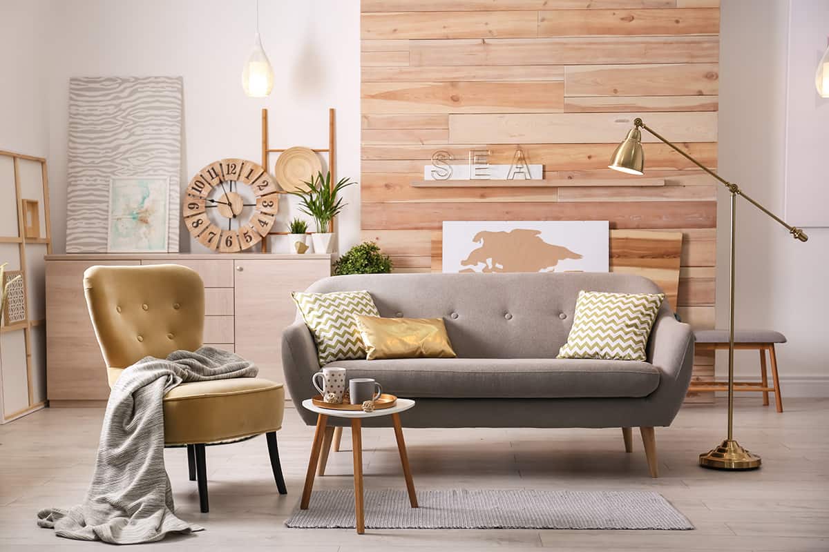
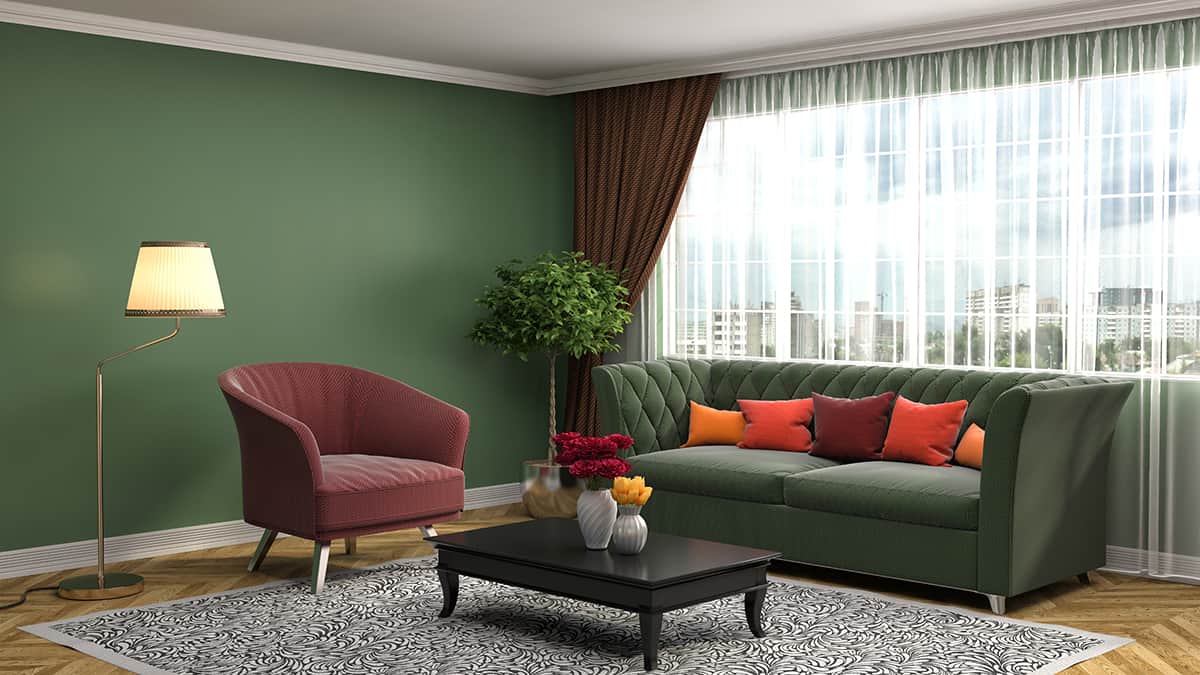
For your dominant color at a 60 percent ratio, this is going to include large areas of the room, such as the walls, sofas, chairs, bedspreads, and rugs, as well as some smaller accent items to tie the color scheme together, such as plant pots, towels, candles, and cushions.
For your secondary color, you should be looking at medium-sized pieces which occupy a good portion of the room but are not considered the base items. This typically includes curtains, chairs, painted furniture such as a coffee table, upholstery, throw blankets, and cushions.
Your accent color is what is really going to make your color scheme pop, so use it wisely. Accent colors work really well for lampshades and cushions, as well as other smaller accessories such as vases, ornaments, and photo frames.
However, you can also use up the whole 10 percent of your accent color by using it for one bold piece. For example, a room that uses navy blue as the dominant color and pale gray as the secondary color will have navy blue painted walls, a navy blue area rug, pale gray curtains with a pale gray sofa, and navy blue cushions.
You could then choose a striking color like bubblegum pink as your accent shade and choose a vibrant bubblegum pink velvet upholstered accent chair to position in the room, which will use up your entire 10 percent. It will create a really shocking effect that will look quirky and interesting.
Must the 60: 30: 10 Rule be Obeyed?
The simple answer here is: no, absolutely not. Interior design in your own home is about self-expression as much as it is about style. You could alter the numbers slightly for your own space, such as 65:20:15, or abandon it entirely in favor of a monochromatic style or a dual-colored space.
A popular style that does not follow this color rule is to select one color, such as blue, and use that color in varying shades across the whole room, for example, pale blue walls, navy blue sofas, and medium blue cushions and curtains. You could also add more colors to your color scheme for a bohemian style. For example, choose five colors and set the ratio at 50:20:10:10:10.
The key in any color scheme is to choose a dominant color and use that the most heavily across the space; this will work well in any room to ensure balance and a sense of met expectations which results in a feeling of safety.