Red and blue are two primary colors that, along with yellow, are used to form all of the other colors on the color wheel.
Red is a fiery shade that is associated with passion, romance, heat, and intensity. It is so scorching that it can sometimes cross over the line from passionate love to passionate rage.
Red is also the color of blood, and it is often used as a key part of the color scheme in horror movies. Red is also a color of warning, for example, red stoplights and danger signs.
It is a warm color that comes in a wide range of shades, from orange-toned candy red to blue-toned merlot red.
By comparison, blue is a cool-toned color that is synonymous with the ocean and the sky, making it a color that most people associate with tranquility, peace, and calm.
Blue is a widely used color in interior design for these reasons, as when we are at home, we like to feel relaxed and at ease.
Although red and blue are not directly contrasting colors since they do not face opposite each other on the color wheel, they still create contrast when used together. The direct contrasting color of red is green, and green contains a certain amount of blue. So, theoretically, some colors that match well with red can go nicely with blue.
Blue and red, when set alongside each other, will make for a bold but not overly intense contrast, which is easier for the eyes to adapt to compared with directly contrasting colors.
The energy created in a room when blue and red are used for the interior decor will really vary depending on the shades of blue and red and the other colors added to the color scheme.
Balancing out the energy of serene blue with fiery red can be quite interesting, but it is possible. Here, we will look at some of the best color schemes using blue and red in home decor.
Table of Contents
| Shade | Hex Code | CMYK Color Code (%) | RGB Color Code | Color |
| Burgundy | #c72425 | cmyk(0%, 82%, 81%, 22%) | rgb(199, 36, 37) | |
| Navy Blue | #242951 | cmyk(56%, 49%, 0%, 68%) | rgb(36, 41, 81) | |
| Blush Pink | #d4847b | cmyk(0%, 38%, 42%, 17%) | rgb(212, 132, 123) |
This is a really elegant color scheme that also has a slightly playful twist thanks to the presence of blush pink.
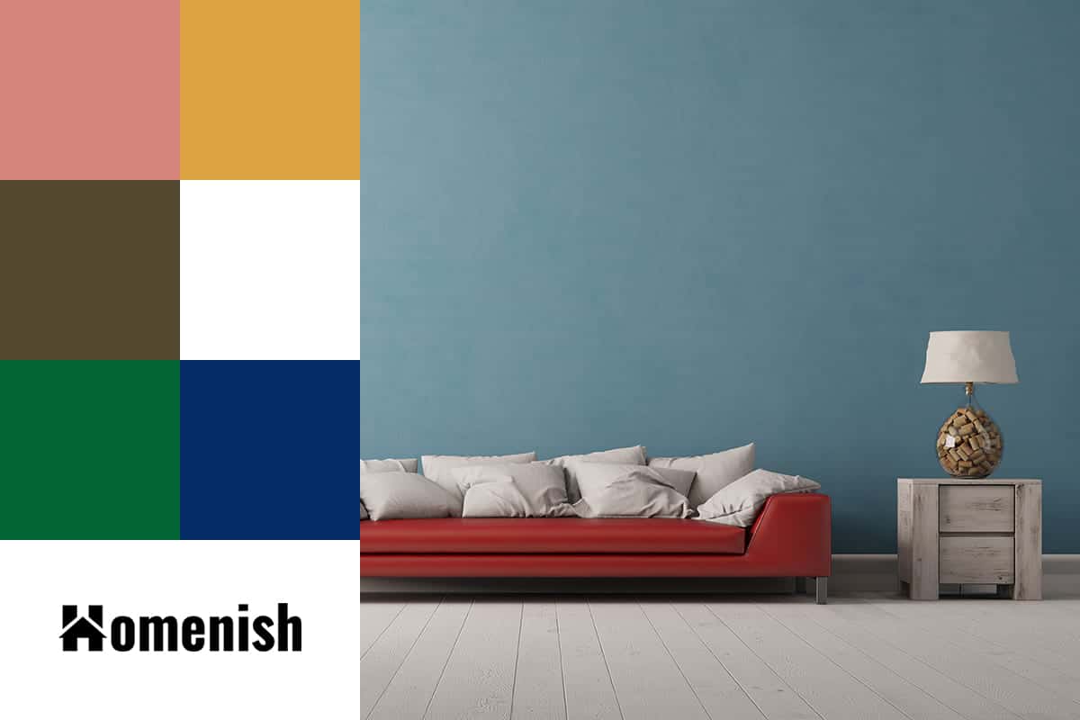
Burgundy is a deep and dark shade of red that is warming and mature, while navy blue can also be perceived as mature and formal, so even without the addition of pink, these two colors look great together. They create a sense of heritage and sophistication that lends them well to use in a dining room or grand entrance hallway.
If you want to create an atmosphere that is stately and imposing, then burgundy with navy alone will work well. However, to add a contemporary edge to this color scheme, use touches of blush pink as an accent shade.
Blush pink is dusky and muted, but it still has a lingering flirtatious and feminine feel. It works to tone down the serious vibe created by burgundy and navy for a more modern and quirky style.
In a dining room with navy walls and burgundy curtains, lighten up the mood with a bouquet of faux blush pink flowers as the dining table centerpiece, and blush pink cushions on each dining chair.
In a bedroom, paint the walls blush pink and then use burgundy and navy to bring a more sophisticated style to the space, for example, with a navy blue rug, navy blue cushions, and a burgundy bedspread.
Red, Sapphire Blue, and Mustard Yellow
| Shade | Hex Code | CMYK Color Code (%) | RGB Color Code | Color |
| Red | #c72425 | cmyk(0%, 82%, 81%, 22%) | rgb(199, 36, 37) | |
| Sapphire Blue | #297dd7 | cmyk(81%, 42%, 0%, 16%) | rgb(41, 125, 215) | |
| Mustard Yellow | #dda241 | cmyk(0%, 27%, 71%, 13%) | rgb(221, 162, 65) |
All of the shades in this color scheme are heavily pigmented, which in most cases would result in a space that feels overstimulating and too intense.
However, the merlot red in this trio of shades works as a neutral because it is so dark and deep that it makes for a good background shade.
It also serves to break up the warmth of mustard yellow and the cool crispness of sapphire blue.
Merlot, despite being a deep shade of red, has blue undertones that give it a slight purple appearance. This means that it contains both cool and warm energy, and as a result, it won’t make a room feel overwhelmingly warm.
When creating a space using merlot red, sapphire blue, and mustard yellow, introduce prints as a means of mellowing out the colors.
Plain blocks of color can look odd when the shades are so strong, so instead, choose patterns that will create a more muted impression.
For example, for bed linen, choose a merlot red-based fabric with sapphire blue and mustard yellow flowers printed on it, or cushion covers with a sapphire blue and mustard yellow zigzag print would look appealing against a merlot red sofa.
Saturated Red, Sky Blue, and Olive Green
| Shade | Hex Code | CMYK Color Code (%) | RGB Color Code | Color |
| Saturated Red | #711f19 | cmyk(0%, 73%, 78%, 56%) | rgb(113, 31, 25) | |
| Sky Blue | #5b83af | cmyk(48%, 25%, 0%, 31%) | rgb(91, 131, 175) | |
| Olive Green | #544830 | cmyk(0%, 14%, 43%, 67%) | rgb(84, 72, 48) |
Saturated red is a dark red-purple color that feels earthy and natural. We see this color in the changing leaves of deciduous trees in the fall before they drop to the ground.
This color has a fairly balanced energy due to the warm red tones and cool blue undertones. Use this color alongside sky blue and olive green in a natural-themed decor.
Sky blue, of course, is a natural color we see in the sky every day, and olive green is a dusky shade of green with brown and yellow undertones that can be seen almost everywhere we turn, from the foliage of plants to the mossy growth on mountainsides.
Since these three colors are all associated with nature in some way, and they are all either pale or muted shades, they work really well together.
In a living room, paint the walls olive green, choose a grape red sofa, and set sky blue cushions on it, along with an olive green rug and grape red curtains.
A wallpaper incorporating at least two of these colors could be a good way to define the room as a natural-themed space, for example, a sky blue-based print with olive green leaves.
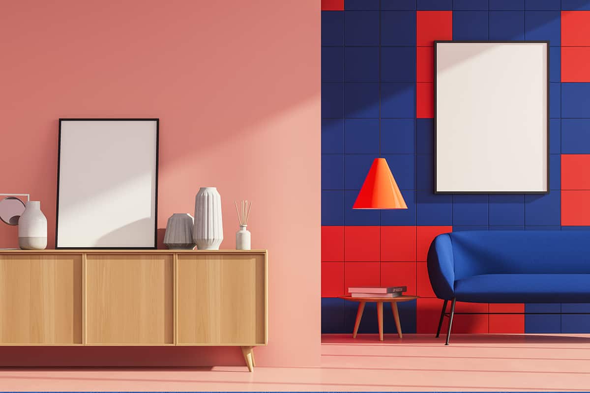
Cherry Red, Medium Blue, and White

| Shade | Hex Code | CMYK Color Code (%) | RGB Color Code | Color |
| Cherry Red | #810307 | cmyk(0%, 98%, 95%, 49%) | rgb(129, 3, 7) | |
| Medium Blue | #006895 | cmyk(100%, 30%, 0%, 42%) | rgb(0, 104, 149) | |
| White | #ffffff | cmyk(0%, 0%, 0%, 0%) | rgb(255, 255, 255) |
Cherry red is a bright and vivid shade of red that creates a nice contrast against a medium shade of blue. Along with white, these colors can be used to create an Americana style interior look based on the stars and stripes flag of the United States.
These colors are synonymous with patriotism and American heritage, so they work well in classic cape cod style homes, and they are also popular in dorm rooms.
Choose a red plaid patterned wallpaper along with a mid-blue bedspread and white painted furniture. These three colors also work well in coastal style interiors, with a focus on blue and white, and red used as an accent color.
In this color scheme, white represents the frothy ocean waves or white sand, while blue represents the sky and the sea.
Red could be used as a reference to a lighthouse or the lifeguard hut at the beach. To use these colors as inspiration in a living room, paint the walls white and opt for a blue sofa and blue curtains.
Add small hits of red for an energetic contrast, such as white cushions with red stripes and a red-framed clock on the wall.
This color scheme can work well to achieve a breezy and airy coastal vibe by using casual textures like rope and cotton, or you can elevate the coastal style into a more nautical look with shiny wooden surfaces and a darker shade of blue.
Rose Red, Pale Blue, and Dark Blue

| Shade | Hex Code | CMYK Color Code (%) | RGB Color Code | Color |
| Rose Red | #dd5363 | cmyk(0%, 62%, 55%, 13%) | rgb(221, 83, 99) | |
| Pale Blue | #2a65ab | cmyk(75%, 41%, 0%, 33%) | rgb(42, 101, 171) | |
| Dark Blue | #052b67 | cmyk(95%, 58%, 0%, 60%) | rgb(5, 43, 103) |
Rose red is a medium shade of red with a slightly pink hue. It is a good alternative to bolder shades of red when you want the mood in the room to feel slightly more subdued.
Use this shade alongside a very soft pale blue and a deep and dark shade of blue. The resulting atmosphere will vary depending on the shade you choose as the primary color.
For a serene space with a touch of romance, pick pale blue as a wall paint color, along with a pale blue rug and dark blue lamp shades with a dark blue accent chair. The hits of rose red should be limited in order to make the most impact with them.
A rose-red cushion on the bed, along with a rose-red candle on the nightstand and a rose-red robe hanging from a hook on the wall, should be enough to hint at a romantic atmosphere without being too obvious.
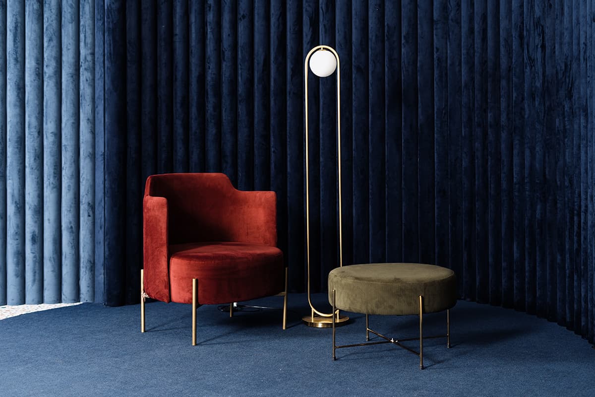
Ruby Red, Sapphire Blue, and Emerald Green
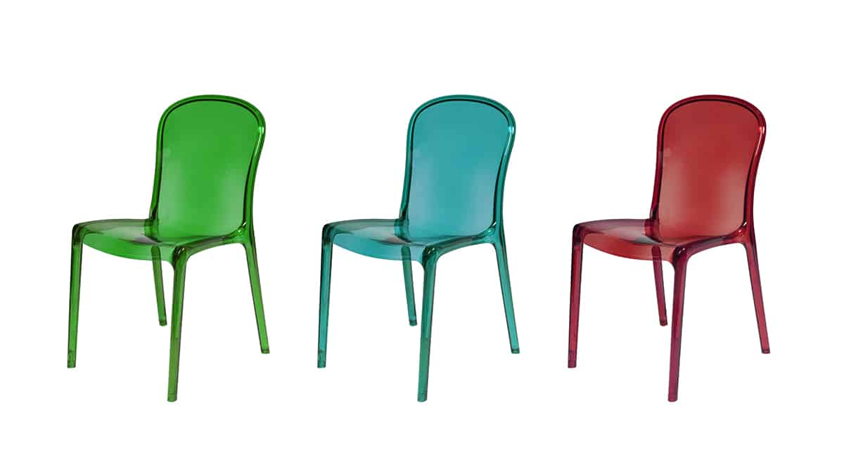
| Shade | Hex Code | CMYK Color Code (%) | RGB Color Code | Color |
| Ruby Red | #a93535 | cmyk(0%, 69%, 69%, 34%) | rgb(169, 53, 53) | |
| Sapphire Blue | #1e9295 | cmyk(80%, 2%, 0%, 42%) | rgb(30, 146, 149) | |
| Emerald Green | #036534 | cmyk(97%, 0%, 49%, 60%) | rgb(3, 101, 52) |
Jewel tones always look alluring together, so it makes perfect sense that ruby red, sapphire blue, and emerald green should be used in one color scheme.
Blue and green are analogous and therefore harmonizing colors, while red will provide a contrast against both of them.
In a dining room, paint the walls in emerald green and opt for heavy velvet sapphire blue curtains with matching sapphire blue upholstered dining chairs. Choose a standing lamp in the corner of the room with a ruby red shade, and set ruby red candles in the center of the dining table.