Cerise is a shade of pink that can have undertones of red or purple to give it a more complex color. Compared with other shades of pink, cerise falls on the warmer side of the color spectrum due to the obvious presence of red. This article explores everything you need to know about the color cerise.
Table of Contents
What Does Cerise Look Like?
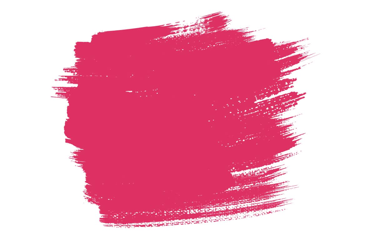
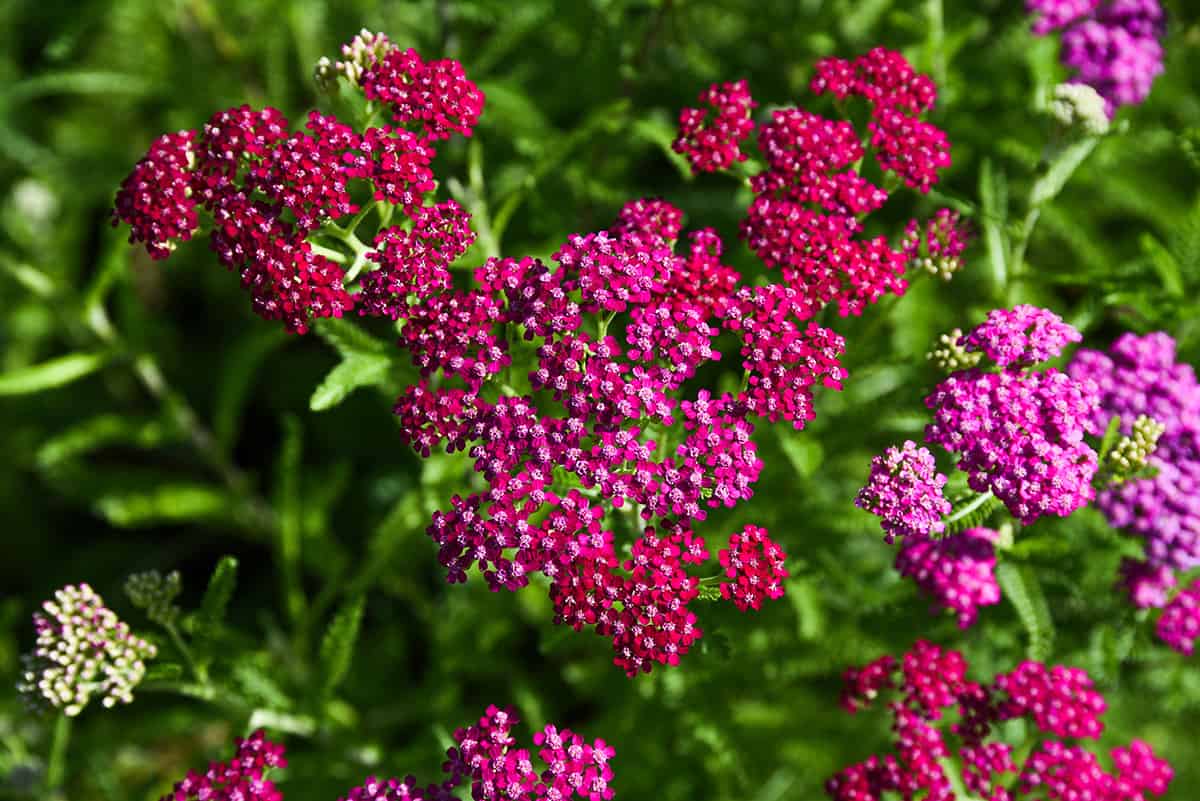
Cerise is a bright, deep shade of pink with a slight purplish or reddish undertone. It is a vivid and vibrant color that is reminiscent of the color of cherry blossoms or ripe cherries. In fact, the word “cerise” is French for “cherry,” and the color cerise is named after the fruit.
The color cerise is often associated with the deep, rich red of ripe cherries, which is why it shares its name with this fruit. Cherries can have various shades of red, from lighter red to darker red, and cerise captures that deeper, vibrant red-pink color often seen in cherries. Cerise is often described as a rich, dark pink or magenta color.
Similar Colors to Cerise
Magenta
Magenta is a bright and intense pinkish-purple color that closely resembles cerise. Magenta and cerise are similar in that they are both shades of pink with purplish undertones, but they are not exactly the same. Magenta is typically a bit more purplish and tends to be a brighter, more vivid color.
Cerise, on the other hand, is often slightly darker and has a more noticeable red undertone. Magenta is often described as a shade of pink with a strong purplish or reddish undertone. If you are looking for an intense, saturated shade of pink or purple, both cerise and magenta are excellent choices.
Fuchsia
Fuchsia is known for its intensity and vibrancy, making it a striking and eye-catching color. It falls between the colors red and magenta on the color spectrum. Fuchsia tends to have a slightly more purplish or violet undertone compared to cerise, which often leans more towards a red undertone.
The difference in undertone gives fuchsia a cooler temperature compared to cerise, which is slightly warmer. Fuchsia is also typically a very bright and intense color, while cerise can be slightly darker and less bright in comparison.
Raspberry
Raspberry is a color that is named after the fruit of the same name. It is a deep, rich, pinkish-red color often associated with the color of ripe raspberries, which can range from deep red to pinkish-red, depending on the variety.
Raspberry and cerise are similar in that they are both deep, rich, pinkish-red colors, but there are distinctions between them. Cerise is typically brighter and more vivid, while raspberry can be a bit darker and more subdued.
Ruby
Ruby is a deep, rich red color. It is named after the precious gemstone, the ruby, which is typically known for its deep red hue. Ruby is a warm and vibrant red color, often associated with passion and luxury.
It is one of the classic and timeless shades of red, and it can vary in darkness and intensity, but it typically has a noticeable red undertone.
Cerise, by comparison, often has a purplish or reddish undertone, while ruby typically leans more towards a true red with less noticeable undertones. Ruby is also typically warmer and closer to a pure red, while cerise may have variations that make it appear more magenta or pinkish.
Hot Pink
Hot pink is a bright, intense, and vibrant shade of pink. It is known for its eye-catching, almost fluorescent quality. Hot pink is much brighter and more vivid than traditional pink and often leans toward a purplish or magenta undertone.
It’s a bold and attention-grabbing color that is commonly used in fashion, cosmetics, and various design and decorative applications to make a strong and lively statement. Hot pink can be close in hue to cerise, although it may be lighter and more intense. Cerise is often darker and has a richer appearance compared to the brighter and more vivid hot pink.
What Colors Go With Cerise?
Neutrals
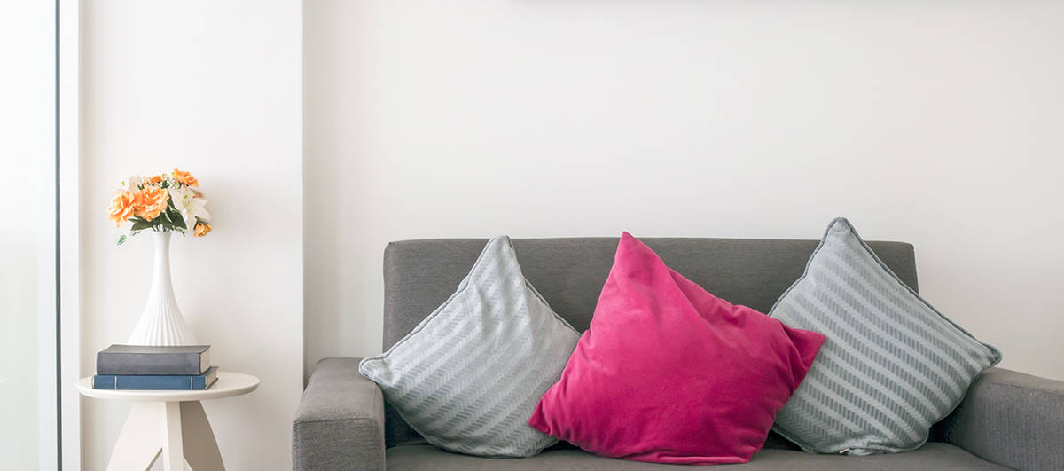
Neutral colors like white, gray, or black can help balance the boldness of cerise. They create a clean and sophisticated look. Pairing cerise with light neutrals such as white, cream, or light gray can create a soft and elegant look.
The cerise color will stand out against the neutral backdrop and add warmth to the space. For a more dramatic and bold look, you can combine cerise with dark neutrals like charcoal, deep brown, or black.
This contrast can be particularly striking and create a sense of luxury and sophistication. If you want to add cerise to your neutral color palette without overpowering the space it, use cerise as an accent color.
For example, add in cerise throw pillows, artwork, or accessories against a backdrop of neutrals like white, gray, or beige. This will create a pop of color and add vibrancy to the space without overwhelming it.
Pink
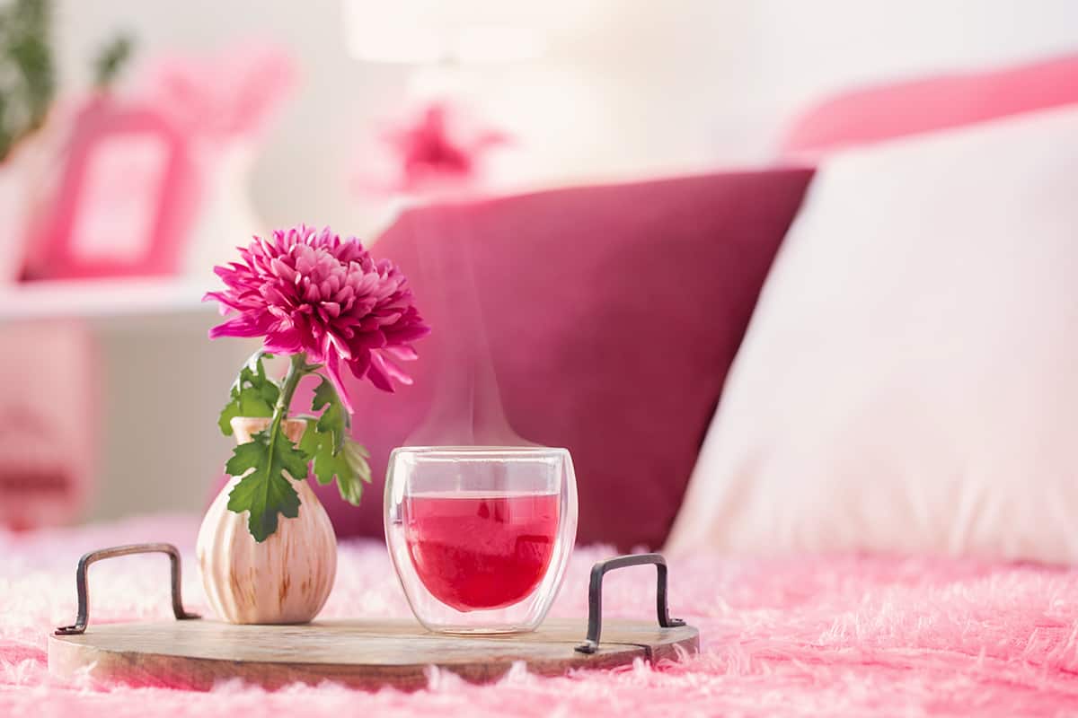
Combining cerise with other shades of pink, especially those within the same color family, can create a monochromatic and layered look. This can be visually pleasing and add depth to the design.
To avoid a flat appearance, be sure to use varying shades of pink. For example, pairing cerise with a lighter or softer pink can create a pleasing contrast. The cerise will stand out against the lighter pink and add vibrancy to the color palette.
Yellow
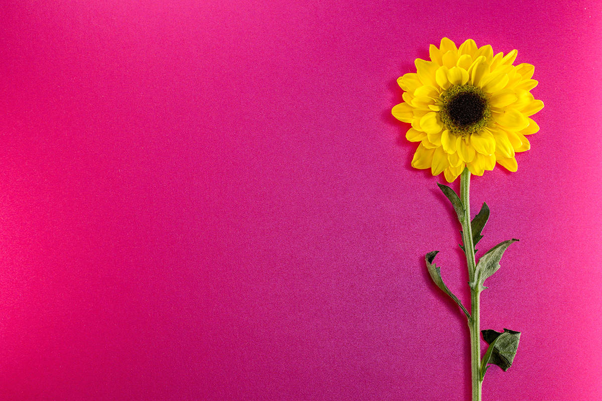
Cerise and yellow create a lively and cheerful pairing. The bright, warm tones of yellow can complement the vibrancy of cerise, making it suitable for vibrant, energetic designs. Yellow is a complementary color to cerise on the color wheel, which means they are opposite each other.
Combining complementary colors can create a striking and visually appealing contrast. Cerise and yellow together can make each color stand out more vividly. To make the combination work, you’ll need to find the right balance.
The intensity and saturation of the yellow and cerise shades can be adjusted to suit your design preferences. For a light and playful atmosphere, opt for lemon yellow with cerise, or for a more intense and dramatic combination, mustard yellow would work well with cerise.
You can use cerise as the dominant color with touches of yellow as accents or vice versa. Both cerise and yellow are warm colors, and their combination can create a warm and inviting atmosphere, ideal for a bedroom.
Navy blue is a deep, rich color, and cerise is vibrant and bold. When combined, they offer a strong contrast that is visually appealing.
Since cerise leans towards the warmer side of the spectrum and navy blue is a distinctly cool color, the combination of these two shades creates a striking contrast. To avoid overstimulation, it’s best to use a third color within a navy blue and cerise color palette to offer balance.
A neutral, such as pale gray or cream, would work well. If you want to create a dramatic atmosphere, choose navy blue as your main color, with cerise as the accent shade.
For example, paint the living room walls in navy blue and choose neutral-colored furniture such as a gray sofa. Then, add in bright splashes of cerise to set off the space, such as cerise lamp shades and cerise cushions.