Colors can have a psychological and physiological impact on your mood and energy levels, which can affect how awake and alert you feel. While individual responses to colors can vary, some colors are generally associated with helping people feel more awake and energized.
This article explores some of the best colors and color combinations to help wake you up.
Table of Contents
Colors to Combat Fatigue
If you find it hard to wake up in the morning, or you’re noticing that you’re getting drowsy in your home office, then you might want to consider painting the room in a different color that’s going to help you stay alert and focused. Some colors to consider include:
Bright and Warm Colors
Colors like yellow, orange, and red are often associated with warmth, energy, and excitement. They can help stimulate the senses and promote alertness. They can also serve to evoke a sense of vitality and motivation, which can help combat feelings of sleepiness and lethargy. Warm colors can stimulate physiological responses in the body, including an increase in heart rate and blood pressure. This heightened physiological state can make you feel more awake and alert.
Warm colors can also create a sense of urgency and action, making them well-suited for environments where you need to be productive and active. For example, using warm colors for the walls in a home office can help keep you focused and engaged in tasks. Warm colors can create a feeling of coziness and comfort, which can be particularly helpful in waking you up on a cold or dreary day, as they provide a sense of emotional warmth and well-being.
Warm colors are often used in restaurants and dining areas because they can stimulate appetite. If you’re trying to wake up and feel more alert in the morning, warm colors in your kitchen or dining area may help stimulate your appetite and provide a boost of energy. Warm colors are also associated with creativity and innovation.
If you need to think creatively or come up with new ideas, being in an environment with warm colors may help you feel more mentally awake and inspired.
Orange

Orange is a vibrant color that radiates energy and enthusiasm. It can stimulate your senses and evoke a feeling of vitality, which can shake off sleepiness. Orange is often associated with creativity and artistic expression.
Many art studios, creative agencies, and design spaces incorporate orange into their branding and environments to inspire and stimulate the creative process, making this a good color choice for a home studio or personal office space when you want to reduce fatigue and boost creativity.
Orange is a color that naturally stands out. Its bold and attention-grabbing nature can draw your focus and encourage you to think creatively while also keeping you alert and awake.
Yellow
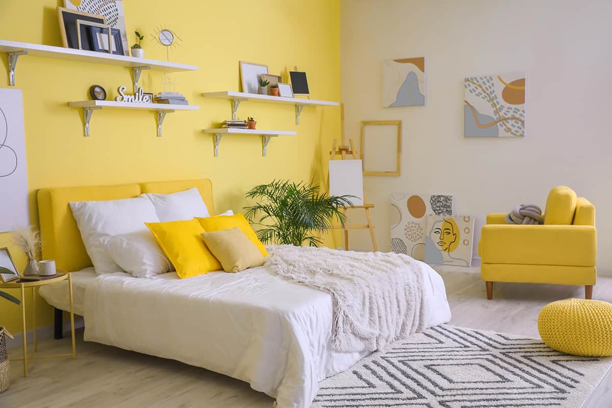
Yellow is a positive and sunny color that can promote a sense of optimism, which in turn can combat the mental and emotional fatigue associated with a negative mood.
Yellow is often associated with energy, happiness, and cheerfulness. Its bright and sunny appearance can uplift your mood and create a sense of positivity, which can help counter feelings of fatigue and low energy.
Light Neutral Colors
Light neutral colors like white and pale gray can help create a sense of openness and cleanliness, making your environment feel more awake and invigorating. White and light gray colors are often associated with cleanliness, purity, and freshness, which is why they are popular colors in kitchens and sterile environments such as medical offices.
When your environment appears clean and bright, it can promote a sense of wakefulness and alertness. Minimalist design often incorporates white and light gray colors to create a clean and uncluttered appearance. A clutter-free environment can also be useful to reduce distractions and promote focus and wakefulness.
White and light gray colors are highly reflective, which means they bounce light effectively. This can help maximize the use of natural light in a space, making it feel more open and airy. Exposure to natural light is known to regulate your circadian rhythm and promote alertness during the day.
Pale neutral shades are less likely to cause eye strain compared to intense or contrasting colors, which can be particularly beneficial if you’re working on tasks that require prolonged visual focus.
White is also associated with a sense of purity and simplicity, while light gray can evoke feelings of balance and neutrality. These psychological associations can contribute to a sense of wakefulness and clarity.
White
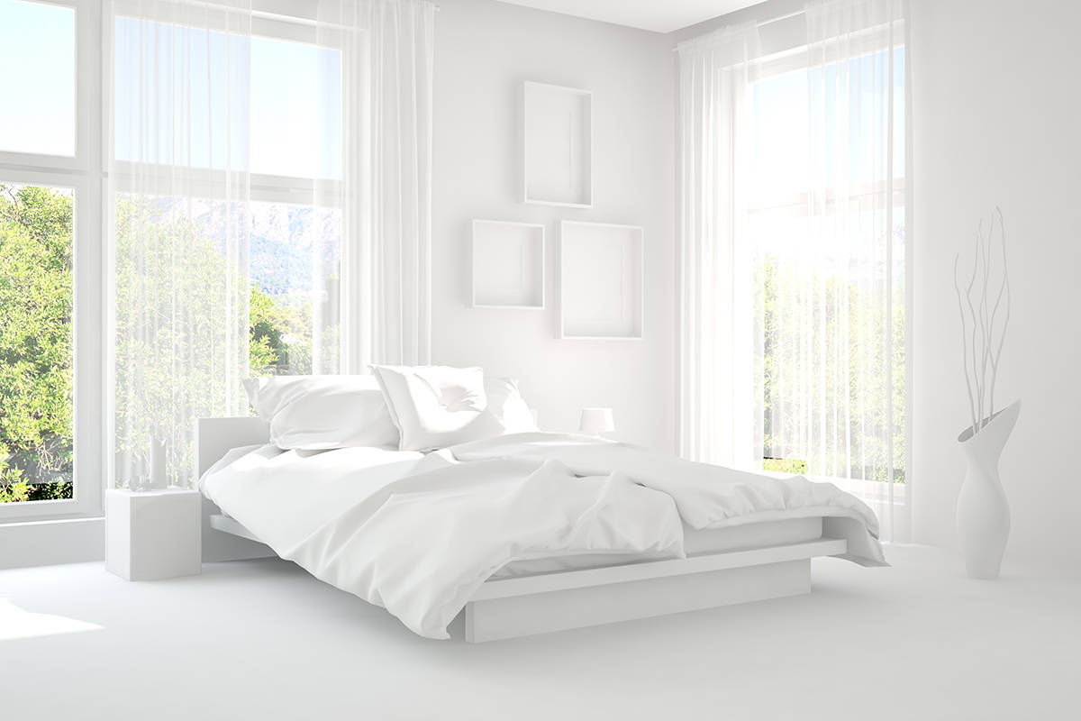
White is often associated with simplicity, purity, and a blank canvas for creativity. These associations can promote a sense of mental clarity and freshness, which can help reduce mental fatigue.
White is highly reflective, making it especially beneficial in spaces with good levels of natural light, as it can maximize the illumination in the area. Exposure to natural light during the day can help regulate your circadian rhythm and improve overall wakefulness.
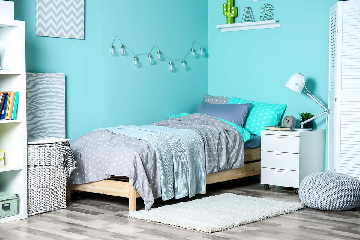
Cool Colors
Colors like blue and green are associated with serenity and tranquility, and while this can help you to relax and fall asleep, it can also help to reduce stress which in turn allows you to focus more effectively.
Cool colors are often associated with natural elements like the ocean and the sky. These associations can create a refreshing and invigorating feeling, similar to being in nature. This can help wake you up and boost your mood.
Cool colors are less likely to cause eye strain compared to bright, contrasting colors. This can be important if you’re looking at screens or reading for extended periods, as it can help you maintain visual comfort and stay awake.
Blue, in particular, is known to improve concentration and productivity. It can help you stay focused on your tasks and maintain mental clarity, which can be especially helpful when you’re trying to stay awake and alert.
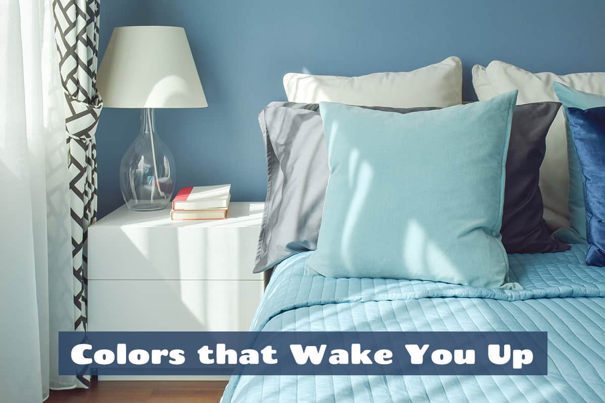
Blue
Blue is a cool and soothing color that can create a rejuvenating atmosphere, especially due to associations with a fresh sea breeze or cool ocean water. It can be used to help you feel more awake and focused on hot and humid days or in stuffy office environments. Blue is also known to improve concentration and focus.
When you’re alert and focused, you are more likely to feel awake and attentive, making this a popular color choice in work and office spaces. It can also be effectively used in bedrooms as a color that makes you feel calm and stress-free in the evening to fall asleep, yet fresh and alert in the mornings when you need to wake up.
Green

Green is strongly associated with nature, trees, and plants. Exposure to natural environments, including green landscapes, can have a refreshing and revitalizing effect on your mood and energy levels.
Spending time in nature or having indoor plants with green foliage can help wake you up by connecting you to the natural world, and you can also replicate this effect by painting your walls green or using green home decor accessories. Green is easy for the eyes to adjust to and therefore it can help to reduce eye strain, which in turn can help you stay away and focused.
Contrasting Colors
Contrasting colors can make you feel more awake and alert by creating visual stimulation and enhancing the perception of details and depth in your surroundings. Contrasting colors create a stark difference between two or more colors, making objects and elements in your environment stand out.
This increased visual interest can capture your attention and keep you engaged, helping to prevent feelings of drowsiness or boredom. When you have contrasting colors, it becomes easier to distinguish objects and text. This improved visibility can reduce eye strain and make it easier to focus on tasks, which contributes to feeling more awake.
Contrasting colors can create the illusion of depth and dimension. This effect can make your environment appear more dynamic and stimulating, which can also help combat feelings of tiredness. Contrasting colors are also known to trigger physiological responses in the body.
For example, the contrast between bright colors and a dark background can cause the pupils to constrict and increase alertness. This effect is similar to how our pupils naturally respond to changes in light levels. The contrast between colors can engage your cognitive processes as your brain works to process and interpret the visual information. This mental activity can help keep you mentally alert and awake.
It’s worth noting that the effectiveness of contrasting colors in making you feel more awake can vary depending on individual preferences and sensitivities. Some people may find certain color combinations too stimulating, while others may feel more awake and focused with the right mix of contrasting colors.
Blue and Orange
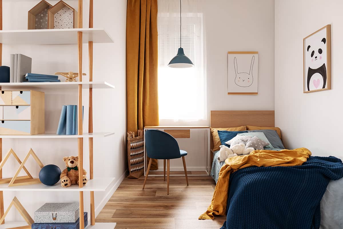
Blue and orange create a strong visual contrast that can stimulate the senses to help wake you up. The associations of these colors can also play a part in helping you to stay alert.
Blue is associated with calm, while orange is associated with creativity. Combining these colors can strike a balance between a sense of focus and high energy.