Loden is a shade of green that has been around for centuries, based on the fabric worn by peasants in Austria. However, it is a shade that has recently become increasingly popular in fashion and home decor. This color guide explores everything you need to know about loden green.
Table of Contents
What Color is Loden?
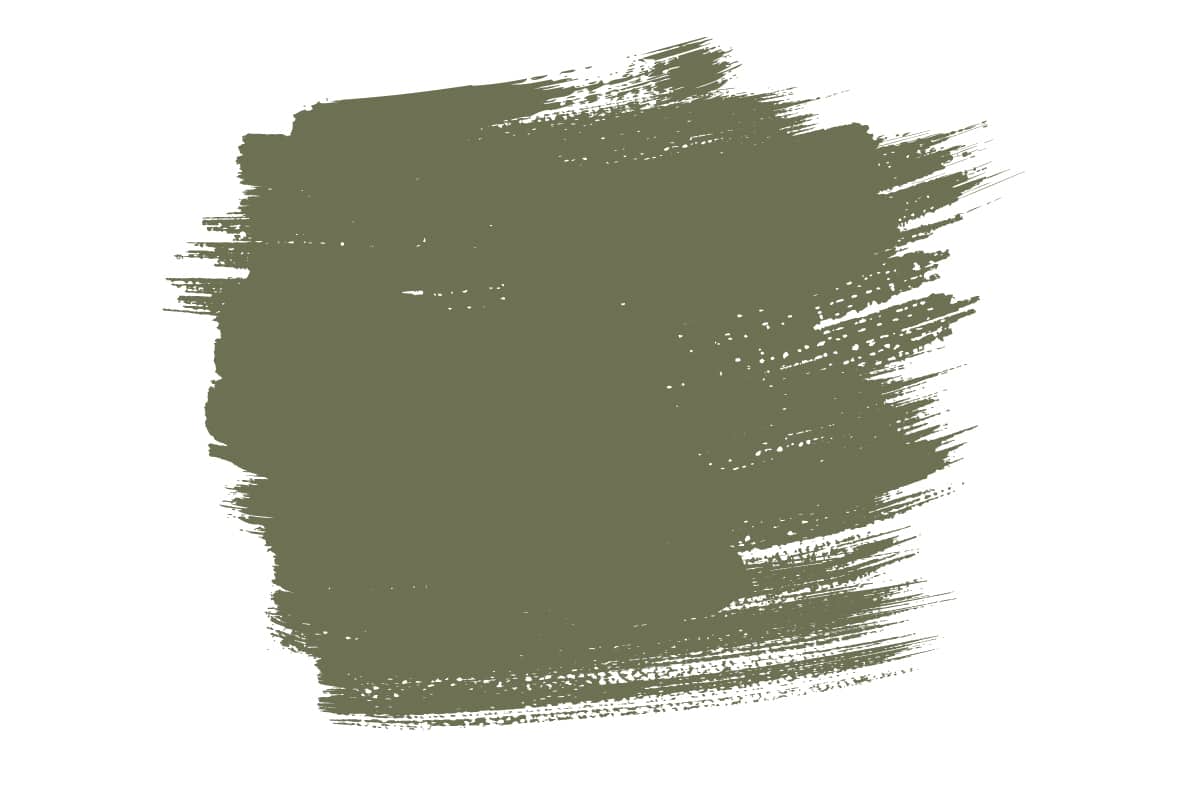
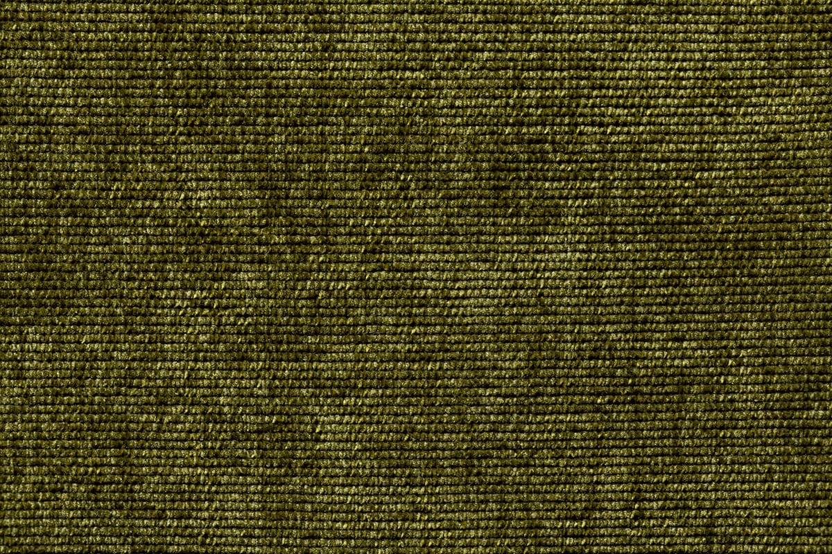
Loden is an earthy shade of green, which could be described as a dark moss green or a dark olive green. It has a natural and almost neutral feel since it is usually very muted and subtle.
The color loden is most closely associated with traditional clothing in Austria and Bavaria, where it was used in the making of outerwear such as coats and jackets. Today, the color loden green is gaining in popularity around the world as part of the growing trend for muted, earthy green shades in interior design and fashion.
What is Loden Color Named After?
The color ‘loden green’ is named after a fabric of the same name. The word ‘loden’ actually comes from the Middle High German word ‘lode’, which translates to mean ‘coarse fabric’. Loden fabric is a heavy and durable woolen textile known for its excellent insulating and weather-resistant properties.
It has been traditionally used for making outerwear, particularly coats and jackets, in regions with cold and wet climates, such as Austria and Bavaria. Loden fabric is traditionally made from the greasy wool of mountain sheep and will typically be 100% wool, although blends that incorporate other natural fibers like alpaca or cashmere can also be used. The fabric is thick and coarse and is woven quite densely, which contributes to its durability and wind-resistant properties.
Loden fabric is naturally water-resistant due to the unique processing it undergoes. The wool is treated with a process that involves washing, fulling, and pressing, which makes the fibers compact and creates a dense, water-resistant surface. Loden fabric is associated with the shade of green, known as “loden green” because the textile typically has this muted, earthy green color.
Similar Colors to Loden
Loden is an earthy shade of green that can be used interchangeably with a number of other earthy green shades. Similar colors to loden green include:
Olive Green
Olive green is a warm and earthy green color with a gray or brown undertone, resembling the color of green olives. It can vary in shade from light to dark, but it typically has a muted and subdued appearance, much like loden green.
The main difference between loden green and olive green is that loden green features some subtle blue undertones, while olive green leans more towards the warmer side of the color spectrum.
Moss Green
Moss green is a color that closely resembles the greenish hue of moss found on rocks, trees, and other surfaces in nature. It is typically a muted, earthy shade of green, often with gray or brown undertones. Moss green can vary in intensity, ranging from lighter and more subdued to darker and richer shades.
Overall, it has a natural and calming quality, much like loden green. Moss green and loden green are so similar that they can be used interchangeably in fashion and interior design, and many people may find it difficult to tell the difference between the two colors. If you are trying to differentiate between loden green and moss green, notice that moss green is more earthy while moss green can be quite rich.
Khaki Green
Khaki green is a color that combines elements of both khaki and green. It typically falls within the green spectrum but has a muted, earthy quality similar to khaki. Khaki green can vary in shade, but it generally resembles a greenish-brown or olive-green color. Khaki is a versatile and subdued color that is often used for military or outdoor apparel, as well as in fashion and interior design.
Like loden green, khaki green can vary in shade, but it tends to have a natural and neutral appearance. Both khaki green and loden green are popularly used for outerwear, and the two colors can be used interchangeably in home decor.
Forest Green
Forest green is a dark and deep shade of green associated with the color of lush forest tree canopies. It is a saturated and cool-toned green, which can be described as a very dark or deep green with blue or black undertones. Compared to loden green, forest green is more intense and has a more vivid appearance, but in terms of tone, the two colors are very similar.
What Colors Go With Loden?
Neutrals
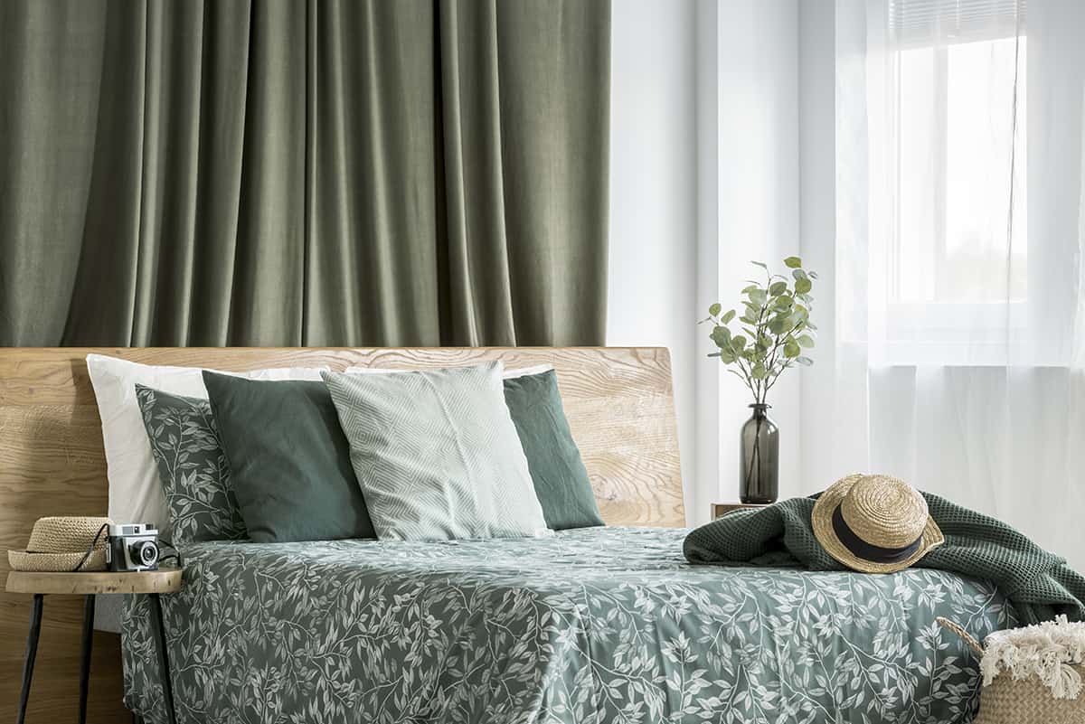
Loden green pairs beautifully with neutral colors like beige, cream, gray, and white. These neutrals provide a subtle and balanced backdrop for the rich, earthy tones of loden green.
Consider adding textural elements in loden green to your neutral palette, such as a loden green textured rug, cushions, or curtains. These textures can add warmth and coziness to the space. Loden green also works really well with the natural materials common in neutral decor schemes, such as wood, stone, and rattan.
Earthy Tones
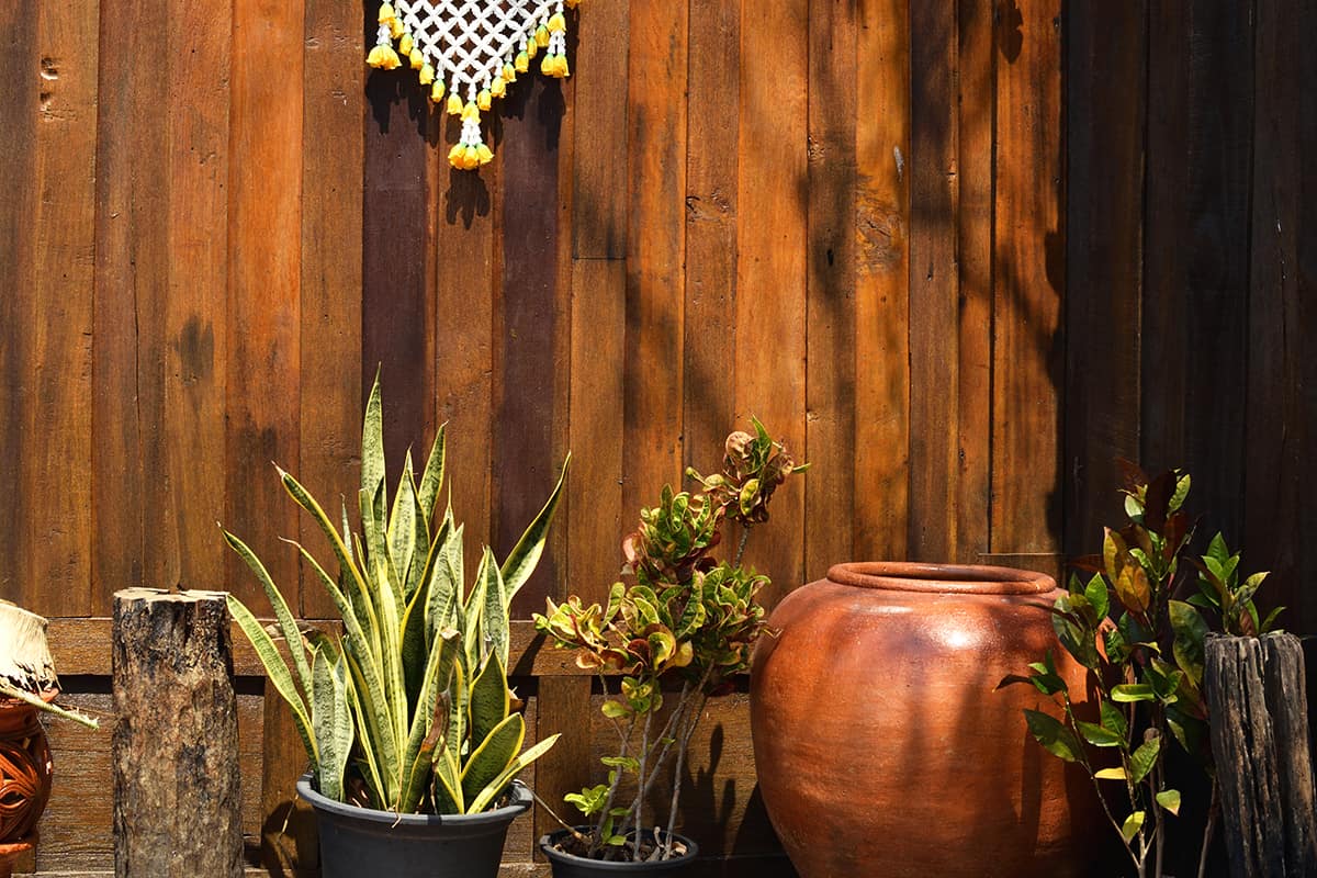
Loden green is, in itself, an earthy color due to its muted and natural greenish-brown tones. When combined with other earthy colors, it can create a harmonious and cohesive color palette that evokes a strong connection to nature and a sense of warmth.
Other earthy colors, such as rust, mustard, taupe, and terracotta, work well with loden green. These colors create a warm and nature-inspired color palette.
Deep Blues
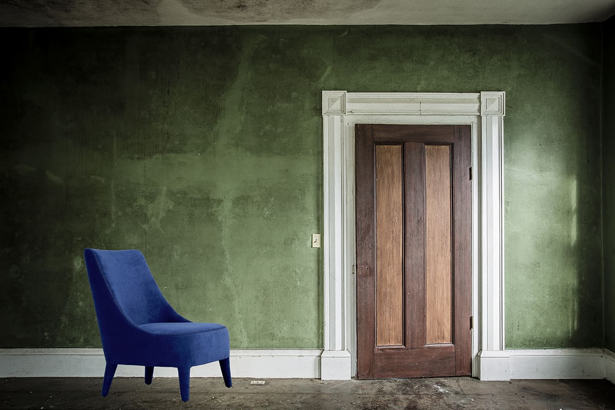
Deep blues, like navy or indigo, can create a striking contrast with loden green. Loden green and dark blue create an attractive and balanced color combination. The pairing of loden green with dark blue offers a subtle contrast between warm and cool tones, without a harsh or bold look.
Since green is known as a fresh color and blue is a soothing color, a room using this color scheme can be very relaxing and rejuvenating. Consider adding metallic accents, like gold or brass, which can complement and add a touch of sophistication to the loden green and dark blue combination.
Charcoal Gray
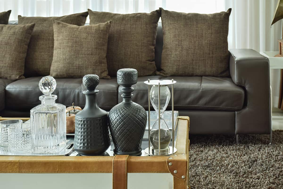
Charcoal gray can provide a sophisticated and modern contrast to loden green for a refined and elegant look. The deep and rich tone of charcoal gray contrasts nicely with the muted, earthy quality of loden green. This contrast adds visual interest to the color scheme without a bold or overstimulating difference.
Loden green and charcoal gray are both neutral colors, which means they can serve as versatile base colors in your design. You can use them as a backdrop for other colors or as dominant colors in your palette, depending on the type of atmosphere you want to achieve.
Muted Pastels
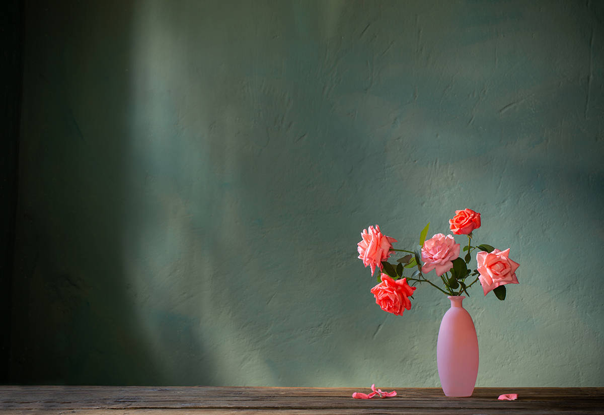
Soft pastel colors like dusty rose, lavender, or muted sky blue can offer a delicate and feminine touch when combined with loden green. Achieving the right balance is crucial to ensure the overall result is appealing.
You can use pastel colors as accents to add a touch of softness and contrast to a primarily loden green color scheme or experiment with textures to add depth and interest to the combination. Different textures in both pastel and loden green elements can provide a more layered and visually dynamic design. Loden green is a muted, earthy color, while pastels are soft and light, so the combination can create an interesting contrast.