Red is an interesting color because it can evoke dramatically different emotions depending on the shade of red used.
If you want to use red in interior design, then you’ll need to be aware of the various ways red can be used to achieve different styles and which colors it can be paired with.
From cherry red to tomato red and raspberry red, there are so many shades of red that can be employed to create spaces that are relaxing, vibrant, moody, or happy.
Take a look at these colors that go with red to garner inspiration for your next interior decor project, and learn more about how to work with red.
We’ve got an awesome video from our YouTube channel waiting for you below. And if you’re looking for even more juicy details, check out our blog post, which goes into more depth. If you love what we’re putting out there, don’t forget to hit that subscribe button on our YouTube channel for more great content!
Table of Contents
| Shade | Hex Code | CMYK Color Code (%) | RGB Color Code | Color |
| Red | #b52823 | cmyk(0%, 78%, 81%, 29%) | rgb(181, 40, 35) | |
| Navy Blue | #2c3a5d | cmyk(53%, 38%, 0%, 64%) | rgb(44, 58, 93) |
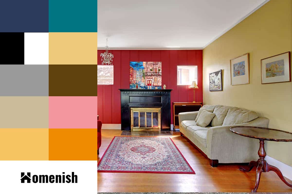
Navy and red are classic complementary colors for white, which never fails to look stylish.
These colors are often used in Americana-style interior decors, as they align with the colors of the United States flag. If you want to use red to create this look, focus on striped or checked patterns and steer away from florals.
Be sure to use navy blue as opposed to any other shades of blue because they can look too stark alongside red.
Navy, white and red can also be used to create a more modern vibe in interiors and to do this, you should try to use solid decor items instead of patterns. Blocks of color in these shades will make a space feel bold and minimalist.
Black and White + Red
| Shade | Hex Code | CMYK Color Code (%) | RGB Color Code | Color |
| Red | #b52823 | cmyk(0%, 78%, 81%, 29%) | rgb(181, 40, 35) | |
| White | #ffffff | cmyk(0%, 0%, 0%, 0%) | rgb(255, 255, 255) | |
| Black | #000000 | cmyk(0%, 0%, 0%, 100%) | rgb(0, 0, 0) |
Black and red are another classic excellent color combination with black for a retro vibe. This is a good color theme to choose if you want to use red but aren’t confident in choosing the right shade because absolutely any shade of red will work with black and white, making it completely foolproof.
This color theme works best when red is used sparingly but in bold splashes. For example, decorate a room in predominantly black and white, then add in a red painted table and a few smaller red items.
To achieve a truly retro look, use a black and white chequered pattern for flooring or fabrics and decorative objects in glossy red, such as a red-framed clock or a red kitchen blender.
Gray + Red
| Shade | Hex Code | CMYK Color Code (%) | RGB Color Code | Color |
| Red | #b52823 | cmyk(0%, 78%, 81%, 29%) | rgb(181, 40, 35) | |
| Gray | #9b9b9b | cmyk(0%, 0%, 0%, 39%) | rgb(155, 155, 155) |
Gray is the perfect color to both tone down red and also make it pop. Any shade of gray will go with red, and it is a very trendy color in interiors right now, so you will find plenty of gray home decor items to add to your room.
For a contemporary look, paint walls in your favorite shade of gray and inject red into the space by choosing red patterned curtains or a statement red chair. Pick out the red in a few other pieces in the room, such as a red candle, a book with a red spine, or a plant with red flowers.
Beige + Red
| Shade | Hex Code | CMYK Color Code (%) | RGB Color Code | Color |
| Red | #b52823 | cmyk(0%, 78%, 81%, 29%) | rgb(181, 40, 35) | |
| Beige | #c9ba99 | cmyk(0%, 7%, 24%, 21%) | rgb(201, 186, 153) |
If you want to use red and also maintain a relaxing atmosphere in a room, use the color sparingly in a space that is predominantly beige. Opt for varying shades of beige, from soft linen to more coffee-colored hues, and layer them in the space to make sure the room doesn’t feel flat.
You can do this by painting the walls in one shade of beige, choosing a sofa in a different shade of beige, and having the flooring in yet another shade of beige.
You can then add small touches of red to cushions, throws, and rugs to liven up the room while still benefiting from a calm and casual vibe. Beige will help to tone down the red, and because it isn’t a stark color, the red won’t stand out from it in a harsh way.
Read further about the beige color combinations in our post ‘ what colors go with beige. ‘
Yellow + Red
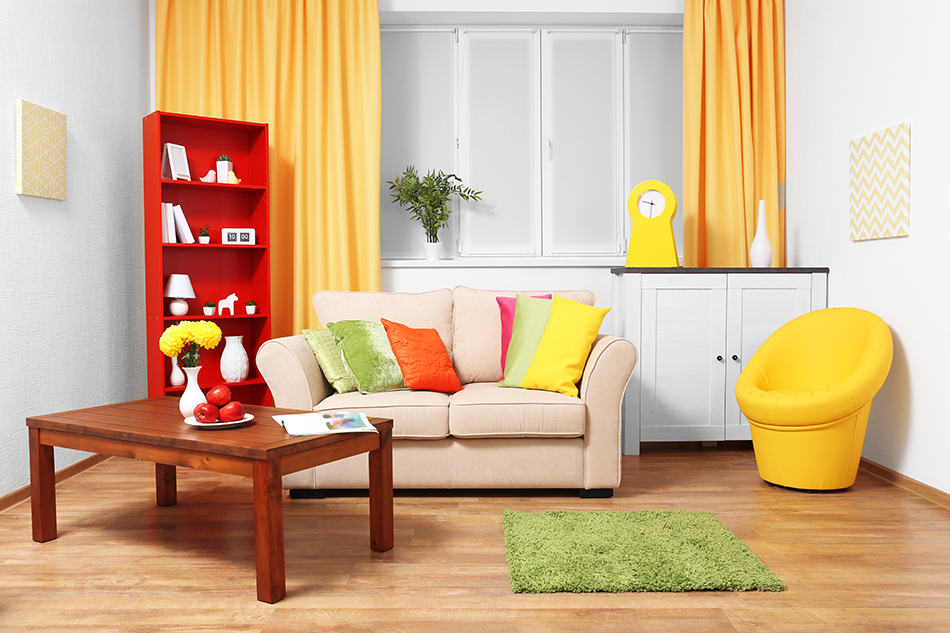
| Shade | Hex Code | CMYK Color Code (%) | RGB Color Code | Color |
| Red | #b52823 | cmyk(0%, 78%, 81%, 29%) | rgb(181, 40, 35) | |
| Yellow | #f8c363 | cmyk(0%, 21%, 60%, 3%) | rgb(248, 195, 99) |
Red can work really well with yellow to create a sunny and warm environment. Choose an orange-based red to ensure both colors have warm tones and use a neutral color alongside them to break them up a little and prevent them from jarring.
Yellow and red can be a pretty combination in a bedroom if you opt for a floral pattern in soft furnishings, with a cream or off-white base.
Mustard yellow works particularly well with a cinnamon shade of red to achieve a Mediterranean or Moroccan style interior, which is inviting and appealing.
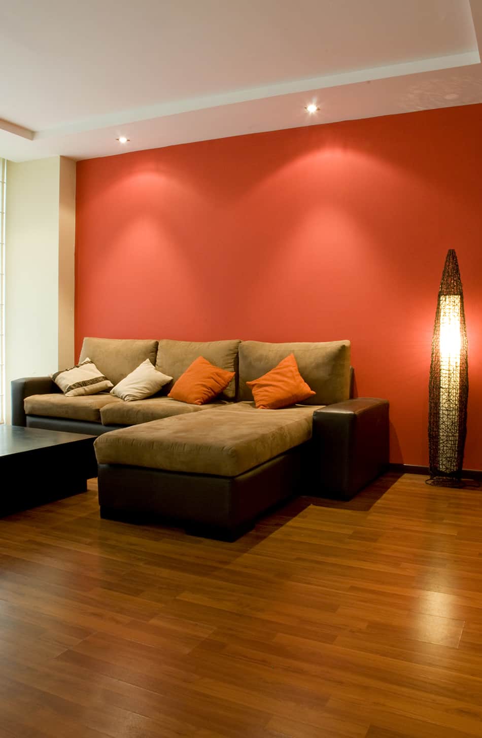
Orange + Red
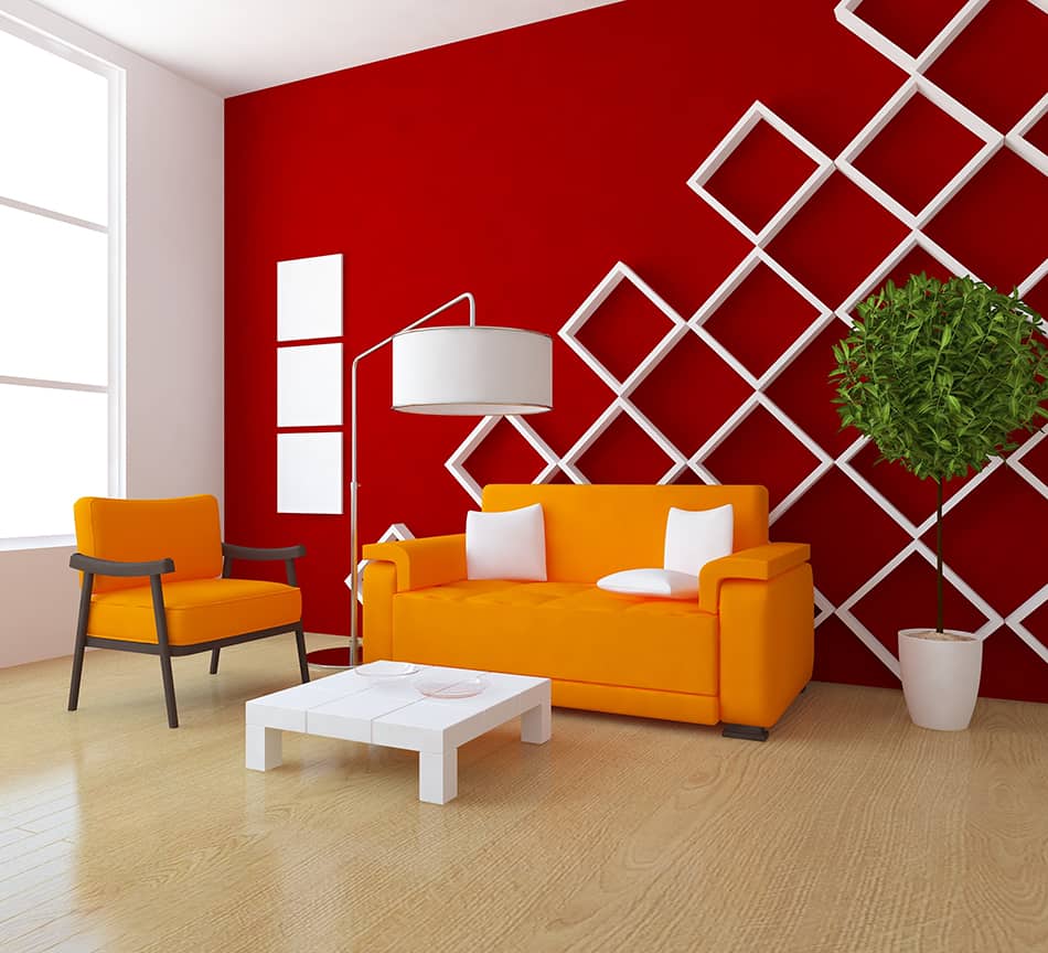
| Shade | Hex Code | CMYK Color Code (%) | RGB Color Code | Color |
| Red | #b52823 | cmyk(0%, 78%, 81%, 29%) | rgb(181, 40, 35) | |
| Orange | #ee8a00 | cmyk(0%, 42%, 100%, 7%) | rgb(238, 138, 0) |
Orange is next to red on the color spectrum and will look modern and energetic when used with white or another neutral color. When using orange with red, choose a bright pumpkin shade that will be able to hold its own against a dominant red.
These two colors alongside each other create a tonal and layered feel, as they have similar notes.
If you choose red as a color to pair with orange, be confident and bold, and don’t be afraid of the starkness of these colors. If you overthink it and opt for a peach shade of orange, you will find the combination clashes.
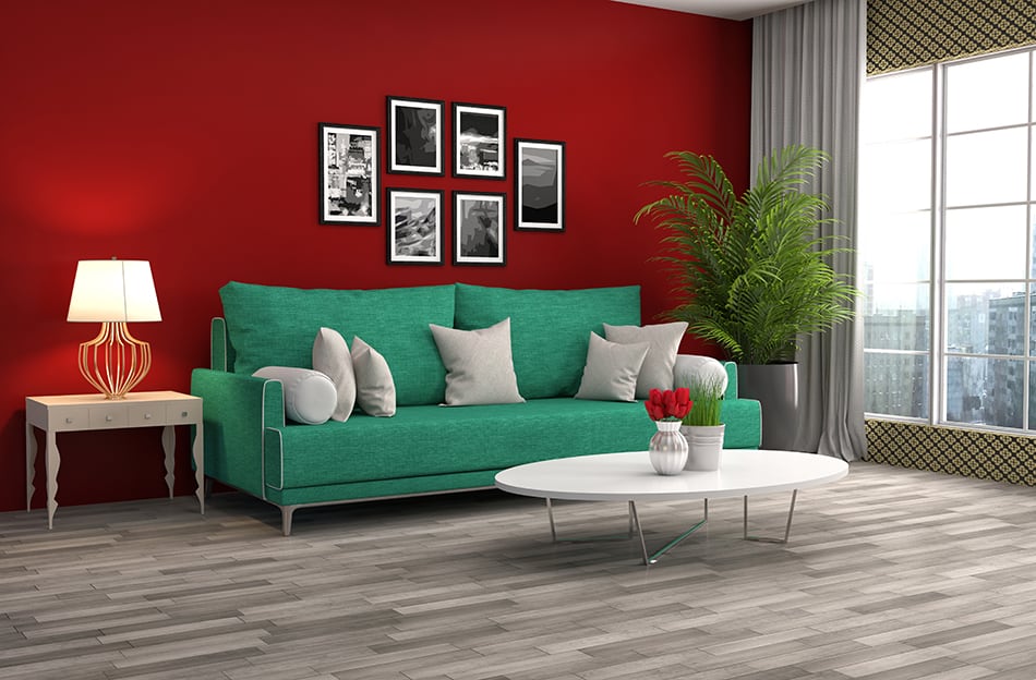
Teal + Red
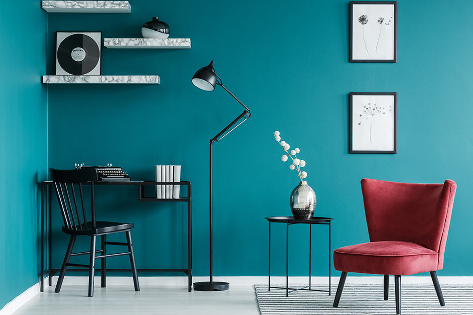
| Shade | Hex Code | CMYK Color Code (%) | RGB Color Code | Color |
| Red | #b52823 | cmyk(0%, 78%, 81%, 29%) | rgb(181, 40, 35) | |
| Teal | #017785 | cmyk(99%, 11%, 0%, 48%) | rgb(1, 119, 133) |
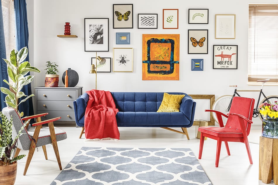
As opposite colors on the color wheel, blue and red go hand in hand when it comes to color pairings. So red is a good color that goes with teal because teal is the perfect shade of blue and it is strong enough to hold its own alongside dominating red.
When used in conjunction with a neutral, these colors don’t look stark and actually manage to tone each other down to create a more easy and casual look. These colors can work in a variety of interior styles, such as modern, retro, and vintage.
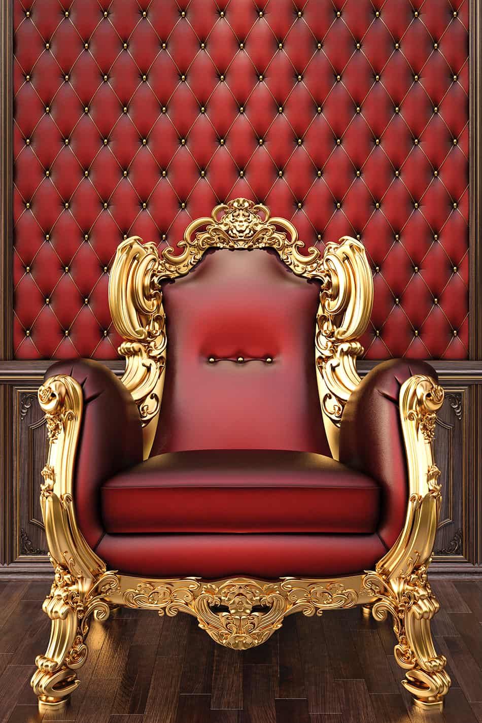
Gold + Red
| Shade | Hex Code | CMYK Color Code (%) | RGB Color Code | Color |
| Red | #b52823 | cmyk(0%, 78%, 81%, 29%) | rgb(181, 40, 35) | |
| Gold | #eec87a | cmyk(0%, 16%, 49%, 7%) | rgb(238, 200, 122) |
For an elegant and opulent style, use touches of gold in a red room. This works especially well when there are also elements of black, such as black furniture or black flooring.
When using the red and gold color combination, you should choose deep shades of red such as wine or sangria red to ensure the space looks luxurious. Brighter shades of red like cherry red or ruby red can look trashy and tasteless when used with gold.
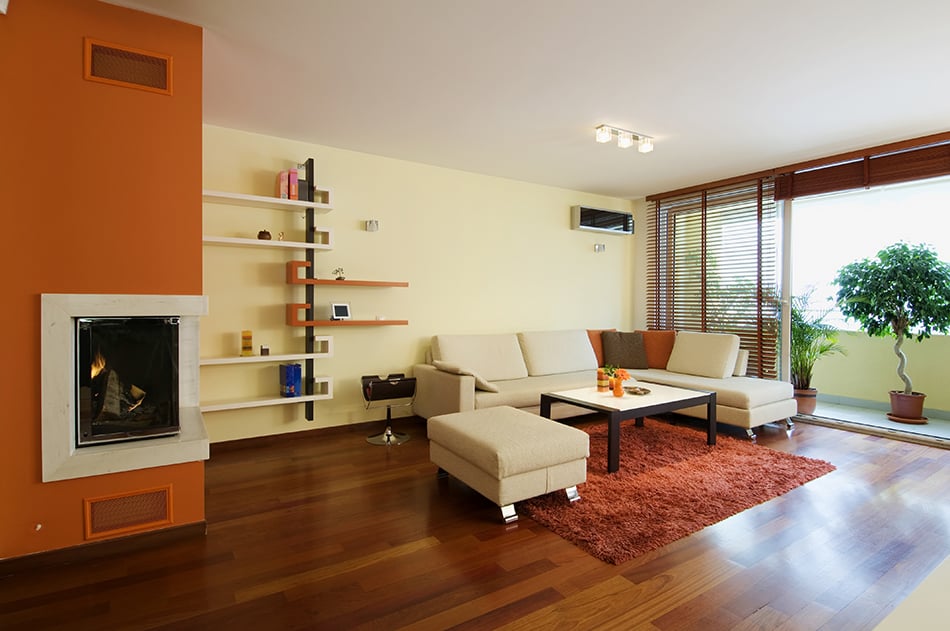
Brown + Red
| Shade | Hex Code | CMYK Color Code (%) | RGB Color Code | Color |
| Red | #b52823 | cmyk(0%, 78%, 81%, 29%) | rgb(181, 40, 35) | |
| Brown | #60400d | cmyk(0%, 33%, 86%, 62%) | rgb(96, 64, 13) |
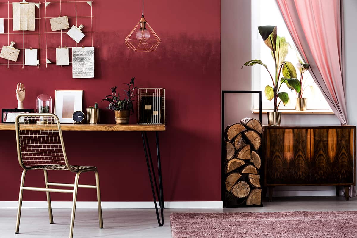
Brown and red is a color pairing that has a masculine feel to it. This can be used to create a modern style in a loft space or a more traditional style in an office or library.
For a distinguished look, for example, in a study, paint the walls in a dark shade of red and fill the space with dark brown wooden furniture such as a desk and bookshelves. When used in this way, brown and red work together to achieve a prestigious feel which is popularly employed in business decor.
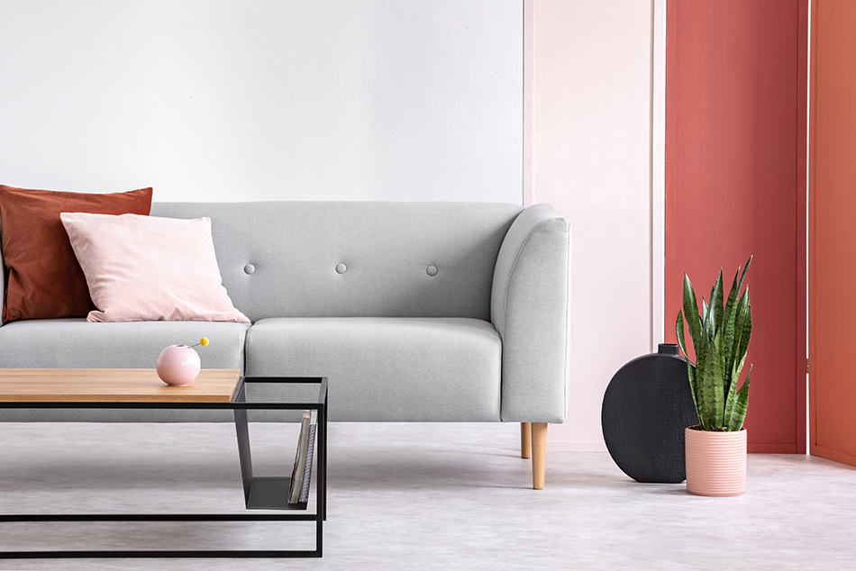
Pink + Red
| Shade | Hex Code | CMYK Color Code (%) | RGB Color Code | Color |
| Red | #b52823 | cmyk(0%, 78%, 81%, 29%) | rgb(181, 40, 35) | |
| Pink | #f4979c | cmyk(0%, 38%, 36%, 4%) | rgb(244, 151, 156) |
If you are going to pair pink with red, go with light pink, dusty pink. These two colors combine each other well. When red represents love, pink stands for feminine. This will create bring a romantic and feminine atmosphere
Tips for Decorating with Red
Use Strong Tones
Red is a very bold color that needs strong tones to balance it out, but you need to walk the line carefully to avoid creating a space where dominant colors are battling for attention. When pairing red with another color other than neutrals, choose a color with a strong tone but a muted hue. For example, dark green, mustard yellow, eggplant purple, and bold orange will all hold their own alongside red without drowning it out. Avoid pastel shades, as these will clash and result in an awkward look.
Use Patterns in Soft Furnishings
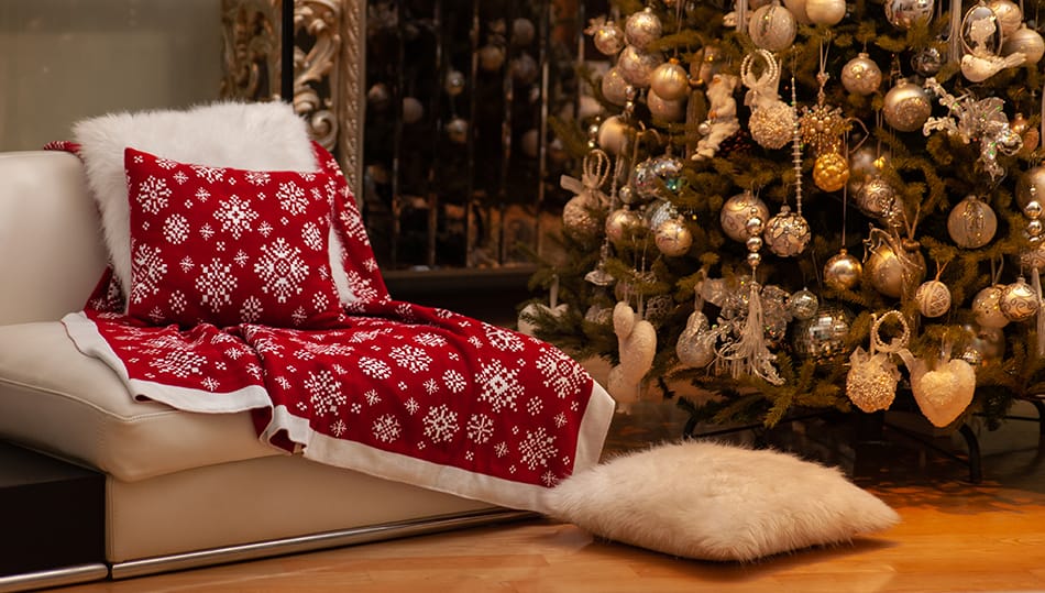
Using red in soft furnishings is a great way to introduce the color into a room without making it too permanent because you can always switch out pillows or rugs at a later date if you want to.
When bringing soft red furnishings into a space, you should choose those with red patterns on and avoid solid red cushions or curtains. Soft furnishings in solid red will look harsh and startling, whereas patterns that incorporate red elements will blend in better and make the decor look more seamless and styled. You can then pick out the red in your soft furnishings in other accessories, such as photo frames and vases.
Use Red to Accent
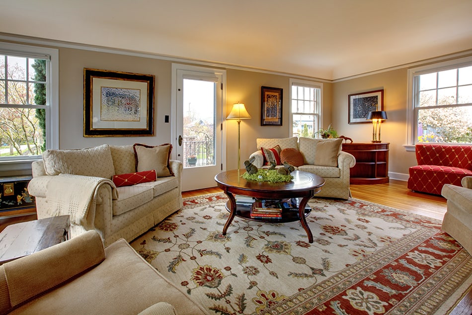
Even if you love red, you might find it too overwhelming if your entire room is painted in this color. Red is a very bold and dramatic color, which can feel intense when it surrounds you. Instead, use a wallpaper with a red pattern on a feature wall, or use red as an accent color in a room alongside more neutral tones.
Explore Red Shades
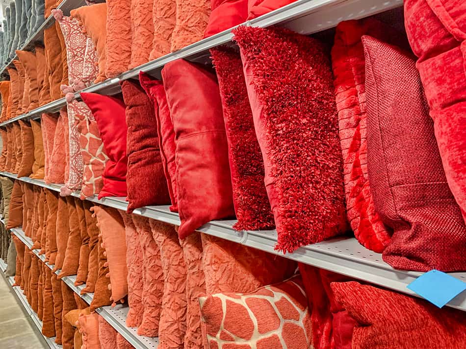
There are so many shades of red, and it’s important to identify the one which works best in your space, as even a subtle tonal difference can completely change the feel of a room. If you are using small amounts of red in space as an accent color, then you can use a more risky shade of red to make an impact.
Reds that will make the biggest statement against neutral shades are those which have orange undertones, such as chili red, scarlet, and crimson. If you want to use more red in a room, then choose a shade with blue undertones, as this will help to tone down the red and make it an easier color to be around. Some popular shades of red with blue undertones are garnet and mahogany. Blue undertone reds have a more relaxing feel, whereas orange undertone reds are more lively and vibrant.
Red in Interior Design
Red is an interesting color because it can evoke dramatically different emotions depending on the shade of red used. If you want to use red in interior design, then you’ll need to be aware of the various ways red can be used to achieve different styles and which colors it can be paired with.
From cherry red to tomato red and raspberry red, there are so many shades of red that can be employed to create spaces that are relaxing, vibrant, moody, or happy.
Wine Red
Wine red is a deep and dark shade of red that is, as you have probably predicted, named after the color of red wine. This is a rich and luscious color that provides a warming sensation, much like its namesake. Wine red is a cozy and comforting color to use as a paint color on the walls, and it works particularly well in large rooms to create a sense of intimacy that didn’t previously exist.
The colors you choose to use with wine red will depend upon the type of style and atmosphere you want to achieve. Dark green works well with wine red for a festive feel, or pair wine red with beige for a more traditional look.
Primary Red
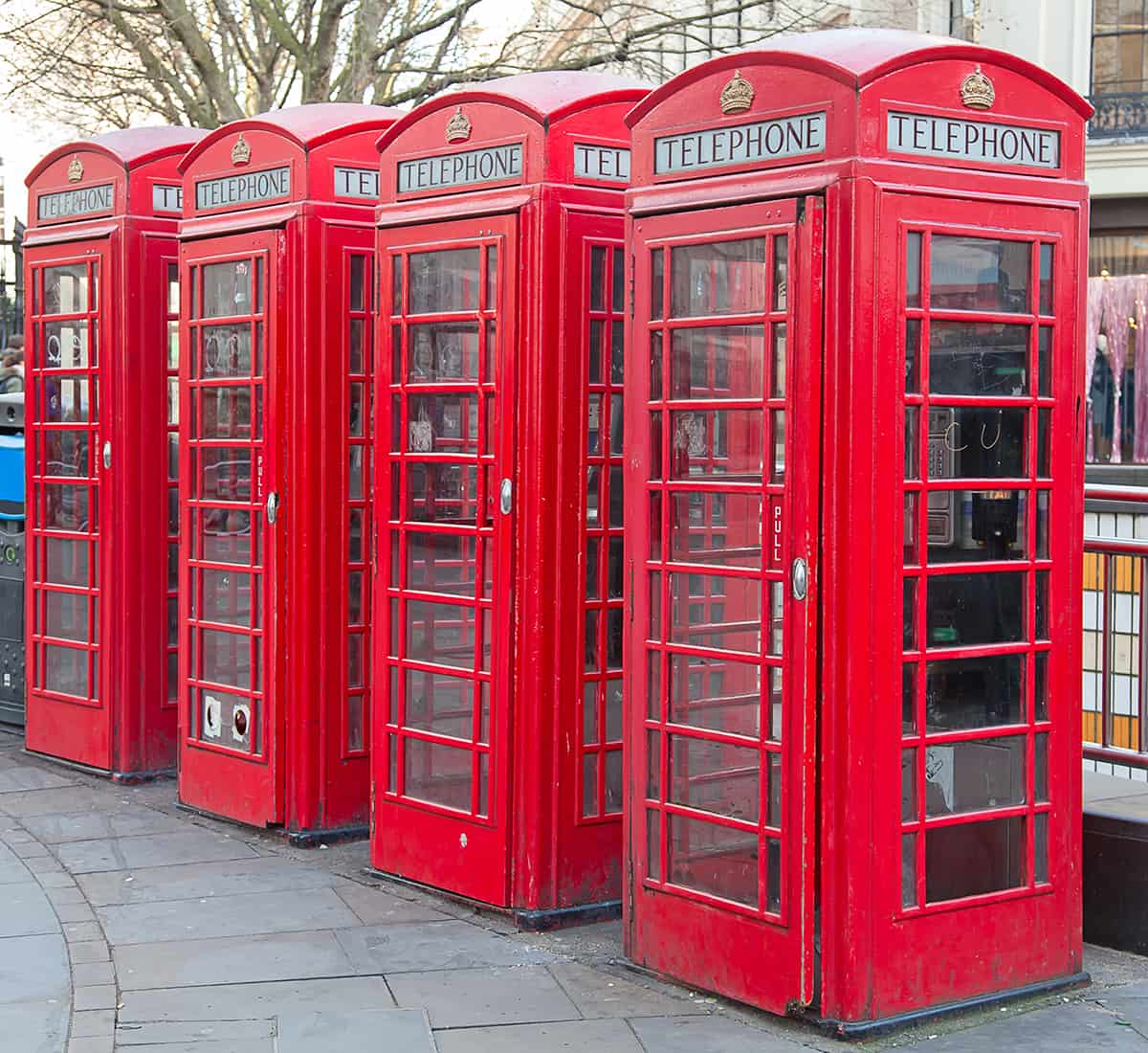
Primary red is the bright red of British phone boxes, London buses, and fire trucks. It is a vivid, bold shade that can be used to make a strong impact in interior design. Since this color is quite intense, it is most often used as an accent shade rather than the main color in a decor palette. It pairs well with other distinctive colors, such as navy blue or bright yellow.
This is a color that can be put to good use in a child’s room for a fun look, but it also works well in common spaces in the home, such as in a nautical-themed design.
Cool Red

Most people assume that red is a warm color. Although red is most commonly found in warming shades, it can also have blue hues, which give it a cooler feel. When red has blue undertones, it can be perceived as a more violent shade since it more closely resembles the color of blood and is evocative of violence or danger. However, cool red tones can work well in small doses in interior design, particularly in rooms that receive a lot of natural sunlight.
Warm Red

Warm red colors are those which have orange or brown tones. Dark reds, which make you feel cozy and snuggly, will typically have brown undertones, while bright or light reds, which appear joyful, will usually have orange undertones.
In some instances, the undertones will be obvious, but this is not always the case. Warm red shades can be balanced out nicely with cool colors; for example, pair orange-red with a cool dusty gray.