Turquoise is a blue-green color that sits right in between true blue and true green on the color wheel. It also contains yellow hues, which affect the way turquoise makes a room feel.
While most colors can be described as either a warm or cool color, turquoise can be either depending on the intensity of the hues within it. This is because turquoise is made up of blue, which is a cool color, and yellow, which is a warm color. The depth of yellow in a particular shade of turquoise will affect whether it leans more towards warm or cool.
Turquoise is predominantly blue and therefore has a calming effect when used in interior design, but the yellow components of this color make it an energetic shade that can be overwhelming when used too heavily.
The best way to use turquoise is as an accent color to prevent it from being overstimulating and allowing the user to benefit from its healing ability.
Here we look at the best colors to pair with turquoise to bring out the best in it and how to best use turquoise around the home.
Table of Contents
Colors that Go with Turquoise
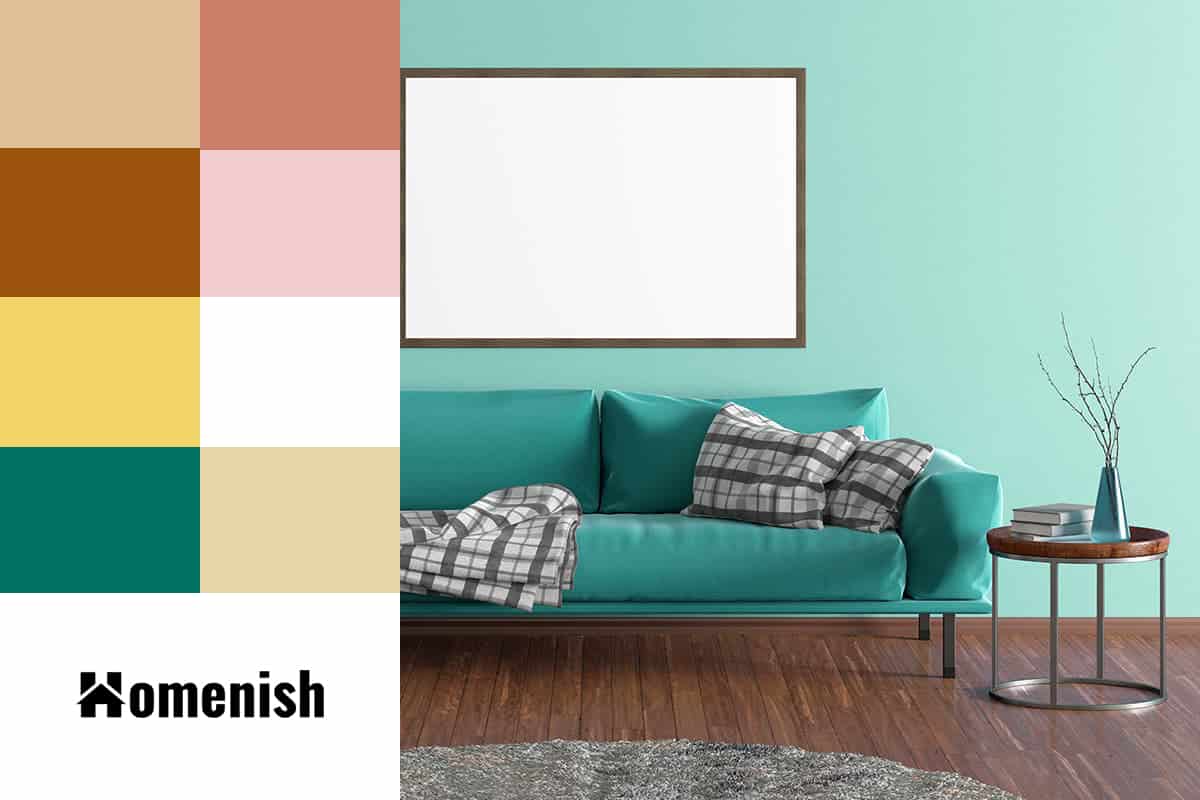
Beige
| Shade | Hex Code | CMYK Color Code (%) | RGB Color Code | Color |
| Turquoise | #3bbdbe | cmyk(69%, 1%, 0%, 25%) | rgb(59, 189, 190) | |
| Beige | #e0be98 | cmyk(0%, 15%, 32%, 12%) | rgb(224, 190, 152) |
Turquoise, in its truest sense, is a naturally occurring mineral and gemstone upon which the color turquoise is based. As it is found in nature, it makes sense that this color pairs easily with other natural shades found in the environment.
Beige is a good color choice to use as a predominant color when using turquoise as an accent shade because it has a calming ambiance that helps to balance out the energy found in turquoise.
The warmth in turquoise can complement beige, which is also a warm color, allowing the turquoise tranquil elements to shine. If you are concerned that turquoise will feel too vibrant, use it alongside beige because this neutral color will play down the intensity of turquoise.
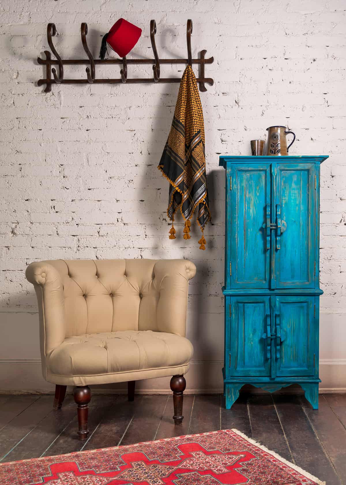
Brown
| Shade | Hex Code | CMYK Color Code (%) | RGB Color Code | Color |
| Turquoise | #3bbdbe | cmyk(69%, 1%, 0%, 25%) | rgb(59, 189, 190) | |
| Brown | #9c540c | cmyk(0%, 46%, 92%, 39%) | rgb(156, 84, 12) |
Like beige, brown is a good natural color choice to use with turquoise because it is a color frequently found in nature. Brown is a color commonly found in outdoor environments, from the rich soil to textured tree trunks.
The turquoise and brown color combination highlights the calming benefits of turquoise with a hint of bold energy. They are popularly used in the interior of spas and therapeutic spaces to induce a feeling of serenity and positivity.
You can use brown as a base color for walls and add accents of turquoise, for example, with turquoise candles or books, or alternatively, you could pair brown and turquoise with a paler neutral color, such as white, for a more airy atmosphere.
White
| Shade | Hex Code | CMYK Color Code (%) | RGB Color Code | Color |
| Turquoise | #3bbdbe | cmyk(69%, 1%, 0%, 25%) | rgb(59, 189, 190) | |
| White | #ffffff | cmyk(0%, 0%, 0%, 0%) | rgb(255, 255, 255) |
Turquoise is a nice color that complements white. If you want to achieve a thoroughly modern and eclectic vibe, then paint a room white and add touches of turquoise on random pieces of furniture, for example, a wooden stool painted in gloss turquoise or a table with turquoise painted legs.
You could also use white and turquoise to create a modern take on a coastal style, with white walls and white linen sofas teamed with landscape photographs of a turquoise ocean.
To continue the relaxed, beachy feel, frame landscape artwork in white wooden frames or use black frames to introduce a contrast that will look contemporary and chic.
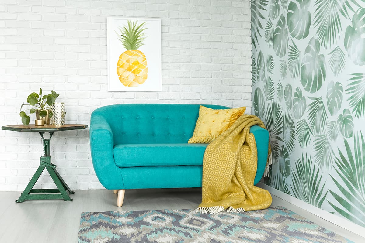
Yellow
| Shade | Hex Code | CMYK Color Code (%) | RGB Color Code | Color |
| Turquoise | #3bbdbe | cmyk(69%, 1%, 0%, 25%) | rgb(59, 189, 190) | |
| Yellow | #f2d569 | cmyk(0%, 12%, 57%, 5%) | rgb(242, 213, 105) |
As turquoise has yellow components in it, so this color pairs well with yellow in small doses. These two colors are strong and vivid and would be overstimulating when used excessively, but they work well when balanced out by a neutral color.
Choose a neutral shade, such as beige or pale gray, and use it on 60% of the room, then choose turquoise and yellow for 30% and 10% of the space. This 60-30-10 rule ensures balance and means the colors will accent each other rather than combat each other.
Shades of yellow that work best with turquoise are those which are warm and vibrant, such as mustard, dandelion, and pineapple. Pale shades of yellow can work but may look washed out by very vivid shades of turquoise.
Look out for fabrics or wallpapers which use both yellow and turquoise together, such as in floral or geometric prints. This will help to tie the color scheme together when used on cushions or other soft furnishings in the space.
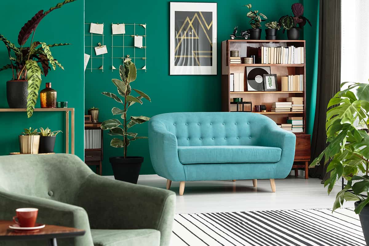
Green
| Shade | Hex Code | CMYK Color Code (%) | RGB Color Code | Color |
| Turquoise | #3bbdbe | cmyk(69%, 1%, 0%, 25%) | rgb(59, 189, 190) | |
| Green | #017060 | cmyk(99%, 0%, 14%, 56%) | rgb(1, 112, 96) |
Using green with turquoise will balance out the energy and make for a fresh and uplifting feel. As green is also a color found in nature, it goes really well with turquoise. Try lime or mint greens with turquoise for a refreshing tone or paler sage greens for a more calming effect.
When making a turquoise and green color combination, it will be best to work with a neutral color for the base shade of a room, such as cream or pale taupe. This will prevent the brighter colors from becoming overwhelming.
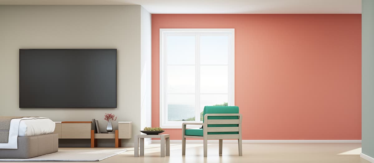
Coral
| Shade | Hex Code | CMYK Color Code (%) | RGB Color Code | Color |
| Turquoise | #3bbdbe | cmyk(69%, 1%, 0%, 25%) | rgb(59, 189, 190) | |
| Coral | #cb7e6a | cmyk(0%, 38%, 48%, 20%) | rgb(203, 126, 106) |
Coral is a pink-orange shade that provides the perfect contrast for turquoise. It is one of the opposite colors to turquoise on the color wheel, which means that they set each other off. For a vibrant, Mediterranean-inspired interior, use white as a wall color and then add bright pops of turquoise and coral.
Choose bold patterns incorporating both colors, such as embroidered cushion covers and woven rugs. If you want to veer away from white or neutral wall colors, you could use coral as your base color. Paint the walls in a subtler shade of coral, hinting towards salmon, and then use turquoise as your accent color to create a contrast that will feel elegant yet playful.
For this color scheme, the texture is important. Choose fabrics that are luxurious for a more feminine vibe, such as silk or velvet, or use more natural textures like cotton and canvas for a laidback style.
Pink
| Shade | Hex Code | CMYK Color Code (%) | RGB Color Code | Color |
| Turquoise | #3bbdbe | cmyk(69%, 1%, 0%, 25%) | rgb(59, 189, 190) | |
| Pink | #f2cccf | cmyk(0%, 16%, 14%, 5%) | rgb(242, 204, 207) |
Turquoise match well with pink in some ways. There are so many shades of pink which go with turquoise, but the shade you choose will play a big part in defining the atmosphere you create in a room. Hot fuchsia pink with turquoise will be lively and striking, whereas soft and dusky pinks with turquoise will look feminine and cute.
If you want to use a neutral base color for the room, then bright pink and bright turquoise will work as accent colors that bounce off each other. If you would prefer to choose a more distinctive color for the main color in a room, choose a more subtle shade.
To use pink and turquoise in this way, you could paint the walls in a pale, washed-out shade of turquoise and add bright pink accessories, or paint the walls in a lighter pink with dusty gray tones and choose bold turquoise accessories.
Gold
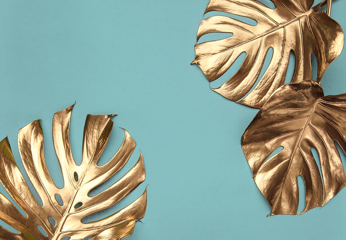
| Shade | Hex Code | CMYK Color Code (%) | RGB Color Code | Color |
| Turquoise | #3bbdbe | cmyk(69%, 1%, 0%, 25%) | rgb(59, 189, 190) | |
| Gold | #e7d4a9 | cmyk(0%, 8%, 27%, 9%) | rgb(231, 212, 169) |
As a warm shade, gold works nicely with any blue-green color. Pair it with cool shades of turquoise to help balance it out, or use it with warm shades of turquoise to achieve a cheerful and welcoming atmosphere. Gold accessories can take turquoise up to the next level and give it a sophisticated twist.
Look out for mirrors with intricately carved gold frames or gold satin drapes for an elegant and modern take on a regal style.
If you are going to use turquoise on the exterior of your home, such as for a painted front door, then use gold hardware to add warmth and charm. Alternatively, using silver metal alongside turquoise will work, but it can bring out the cooler side of the color.
Using Turquoise in Interior Design
Turquoise is an intense color that can be overstimulating if used too heavily. Ensure turquoise has the desired effect in your home by using it in moderation. Follow one or more of these tips for a stylish turquoise interior.
Feature wall
Add turquoise to your color scheme with the addition of a feature wall in a room. Select the wall you want to be the focus of the room. This would usually be the wall behind the bed in a bedroom or the wall with a fireplace in a living room.
Paint it in turquoise and leave the rest of the walls neutral, or choose a patterned wallpaper with turquoise in it.
Soft furnishings
Decorate your room with turquoise by adding soft furnishings in this color. Think about curtains, cushions, throw blankets, rugs, and wall hangings. Using turquoise for textured accessories gives this color a softer appeal that makes it less jarring.
Accent shade
Turquoise, in most scenarios, should be thought of as the accent color instead of the dominant color. Though it may seem counter-intuitive, with turquoise, less is definitely more.
As an accent color, turquoise will shine as the star of the show, whereas if you use it as the dominant color, it can be overwhelming and excessive.
Patterns
Introduce turquoise into your space with the use of patterns, as this will be more subtle and palatable than block colors.
Avoid solid turquoise items, such as cushions made entirely from a plain turquoise fabric, and instead, choose patterned fabrics that feature other colors besides turquoise.