Peach is a color that is named after the flesh of the juicy fruit, and it can vary in tone from pink-orange to pink-yellow. It is a warm color that can be bright and vibrant or more subdued and subtle, depending on the tone.
Here we look at the best colors that go with peach, particularly with reference to using peach as a wall color or an accent color in interior design.
Table of Contents
What is the Meaning of Peach?
As it contains yellow and orange hues, peach is a color that inspires joy and creativity, while the pink elements of peach add a feminine touch to the color. Overall it is a very positive color which can be linked to playfulness and high levels of energy.
In terms of translating this color to its use in interior design, it would work well in a space where you want to boost productivity and creative thinking, such as in a home office, or it could work well in a bedroom if you want to encourage a flirty playfulness. It is also considered to be a sweet and lighthearted color, so it can work perfectly in kitchens, bathrooms, and children’s rooms.
Peach as the Main Color
When using peach as the dominant color in your color scheme, consider a more subtle and softer shade to avoid making a space feel too overstimulating, as vibrant shades of peach can be intense.
Peach is a happy color that can be exuberant in its brightest shade, which can make it overwhelming as the main color in an interior space. For a room that is more soothing and easier to live in, a paler shade of peach will have more longevity.
Peach as an Accent Color
If you want to use peach as an accent color, then any shade will work, and in fact, for the most impact, a more vivid shade of peach is most often the best choice.
The best accent colors are those which provide a stark contrast against the other colors in the room, so opt for a shade of peach, which seems at odds with the other shades in your color scheme.
For example, the contrasting shade of peach to go with pale gray would be a strong and vibrant shade of peach, while to contrast dark gray, a lighter shade of peach would work better.
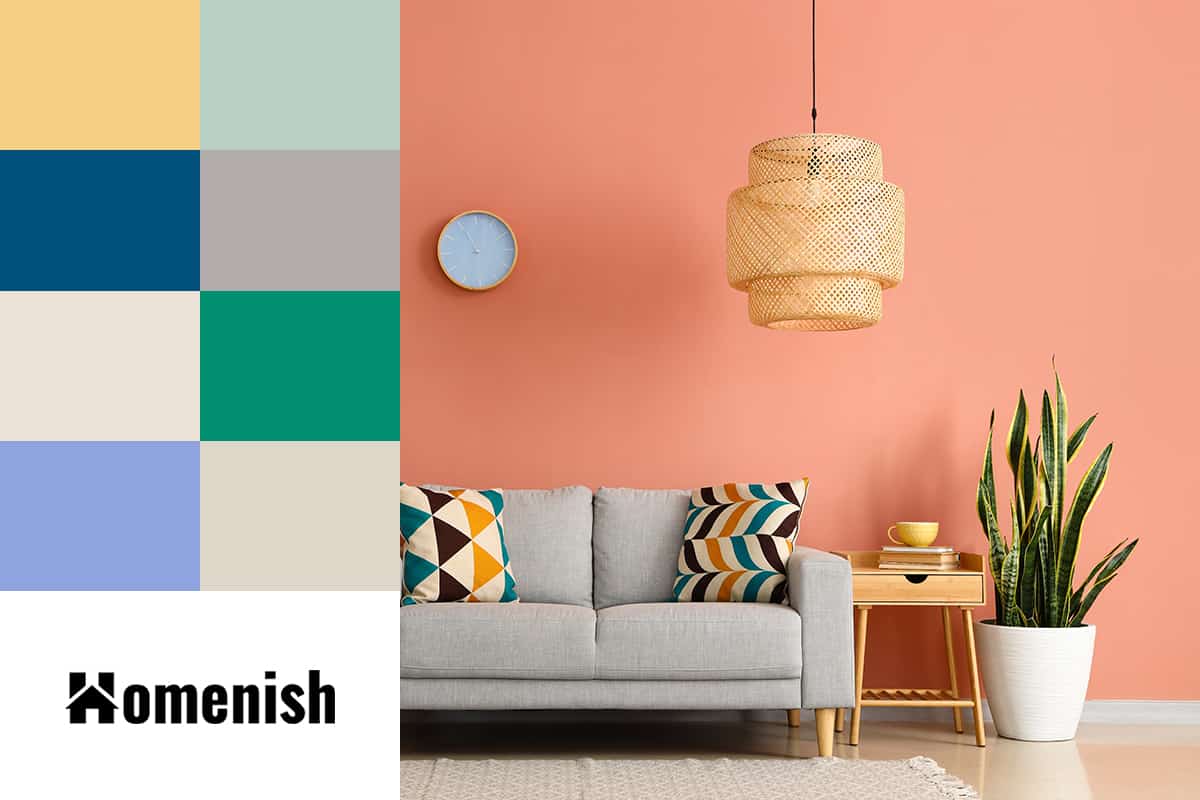
What Colors Go with Peach?
Pale Yellow + Peach
| Shade | Hex Code | CMYK Color Code (%) | RGB Color Code | Color |
| Peach | #f79586 | cmyk(0%, 40%, 46%, 3%) | rgb(247, 149, 134) | |
| Yellow | #f6cf86 | cmyk(0%, 16%, 46%, 4%) | rgb(246, 207, 134) |
Some shades of peach have yellow tones in them, and you can draw out this cheerful side of peach by pairing it with a soft shade of pale yellow.
A buttery yellow color on the walls would work as a slightly more lively paint choice instead of a neutral one, which would accent nicely against peach curtains or peach-colored bedding. These two colors together will create the look of a sunset, which can make for a soothing or even romantic feel in a room.
You can also use pale yellow with shades of peach, which have more of an orange or pink dominant tone, to create a more vibrant contrast that hints towards a tropical theme.
Mint Green + Peach
| Shade | Hex Code | CMYK Color Code (%) | RGB Color Code | Color |
| Peach | #f79586 | cmyk(0%, 40%, 46%, 3%) | rgb(247, 149, 134) | |
| Mint Green | #b8d0c4 | cmyk(12%, 0%, 6%, 18%) | rgb(184, 208, 196) |
Peach is such a gorgeous complementary color combination for mint green because they contrast and balance each other out perfectly. The cool tones in green create a nice harmony alongside the warm tones in peach.
These two colors also sit on opposite sides of the color wheel, which makes them very complementary. Mint green and peach are a lovely color pairing for a traditional cottage country-style interior, and they work especially well when used together in floral prints.
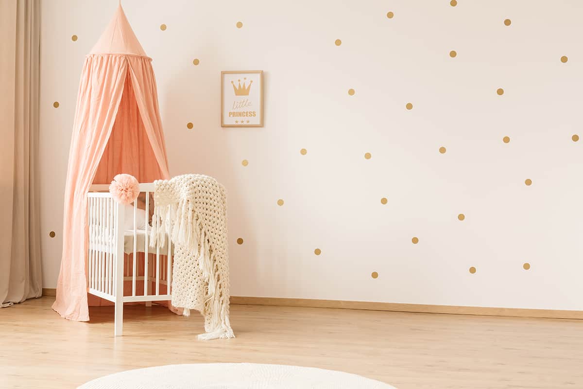
Consider a patchwork comforter using a petite and delicate floral pattern comprising peach flowers and mint green foliage. Peach and mint green are a nice choice for a nursery or child’s bedroom if you want to use pastel colors that are slightly outside of the norm.
| Shade | Hex Code | CMYK Color Code (%) | RGB Color Code | Color |
| Peach | #f79586 | cmyk(0%, 40%, 46%, 3%) | rgb(247, 149, 134) | |
| Navy Blue | #01507b | cmyk(99%, 35%, 0%, 52%) | rgb(1, 80, 123) |
Pale pink is a popular color pairing with navy blue in modern interiors, and using navy blue with peach is an offshoot of this. As blue and orange sit opposite each other on the color wheel, these are considered ideal contrasting and complementary shades.
If you find a shade of peach, which is orange and pink combined, then this will work perfectly as an accent color with navy blue. This is because the orange hues will contrast against the blue, while the pink tones will bring a softness to the color, which works well in luxury and elegant interiors.
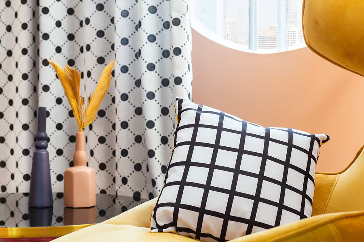
Consider painting your walls in a dark shade of navy blue and using peach accessories such as cushions or an area rug as accents.
This style can be further enhanced with metallic notes such as gold lighting futures or rose gold photo frames. These two colors will work well in contemporary designed rooms in most areas of the home, including bedrooms, dining areas, kitchens, and living rooms.
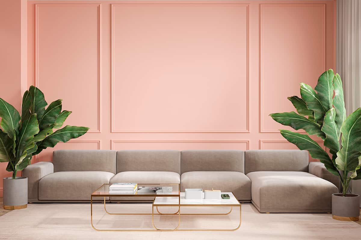
Gray + Peach
| Shade | Hex Code | CMYK Color Code (%) | RGB Color Code | Color |
| Peach | #f79586 | cmyk(0%, 40%, 46%, 3%) | rgb(247, 149, 134) | |
| Gray | #b1abab | cmyk(0%, 3%, 3%, 31%) | rgb(177, 171, 171) |
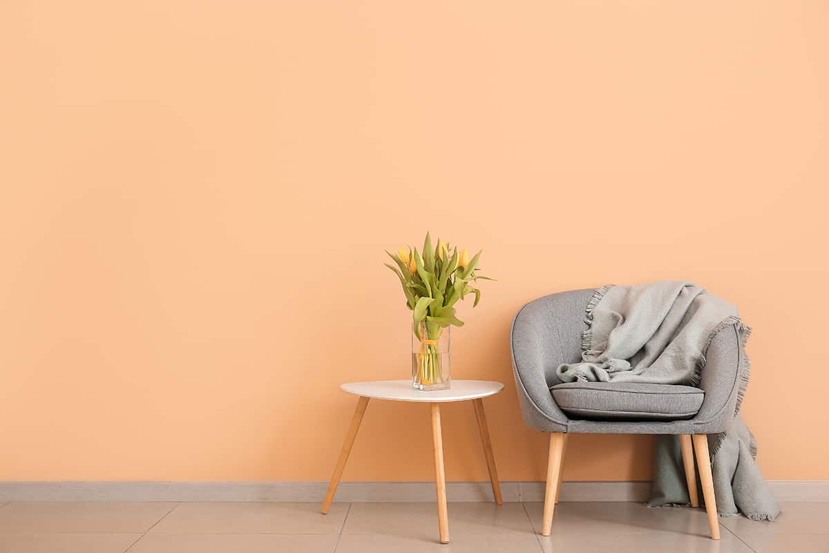
As a neutral shade, gray works well with most colors in interior design. Peach and gray make a particularly attractive pairing, with the cool tones in gray balancing out the heat in peach.
Peach can be thought of as a more traditional color or even an outdated color since it was most popular in the 1990s, but by using it alongside gray, peach is given a modern update and is instantly transformed into a more contemporary color.
For a bold interior, use dark shades of gray such as slate or charcoal with peach; this will create a contrast not only between the tones in these colors but also in the shades, making the peach seem more vivid.
Pale gray and a soft pale peach will also look lovely together in a more subtle style of interior decor. If you want to highlight the orange tones in your peach interior, then choose a shade of gray with blue undertones because this will enhance the orange elements of peach.
Shades of gray which have a brown undertone will be warm neutrals, and these will actually make peach look less vibrant.
Cream + Peach
| Shade | Hex Code | CMYK Color Code (%) | RGB Color Code | Color |
| Peach | #f79586 | cmyk(0%, 40%, 46%, 3%) | rgb(247, 149, 134) | |
| Cream | #ebe1d7 | cmyk(0%, 4%, 9%, 8%) | rgb(235, 225, 215) |
Peaches and cream is not just a delicious dessert but also a lovely color pairing. When used alongside cream, peach can look uninspiring and even take on a sickly note, but by choosing a softer shade of off-white such as cream, peach looks lush and inviting.
Opt for cream-colored walls and add peach accents such as cushions or an accent chair. You could also consider peach as a wall color in a kitchen with cream-colored cabinets for a bright and cheerful cooking space.
As cream and peach are both warm colors, you may want to set them off by using a third color as a contrasting accent. Use a cool color in this instance, such as blue or green, which will help to balance out the energy in the room.
Turquoise + Peach
| Shade | Hex Code | CMYK Color Code (%) | RGB Color Code | Color |
| Peach | #f79586 | cmyk(0%, 40%, 46%, 3%) | rgb(247, 149, 134) | |
| Turquoise | #00906f | cmyk(100%, 0%, 23%, 44%) | rgb(0, 144, 111) |
Turquoise is a color that is made by combining blue and green. It is a vivid and refreshing color that also has calming properties, and it is often used in relation to the ocean to describe clear or deep tropical waters.
As blue and green are the complimentary and contrasting colors of orange and pink, it makes perfect sense that peach would make a striking color theme with turquoise. When used together, peach and turquoise create a tropical style that can be reminiscent of exotic cocktails and faraway vacations.
These colors work together to create an energy that is revitalizing and restorative, using the refreshing yet soothing vibes or turquoise with the positive and creative vibes of peach.
As these colors can be very bold and vibrant when used alongside each other, it can be a good idea to incorporate a third neutral shade into your color scheme to avoid peach and turquoise from becoming overwhelming.
A good neutral would be pale gray, beige, or dark gray. You could even use white with stark shocks of peach and blue for a quirky minimalist style.
Purple + Peach
| Shade | Hex Code | CMYK Color Code (%) | RGB Color Code | Color |
| Peach | #f79586 | cmyk(0%, 40%, 46%, 3%) | rgb(247, 149, 134) | |
| Purple | #8fa3de | cmyk(36%, 27%, 0%, 13%) | rgb(143, 163, 222) |
Purple and yellow are contrasting shades that sit opposite each other on the color wheel, so peach shades that have strong yellow tones will look very striking and a nice match with purple.
Dark or vibrant shades of purple will be made to feel more playful when used alongside peach, or pair peach with paler shades of purple such as lilac or lavender for a more feminine decor.
Purple and peach work best together in interior design when used with a third color which is neutral. A good choice for this shade alongside purple and peach would be gray, black, or off-white.
These colors will work well in a variety of interior styles; for example, a pale gray room with lilac and peach floral print sofas or bedding will make for a modern twist on a country cottage style, while a dark gray room with an elegant bright purple velvet sofa and a soft peach cushion will achieve a glamorous quirky style.
Beige + Peach
| Shade | Hex Code | CMYK Color Code (%) | RGB Color Code | Color |
| Peach | #f79586 | cmyk(0%, 40%, 46%, 3%) | rgb(247, 149, 134) | |
| Beige | #ded6c9 | cmyk(0%, 4%, 9%, 13%) | rgb(222, 214, 201) |
Most shades of beige are warm, so to use this neutral color with peach, you should also incorporate a third color with a cool tone to balance out the energy, such as blue. Alternatively, opt for white as the third color, which will be neither warm nor cool.
Beige and peach can have some similarities in terms of tone, as beige shades will often contain elements of yellow or orange; however, the vibrancy and femininity found in peach are what makes it differ from beige and can make it a good accent color with beige in an otherwise neutral color scheme.
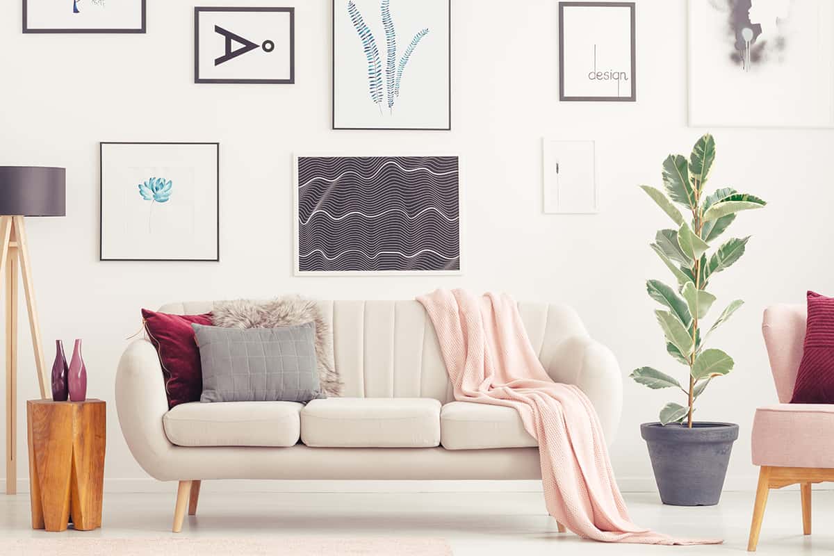
In a white room with beige sofas, add peach cushions or other peach accents to bring some character to the space.
Recommended Peach Paint Colors
Certain Peach by Sherwin Williams
This is a true peach shade that could be used as a wall color against warm neutral beige furnishings to bring a hint of modern femininity to the room. Paint Certain Peach on the upper half of the walls, where the lower half is paneled and painted in off-white, along with pale beige sofas and matching curtains.
Fresh Peach by Benjamin Moore
This is a medium shade of peach that comes across as very playful and flirtatious. It feels fun and exotic and could easily be envisioned as the exterior wall color of an Italian townhouse on the Amalfi Coast or as a delicious peach-flavored gelato. Some people might describe Fresh Peach as a shade of pink, but the brown undertones add a distinctive warmth and decidedly transform this to a peach shade.
Pretty in Peach by Valspar
This is a sweet ice cream shade that will work really well with mint green, tangerine orange, and icy blue. It would be ideal for a modern gender-neutral children’s bedroom or as a laid-back color scheme in a living room or dining room. Pretty in Peach leans more towards pink than orange.
Peach Mimosa by Behr
This is a heavily saturated shade of peach that is strong enough to take on slightly darker or more intense colors. It would be a nice accent shade with eggplant or with navy blue. Peach Mimosa would look stunning as a statement wall color in a small space such as a bathroom. Use it on all of the walls and opt for dark gray glossy tiles and navy blue towels to set it off.
Whispering Peach by Benjamin Moore
As the name of this paint shade implies, it is a very soft, whispered shade of peach. It is much more subtle than your typical peach color, which means it can be used to achieve a softer or more muted look. Use Whispered Peach in a bedroom with gold metal accessories for a touch of delicate glamor.
Dutch Pink by Farrow and Ball
This is a very warm-toned peach from Farrow and Ball. Despite its name, Dutch Pink reads as distinctly more of a peach than a pink shade. The paint color is very responsive to light, and in some spaces will appear more orange-toned, while in others, it might seem browner.