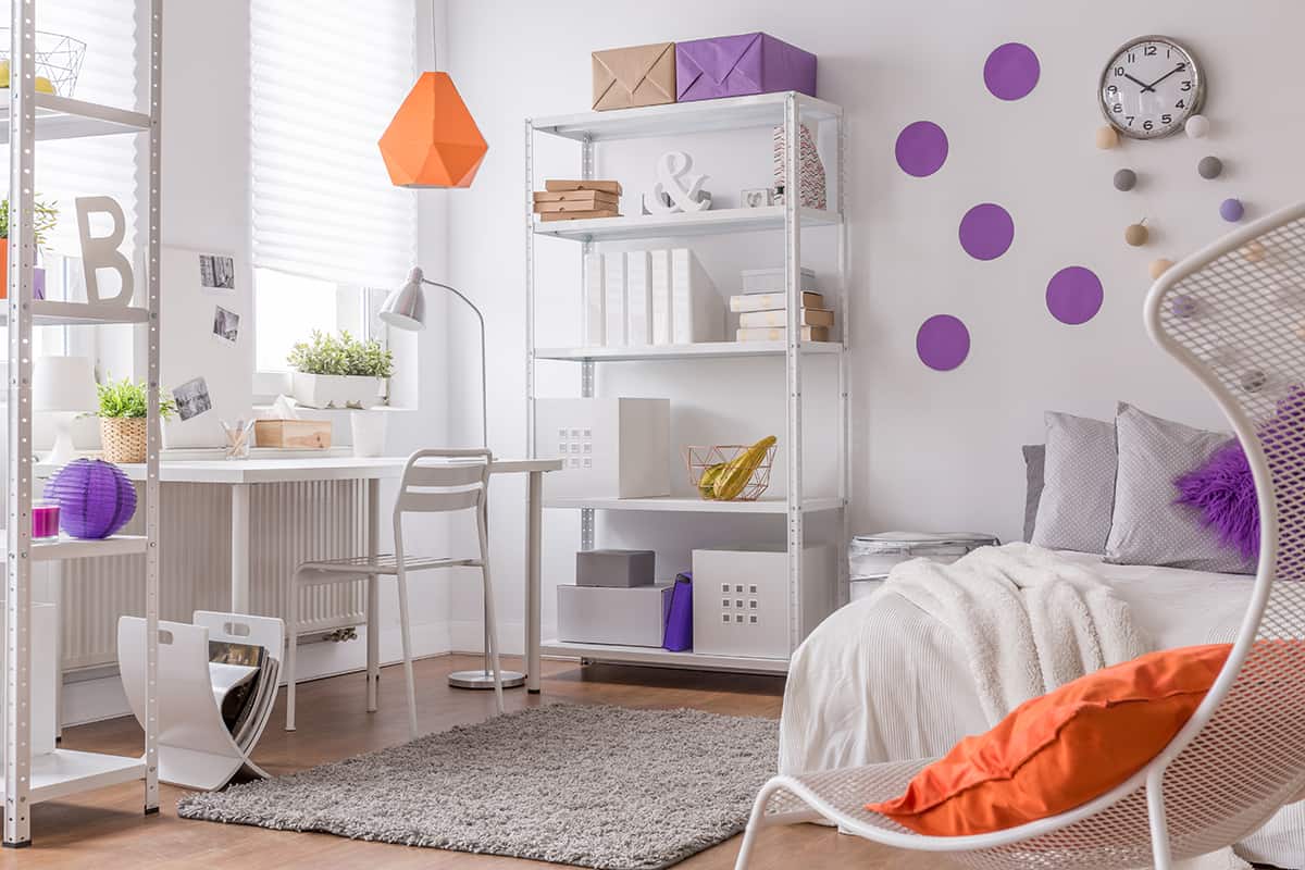
Purple is a popular color choice for rooms where a feminine feel is desired when pink seems too obvious. Parents with little girls will typically opt for purple as an alternative decor color when they don’t want to fall into the stereotypical pink camp.
Purple can also be used for more mature and elegant spaces. Here we look at the best colors to pair with purple in interior design.
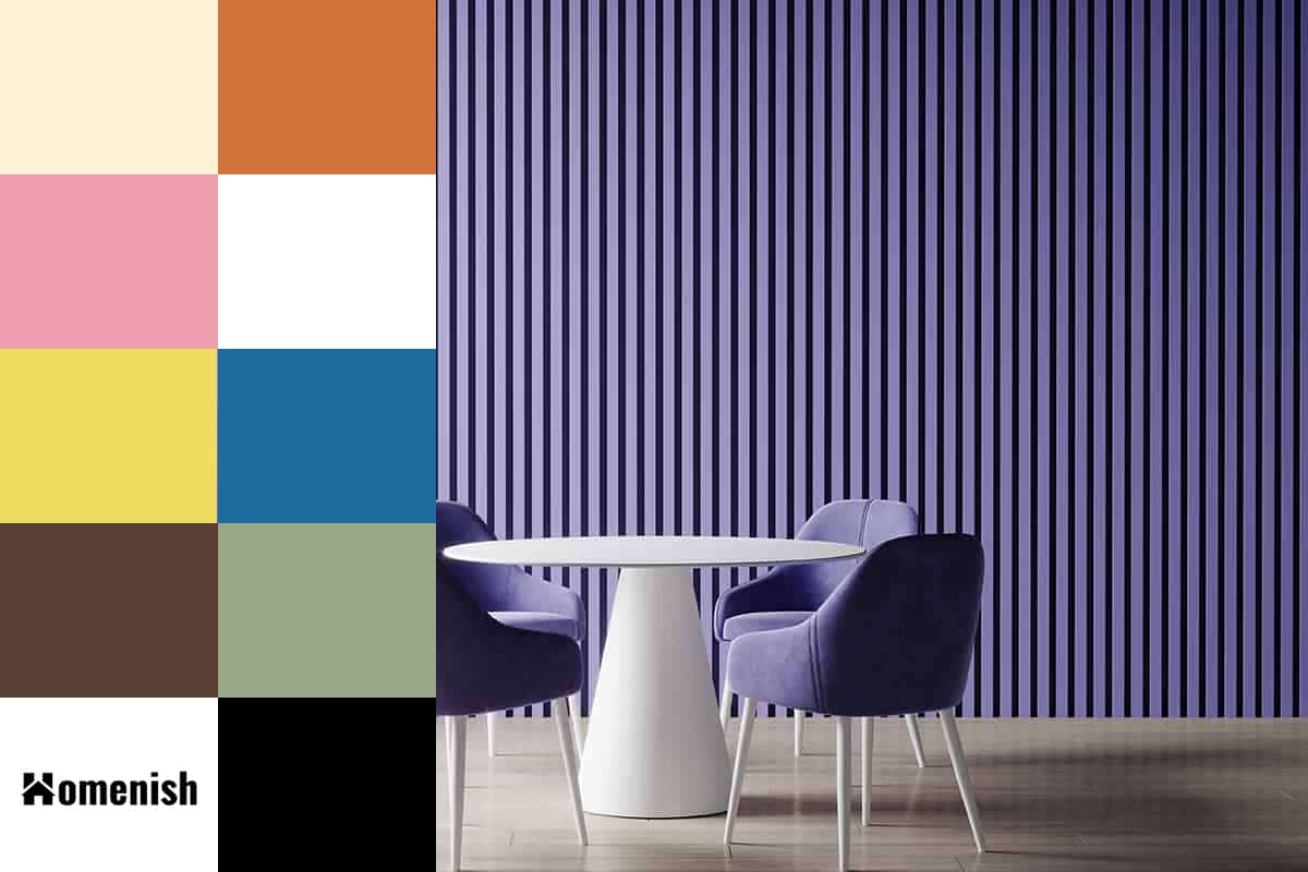
Table of Contents
Effects of Purple Decor
Purple is an interesting color because it can have vastly different effects on a person’s feelings and emotions depending on the specific shade of purple used. Pastel shades of purple such as lilac and lavender have a distinctly feminine, relaxing feel, which makes them ideal colors to use in bedrooms and areas where you want to provide a calming retreat.
Conversely, some deep and dark shades of purple can elicit feelings of negativity, so these need to be used carefully alongside complementary colors which can balance out the sadness in purple. Bright purple has long been associated with nobility, which makes it a good color choice for luxurious interior design themes.
Complementary Colors for Purple
Though purple can be a tricky color to work with, there is an abundance of colors that go well with purple so it is a reasonably popular color in both fashion and interiors.
When choosing other shades to use alongside any color you should always consider complementary colors because they create a contrast and help both colors to pop.
Here we take a closer look at complementary colors to use with purple, and how to make them work in particular interior settings.
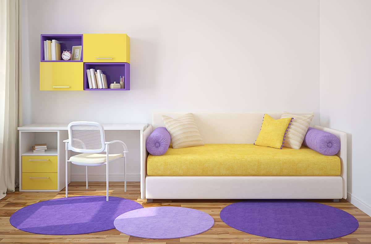
Yellow + Purple
| Shade | Hex Code | CMYK Color Code (%) | RGB Color Code | Color |
| Purple | #490c61 | cmyk(25%, 88%, 0%, 62%) | rgb(73, 12, 97) | |
| Yellow | #f0dc5f | cmyk(0%, 8%, 60%, 6%) | rgb(240, 220, 95) |
Yellow and purple balance each other out perfectly, so they’re a great choice in both fashion and interior design. If you want a royal look then pair a deep shade of purple with rich mustard yellow.
These two colors together look regal and stylish; a vibe that can be further emphasized by using sumptuous and heavy textures such as velvet and even corduroy.
For a more playful and feminine feel, use a pale pastel yellow with lilac. These two sweet shades would be ideal for a nursery or child’s bedroom if you want it to be cute and delicate. Embrace petite floral patterns or checked prints in both of these pastel shades.
To tone down the contrast between yellow and purple you can add in a third neutral color such as magnolia or white, though these are two colors that can successfully be used as a duo.
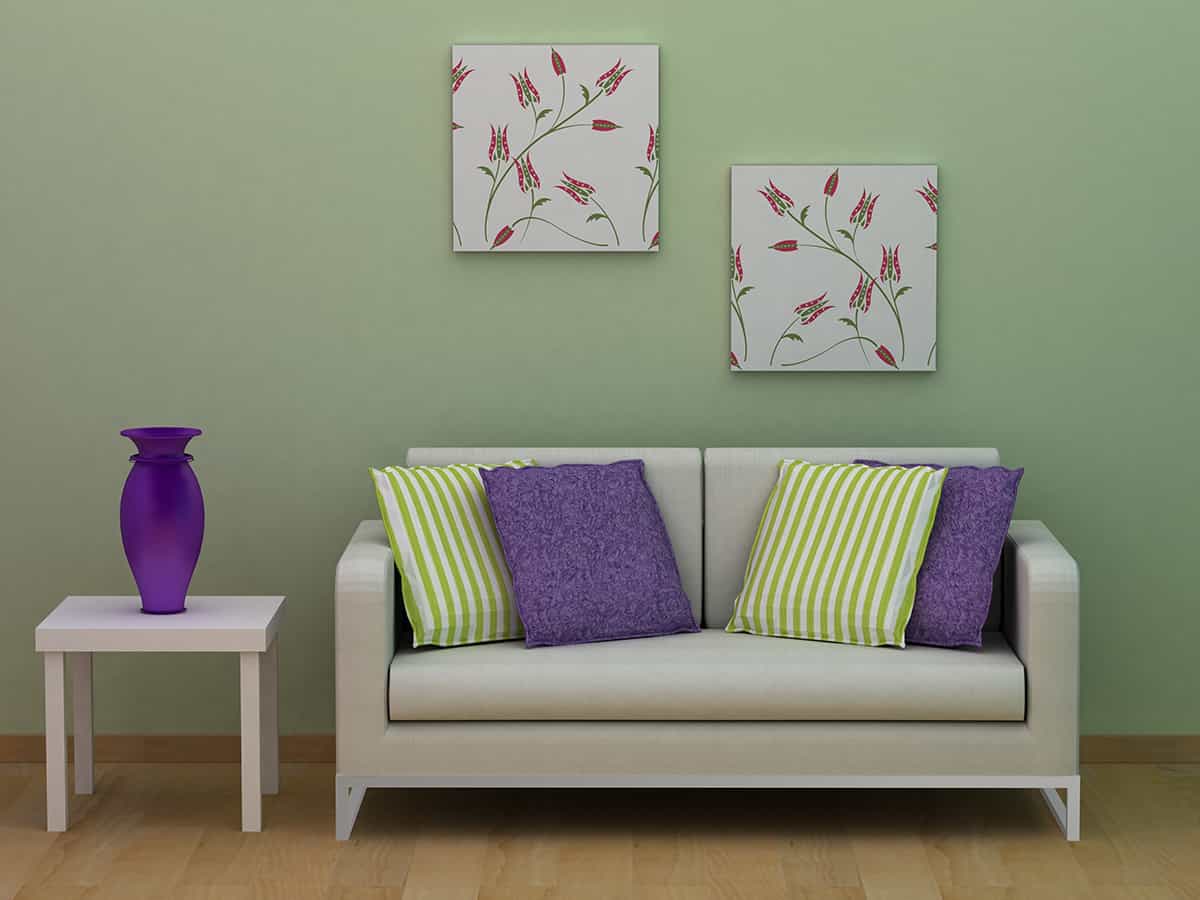
Green + Purple
| Shade | Hex Code | CMYK Color Code (%) | RGB Color Code | Color |
| Purple | #490c61 | cmyk(25%, 88%, 0%, 62%) | rgb(73, 12, 97) | |
| Green | #99a987 | cmyk(9%, 0%, 20%, 34%) | rgb(153, 169, 135) |
Green and purple are complementary colors on the color wheel, so it makes sense that these two should be paired together. Lime green looks lively and vivid when paired with bright purple, though if you choose these colors be sure to also introduce a third muted color such as cream or white, otherwise the space will feel too loud and overwhelming.
Lilac looks stunning with emerald green, but this jewel tone can also work well with a dark shade of purple such as amethyst. Sage green or mint green will also look dreamy with lavender shades of purple, giving a refreshing yet cozy atmosphere.
This color combination can work well in any room in the home, as well as within almost any style of interior decor you are drawn to, including contemporary, country house, shabby chic, or mid-century modern.
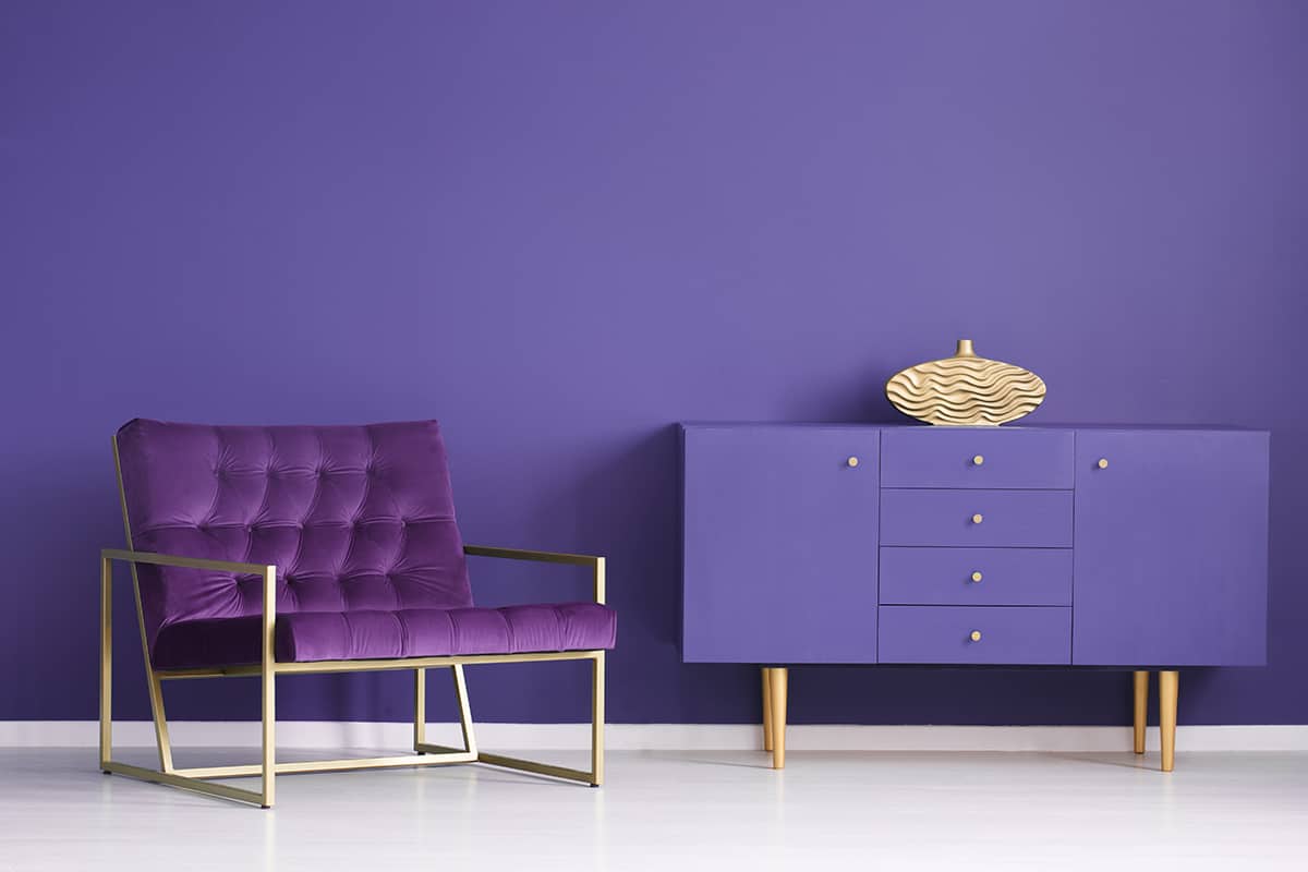
Gold + Purple
| Shade | Hex Code | CMYK Color Code (%) | RGB Color Code | Color |
| Purple | #490c61 | cmyk(25%, 88%, 0%, 62%) | rgb(73, 12, 97) | |
| Gold | #fef0d4 | cmyk(0%, 6%, 17%, 0%) | rgb(254, 240, 212) |
As a color that is synonymous with royalty, purple naturally pairs well with gold. Any shade of purple will feel glamorous and elegant alongside gold, so you can’t really go wrong when using this color combination in interior design or fashion.
If you want to achieve a more grown-up style then opt for a deep shade of purples such as mulberry or wine, and accent this with gold accessories such as a satin gold throw blanket, and an elaborate gold-trimmed mirror. More muted shades of purple such as periwinkle also pair perfectly with gold, and these colors will result in a more feminine style of interior space.
This can work well in a living room or dining room, as well as a bedroom. It can be a good color option for a teenager’s room when you want to achieve a space that reflects their desire to grow up, without having their room be too adult-like. Lavender and lilac shades work beautifully with gold, as this is much like lavender and yellow taken one step further.
If you like purple and yellow together but find this pairing too childish, then purple and gold will give a similar feel but with a more sophisticated elevation.
Orange + Purple
| Shade | Hex Code | CMYK Color Code (%) | RGB Color Code | Color |
| Purple | #490c61 | cmyk(25%, 88%, 0%, 62%) | rgb(73, 12, 97) | |
| Orange | #d2733c | cmyk(0%, 45%, 71%, 18%) | rgb(210, 115, 60) |
Purple and yellow sit at directly opposite sides of the color wheel, which is what makes them contrasting and complimentary colors. Since orange sits right alongside yellow on the color wheel, this means orange is also a complementary color to purple.
These two colors can look very brash when used together, so to achieve an appealing look they are best used in muted tones. A room with soft lilac walls and an apricot orange sofa would have an uplifting, joyful feel with a calming appeal.
For an intense or dramatic look, pair a deep and dark purple color with burnt orange accents, for example, a plum velvet upholstered chair with a rich burnt orange throw cushion on it.
Analogous Colors that Go with Purple
An analogous color palette uses several colors that all feature closely alongside each other on the color wheel. For example, an analogous color scheme could be brown, dark olive green, pale olive green, navy blue, medium blue, and purple.
Analogous colors compliment each other in a much more subtle way than contrasting colors. Here we take a look at some of the best analogous colors to use with purple decor.
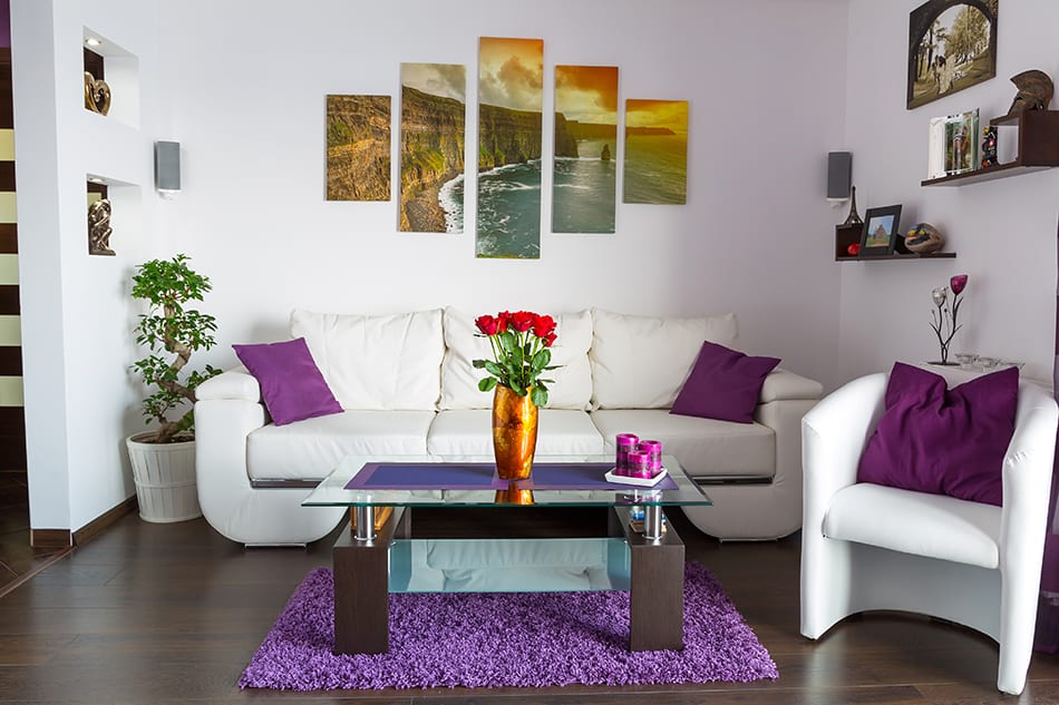
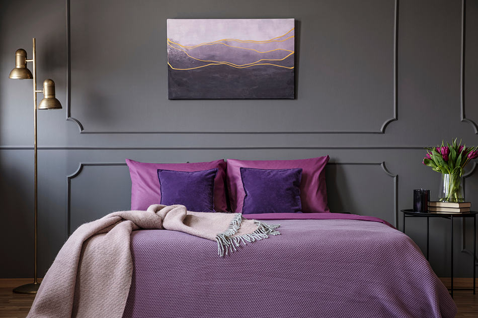
Pink + Purple
| Shade | Hex Code | CMYK Color Code (%) | RGB Color Code | Color |
| Purple | #490c61 | cmyk(25%, 88%, 0%, 62%) | rgb(73, 12, 97) | |
| Pink | #f09ead | cmyk(0%, 34%, 28%, 6%) | rgb(240, 158, 173) |
Pink and purple may initially seem like a color combo that you would ordinarily see in a young girl’s journal, but actually, when done correctly it can look stylish and glamorous.
Pair a deep shade of eggplant with a pale dusky pink to achieve an intimate and sophisticated style that works particularly well in bedrooms and dining rooms. These two colors work well together to create a seductive yet glamorous vibe, especially when eggplant is used as the dominant color, for example on the walls, and pale pink is used as an accent color.
Be sure to use a rich and heavily pigmented shade of eggplant to create a strong contrast against the pale pink, and select sensory fabrics which are a pleasure to touch. The pretty playfulness of pink helps to balance out the moodiness of eggplant.
Blue + Purple
| Shade | Hex Code | CMYK Color Code (%) | RGB Color Code | Color |
| Purple | #490c61 | cmyk(25%, 88%, 0%, 62%) | rgb(73, 12, 97) | |
| Blue | #1f6ba0 | cmyk(81%, 33%, 0%, 37%) | rgb(31, 107, 160) |
There are so many shades of blue that work with purple; so it’s almost hard to go wrong when using these two colors together in interior design. Starting with the darkest blues, navy blue looks elegant next to a dark purple shade when offset by a further pale color, such as pastel pink or a very light gray.
Royal blue also looks good with purple, but in this instance choose a paler shade of purple so that the colors are not competing too heavily for attention. You could paint a room in a pale dusty purple shade with a hint of gray in it, and add accessories in bright pops of royal blue.
Baby blue or a pale cornflower blue looks good alongside a bright medium shade of purple and helps to balance it out by adding a feeling of calm and serenity.
Neutral Colors that Go with Purple
Neutral colors are those which lack obvious color and have a balanced look. Neutrals are good for pairing with almost any other color, and they can work well as background colors.
Here we look at ways to use neutral shades with purple.
Brown + Purple
| Shade | Hex Code | CMYK Color Code (%) | RGB Color Code | Color |
| Purple | #490c61 | cmyk(25%, 88%, 0%, 62%) | rgb(73, 12, 97) | |
| Brown | #573e30 | cmyk(0%, 29%, 45%, 66%) | rgb(87, 62, 48) |
Dark brown and purple look regal and stately when paired together. Choose a rich, royal shade of purple and use it on soft furnishings alongside dark walnut wood surfaces. These colors can work nicely in a kitchen for a sophisticated yet unusual choice. Opt for a dark wood countertop surface and paint kitchen cabinet doors in eggplant.
This is a color pairing that would look stylish in an office or library area if you want it to feel professional yet stylish with a touch of femininity. When using purple and brown together stay away from tan browns unless you are going for more of a retro theme.
White
| Shade | Hex Code | CMYK Color Code (%) | RGB Color Code | Color |
| Purple | #490c61 | cmyk(25%, 88%, 0%, 62%) | rgb(73, 12, 97) | |
| White | #ffffff | cmyk(0%, 0%, 0%, 0%) | rgb(255, 255, 255) |
White, as a neutral color, technically goes with any color you can think of, however, it does look particularly good next to pale shades of purple, such as lilac. White and pastel lilac together create a delicate feel in a space that works great in traditional-style bedrooms where you want to achieve a refreshing yet relaxing feel.
Verging slightly away from stark white will help the room feel more welcoming and less intense, so consider painting the walls in shades of off-white such as ivory, porcelain, or vanilla. White can be a surprisingly hard color to get right when pairing it with purple because some shades of purple will have more of a gray-blue tone, while others may have more of a pink-red tone.
Depending on which tones you want to highlight in your purple, you’ll want to choose an off-white with yellow or blue undertones. Remember to use a tester pot on the wall in question before you commit to painting the whole room, as the type of light in the space will have a big influence on how the final color appears.
White and bright purple also work well together if you want to create a lively and energetic space, while a deeper and darker shade of purple can be toned down by pairing it with white to prevent it from becoming too consuming.
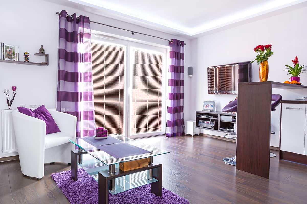
Black + Purple
| Shade | Hex Code | CMYK Color Code (%) | RGB Color Code | Color |
| Purple | #490c61 | cmyk(25%, 88%, 0%, 62%) | rgb(73, 12, 97) | |
| Black | #000000 | cmyk(0%, 0%, 0%, 100%) | rgb(0, 0, 0) |
Black and purple go nicely together when a third color is added to the mix, such as gray or pale pink. For sophisticated and high-end styling in a room, follow the 60-30-10 rule, using purple as the main color at a ratio of 60%, gray or pastel pink at 30%, and black for the remaining 10%.
A nice way to add black touches and keep a classy look is to choose artwork mounted in black frames and arrange these on a feature wall. You can also choose furniture or decor items with elements of black metal, such as a sofa with black legs, or table lamps with black bases.
In some instances black and purple can work well together without a third color among them, particularly if you want to create a sensual boudoir feel in a bedroom, or an intimate feel in a dining area. Paint the walls in black or deep purple, and then accent the space with the opposite color.
Rather than stick to just one shade of purple you could incorporate accessories in varying purple hues, such as eggplant and magenta. Introducing textures and layers will also go a long way in creating an intimate appeal in a space, so you should also think about soft furnishings in sumptuous fabrics to pull the black and purple theme together.
Shades of Purple For Your Home
If you want to find a shade of purple to use in your home then there are plenty to choose from. Here we look at some of the most popular shades of purple in home decor right now.
Lilac
This is a muted shade of purple that is achieved by mixing purple with white. It is a soothing and peaceful color that works well in bedrooms, but can be used anywhere in the home. Pair it with neutral shades for a relaxing feel, or with green colors for a fresh look.
Violet
Violet is a bright shade of purple that features a higher concentration of blue than red, giving it a cooler temperature. This is a fun color to use in a child’s bedroom or opt for pops of violet to add personality to a living room.
Plum
This dark shade of purple can create a cozy and intimate atmosphere that works well in dining rooms and bedrooms. It works really well alongside the emerald green, and in autumnal-inspired spaces.