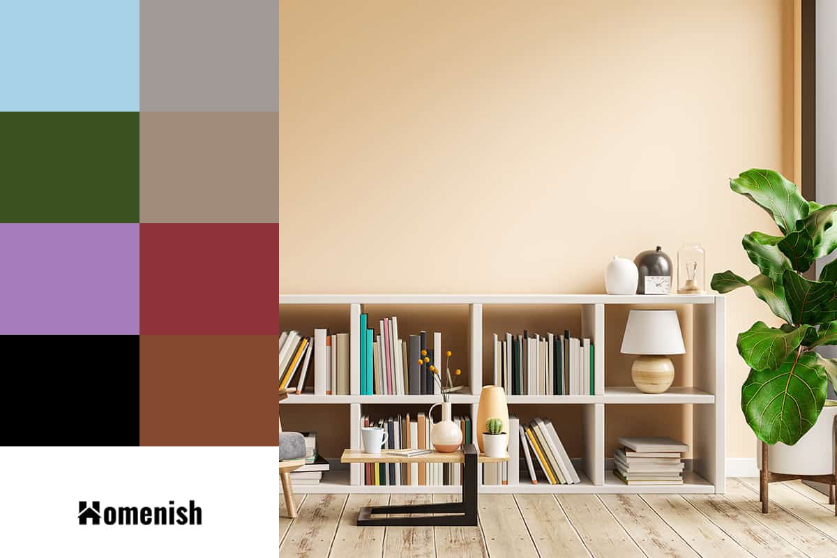
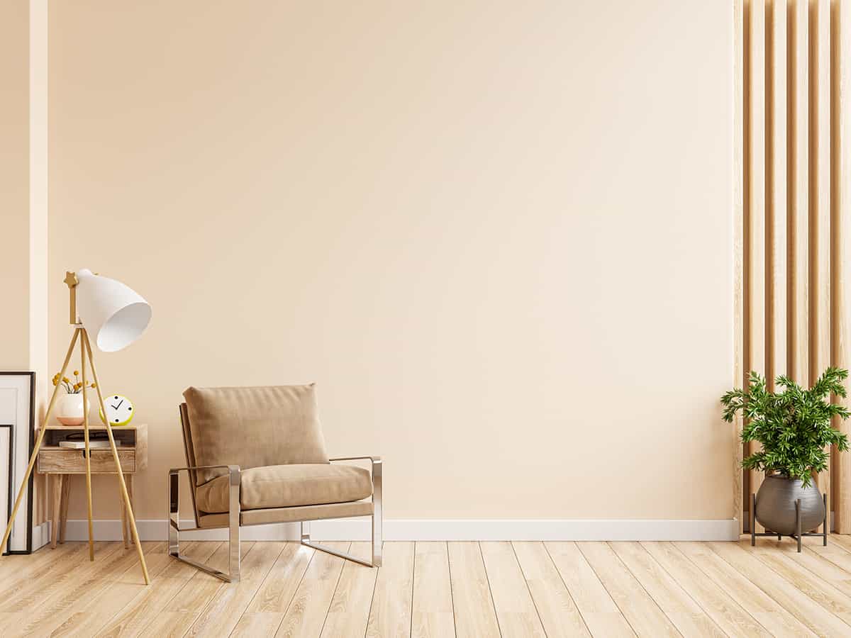
Cream is a warm neutral shade that is made by mixing white with a very small amount of yellow. As a neutral shade, you might expect that cream will work with any other color, and while this is technically true, there are some shades that will bring out the best in cream.
Here we will look at some of the best colors to pair with cream to achieve the mood and style you’ve been looking for.
Table of Contents
Cool and Calming
Colors to pair with for this style: Gray (with blue undertones) for calming feel, gray (with green undertones) for refreshing mood.
| Shade | Hex Code | CMYK Color Code (%) | RGB Color Code | Color |
| Cream | #fbedd4 | cmyk(0%, 6%, 16%, 2%) | rgb(251, 237, 212) | |
| Gray | #a09b94 | cmyk(0%, 3%, 7%, 37%) | rgb(160, 155, 148) |
Cream has a warm temperature because it has yellow tones, and this is what gives cream a fuzzy and welcoming feel. If you want to make a cream room feel cooler to give it a more refreshing and relaxing feel, then pairing the color scheme with gray will achieve this effect.
Equally, if you have a gray room that feels too clinical and cold, incorporating cream accents into the space will instantly make it feel more inviting. Use a gray shade with blue undertones if you are going for a calming atmosphere, or opt for a gray with green undertones for a more refreshing feel.
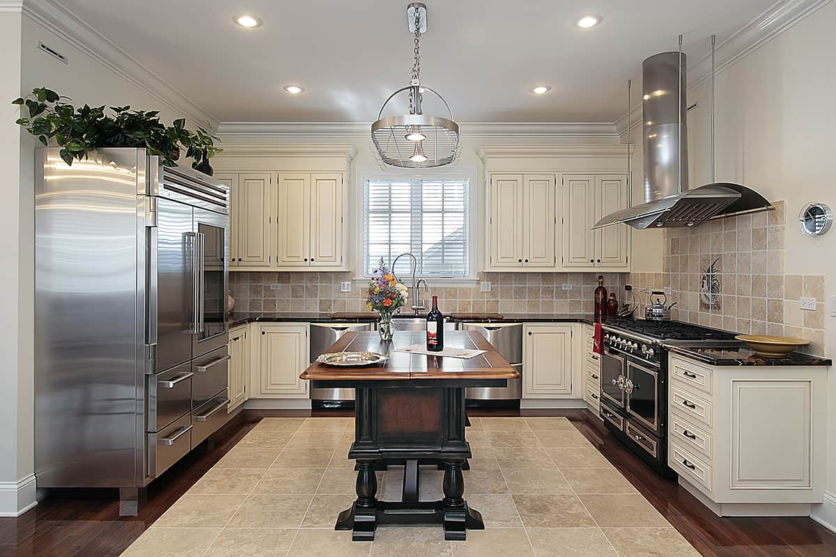
Cream is a common color for painted kitchen cabinets, and if this feels too country for your taste, then painting the kitchen walls in a shade of gray will make it feel much more modern. Use a pale gray color for an easy-breezy style or dark gray for a more striking contrast.
The fact that cream contains a small amount of yellow is what makes gray such a great pairing for cream because gray and yellow are famously a stunning color combination. The cool of gray and the warm of cream balance each other out so that the atmosphere in a room feels neutral.
Tranquil
Colors to pair with for this style: : blue (light to medium shades. Avoid darker shades).
| Shade | Hex Code | CMYK Color Code (%) | RGB Color Code | Color |
| Cream | #fbedd4 | cmyk(0%, 6%, 16%, 2%) | rgb(251, 237, 212) | |
| Blue | #a9d2e6 | cmyk(27%, 9%, 0%, 10%) | rgb(169, 210, 230) |
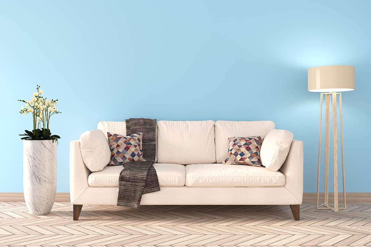
Tranquility is a sought-after feeling among most of us, so it’s no surprise that this is an atmosphere many people try to achieve through interior design. Coming home after a long day at work to a serene living room that helps you unwind and find inner peace is something that sounds very appealing. Fortunately, this is actually an easy style to create.
Cream and blue are two ideal colors to use together in a tranquil room because they have the ability to make us feel relaxed and refreshed. In a cream and blue color scheme, you may be reminded of the beach because this is the place where most people will have seen cream and blue used together in the natural world.
Cream represents the sand at the beach, while blue represents the ocean. The beach is thought of as a peaceful and energizing retreat for many people, as they associate it with relaxing vacations or wide-open space that gives us the opportunity to take a deep breath and fill our lungs with fresh air.
A coastal style decor can be very tranquil, and this is achieved quite easily by painting the walls cream and then using a light to a medium shade of blue as an accent shade. Aqua is a great shade of blue for tranquil environments because it has a positive and soothing vibe.
Avoid darker shades of blue such as navy because this can make for a stark contrast that is stimulating rather than calming.
Country Casual
Colors to pair with for this style: dark forest green for vintage mood, and softer greens for casual style.
| Shade | Hex Code | CMYK Color Code (%) | RGB Color Code | Color |
| Cream | #fbedd4 | cmyk(0%, 6%, 16%, 2%) | rgb(251, 237, 212) | |
| Forest Green | #3b5120 | cmyk(27%, 0%, 60%, 68%) | rgb(59, 81, 32) |
If you’re a fan of country cottage decor, then cream is going to be your best friend. Cream walls are a common feature of country-style interior decor because it feels simple yet warm. There are a variety of colors that are often used with cream to create a country cottage style, including red, lilac, and duck egg blue, but the ultimate color to pair with cream for this look is green.
Choose a dark forest green for an authentically vintage feel or softer greens such as sage or mint for a more casual style.
Green and cream are colors that are found together in nature, which is one reason why these colors work so well together in country cottage decor because this style revolves around nature.
Common themes which run throughout country decor are flowers, foliage, and farm animals. The grassy pastures of a country farm or the dense foliage of a wild country cottage garden are used as inspiration in this interior decor style.
The kitchen is typically the heart of the home in a country cottage, so this is a good place to start when creating a country-style room. Paint kitchen cabinets in a muted shade of mint green and install a natural stone tile splashback against cream-painted walls. The reverse of this would also work well, with green walls and cream-painted kitchen cabinets.
Patterns and prints are pivotal in creating a traditional country theme, so consider these when designing your space. Gingham fabrics work well for curtains or tablecloths, or floral prints are always a nice choice as long as the pattern is quite small and delicate. Large floral patterns can look retro or contemporary, which won’t work so well with a country cottage theme.
Warming Neutral
Colors to pair with for this style: 3 or 4 other shades not far from cream on a color chart – e.g. ivory, biscuit, beige and tan.
| Shade | Hex Code | CMYK Color Code (%) | RGB Color Code | Color |
| Cream | #fbedd4 | cmyk(0%, 6%, 16%, 2%) | rgb(251, 237, 212) | |
| Tan | #a08c7a | cmyk(0%, 12%, 24%, 37%) | rgb(160, 140, 122) |
Cream-painted walls do not necessarily scream ‘contemporary,’ and in some instances, they can even seem dated and out of style.
However, by creating a neutral and complementary color palette around cream, you can make a cream room feel classic and modern. A layered and tonal effect is great for establishing an understated luxury vibe in a space, and the result is effortlessly contemporary.
For a cream room, select three or four other shades which are not too far removed from cream on a color chart. Examples of this could be ivory, biscuit, beige, and tan. Establishing a color palette to work with will be essential in ensuring this style is pulled off in the space.
With cream walls, add accessories and furnishings in the colors you have chosen, and avoid using any other colors.
For example, opt for a tan sofa, some beige and cream cushions, ivory carpet, a beige rug, and various candles and smaller decor items all in the same colors. This will create a layered look in the room, instantly updating a dull cream space into a sophisticated and elegant area.
Delicate
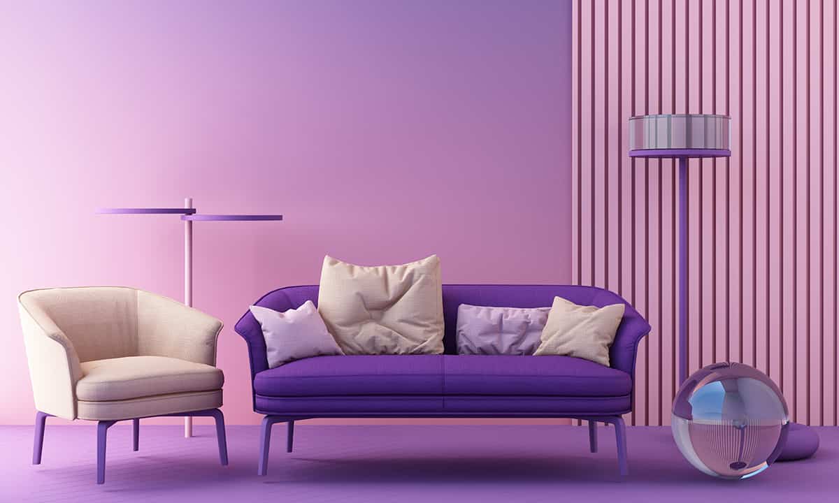
Colors to pair with for this style: lavender.
| Shade | Hex Code | CMYK Color Code (%) | RGB Color Code | Color |
| Cream | #fbedd4 | cmyk(0%, 6%, 16%, 2%) | rgb(251, 237, 212) | |
| Lavender | #a57cba | cmyk(11%, 33%, 0%, 27%) | rgb(165, 124, 186) |
Cream faces opposite lavender on the color wheel, which means that these two colors are contrasting and complementary. For a pretty and delicate interior style that works especially well in bedrooms, use both of these shades in equal measure around the space.
Lavender walls with cream carpets would look sweet with a dainty floral patterned bedspread that features both colors. Small hits of lemon or mint green would also work well in this color scheme to add additional interest.
See a few more lavender combinations in our post on colors that go with lavender.
Fall Tones
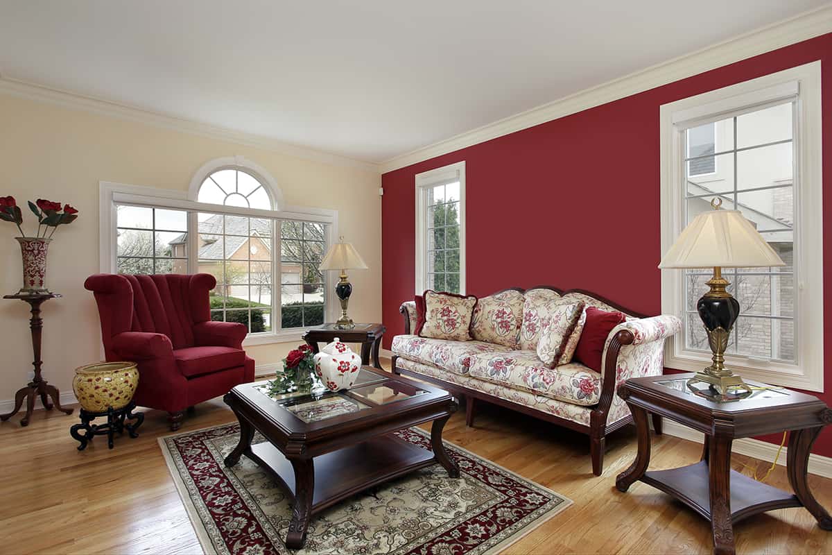
Colors to pair with for this style: shades of fiery orange and rusty red.
| Shade | Hex Code | CMYK Color Code (%) | RGB Color Code | Color |
| Cream | #fbedd4 | cmyk(0%, 6%, 16%, 2%) | rgb(251, 237, 212) | |
| Dusty Red | #8e333a | cmyk(0%, 64%, 59%, 44%) | rgb(142, 51, 58) |
For rooms in the home which should feel cozy, think about fall colors to use alongside cream. Fall colors are those which are seen in nature during this season, such as the various shades of fiery orange and rusty red found on deciduous trees before their leaves drop.
These colors help us to feel cozy and comfortable because they have a warm temperature, and we also associate them with a time of year when we get wrapped up in layers and feel snuggled up.
Use rusty red and deep forest green with cream for a modern take on fall tones. Walls painted in these fall colors will have depth, having the effect of making us feel surrounded and therefore safe. Break up these darker shades with cream accents, such as a cream faux fur throw or a deep pile cream rug.
Luxury Monochrome
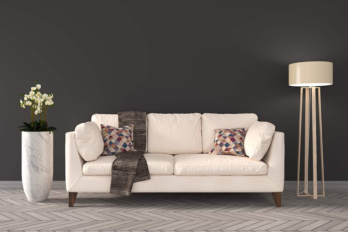
Colors to pair with for this style: pale cream and black for classy style; bolder cream and black for middle-eastern style.
| Shade | Hex Code | CMYK Color Code (%) | RGB Color Code | Color |
| Cream | #fbedd4 | cmyk(0%, 6%, 16%, 2%) | rgb(251, 237, 212) | |
| Black | #000000 | cmyk(0%, 0%, 0%, 100%) | rgb(0, 0, 0) |
White and black together make a striking monochromatic interior style, but for a softer look that has more of a luxury appeal, choose cream and black instead.
A pale cream that could be described as an off-white will look modern and classy with black, while a warmer, more yellow-based cream that resembles butter will look decadent with black, giving off a palatial middle-eastern feel.
Opt for cream walls and black satin sheets in a bedroom to achieve an imposing luxury look, with the addition of sumptuous black sofas and elaborate black framed mirrors.
Rustic
Colors to pair with for this style: brown as accents. Avoid oppressive brown with small hints of cream.
| Shade | Hex Code | CMYK Color Code (%) | RGB Color Code | Color |
| Cream | #fbedd4 | cmyk(0%, 6%, 16%, 2%) | rgb(251, 237, 212) | |
| Brown | #834930 | cmyk(0%, 44%, 63%, 49%) | rgb(131, 73, 48) |
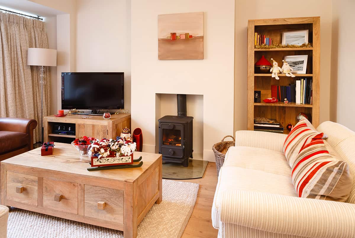
Rustic interior styles are popular because they look earthy and interesting, they are warm and comforting to live with, and they are quite easy to achieve.
For a rustic take on a cream room, incorporate brown accents such as a leather brown sofa and deep brown wooden furniture.
Avoid making the space oppressive by highlighting the brown areas with small hints of cream, such as cream cushions on the brown sofa and a cream vase on a brown wooden coffee table.
Different shades of brown with cream walls can help bring depth and interest to the room, so you should alternate between mid-brown colors and dark brown colors, for example, dark chestnut hardwood flooring and a pale brown leather chair.
This can also help to create a layered look that will add a modern edge to the rustic decor. Rustic looks are based around raw and unfinished edges, but the warmth of both cream and brown ensures a cozy and comfortable feel.