Bronze is a dull metallic shade that traditionally was made as a metal material by mixing gold with tin.
The resulting color that we know as bronze today lies somewhere between brown and orange, with significantly fewer yellow hues compared to gold.
This is a good choice of metal for fixtures and fittings if you want a warm metallic color but find gold to be too showy or brash.
Here we look at some excellent colors that go with bronze.
Table of Contents
Burgundy
Burgundy is a deep shade of red that has hints of brown present in it. Bronze is a color that goes well with burgundy because both colors are warm shades, but they have different undertones.
Burgundy and bronze are most frequently used together to create a festive look on tree decorations or seasonal decor, but they can also successfully be used to create intimate and elegant spaces in parts of the home, such as bedrooms and dining rooms.
To make a room feel cozy, elegant, and understated, paint the walls in a rich shade of burgundy and use subtle hints of bronze in light fittings and accessories.
To increase the deep and dark look, choose soft and luxury fabrics in darker neutral shades, such as faux fur brown throws.
Alternatively, to really set off the burgundy and bronze, choose cream accents, such as a thick pile cream rug or a cream velvet chair with bronze studs.
Deep Purple
Much like burgundy and bronze together, deep purple and bronze work well alongside each other because they create a subtle drama.
Purple is a color associated with royalty and prestige, but it can look over the top or tacky if paired with a high shine or glossy metal.
Bronze, as a more dull metallic with a less glaring color, works as a muted option for fixtures and fittings, which creates a softer and less obvious glamor.
Deep purple decor will look more classy and understated with bronze accents compared with other types of metals. The interesting thing about purple is that it is made by combining red and blue, a warm color and a cool color.
The resulting tone of purple is generally considered to be a cool shade, so by adding bronze to the mix, you can balance out the energy and warm the decor up a little.
Dark Green
Dark shades of green, such as emerald, moss, and forest, have rapidly become firm favorites in the interior design world over the last eighteen months. You can learn about the dark green color combination in our article ‘7 colors that go well with dark green‘
This is a color that can be used to link an interior to the outdoors by highlighting its dominance in nature, or it can be used to create a lavish look by using deep shades of green in heavy, luxurious fabrics.
Bronze and dark green help to create a soothing balance because green provides a coolness while bronze provides warmth, but due to bronze’s subdued nature, the contrast between the two is not stark or harsh in any way.
Bronze, when used with dark green, makes for a very elegant, high-end interior look, bringing sophistication to a space. Consider dark green closet doors with bronze handles or dark green walls alongside bronze lamp stands.
Gray
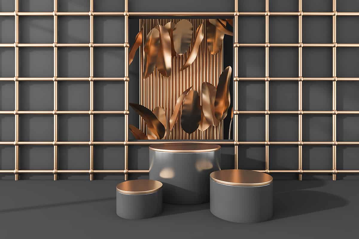
The Sherwin Williams color of the year 2021 Urbane Bronze is a nice gray color with a brown undertone.
Any shade of gray will look contemporary with bronze, but ideally, for the best contrast, you should stick to cool shades of gray with blue or green undertones.
In some instances, bronze can look antique or traditional, but by using it with gray, it instantly gets a modern update. This color combo can create a strong industrial look which has become a prominent style in interior design over recent years.
Warm shades of gray with hints of taupe will also work nicely with bronze, but the look will be more neutral and comfortable as opposed to modern and industrial.
A really stylish look is to upgrade a kitchen with charcoal gray cabinets and choose a modern shaped handle, such as a T-bar in a bronze finish.
The bronze will provide a subtle highlight on the cabinets, which will stand out without becoming the focus of the space.
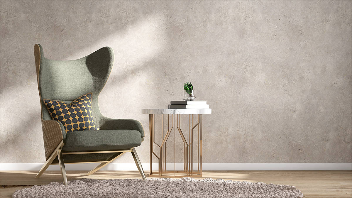
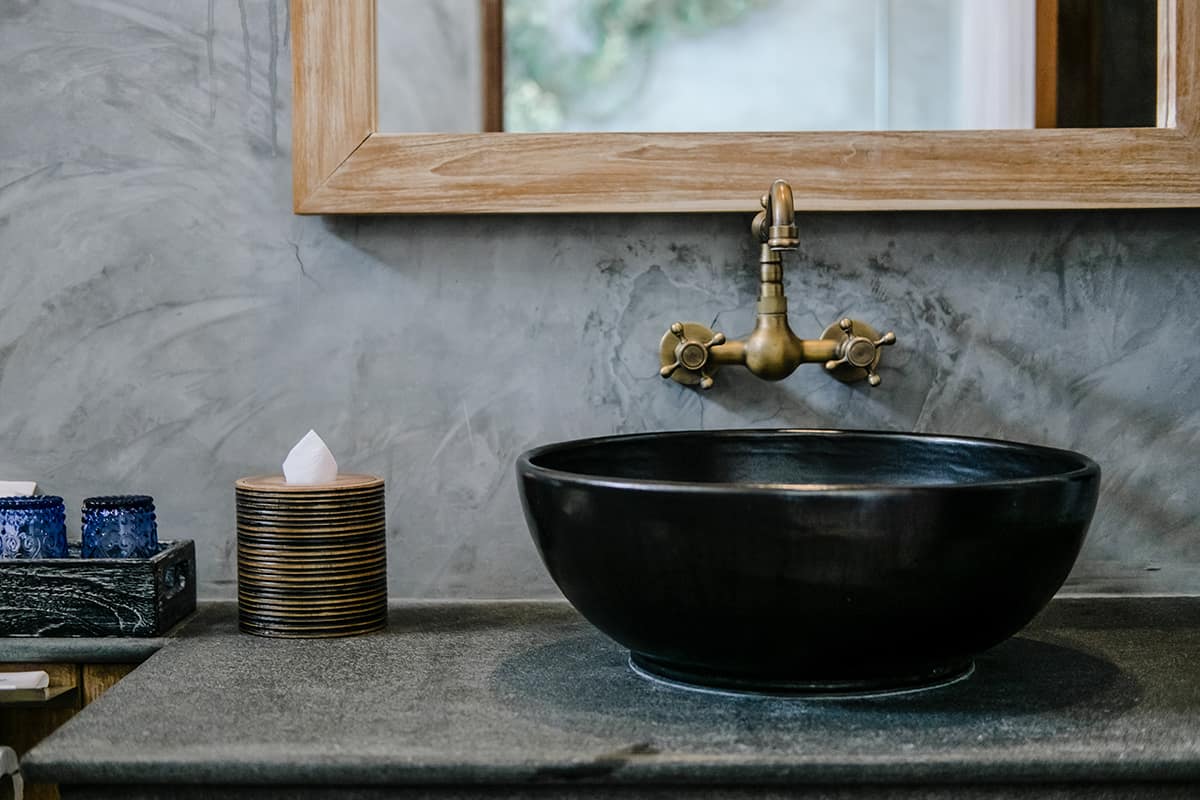
Pale gray will also look classy and elegant with bronze accents, such as bronze faucets, candleholders, and mirror frames.
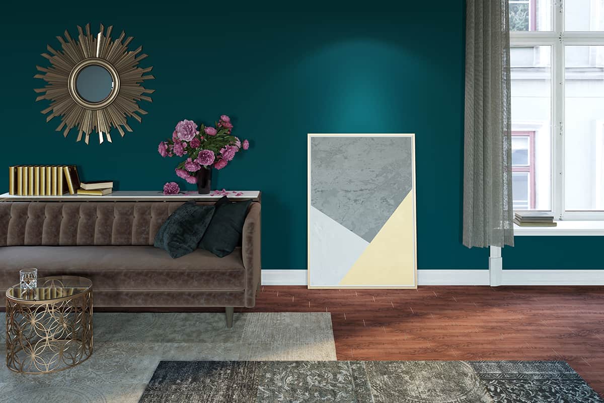
Teal

Teal is a shade that sits halfway between green and blue. It is a vivid and vibrant color that adds a lively character to a space.
Due to the fact that bronze contains strong orange tones, bronze and teal are considered to be contrasting colors that are the opposite of each other in terms of hue because blue and orange are opposing colors on the color wheel.
This means that teal and bronze when used alongside each other, serve to make the other color more striking. Teal is a cool shade, and the energy of teal can be balanced out nicely by the warm tones in bronze.
The bronze and teal color scheme can conservatively prevent a harsh or overwhelming atmosphere. Ideally, choose a third color in a neutral shade that will serve as the dominant color, with teal and bronze used as accent shades.
For example, paint a room in a pale shade of beige, then choose a teal blue sofa with beige cushions and bronze light fittings.
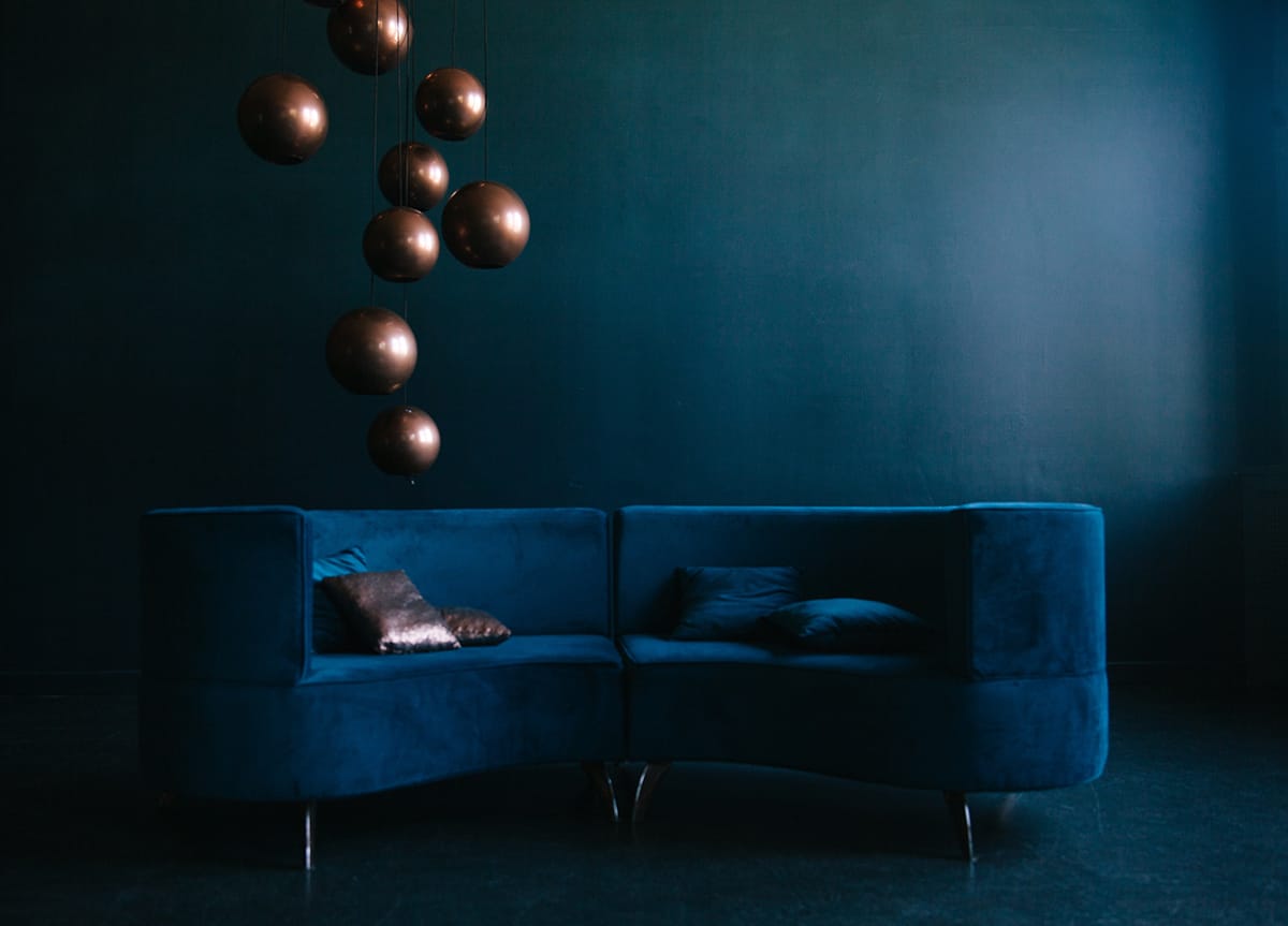
Navy blue and bronze are a color combination that works so well in both contemporary and traditional designs.
For a formal nautical style, paint the walls in navy blue and choose bronze ornaments such as a globe with a bronze metal stand or a decorative anchor fixed to the wall made from bronze. Rich brown wood furniture will work well to further reinforce this look.
To keep a nautical style heavy and formal, choose darker colors in this decor theme, or to create a more coastal easy-breezy style with a similar color palette, add touches of white or off-white neutral shades to the room.
Bronze is one such color that can pair with navy to create a modern industrial style. To achieve this, choose navy blue soft furnishings or upholstery and occasional touches of bronze in industrial styles, for example, rustic wooden tables with bronze hairpin legs.
Black
Although black is a neutral color, it is rarely used as the dominant shade in a room because it is perceived to be associated with sadness, and too much black can make a space feel depressing.
If you want to incorporate lots of black into your interior decor, a nice way to make it feel elegant rather than morbid is to use bronze accents. This will help to bring warmth to the room, and it will also ensure the style is leaning more toward glamour than gothic.
Black rooms can be great for creating a mature and intimate vibe in a room, as long as you make the right choices for accessories and coordinating colors to prevent the black from dragging down the atmosphere.
Metallic touches are an easy way to achieve this because they catch the light and inspire thoughts of glitz and glamour, adding depth and dimension to the space. You could consider using wallpaper on a feature wall that has a black background with a bronze pattern on it, as this will also elevate the style.
For rooms where you don’t want black to be the dominant color, choose a neutral shade for the walls, such as beige or white, and then add black and neutral accents.
A black sofa with bronze silk cushions could be a nice classy look or a black painted coffee table with a bronze vase.
White
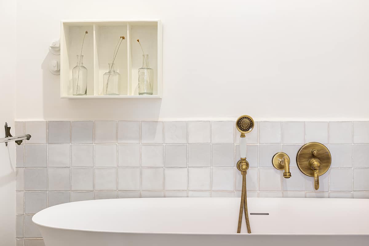
White goes well with any color, and it looks particularly sophisticated when paired with a metallic. White creates a clean and fresh backdrop from which a metallic color can stand out, and bronze is a perfect example of this.
To make a feature of your bronze accents, put them against a white background. For example, choose white kitchen cabinets with bronze handles or painted white shelves holding bronze candles.
Due to the fact that bronze will contrast heavily against white, try to use it sparingly so that it doesn’t look over the top or gaudy. Too much bronze in a small space can result in a tacky look, while subtle hints of this color will look classy and sophisticated.
A growing trend is to decorate an entire room in white with different textures for a layered look, for example, white walls, a white linen sofa with white knitted cushions, and a white faux fur throw.
If you want to follow this style, keep as much of the room as you can be decorated in white, along with your furniture and accessories, and then use small flashes of bronze for your hardware.
Examples of this could include bronze light switches, bronze shelf brackets, bronze table legs, and bronze fixtures.
A very subtle amount of this flat metallic color will create just enough interest to catch the eye without taking away from the predominantly white look. It will also help to prevent the room from looking too dull and one-dimensional.