Bright orange is a vivid, enthusiastic shade of orange that emits energy in tropical sunny areas.
Let’s dive deep down into the bright orange color, some of its popular colors, and colors that go well with bright orange.
Table of Contents
What Color is Bright Orange?
Bright orange is a vibrant and vivid color that is achieved by mixing red with a high proportion of yellow. The extra yellow pigments in bright orange are what elevates this color from regular orange to bright orange.
Orange is named after the color of the common citrus fruit, and prior to this, it was simply known as yellow-red.
What does Bright Orange Mean?
Bright orange is a color that inspires creativity and enthusiasm. It has a positive and uplifting feel that can be used to improve mood. Bright orange is a very distinctive color, and as such, it is used in scenarios where it is important to stand out. For example, traffic cones and life vests are generally made in bright orange so that they can be easily spotted.
The same goes for high-visibility workwear for construction workers and even prison inmates’ uniforms so that they can be immediately identified. Bright orange is a color that is associated with friendliness and good value, and as a result, it is commonly used for the branding of low-cost or budget brands such as EasyJet, Home Depot, Amazon, Burger King, and Dunkin’ Donuts.
Bright orange combines the passionate energy of red with the joyful energy of yellow, which results in a sense of fun and frivolity. Bright orange can, therefore, be used to convey a lighthearted, mischievous atmosphere.
Orange also has links to feelings of warmth and comfort since it is strongly associated with the season of fall. This is due to the leaves of many deciduous trees turning a bright or deep shade of orange before they drop to the ground. Bright orange can also have a spooky vibe when paired with black since these two colors are synonymous with Halloween.
Similar Colors to Bright Orange
Orange

The difference between orange and bright orange is the ratio of red and yellow used to create the colors. True orange will have an even mix of red and yellow, with 50% of one color and 50% of the other color combined together to result in a true orange shade. Bright orange has a more vibrant and cheerful appeal since it contains a higher proportion of yellow.
To make bright orange, the ratio of yellow will need to outweigh the amount of red used. Both of these colors will create a bright and bold look in home decor or fashion, though bright orange has the edge when it comes to vibrancy.
Tangerine
Tangerine is a slightly lighter shade of orange than both bright orange and true orange. It will have a small amount of white mixed with it to tone down the brightness a little. Tangerine can be a good alternative to bright orange if you want a slightly more subtle look.
Pumpkin
Pumpkin is a bright shade of orange that is similar to bright orange but has a slightly warmer and more muted effect. It contains a small amount of brown, which gives it a richer and deeper color.
Use pumpkin instead of bright orange for a rich orange-based color that will create a cozy and comforting feel in a space.
Burnt Orange

Burnt orange is a deep shade of orange that sits in between orange and brown. It is a rich and warming color that can be used to a greater degree than bright orange without feeling overstimulating. Choose burnt orange over bright orange for a more muted interior style or a sophisticated orange look. Burnt orange can go with various neutral tones and contrasting tones.
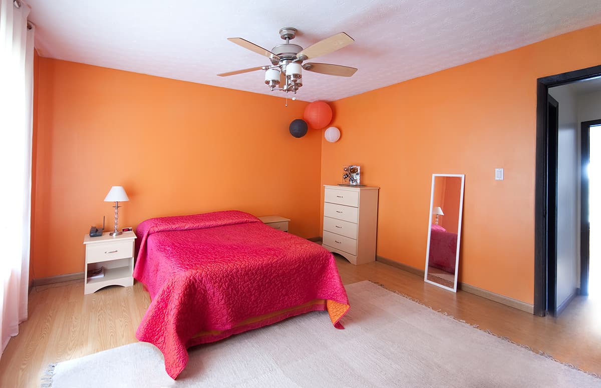
How to Use Bright Orange in Home Decor
Quirky kitchen
Bright orange is a striking color to use if you want to make a statement in any neutral room. Kitchens are one area of the home where people tend to play it safe about interior design, probably because they are aware that kitchen renovations cost a lot of money, so it is an expensive mistake to choose a color that may go out of style in a few years.
As a result, white and gray are very popular shades for kitchen cabinets, kitchen worktops, and even kitchen floors.
If you have a bland kitchen like this that you want to inject some personality into, then bright orange is a great choice. This color is uplifting and vibrant, and even just a few bright orange items will make a big impact and stand out against neutral decor.
Paint wooden bar stools in bright orange furniture paint, and position them at a kitchen island or breakfast bar. Tie this into the color scheme with an orange pendant light hanging over the island.
Alternatively, opt for bright orange mosaic tiles for your splashback and an orange blind at the kitchen window. To make this color scheme one step further and achieve a truly quirky look, paint some of your kitchen cabinets in bright orange.
Typically a full kitchen of orange cabinets will be overwhelming, so leave some of them in a neutral white or gray shade. Select either your base cabinet doors to paint in orange or your wall cabinets, but not both.
Another way to experiment with this color scheme is by painting the trim in the kitchen in bright orange and setting this against pale gray or white walls and adding a bright orange vase to the countertop for a sense of continuity.
Moroccan theme
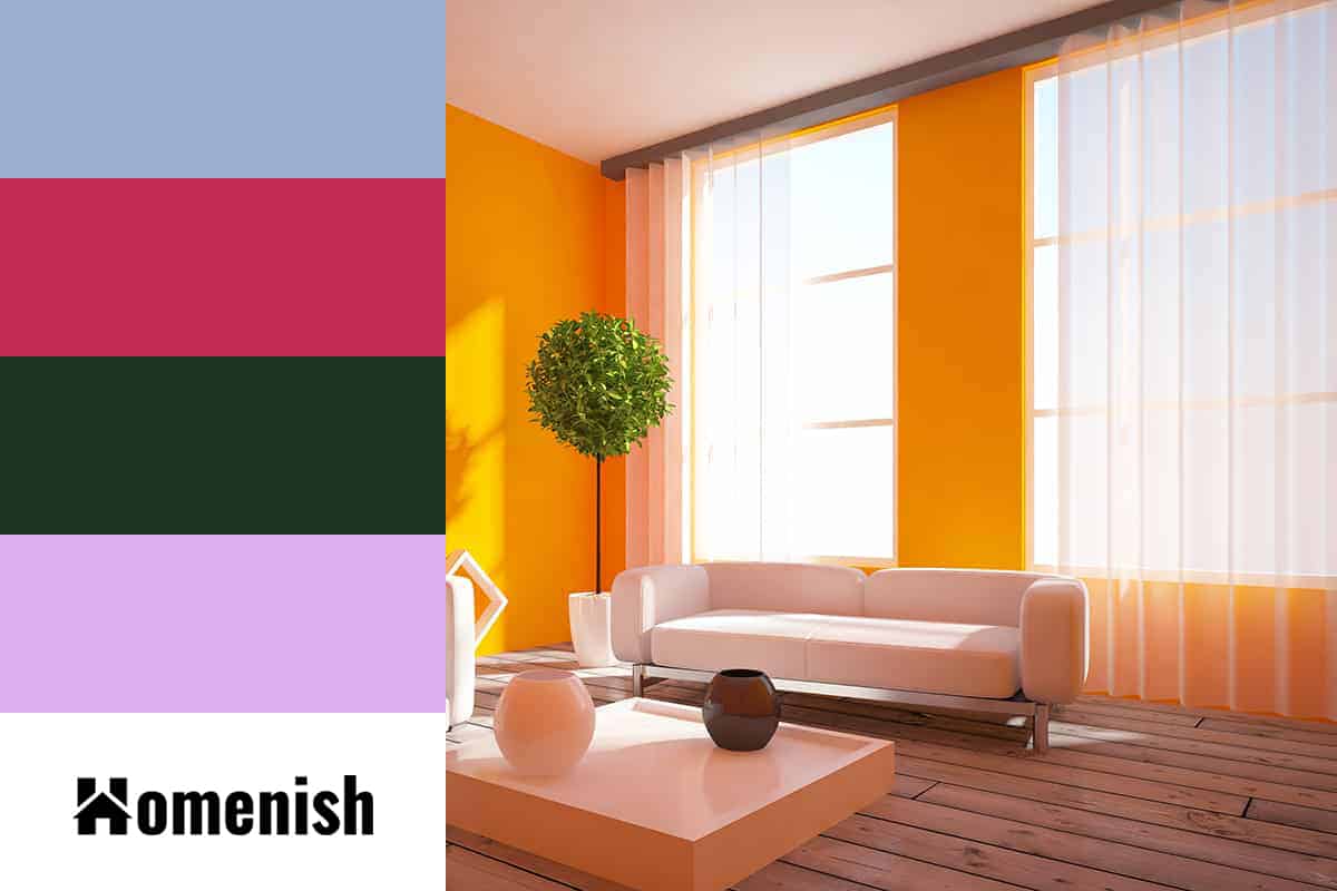
Bright orange is a color commonly found in Moroccan decor styles, which can be imitated for an exotic look in interior design. Use medium to dark shades of blue with bright orange to help define a Moroccan-inspired space, such as royal blue or navy blue.
In a living room, paint the walls in your chosen shade of blue and set a bright orange sofa against this. Choose a fabric with an ethnic style, such as a quatrefoil pattern in blue and white for the curtains and a Moroccan tile print in blue, white, and orange for cushion covers. The resulting look will feel relaxing yet inspiring, and it can work well in any room in the home.
Abstract art
If you want to add some of the energy of bright orange to your home without committing to an orange color scheme, then add small hits of it to your decor with abstract art hanging in frames on your walls.
Abstract art is very impactful in orange, especially against a white background. Use single pieces to create a contrast against the rest of the room, or use a collection of abstract art for a cohesive feel.
Accent wall
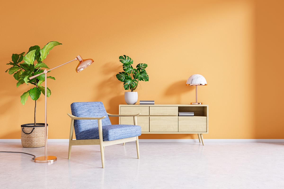
Bright orange is a color that is rarely used for wall paint across an entire room because it is so intense it can create an overwhelming feeling that people simply don’t want to experience at home. However, an accent wall in bright orange is a good way to enjoy the benefits of orange energy without overloading.
Use a muted or neutral color for the remaining walls in the room, such as charcoal gray, navy blue, or off-white. Coordinate the orange wall with a few other bright orange accents in the room to ensure continuity, but don’t go overboard. A few cushions and an orange plant pot on a coffee table will be plenty to tie the color scheme together.
Colors that Go with Bright Orange
Royal blue
| Shade | Hex Code | CMYK Color Code (%) | RGB Color Code | Color |
| Bright Orange | #f57922 | cmyk(0%, 51%, 86%, 4%) | rgb(245, 121, 34) | |
| Royal Blue | #9bafd2 | cmyk(26%, 17%, 0%, 18%) | rgb(155, 175, 210) |
Blue and orange are opposite colors on the color wheel, which means they are contrasting and complementary colors. As a result, they can be used together to create a bold look which will make both of the colors appear even more intense.
Bright orange is a stunning color pairing with royal blue, but they should be used with a third neutral shade, such as white or pale gray, to help balance out the space and prevent it from feeling overwhelming.
Magenta
| Shade | Hex Code | CMYK Color Code (%) | RGB Color Code | Color |
| Bright Orange | #f57922 | cmyk(0%, 51%, 86%, 4%) | rgb(245, 121, 34) | |
| Magenta | #c32b55 | cmyk(0%, 78%, 56%, 24%) | rgb(195, 43, 85) |
Use magenta and bright orange together to create a fun and playful atmosphere in a room.
These two colors will be most effective when used sparingly against a neutral backdrop, for example, a magenta sofa set against white walls with orange lampshades and orange curtains.
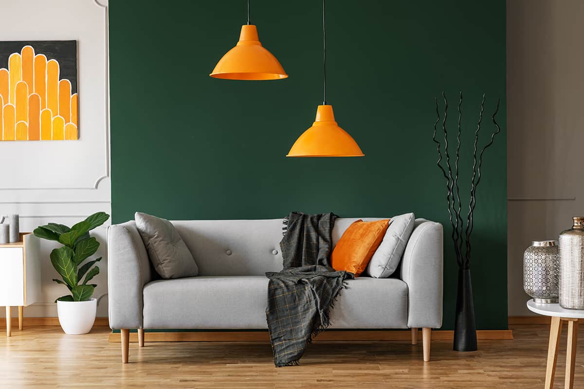
Hunter green
| Shade | Hex Code | CMYK Color Code (%) | RGB Color Code | Color |
| Bright Orange | #f57922 | cmyk(0%, 51%, 86%, 4%) | rgb(245, 121, 34) | |
| Hunter Green | #1d3424 | cmyk(44%, 0%, 31%, 80%) | rgb(29, 52, 36) |
Bright orange is a dark shade of green that can match well with hunter green. These colors are seen together in nature and can be used to create a look that is reminiscent of fall.
Opt for hunter-green walls with brown leather sofas and bright orange cushions for a cozy and contemporary style.
Lilac
| Shade | Hex Code | CMYK Color Code (%) | RGB Color Code | Color |
| Bright Orange | #f57922 | cmyk(0%, 51%, 86%, 4%) | rgb(245, 121, 34) | |
| Lilac | #ddaff1 | cmyk(8%, 27%, 0%, 5%) | rgb(221, 175, 241) |
Purple and orange are a vibrant color pairing, but they will be too intense if the purple color is bright alongside bright orange.
Instead, opt for a lilac shade to pair with for a better balance between these two colors, and be sure to use a neutral color as well to even them out.
Use pure white bedsheets accented with bright orange cushions and a bright orange and white striped rug in a bedroom with lilac walls. A lilac living room can be made to look funky with a bright orange sofa and lilac and white cushions.