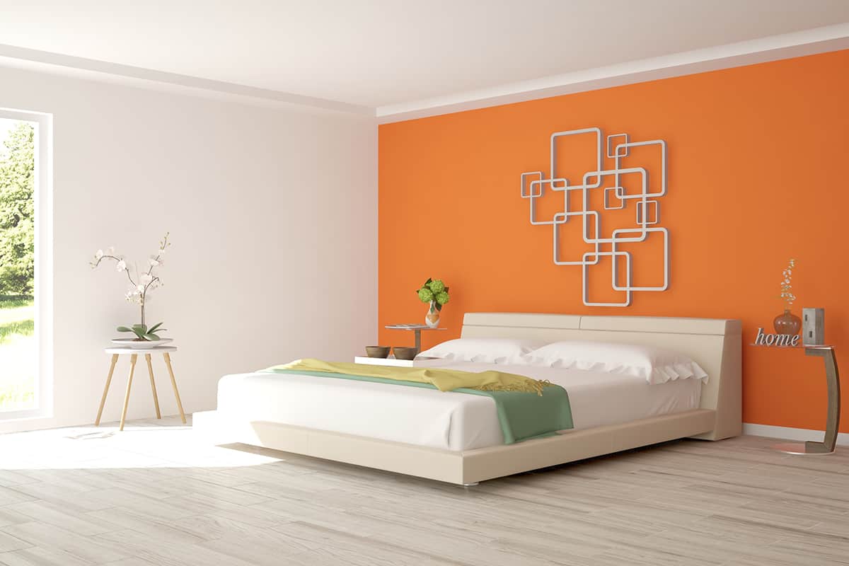
Burnt orange is a deep and dark shade of orange that is achieved by mixing bright orange with brown. It is not as bold and cheerful as bright orange, but it maintains a warm and positive feel and is still very vivid.
Burnt orange was a popular shade in the 1960s and ’70s, and so for some people, it has a retro vibe, but it can also be used in modern decor if you use the right colors with it.
Table of Contents
Neutral Tones
Neutral tones work well with burnt orange because they allow the orange shade to be the star of the show. Burnt orange is quite a loud color, so by pairing it with neutrals, you can ensure it won’t be in competition with other shades for the spotlight. Choose warm neutrals to create a cozy and comforting space or cool neutrals for a more contemporary look.
Cream
| Shade | Hex Code | CMYK Color Code (%) | RGB Color Code | Color |
| Burnt Orange | #d25802 | cmyk(0%, 58%, 99%, 18%) | rgb(210, 88, 2) | |
| Cream | #f9e9d8 | cmyk(0%, 6%, 13%, 2%) | rgb(249, 233, 216) |
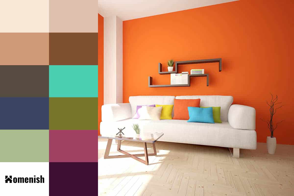
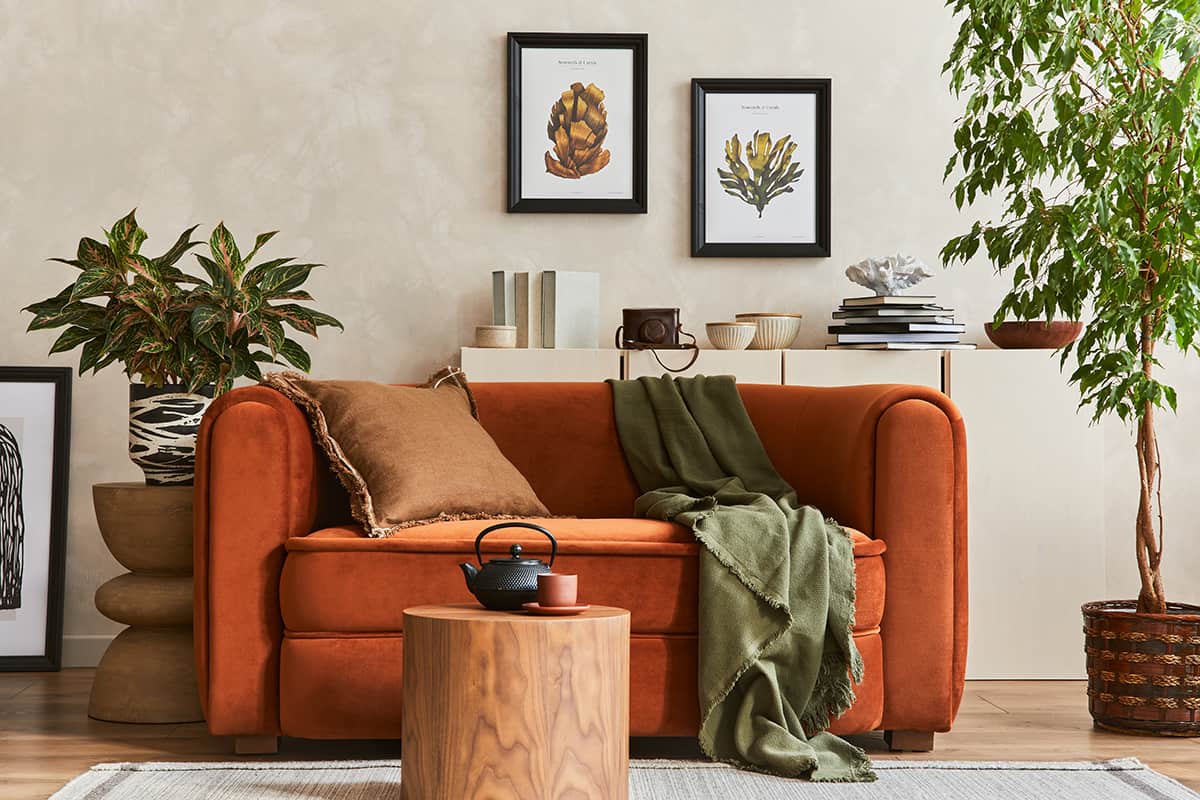
Cream is a very pale shade of yellow-orange, achieved by mixing a touch of yellow and orange with plenty of white. This is a soft neutral that will work well as a background color in a room with burnt orange accents, such as in a living room with cream walls and a burnt orange sofa.
Cream is a warm shade, as is burnt orange, so when you use the two colors together, the resulting atmosphere will be one that feels warm and welcoming.
Cream and burnt orange can look outdated, so if you choose these colors, it’s important to stick to sleek designs if you want a modern look. Opt for furniture in a contemporary style, and avoid large floral patterns as this will hint towards a retro vibe.
Beige
| Shade | Hex Code | CMYK Color Code (%) | RGB Color Code | Color |
| Burnt Orange | #d25802 | cmyk(0%, 58%, 99%, 18%) | rgb(210, 88, 2) | |
| Beige | #dfc2ad | cmyk(0%, 13%, 22%, 13%) | rgb(223, 194, 173) |
There are lots of variations of the color beige, from pale sand colors to almond or biscuit shades. What all shades of beige have in common is that they are warm and neutral.
With burnt orange, the best shades of beige to use are those which will provide some shade contrast with it so that the space doesn’t look bland or flat.
For example, as burnt orange is quite dark, paler shades of beige are going to work best. You could also use two different shades of beige in your color scheme to add more interest and a sense of depth, such as pale beige, medium beige, and burnt orange.
Beige works well as a warm and neutral wall color, creating a sense of comfort and safety which is reinforced by the deep warmth of burnt orange. In a room with beige walls and a beige sofa, use burnt orange accessories such as throw blankets and a rug to add interest and personality to the space.
Tan
| Shade | Hex Code | CMYK Color Code (%) | RGB Color Code | Color |
| Burnt Orange | #d25802 | cmyk(0%, 58%, 99%, 18%) | rgb(210, 88, 2) | |
| Tan | #cf9a76 | cmyk(0%, 26%, 43%, 19%) | rgb(207, 154, 118) |
Tan is a shade that sits right in between beige and brown. It could be described as dark beige or pale brown, but oftentimes it will also have hints of orange or yellow in it, which can mean that it falls closer to these colors on the color wheel.
Tan and burnt orange are quite similar tones, with tan being closer to a neutral shade while orange is not. A room with just tan and burnt orange colors would feel quite intense and also not offer any definition because the two shades are too close to each other.
However, if you incorporated a third color, like cream, you could use tan and burnt orange to achieve a sophisticated look. For example, paint walls in cream and opt for tan leather sofas and armchairs with burnt orange curtains and burnt orange cushions.
There will not be any contrast between the tan and burnt orange; however, there will be a sense of harmony and almost a blended result that will look high-end and classic.
Brown
| Shade | Hex Code | CMYK Color Code (%) | RGB Color Code | Color |
| Burnt Orange | #d25802 | cmyk(0%, 58%, 99%, 18%) | rgb(210, 88, 2) | |
| Brown | #7f5133 | cmyk(0%, 36%, 60%, 50%) | rgb(127, 81, 51) |
As there are brown tones in burnt orange, it makes sense that these colors would work well together. Brown is a darker neutral shade that is commonly used with orange in retro interior decor and fashion, so you have to be careful to avoid this vibe unless you are specifically trying to achieve a vintage style.
The best way to keep a brown and burnt orange color scheme modern is to avoid prints and stick with solid colors. Avoid materials you would associate with the 1960s and 1970s, such as shag pile carpets and rugs. Instead, opt for a cleaner look with brown hardwood floors and a modern style burnt orange velvet chair.
When used correctly, brown and burnt orange will make for an interior space that feels decadent and luxurious. Opt for rich chocolate or hazelnut browns, and use a third pale color such as white or soft gray.
Gray
| Shade | Hex Code | CMYK Color Code (%) | RGB Color Code | Color |
| Burnt Orange | #d25802 | cmyk(0%, 58%, 99%, 18%) | rgb(210, 88, 2) | |
| Gray | #554b3f | cmyk(0%, 12%, 26%, 67%) | rgb(85, 75, 63) |
Burnt orange is an ideal color pairing with gray for a modern interior decor style. Gray instantly transforms any space into a contemporary style, and burnt orange works beautifully with it to ground it and give it a warm and welcoming atmosphere.
Choose pale gray walls and burnt orange sofas for an inviting space that has an airy and breezy feel or for a more cozy space, paint the walls in a dark charcoal gray and cover sofas with chunky knitted blankets and cushions in burnt orange.
Contrasting Tones
The contrasting colors of burnt orange are those which sit across from orange on the color wheel. Contrasting colors create a visual pop that makes each of the two shades appear more vibrant and vivid. If you want to create a striking look, then using contrasting colors is one of the best ways to do this.
Aqua
| Shade | Hex Code | CMYK Color Code (%) | RGB Color Code | Color |
| Burnt Orange | #d25802 | cmyk(0%, 58%, 99%, 18%) | rgb(210, 88, 2) | |
| Aqua | #4bcdb0 | cmyk(63%, 0%, 14%, 20%) | rgb(75, 205, 176) |
Aqua is a very vivid shade of pale to medium blue. It has green undertones that make it feel refreshing, while the blue tones contribute to a calming sensation. Aqua will be at odds with burnt orange because it provides a bright quality to the more muted shade of burnt orange.
Aqua can be used with bright orange not only to provide a contrast but also to lift the color to make it appear more fun and lively. These two colors will make for an intense contrast, so use them sparingly alongside a more neutral third color.
| Shade | Hex Code | CMYK Color Code (%) | RGB Color Code | Color |
| Burnt Orange | #d25802 | cmyk(0%, 58%, 99%, 18%) | rgb(210, 88, 2) | |
| Navy | #3a4361 | cmyk(40%, 31%, 0%, 62%) | rgb(58, 67, 97) |
As a dark shade of blue, navy will contrast against burnt orange, but in a more subtle way. Navy and orange are a really classy color combination that will create a space that feels both soothing and comforting.
Navy blue offers a cool temperature to burnt oranges warmth which helps to achieve a nice balance. In a navy blue painted living room, choose burnt orange sofas with a navy rug.
Complementary Tones
Complementary tones will create a soft contrast next to burnt orange that is more subtle. These colors will work well in a space where you want to create interest while ensuring that there is not an overwhelming or overstimulating feel.
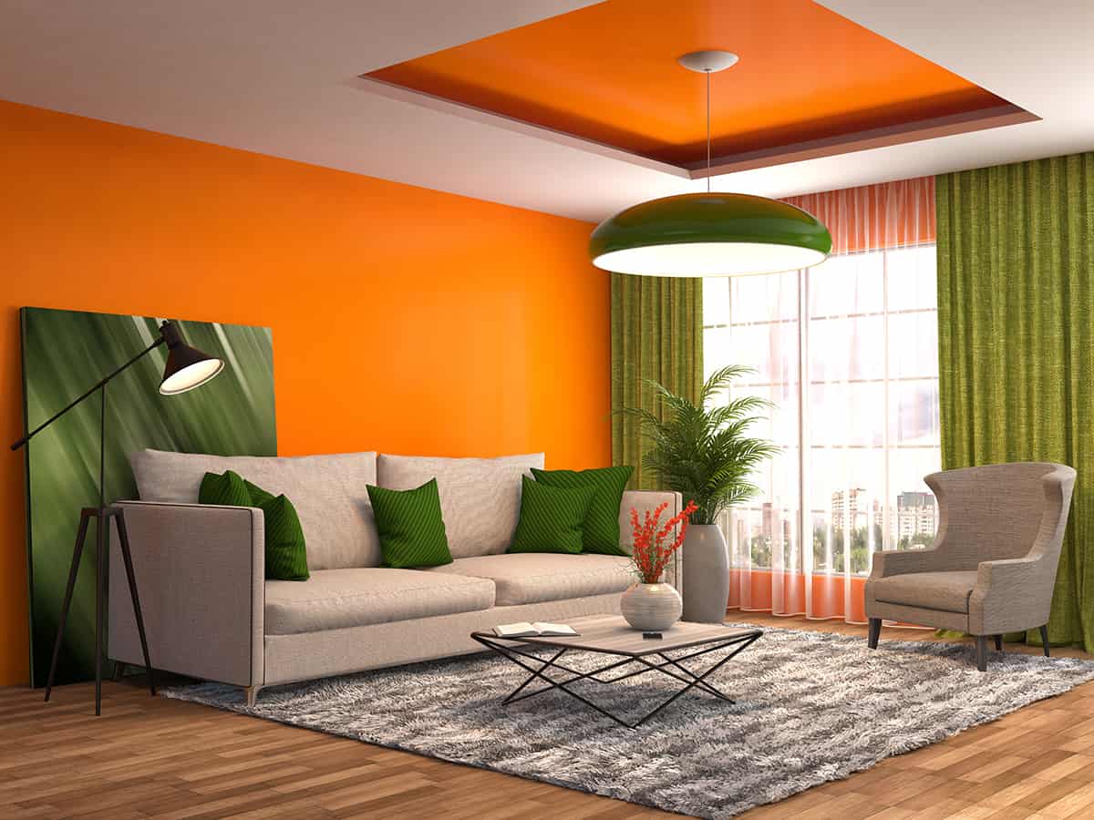
Olive green
| Shade | Hex Code | CMYK Color Code (%) | RGB Color Code | Color |
| Burnt Orange | #d25802 | cmyk(0%, 58%, 99%, 18%) | rgb(210, 88, 2) | |
| Olive Green | #78762d | cmyk(0%, 2%, 62%, 53%) | rgb(120, 118, 45) |
Olive green is a muted shade of green with brown and yellow tones in it, which makes it a really nice choice to use alongside burnt orange.
Olive green has a very earthy feel to it, which will compliment burnt orange, which can also be used in a natural themed space to represent the colors of fall. Add burnt orange cushions to an olive green bed, or find a fabric that incorporates both of these shades.
Sage green
| Shade | Hex Code | CMYK Color Code (%) | RGB Color Code | Color |
| Burnt Orange | #d25802 | cmyk(0%, 58%, 99%, 18%) | rgb(210, 88, 2) | |
| Sage Green | #aabc8d | cmyk(10%, 0%, 25%, 26%) | rgb(170, 188, 141) |
Sage green is a pale, gray shade of green that is muted and cool. This color can help to balance out the warmth of burnt orange while also maintaining a subtle and natural style.
Paint a room in sage green and use burnt orange accessories such as lampshades and plant pots. Opt for natural textures that will help to further define this style, such as woven baskets, jute rugs, and linen upholstery.
Dark pink
| Shade | Hex Code | CMYK Color Code (%) | RGB Color Code | Color |
| Burnt Orange | #d25802 | cmyk(0%, 58%, 99%, 18%) | rgb(210, 88, 2) | |
| Dark Pink | #a04264 | cmyk(0%, 59%, 38%, 37%) | rgb(160, 66, 100) |
Dark pink and burnt orange are two colors that you would think shouldn’t go together, but actually, they look really visually pleasing when used in the same space. Dark pink is able to lift the feel of burnt orange so that it feels more lively and less snuggly, while the burnt orange helps to make the dark pink feel warmer.
Choose a neutral shade to use alongside these colors so that they don’t create a room that feels sickly sweet, such as pale gray or off-white. In a fun and quirky bedroom, consider pale gray walls with a dark pink bedspread and burnt orange cushions.
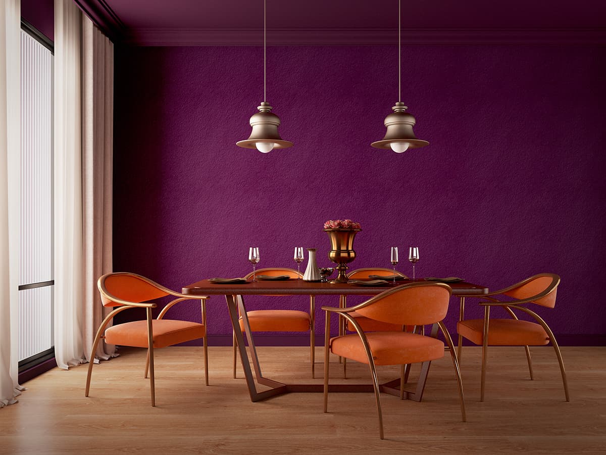
Dark purple
| Shade | Hex Code | CMYK Color Code (%) | RGB Color Code | Color |
| Burnt Orange | #d25802 | cmyk(0%, 58%, 99%, 18%) | rgb(210, 88, 2) | |
| Dark Purple | #3e0e30 | cmyk(0%, 77%, 23%, 76%) | rgb(62, 14, 48) |
Dark purple colors such as plum, eggplant, and wine, work well with burnt orange because they create a subtle contrast while still offering a similar level of earthiness. Burnt orange soft furnishings will lift a dark purple room and make it feel more welcoming and accessible.
Consider painting dining room walls in eggplant and choosing upholstered velvet dining chairs in burnt orange, along with some dark purple placemats and burnt orange napkins.
Burnt orange is one such color that can match with dark purple to create a space that feels dramatic and intimate, or you can add in a third neutral shade if you want a room that feels more casual.