Copper is a metallic orange-gold shade that has exploded onto the interior design scene in the last few years, with a popularity that seems to be unwavering. This color has a warming effect while exuding luxury and glamour, making it suitable for use in any room in the home.
Despite being a very trendy color for a few seasons now, copper furnishings do not look likely to be going anywhere for a while, so if you want to invest in some copper accessories, then now is a great time to do it. Copper can work so well with a range of different shades, from neutrals right through to intense jewel tones.
The colors you choose to accompany copper in your home will play a big part in defining the style and the atmosphere you create. Warm shades will make for a more inviting space, while cool shades have the ability to create an instant contemporary style in a room.
The colors you choose to pair with copper can reflect your own personality while also ensuring they bring out the best in your copper accents. Here we will look at complimentary colors that you can use with copper for a stylish home interior.
Table of Contents
Jewel Tones
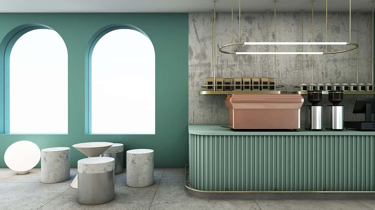
Copper has a warm and inviting attraction that feels deep and luxurious. Because of this, it pairs perfectly with other luxurious colors, such as those in the range of jewel tones. Jewel tones are deep and highly saturated shades that have a royal allure.
Copper is a color that suits the richness of jewel tones for creating a dramatic or glamorous interior design. Jewel tones include emerald green, sapphire blue, teal, magenta, cranberry, citrine, and imperial purple. There are so many ways you can incorporate copper and jewel tones into the interior design of your home.
For an intense look, consider using one of the darker jewel tones on your walls, such as sapphire blue, with copper accents such as copper furniture legs, copper light fittings, and copper ornaments. You can then choose a third color to add more depth to the design, which can be another jewel tone or a dark neutral.
Charcoal gray would work well in this instance, or dark purple. Use your final chosen color on soft furnishings such as curtains, cushions, or upholstered items such as armchairs and lampshades. Emerald green is a luscious shade that looks decadent alongside copper, and dusky pink or amethyst purple are ideal shades to contrast these colors.
Cool Tones
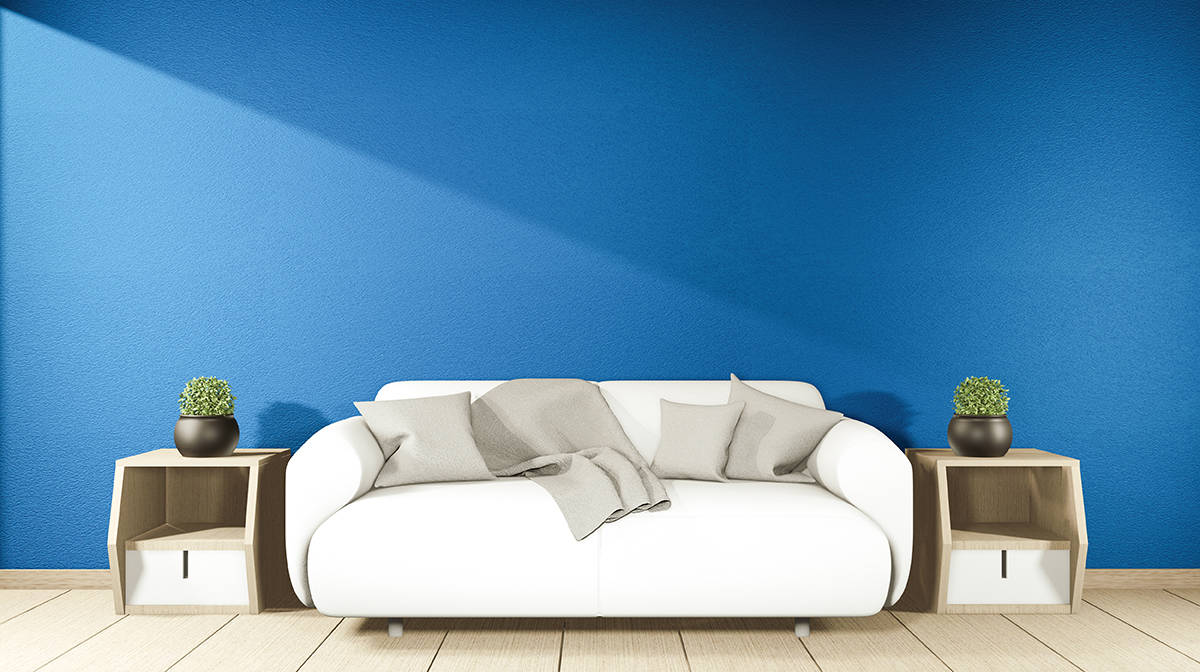
Cool tones work really well with copper because they provide a nice contrast against the warmth of copper and help to balance the energy in a room. Some of the best cool colors that go with copper are shades of blue, green, and gray. For an elegant and brighter space, consider sky blue, mint green, and pale cloud gray.
Dark, cool tones also work well with copper for a dramatic and intimate look. Consider a navy blue color scheme with touches of pale gray and copper.
Forest green will look rich and indulgent with copper while also linking to a natural feel. Pink can be a good cool tone to pair with copper; just make sure you choose a dusky pink with a blue or gray undertone to achieve a modern look.
Neutrals
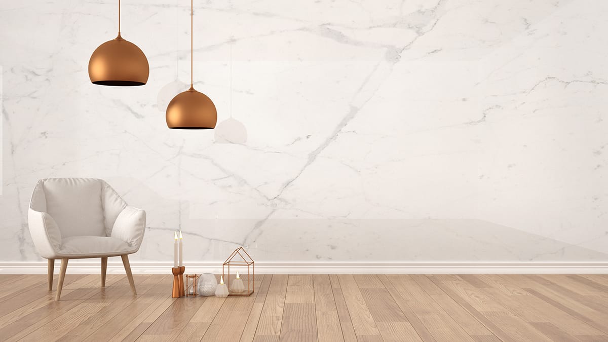
Copper is a warm metallic that will look stunning alongside neutral colors in both light and dark shades. As neutral colors tend to provide a good backdrop that doesn’t carry too much personality, you can use a neutral to really make your copper accents the focus of a space.
The fact that copper is metallic will also help it to stand out from flat neutrals. Choose light-colored neutrals such as ivory and beige for a casual, laidback style, with hints of copper for subtle glamour.
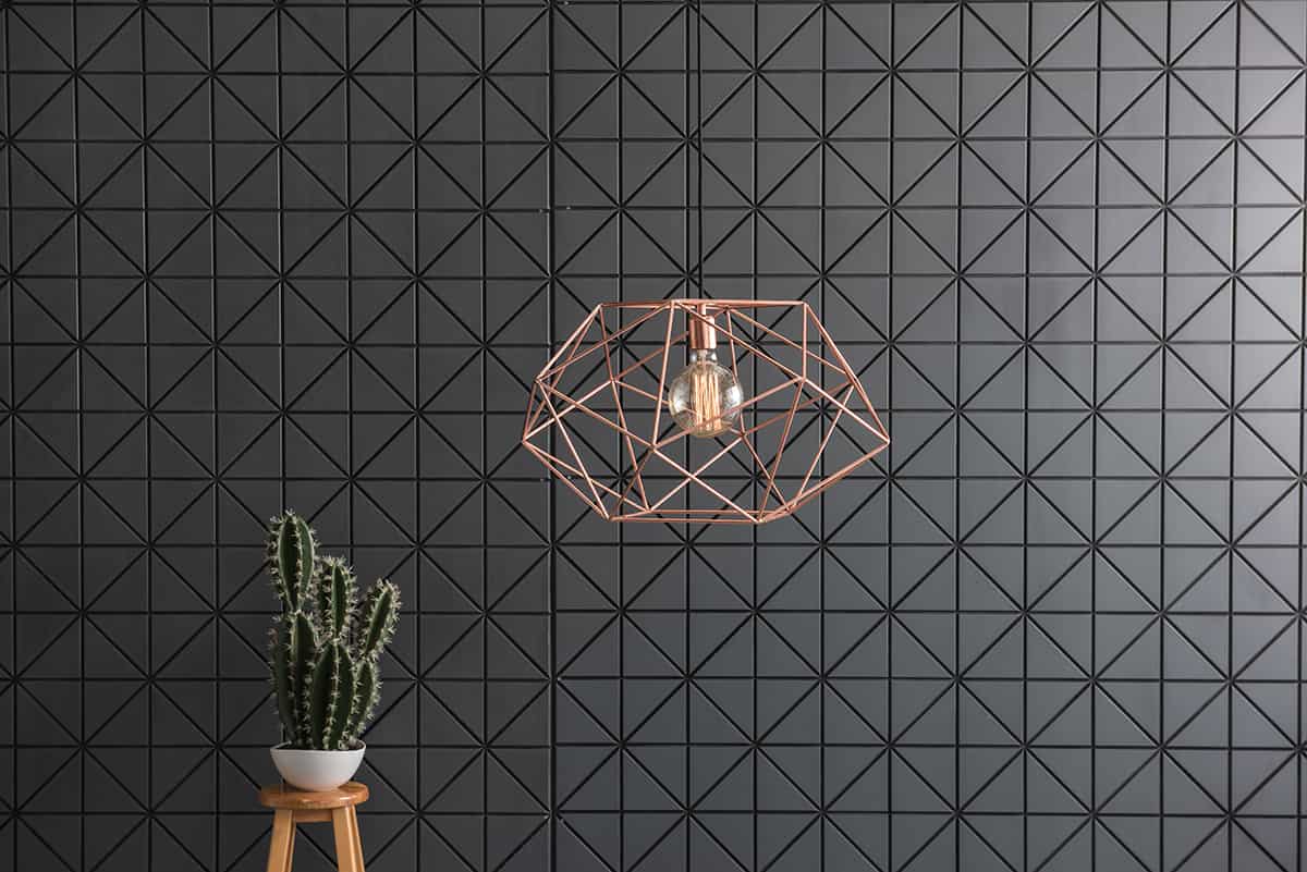
Dark neutrals can also make a nice impact next to copper, such as mud brown, slate gray, and black. Ensure you choose a neutral that is either light enough or dark enough to contrast against copper, or if you would prefer a more blended and tonal look, then tan can work nicely with copper for a sophisticated and contemporary style where copper adds highlights to the space rather than being the central focus.
Copper is a nice accent color to use in a white room because it brings warmth and also adds richness to the space. Choose copper as your single accent shade in a white room for a modern and minimalist vibe, or add another neutral shade to the mix to create more depth, such as gray or dusky pink.
Warm Tones
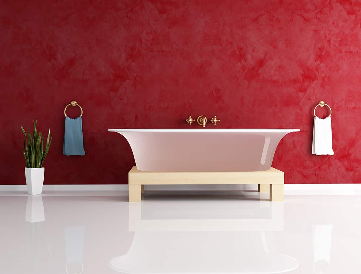
Warm tones are not necessarily the shades that spring to mind as complimentary for copper, but if you choose the right colors, these can pair perfectly together. Warm tones alongside copper will make for a very inviting and comfortable space, but this doesn’t mean the room can’t also be elegant or luxurious. Choose rich red tones such as burgundy, merlot, and terracotta to compliment copper.
Paler warm tones can also work well, but they should be rich or dusky rather than bright and sunny. Copper will work nicely alongside mustard yellow, whereas lemon yellow will not. Other warm tones you can consider to use with copper include caramel, taupe, and cinnamon.
For a cozy and welcoming interior, choose a dark warm tone like syrup brown for your walls, with beige sofas and soft furnishings highlighted by copper accents. This color scheme can work in any room, but it works especially well in bathrooms and bedrooms for a relaxing atmosphere.
In bathrooms and kitchens, consider investing in copper fixtures and fittings for a high-end look. You can now find taps, towel rails, and even cooktop hoods in copper finishes.
Alternatively, to keep the budget lower, choose accessories with copper-colored finishes, such as soap dispensers and candle holders that can be changed inexpensively if you want to switch up your interior look in the near future.