Looking for a calm and peaceful color tone for your home project, serenity color should be one of your top lists. Keep reading for further details on what this color is, what it means, and how to use it.
Table of Contents
What is the Serenity Color?

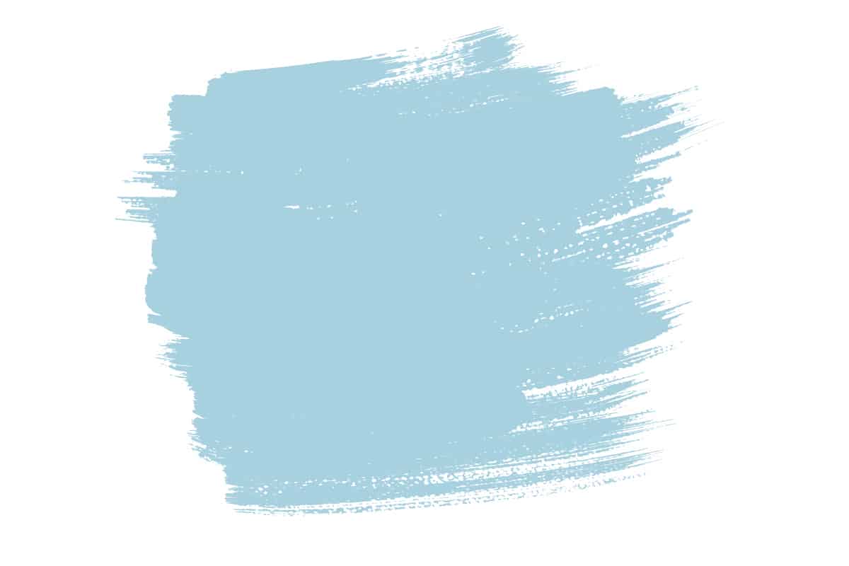
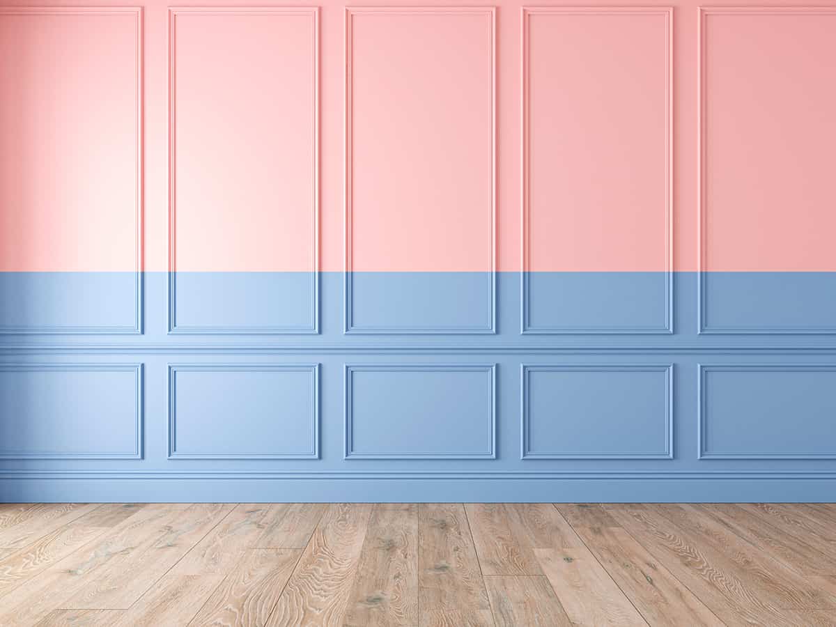
Serenity is a light to medium shade of blue. It was named Pantone’s ‘Color of the Year’ in 2016, along with its complementary color ‘rose quartz.’ This is a soft and calming shade that is revered for creating a sense of stillness and tranquility. Several paint manufacturers produce paint colors that are named ‘serenity,’ and though all of these are blue shades, they do differ slightly.
The serenity paint color from Benjamin Moore is similar to aqua blue. It has mint green undertones that make it feel crisp and refreshing while still maintaining a soft, airy feel associated with light blue. The serenity paint color from Valspar, by contrast, has more gray undertones in the blue, which give it a cool, sky blue effect.
What does Serenity Color Mean?
Light shades of blue, such as serenity, are synonymous with feelings of calm and relaxation. This is likely down to the way we intrinsically associate shades of blue with the ocean and a clear sky, both of which are viewed as peaceful and tranquil.
For many people, when asked to close their eyes and imagine a relaxing image, the first thing that will spring to mind is a still blue ocean gently lapping a sandy beach, with a cloudless pale blue sky unmoving in the background.
The association of blue with all things calm and gentle is something that runs deep in many of us, and as such, it is no surprise that pale blue shades are used to inspire feelings of relaxation, reflection, and restfulness.
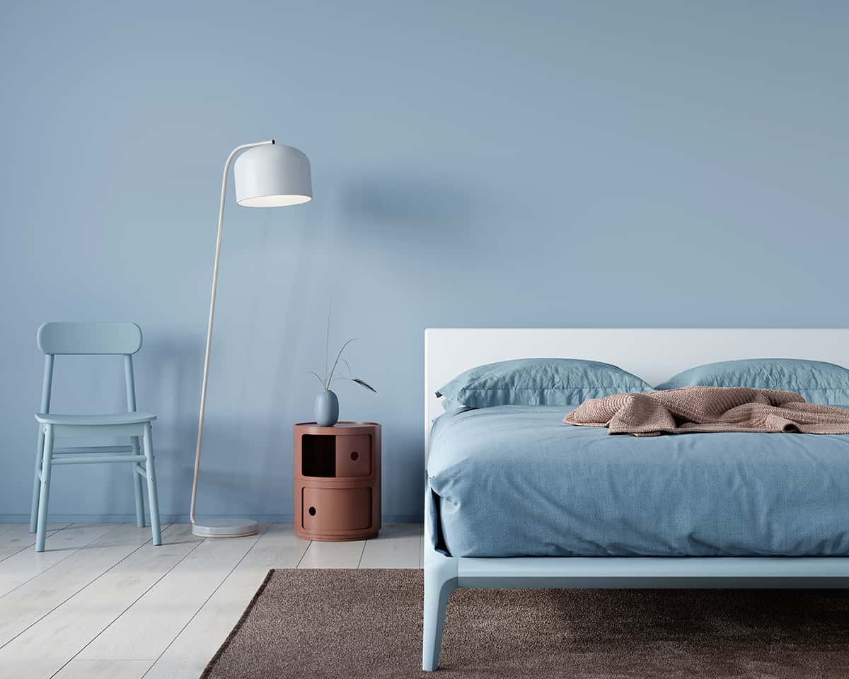
The cool tones of serenity blue help to create a cool, refreshing feel that also aids in a sense of relaxation. This is a color that will achieve a soothing atmosphere when used in interior design, but it also has a crisp and fresh feel, which means it can make a space feel clean and contemporary.
For all of these reasons, it is unsurprising that serenity blue is a popular shade in kitchens and bathrooms. For bedrooms, light shades of blue are among the most popularly chosen paint colors by homeowners since these shades are associated with a relaxing and refreshing night of sleep.
Similar Colors to Serenity
Powder blue

Powder blue and serenity blue are almost impossible to distinguish between. Both of these colors are light to medium shades of blue with soft, floaty vibes.
They are both created by mixing blue with a generous portion of white and a small hint of red. The red hue in these colors comes through as a very subtle lilac undertone, which means they don’t read as cool as some other crisper shades of blue. These colors are so difficult to separate from one another that they could be used interchangeably without a problem.
Periwinkle

Periwinkle, like serenity, is a light shade of blue. Aside from being a light shade of blue, these colors are also similar in that they are created using a tiny splash of red, which results in a subtle lilac undertone and a slightly warmer appearance compared with more cool-toned shades of light blue.
While serenity is a soft and floaty blue, periwinkle is even softer, with a greater proportion of white used in making this color. These two shades are very similar, and as such, they would work well in a tonal effect style, for example, with an array of cushions on a bed in both serenity and periwinkle to create a layered look.
Light blue
Light blue is a light shade of blue, which is achieved by mixing white with blue. It has a similar shade level to serenity; however, it lacks the subtle red tint of serenity, and therefore it comes across as a much cooler shade. Light blue is a true shade of blue that lacks any other undertones, so it has a crisp and fresh look. There are a variety of colors that can go well with light blue, including white, peach, lilac, gray and so on.
How to Use Serenity in Home Decor
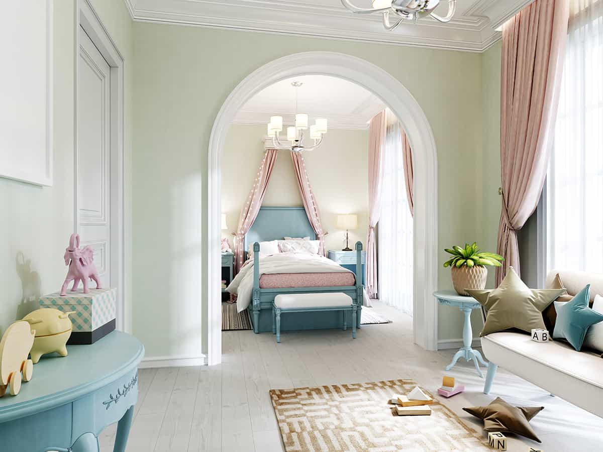
Relaxing bedroom paint
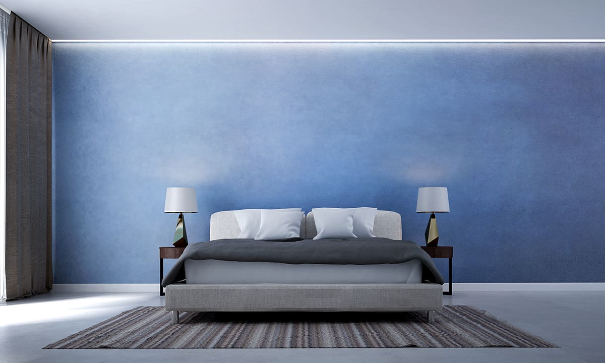
Serenity blue paint could be used in any space in the home, but it is undeniably perfect for a bedroom. As a soothing and calming color, this paint will inspire a sense of relaxation that is perfect to slip into after a long day.
Paint a whole room in this color for an immersive experience where you can imagine you are lying on a warm beach and looking up into a clear blue sky, or for a more subtle hint of tranquility, paint the room in off-white and use serenity as an accent color on the wall behind the head of your bed.
This is a color that can pair well with a variety of shades, but to ensure a still and easy feel in a relaxing bedroom, stick with shades of off-white or very pale gray for accessories and soft furnishings.
The Scandinavian look is still huge in home decor, where it is used to inspire a sense of minimalism and simplicity with a sleek and modern style. Serenity is a color that works really well in this type of look because it feels clean and calm, allowing it to fit in seamlessly with Scandinavian design.
Choose serenity blue bed sheets against white walls with some small accents of red, such as red photo frames or a red vase on the windowsill. Painted furniture is also big in Scandinavian decor, so consider painting your dining chairs in serenity blue and a vibrant shade of yellow for a fresh and cheerful look.
Coastal cool
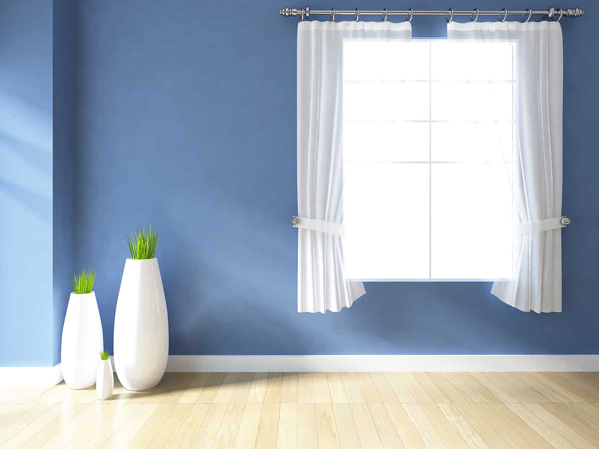
Any shade of light blue always works well in a coastal-themed space because the ocean features so many different hues that almost any blue color can convey a sense of the sea.
If you want a relaxed coastal space, then paint the walls in serenity blue and choose white sofas and sheer white drapes at the windows. This will make for a casual look that feels soothing and calm.
Mediterranean mood
Serenity blue is very similar to the medium-light shades of blue commonly found in decor around France, Spain, and Italy. You might expect to see an old French chateau with wooden doors painted in serenity blue or serenity-colored mosaic tiles used to decorate an Italian porch.
Use this shade of blue as a wall color in your kitchen to inspire a Mediterranean theme with terracotta planters full of fresh herbs and clay casserole dishes aged with years of use. Since orange and blue are contrasting colors, deep shades of tan with orange undertones work really well with serenity blue, and they create a vibe that feels foreign and exotic.
Colors that Go with Serenity
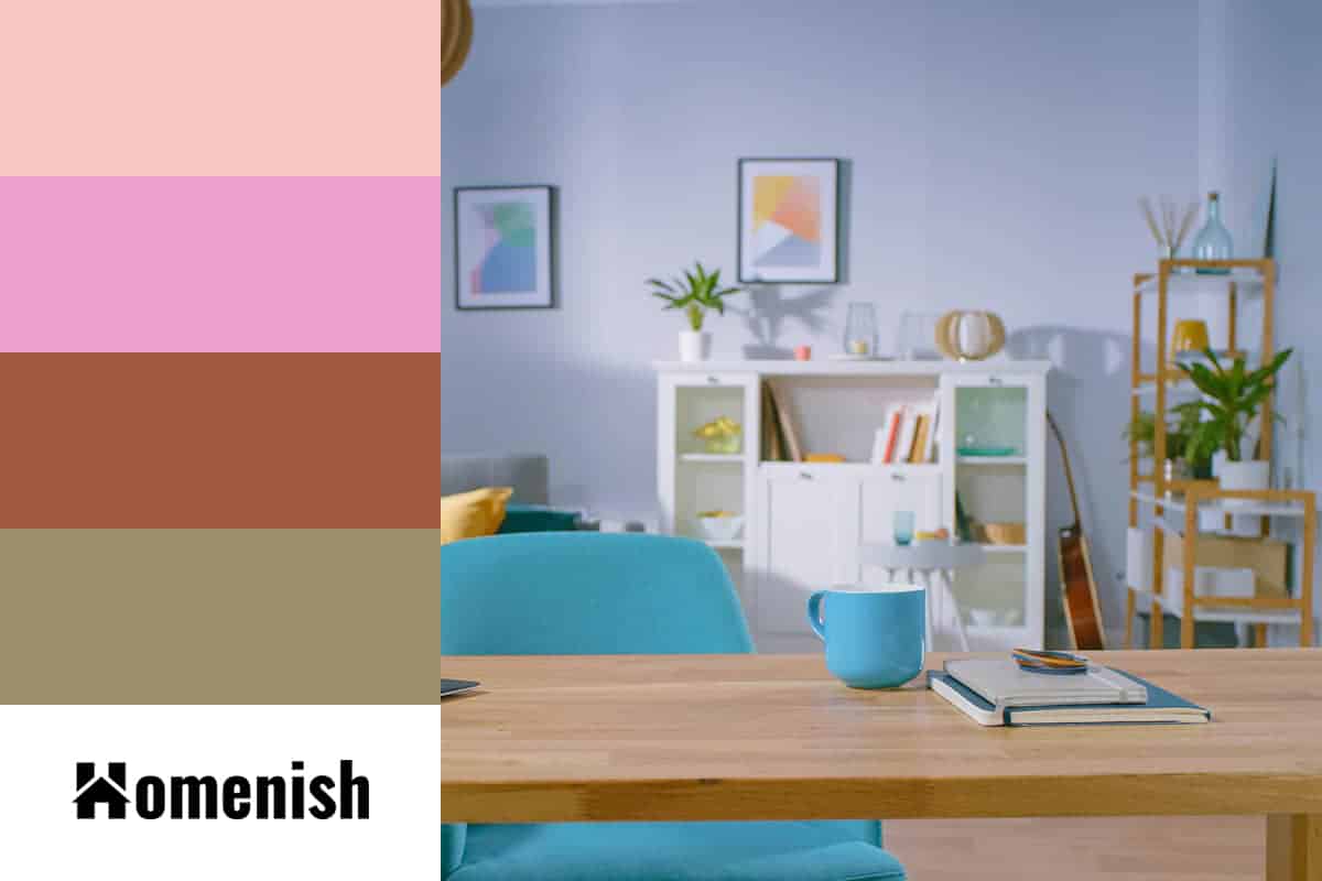
Rose quartz
| Shade | Hex Code | CMYK Color Code (%) | RGB Color Code | Color |
| Serenity | #8ca3cd | cmyk(32%, 20%, 0%, 20%) | rgb(140, 163, 205) | |
| Rose Quartz | #f8c5c4 | cmyk(0%, 21%, 21%, 3%) | rgb(248, 197, 196) |
In 2016 when Pantone announced serenity blue as its ‘color of the year,’ rose quartz was also named as its complementary color. These are both pale colors, so they work really well together to create a calm and soothing space, but the pink is great for adding a subtle warmth to the cool tone of serenity, making for a room that feels even more inviting.
In a room with white walls, choose serenity and rose quartz as accent shades, using serenity blue sofas and curtains, with a rose quartz rug and cushions.
Olive green
| Shade | Hex Code | CMYK Color Code (%) | RGB Color Code | Color |
| Serenity | #8ca3cd | cmyk(32%, 20%, 0%, 20%) | rgb(140, 163, 205) | |
| Olive Green | #9b8e6b | cmyk(0%, 8%, 31%, 39%) | rgb(155, 142, 107) |
Olive green is an earthy color with a hint of yellow-brown, which makes it feel almost like a neutral. Olive green is strongly associated with nature, and since serenity can be thought of as the color of the sky, using the serenity and olive green combo colors can be great for a nature-inspired space.
In a bedroom with olive green walls, select white bed sheets accented with serenity blue cushions and a serenity colored rug beneath the bed.
Lilac
| Shade | Hex Code | CMYK Color Code (%) | RGB Color Code | Color |
| Serenity | #8ca3cd | cmyk(32%, 20%, 0%, 20%) | rgb(140, 163, 205) | |
| Lilac | #eda1ce | cmyk(0%, 32%, 13%, 7%) | rgb(237, 161, 206) |
Lilac and pale blue are analogous colors, which means they reside next to each other on the color wheel. When used together in home decor, they create a sense of harmony that makes a space feel balanced and easy to be in.
Since these colors won’t contrast against each other, the eyes don’t need to work hard to adapt to the space, making a serenity and lilac room feel calm and soothing.
As lilac is based on a flower, it works well in floral and botanical-themed interiors, and serenity blue will be a nice addition to this type of look. In a bedroom with serenity blue walls, choose white bedsheets featuring a lilac and blue floral pattern, and accessorize the bed with some solid fabric cushions in both lilac and serenity.
Terracotta
| Shade | Hex Code | CMYK Color Code (%) | RGB Color Code | Color |
| Serenity | #8ca3cd | cmyk(32%, 20%, 0%, 20%) | rgb(140, 163, 205) | |
| Terracotta | #9f5840 | cmyk(0%, 45%, 60%, 38%) | rgb(159, 88, 64) |
Orange and blue are contrasting colors, and since terracotta has a heavy orange base and serenity is a shade of blue, it means that these two colors look very complimentary when used next to each other.
However, since serenity blue is a paler shade of blue, and terracotta is a dark and muted shade of orange, the resulting contrast doesn’t feel too vivid and overwhelming, and instead, it provides a rich and warm, yet fresh balance.