In home decor, blue is commonly chosen as a wall paint color because it has the effect of creating a relaxing and tranquil environment, while orange is a lesser-used color since it can come across as brash. However, the opposing qualities that blue and orange offer mean that they can create a sense of balance in interior design.
If you’ve ever felt like a predominantly blue room comes across as cold or uninviting, a few touches of orange will change all of that. Similarly, if you have an orange space that is intensely warm, break it up with some blue accessories for a style that feels both balanced and intriguing.
Keep reading to learn thoroughly about how to pair with these colors
Table of Contents
Can Orange and Blue Pair with Each Other?
The answer is yes though there are some rules you need to understand, which we will explain below.
Orange and blue are contrasting colors and so they are commonly paired together in color palettes for home decor and fashion. The contrast comes from the fact that these are directly opposite colors on the color wheel, and this also means that blue and orange are complementary colors.
Contrasting and complementary colors have the ability to simultaneously balance each other out while also making the opposite color appear more intense and vivid. They are able to bring out the best in each other, making the opposing color read as the truest version of itself.
One of the effects of contrasting colors is that they can also come across as overwhelming because the stark contrast can be difficult for our eyes to adjust to. This isn’t always what you want when it comes to an interior design color scheme because most people would prefer to feel relaxed rather than overstimulated when they are in their home.
However, there are ways you can use contrasting colors that will allow them to shine without resulting in a potent and overpowering look. Here we look at ways to use orange and blue together in home decor and the colors that go with orange and blue to create balanced color palettes.
Blue and orange are contrasting in every sense of the word. Blue is cool while orange is warm, and blue is soothing while orange is stimulating. Colors that go with blue many times are not suitable to pair with orange.
The best way to ensure your contrasting colors don’t read as too stark against each other is to opt for a muted version of one of the colors or a very dark or very light shade of one of your colors.
For example, bright blue and bright orange are going to clash against each other and fight for attention, and the intensity of the contrast can be difficult for our eyes to adapt to, which makes the space feel chaotic and hard work to be in.
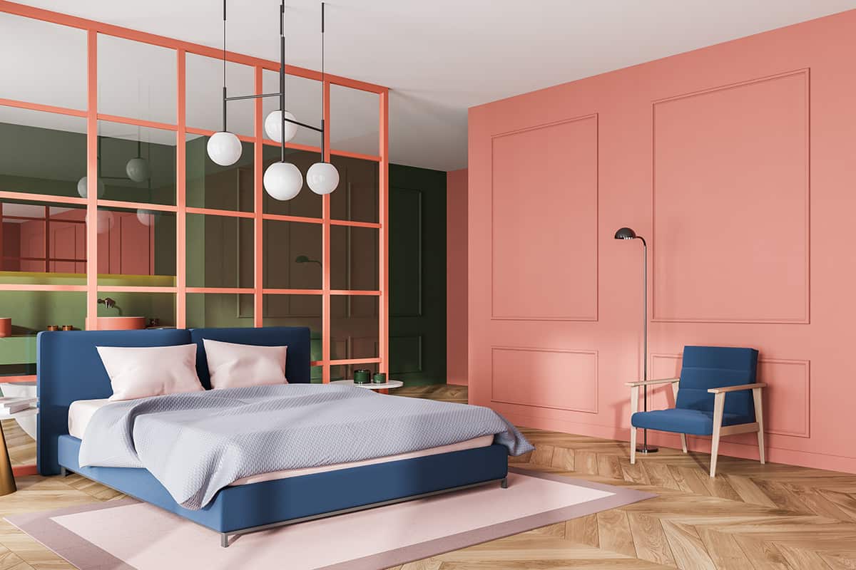
However, when one of those colors is subdued, the contrast is also subdued. For example, bright orange can work with a pale and dusky shade of blue or a dark shade of blue such as navy.
Alternatively, use a bright shade of blue with a more muted shade of orange, such as pale peach or dark burnt orange. This trick allows for directly contrasting colors to be used alongside each other in a stylish and inoffensive way, and yet you can still benefit from the advantages that contrasting colors offer.
| Shade | Hex Code | CMYK Color Code (%) | RGB Color Code | Color |
| Burnt Orange | #c14a22 | cmyk(0%, 62%, 82%, 24%) | rgb(193, 74, 34) | |
| Navy Blue | #1e3444 | cmyk(56%, 24%, 0%, 73%) | rgb(30, 52, 68) | |
| Sage Green | #557741 | cmyk(29%, 0%, 45%, 53%) | rgb(85, 119, 65) |
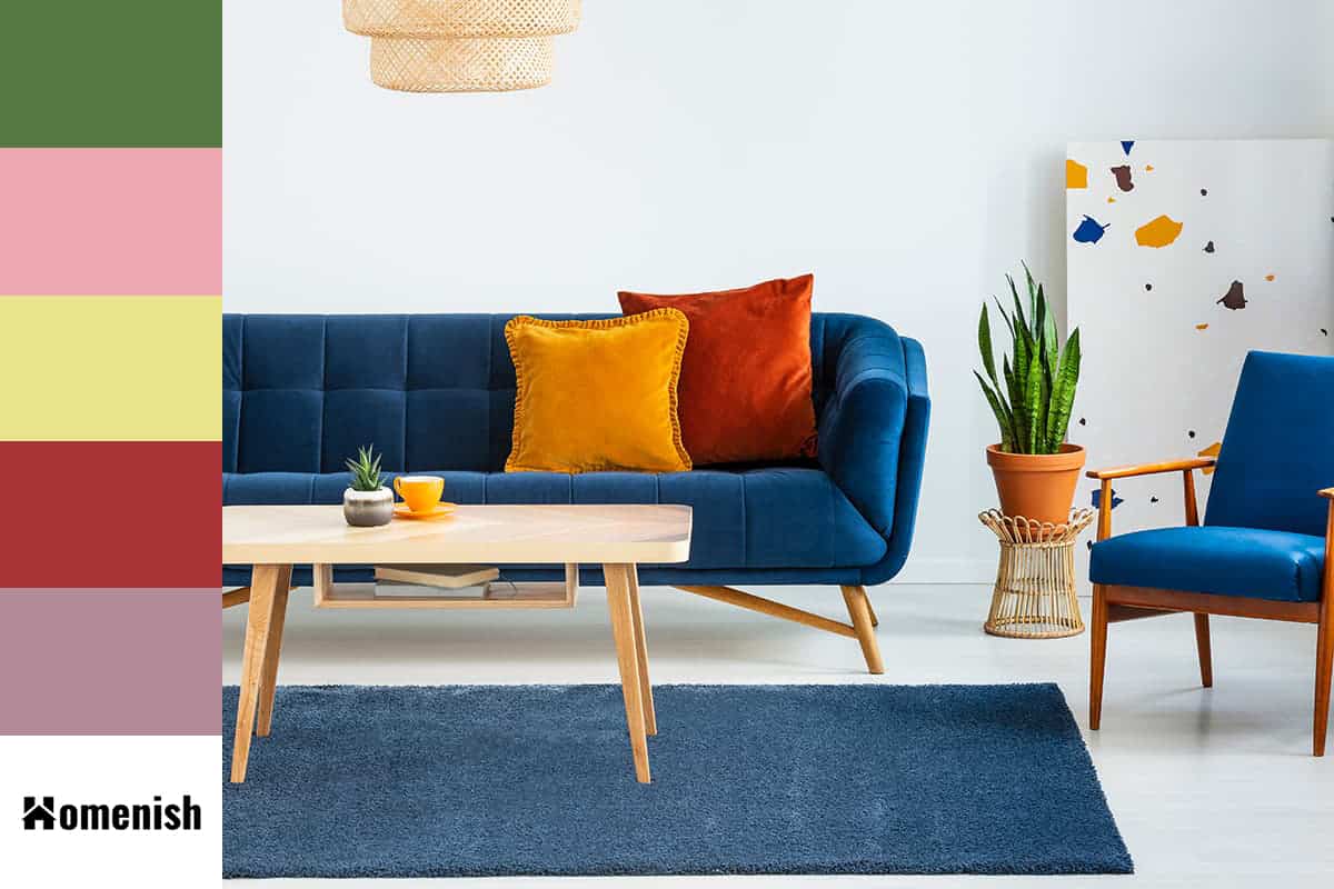
This is a really versatile trio of colors that can be used in a vintage-style room just as well as a contemporary room. For a vintage look, opt for a wallpaper on a feature wall that uses a floral pattern in navy blue, sage green, and burnt orange. The muted tones of these colors make for a space that feels neutral and easygoing, despite the contrast between blue and orange.
To continue the vintage style, choose burnt orange velvet tasseled lampshades, and paint the remaining walls in sage green. Navy blue accessories will help to tie the whole look together, such as a navy rug or navy-painted dining chairs.
Apricot, teal, and blush pink
| Shade | Hex Code | CMYK Color Code (%) | RGB Color Code | Color |
| Apricot | #f7ab6a | cmyk(0%, 31%, 57%, 3%) | rgb(247, 171, 106) | |
| Teal | #007c7c | cmyk(100%, 0%, 0%, 51%) | rgb(0, 124, 124) | |
| Blush Pink | #eca7b0 | cmyk(0%, 29%, 25%, 7%) | rgb(236, 167, 176) |
For an orange and blue color scheme that feels modern and playful, choose a pale and sweet shade of orange such as apricot, along with a vivid blue such as teal or peacock blue. Although the blue color is quite intense, the contrast between this and the orange won’t be overwhelming since it is a subdued shade of orange.
The addition of blush pink adds a contemporary and flirtatious edge to the color scheme. These colors are ideal for a room that is based around a geometric theme.
For example, choose a large piece of abstract art as the focal point for the room that features the trio of colors from your color scheme, and use this as inspiration for the rest of the space. This could include blush pink walls with apricot sofas and teal curtains and cushions.
Saturated Orange, Blue, and lemon yellow
| Shade | Hex Code | CMYK Color Code (%) | RGB Color Code | Color |
| Saturated Orange | #ff8500 | cmyk(0%, 48%, 100%, 0%) | rgb(255, 133, 0) | |
| Blue | #1f1bb3 | cmyk(83%, 85%, 0%, 30%) | rgb(31, 27, 179) | |
| Lemon Yellow | #e9e48c | cmyk(0%, 2%, 40%, 9%) | rgb(233, 228, 140) |
Yellow always brings a lighthearted, positive vibe to a room, and an orange and blue color scheme is no exception. Add lemon yellow accessories to a cornflower blue and honey orange bedroom for a country farmhouse look.
This is a style that works beautifully in a guest bedroom because it creates the atmosphere of a relaxing haven that is uplifting and appealing, helping to aid in a good night’s sleep, so your guest awakens feeling recharged and refreshed.
Paint the walls in cornflower blue so that the dominating color is one that feels soothing and tranquil, then add honey orange cushions and lampshades for an interesting contrast and to add a sense of warmth and comfort.
Lemon yellow flowers on the desk and a lemon yellow blanket draped over the end of the bed add the perfect splash of zing to bring the whole color scheme together in a restorative style.
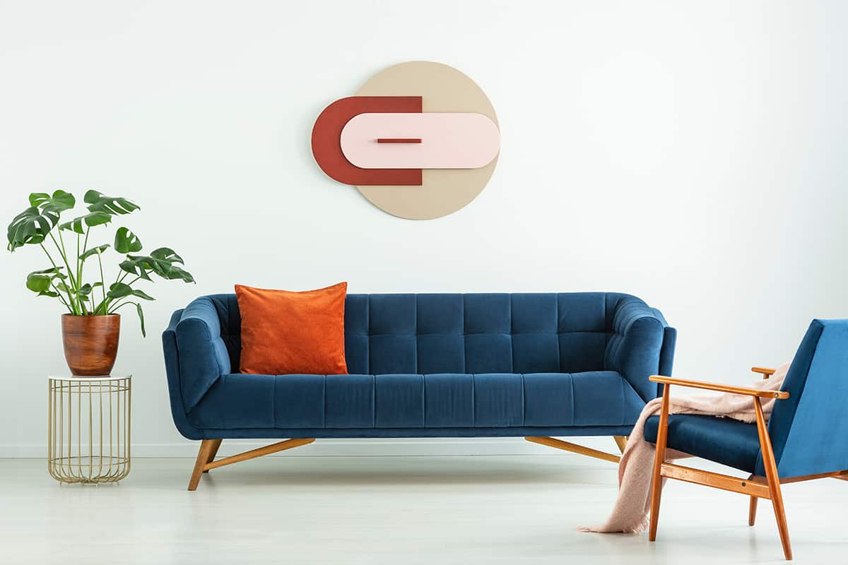
Cinnamon orange, Egyptian blue, and dark red
| Shade | Hex Code | CMYK Color Code (%) | RGB Color Code | Color |
| Cinnamon Orange | #e27b52 | cmyk(0%, 46%, 64%, 11%) | rgb(226, 123, 82) | |
| Egyptian Blue | #254281 | cmyk(71%, 49%, 0%, 49%) | rgb(37, 66, 129) | |
| Dark Red | #a83437 | cmyk(0%, 69%, 67%, 34%) | rgb(168, 52, 55) |
Blue and orange are widely used together in Moroccan-themed decor and other interiors based on Middle Eastern styles. For an authentic take on this look, choose a deep and intense medium shade of blue such as Egyptian blue, along with an earthy shade of orange such as cinnamon.
These colors alone set against a white base will be able to create a convincing Moroccan style, but to elevate the look to another level, you should add in a deep and dark shade of red such as merlot or blood red.
Use these colors on fabrics that feature intricate patterns and embroidery, along with mosaic tiled surfaces and carved wooden furniture.
The kitchen is a nice place to display a Moroccan-themed decor because it offers practical places for tiles to be used. For example, an orange terracotta tiled floor or an Egyptian blue and cinnamon orange mosaic backsplash behind the kitchen counter. Choose dark red accessories such as plant pots and a silk valance to emphasize the Middle Eastern look.
Peach, azure blue, lavender
| Shade | Hex Code | CMYK Color Code (%) | RGB Color Code | Color |
| Peach | #dd9387 | cmyk(0%, 33%, 39%, 13%) | rgb(221, 147, 135) | |
| Azure Blue | #355f95 | cmyk(64%, 36%, 0%, 42%) | rgb(53, 95, 149) | |
| Lavender | #b38b98 | cmyk(0%, 22%, 15%, 30%) | rgb(179, 139, 152) |
Peach is a shade of orange with pink undertones, which gives it a slightly feminine and low-key feel compared with truer shades of orange. The pink undertones also add a slightly cool temperature to peach, which makes it come across as a more modern shade than rich, warmer orange colors.
Use peach with azure blue and lavender for a cute and quirky look in a living room or a child’s bedroom. Floral prints on fabric and wallpaper will push this color scheme towards a sweeter and more wholesome look or use solid fabrics and sleek textures such as marble tabletops and gold lampstands to make this color scheme come across as one of contemporary elegance.
Use peach as your wall paint color and contrast this with a velvet azure blue sofa and peach cushions edged with miniature lavender-colored pom poms. An azure vase placed centrally on a coffee table with a bunch of dried lavender in will tie the whole space together and keep the atmosphere fresh.