Table of Contents
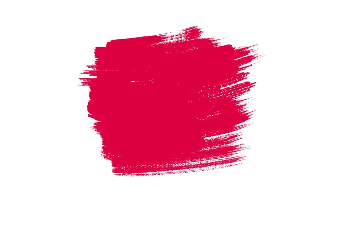
What is Scarlet Color?

Scarlet is a bright shade of red that is tinted slightly with orange. On the color wheel, it is in between red and orange but closer to red. This is a color that is warm and vibrant and is not widely chosen as a shade for interior design palettes.
What Does Scarlet Mean?
Scarlet has a long history, with the first record of the word scarlet being used to describe the color in 1250. The use of scarlet dyes was originally only available to the wealthy, and as a result, this color signified nobility for a long time.
It was an important color in the Roman Empire, with high-ranking officials being dressed in scarlet clothing, and as a result, it became a color that demanded respect. The Christian church adopted scarlet as a principal color, with the Crusaders flag depicting a scarlet cross on a white background.
The scarlet was said to be representative of sacrifice and blood. Throughout the Middle Ages, scarlet continued to be a color that was used to signify wealth and importance and was chosen as a favorite shade for clothing among kings and royalty.
The finest scarlet fabrics were known to come from Venice in Italy, and the dye was known as Venetian Scarlet. The high cost of scarlet was one of the driving forces which made it popular with the wealthy because scarlet fabrics were priced ten times higher than the same fabrics which had been dyed in blue.
The result of this was that the color of scarlet gained a reputation for signifying affluence and luxury. It has been adopted as a military uniform in many countries since it is representative of authority and respect.
Conversely, scarlet also has associations with sin and dishonorable behavior, as in the 1850 novel by Nathaniel Hawthorne, The Scarlet Letter. Like other shades of red, scarlet can also be used to represent passion, heat, and intensity.
The hint of orange in this shade of red also means that scarlet can be used to signify joy. It is a bold and bright color that can feel warm and cozy when used with earthy colors like brown and beige, or it can appear more daring with other bright and warm shades like yellow.
Similar Colors to Scarlet
Crimson

Crimson is a cooler shade of red compared with scarlet, though it has a similar appearance. It contains blue undertones and lacks the warm orange hues that you will find in scarlet. As a result, crimson has a less playful, more passionate appearance than scarlet.
Crimson is said to be the color of blood, and as such, it has a deep intensity that comes across as more explosive and emotional compared to scarlet.
If you want to make a bold impact with red accents, then scarlet will do this with a lighter energy, while crimson will be fiery and can even promote rage.
Ruby
Ruby is a darker shade of red than scarlet, with true red tones and a lack of orange hues. Ruby red takes its name from the ruby gemstone, and it offers a depth and warmth that works well as an accent shade in interior design.
You could use these two colors interchangeably in home decor, though scarlet would give off a more fun and flirty vibe, while ruby may appear more serious.
Cherry

Cherry red has a darker and deeper color than scarlet, but it shares a lot of the same qualities. Both colors can be used to promote passion, romance, and wealth, and they will work well in similar color schemes.
Vermilion

Vermilion is also known as red-orange since it hovers between these two colors on the color wheel. To make scarlet, you would mix red with a small amount of yellow, whereas to make vermilion, you would mix red with a slightly higher proportion of yellow.
Vermilion is slightly more orange than scarlet, but it still falls into the category of red shades. If you were to mix too much yellow with red, then you would end up with orange, which is past vermilion.
This color is the most similar to scarlet, and these two shades can be used interchangeably in home decor. They both have a bright and bold look and are associated with positivity, joy, passion, and warmth.
How to Use Scarlet in Home Decor
Patterned textiles
Scarlet is a strong color that can look too bold, intense, or simply basic when it is used in plain fabrics. To bring a higher-end look to your interior, choose red accessories which are made from patterned textiles.
This will add interest to the room and create a style that feels more expensive while also ensuring that the color creates a subtle effect and isn’t overwhelming.
Consider cushion covers in scarlet floral prints or a rug in a scarlet geometric pattern. You can tie this in with other scarlet elements in the room, such as a scarlet photo frame or scarlet plant pots.
In a dark blue bedroom, create a contrast with curtains that have scarlet details on them, such as white drapes with a scarlet pom pom trim, and coordinate this with scarlet striped cushion covers on the bed or a knitted scarlet blanket.
Artwork
If you want to introduce some scarlet elements to your space without completely changing the decor, adding in some new artwork is a fun way to do this. There are plenty of prints that include scarlet as the main color since this is a shade that makes a bold impact in art.
Choose a piece that is large and can be used as the central feature in the room, hanging it in a prominent place such as over a fireplace or above the headboard of a bed.
To really make the scarlet stand out, leave the rest of the room quite plain and neutral, or to tie it in with the rest of the space, you can add in a few small scarlet touches such as candles or a vase.
Painted furniture
In a room decorated in primary colors, choose scarlet paint to upcycle wooden furniture. A yellow dining table set will look striking next to scarlet painted dining chairs set against a pure white wall background.
In an entryway, paint a shoe rack in scarlet furniture paint to add definition and interest to the small space without making the area too stimulating.
As a bright and cheerful color, scarlet is ideal for updating furniture to make it feel modern and playful. Choose a matte finish for an understated contemporary style or a gloss finish for a sleeker and more hardwearing result.
Wall paint
Scarlet is not a color many people choose for painting their walls since it is very bright and bold. However, it can be really effective in small spaces, such as bathrooms and home offices.
Use the color across all of the walls and pair it with a shade that is neutral and either light or dark.
In a guest bathroom, scarlet walls will look good with white tiles and towels, which are white with scarlet embroidery.
Colors to Use with Scarlet
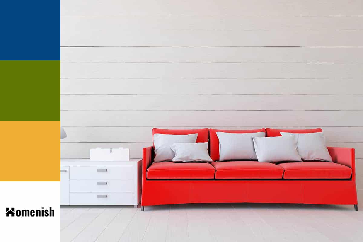
| Shade | Hex Code | CMYK Color Code (%) | RGB Color Code | Color |
| Scarlet | #f72300 | cmyk(0%, 86%, 100%, 3%) | rgb(247, 35, 0) | |
| Navy Blue | #014580 | cmyk(99%, 46%, 0%, 50%) | rgb(1, 69, 128) |
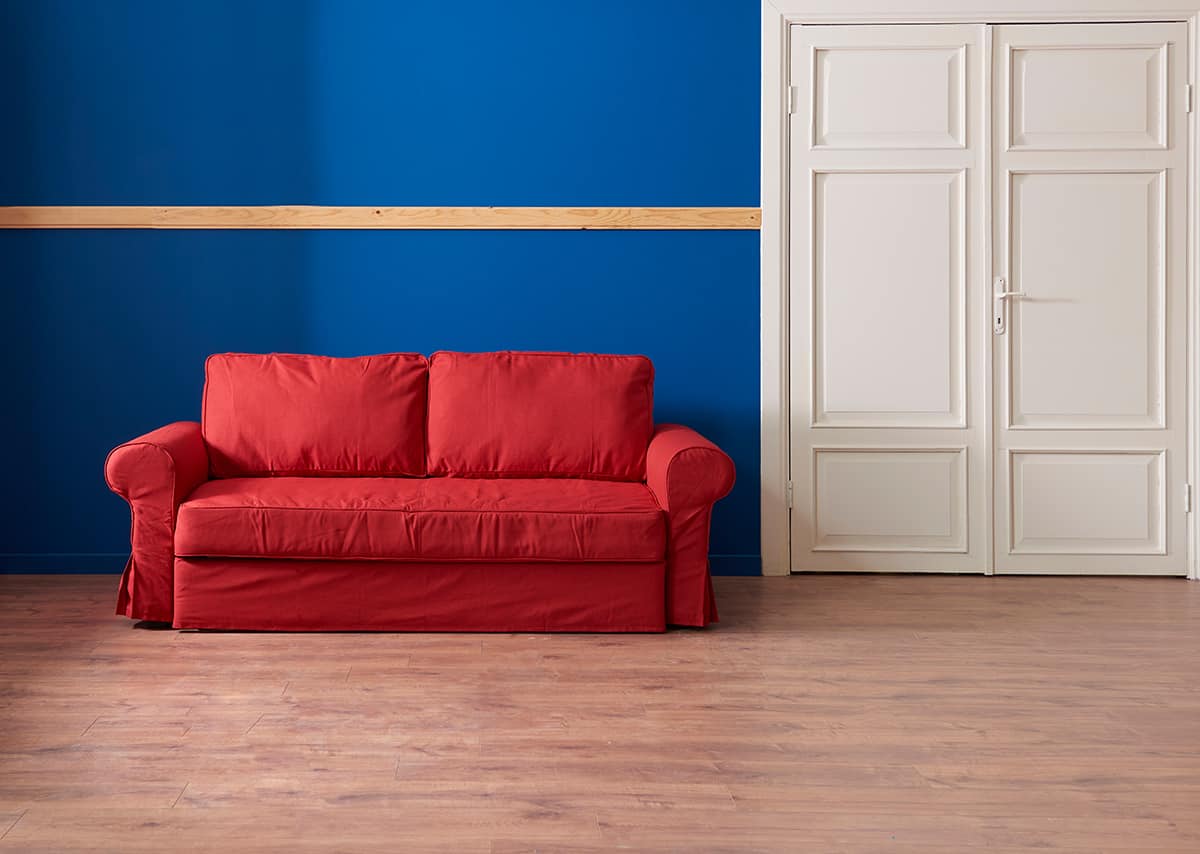
Navy blue is a classic color to use with scarlet because it balances out the warmth and intensity with a shade that feels almost neutral. Scarlet will stand out well against navy blue, but the contrast isn’t so harsh that the result is difficult to process.
In a navy blue painted dining room, set a glass vase of scarlet flowers as the table centerpiece, with scarlet placemats and gray chairs.
Olive green

| Shade | Hex Code | CMYK Color Code (%) | RGB Color Code | Color |
| Scarlet | #f72300 | cmyk(0%, 86%, 100%, 3%) | rgb(247, 35, 0) | |
| Olive Green | #5f7601 | cmyk(19%, 0%, 99%, 54%) | rgb(95, 118, 1) |
Olive green is an earthy, muted shade of green that has a natural appeal. As scarlet is associated with nature in the changing color of fall leaves, these two shades can work well together in nature or botanical-themed spaces.
In a living room with olive green walls and brown sofas, choose cushions with a cream and scarlet printed pattern and artwork on the walls of scarlet poppy flowers. These colors will make for a warm and cozy atmosphere in a room.
Yellow
| Shade | Hex Code | CMYK Color Code (%) | RGB Color Code | Color |
| Scarlet | #f72300 | cmyk(0%, 86%, 100%, 3%) | rgb(247, 35, 0) | |
| Yellow | #efaf34 | cmyk(0%, 27%, 78%, 6%) | rgb(239, 175, 52) |
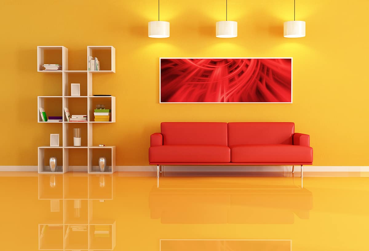
If you want to create a more daring look, then pairing scarlet red with a vivid shade of yellow such as canary or pineapple will be sure to achieve this. Since both yellow and scarlet are playful, positive, and energetic colors, the resulting look will feel very lighthearted and fun.
Choose a neutral to set the colors against so that they aren’t too overstimulating, such as gray or white. For example, opt for a charcoal gray living room with yellow and scarlet accents or a scarlet painted bathroom with white tiles and towels and yellow candles.
A room with both yellow and scarlet accessories cannot fail to feel uplifting and exuberant, though be careful about using this kind of color scheme in a room which you want to be restful, such as a bedroom.