Table of Contents
What is Pastel Blue?
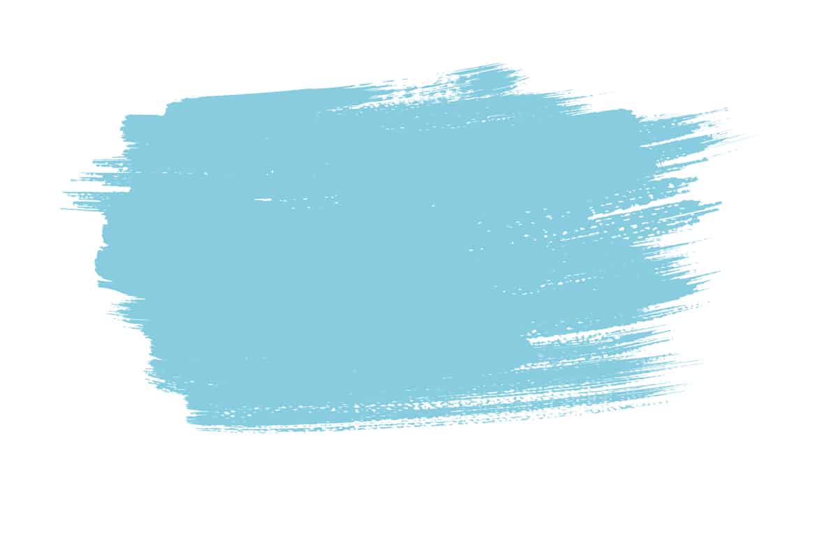
Pastel blue is a pale shade of blue that can be achieved by mixing a small amount of blue with a large amount of white. It is a color that is sometimes confused with baby blue, but although these two colors are both light shades of blue, they are not the same color.
Baby blue has a brighter and softer hue of blue, whereas pastel blue is decidedly more muted. Pastel blue has seen waves of popularity throughout history. It was favored by Marie Antoinette during her reign of France in the late 1700s, and many of her portraits feature her wearing pastel blue gowns.
In more recent history, pastel blue was popularly used in interior design throughout the art deco period, and it saw a resurgence during the 1980s when it was used alongside other pastel shades such as pastel pink and pastel orange.
Many people may remember bathrooms from the 1980s when sinks and bathtubs were pastel blue or pastel pink, rather than the white that is more prevalent today. Over the last decade, pastel blue has been widely used in home decor to create a casual and calming look.
What Does Pastel Blue Mean?
Pastel blue is commonly considered to be a soothing and calming color because of its similarity with the color of the sky and the ocean. It has a low saturation which means that it comes across as mellow and muted. Blue is a cool color that can be seen as icy and unwelcoming, but the subtle tones of pastel blue mean that it is more neutral than cool.
Most people who are drawn towards pastel blue are said to be nurturing and caring, and as such, this color can be used to represent a softness that may seem at odds with other shades of blue.
Pastel blue is widely used in interior design to convey a feeling of tranquility and serenity, and it is a popular choice of color in spas and retreats for this reason. Pastel blue is also associated with coastal regions of the world, and as such, it is popularly used in beach-style restaurants and interiors.
Similar Colors to Pastel Blue
Sky blue

Sky blue has a very similar tone to pastel blue, but it is a few shades darker. You can achieve sky blue by mixing white with a higher ratio of blue than you would use when creating pastel blue. Like pastel blue, sky blue has quite a toned-down, subtle feel, but it is marginally more saturated by comparison.
Both of these colors could be used effectively to create the same atmosphere, though pastel blue will give off a more muted effect. Sky blue is said to be the color of the sky on a clear day, and as a result, it has an uplifting feel to it that can also be soothing and fresh.
Baby blue

Baby blue is noticeably brighter than pastel blue, which is much more subtle. Baby blue contains some green, which is what gives it a more vivid look. This is a color that is associated with newborns, and it is widely used for baby clothing and decorating nurseries.
As a result, it can be hard to see this color as anything other than a shade for babies. If you are looking for a mature pale blue shade, then pastel blue will read as a more updated, modern take on baby blue.
Light blue
Light blue is a shade of blue that hovers in between pastel blue and baby blue. It is not quite as muted as pastel blue, but it is not quite as bright as baby blue. This is a color that is still heavily associated with young boys, and as a result, it can come across as very innocent.
Like pastel blue, light blue is linked to the sky and the ocean, and as such, it has connotations of serenity and peace. It can be used instead of pastel blue in interior decor if you want a room that is a little more uplifting.
Fore color combination with light blue, you can check out our post – ‘ 11 Colors that Go Well with Light Blue ‘
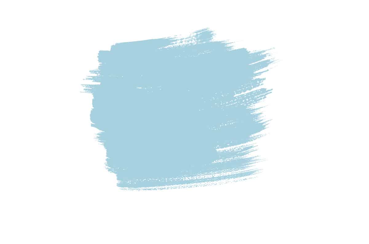
Powder blue

Powder blue is paler than pastel blue and appears as a softer, less saturated version of light blue. While pastel blue can appear slightly gray, powder blue is more distinctly blue.
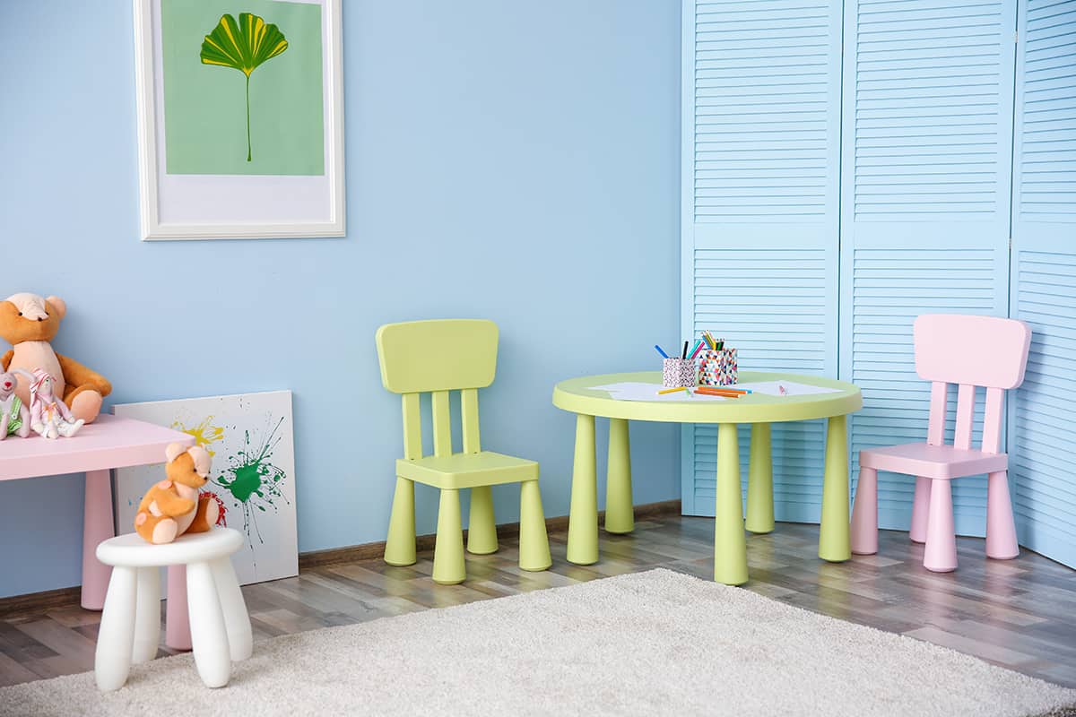
How to Use Pastel Blue in Home Decor
Light and airy
Pastel blue has a muted and mellow energy that works really well in rooms where you want to create an open and airy atmosphere. In a living room with large windows, accentuate the feeling of light and space with pastel blue painted walls and highlight this breezy energy with off-white sofas and pale gray accessories.
Pastel blue can be used to great effect in a bathroom where you want to spend time renewing yourself for a fresh and light energy.
In a bathroom, use pastel blue tiles on the walls behind the sink and around the bathtub, with cream-colored walls and fluffy white towels. The resulting effect will feel crisp and fresh, creating a bathroom you want to relax in.
Soft neutral
Since pastel blue is a subtle shade of blue with some gray pigments in it, it reads as a neutral when used with other muted shades. If you want to decorate a room using neutral colors but also want to ensure it doesn’t feel bland, then use pastel blue alongside neutrals such as beige or gray. Pastel blue will work well with both cool and warm neutrals, adding a soft and gentle feel to any space.
In a bedroom, paint the walls in dove gray and choose pastel blue bed linen and pastel blue velvet curtains. A cream faux fur throw draped across the bed will help to highlight the soft and inviting energy of this interior, which will feel modern and neutral.
Contemporary coastal
If you want to create a coastal or beach-themed interior in your home that doesn’t look predictable or dated, then choose pastel blue instead of a bolder or more heavily saturated shade of blue. The muted effect of pastel blue will work in a coastal-themed space while also ensuring a modern vibe is achieved.
Paint walls in off-white and opt for a pastel blue sofa, with pastel blue and gray striped curtains and gray cushions and lampshades. The resulting effect will feel coastal yet contemporary, hinting at a relaxed beach style without being too obvious.
Relaxing haven
Pastel blue is effortlessly relaxing and soothing. It feels understated and easygoing and helps the mind to feel rested and untroubled. This makes pastel blue an ideal color choice in rooms where you are going to want to unwind, such as the bedroom, bathroom, or living room.
In a restful bedroom, paint the walls in pastel blue and choose curtains and bedsheets in an off-white fabric with a lilac print.
Polka dots could work well, or a floral print will feel soothing and fresh. In a living room, paint the walls in pastel blue to achieve a space where you want to relax, and also add in an accent color to give the room some personality and definition.
Coral accents will work well to contrast against pastel blue, such as a coral-colored rug or coral cushions.
Colors to Use with Pastel Blue
Mint
| Shade | Hex Code | CMYK Color Code (%) | RGB Color Code | Color |
| Pastel Blue | #97dffa | cmyk(40%, 11%, 0%, 2%) | rgb(151, 223, 250) | |
| Mint | #d3dc99 | cmyk(4%, 0%, 30%, 14%) | rgb(211, 220, 153) |
As another pastel shade, mint green creates a harmonious pairing with pastel blue. Mint will make for a fresh and clean look alongside pastel blue, which works especially well in kitchens.
In a country cottage kitchen, paint the walls in off-white, and choose pastel blue kitchen cabinets and mint green subway tiles for a classic appeal. For an art deco-inspired space, paint walls in mint green and opt for scalloped suede chairs in pastel blue with gold legs.
Coral
| Shade | Hex Code | CMYK Color Code (%) | RGB Color Code | Color |
| Pastel Blue | #97dffa | cmyk(40%, 11%, 0%, 2%) | rgb(151, 223, 250) | |
| Coral | #ffafa6 | cmyk(0%, 31%, 35%, 0%) | rgb(255, 175, 166) |
Coral pairs well with pastel blue because it is a contrasting color that isn’t too intense, and therefore it won’t drown out the blue. Use coral in small hits in a pastel blue space to add interest, for example, coral plant pots lined on a shelf against a pastel blue painted wall.
Lilac
| Shade | Hex Code | CMYK Color Code (%) | RGB Color Code | Color |
| Pastel Blue | #97dffa | cmyk(40%, 11%, 0%, 2%) | rgb(151, 223, 250) | |
| Lilac | #dcbef4 | cmyk(10%, 22%, 0%, 4%) | rgb(220, 190, 244) |
Lilac and pastel blue create a fresh and soothing look when used together, and they also have a youth-like innocence that works well in a variety of spaces in the home. Use the pastel blue and lilac color combinations along with a third neutral shade to add some definition and prevent the room from feeling too bland.
Breaking up lilac and pastel blue will help them to make more of an impact. Good colors to do this with include cream, white, off-white, beige, and gray.
Cream
| Shade | Hex Code | CMYK Color Code (%) | RGB Color Code | Color |
| Pastel Blue | #97dffa | cmyk(40%, 11%, 0%, 2%) | rgb(151, 223, 250) | |
| Cream | #dcd8d6 | cmyk(0%, 2%, 3%, 14%) | rgb(220, 216, 214) |
Use cream and pastel blue together to create a space that feels relaxing and cozy. Cream walls will make for a warm neutral, while a pastel blue sofa will add a sense of tranquility and a style that feels modern. Add touches of charcoal gray for a shade contrast, such as charcoal-colored fluffy cushions.