Table of Contents
What Color is Amber?
Amber is a bright and vibrant color that sits exactly halfway between yellow and orange on the color wheel. It is known as a pure chroma color because it is not darkened or lightened by the presence of black or white and instead is at full saturation with a mix of fifty percent yellow and fifty percent orange.
The color amber is named after the material of the same name, which is formed from tree resin that has been fossilized. The material of amber has various shades of yellow, orange, and brown present, and as such, people often use the word amber to describe various yellow-orange-brown shades.
What Does Amber Color Mean?

In the psychology of color, amber represents positivity, joy, security, and high energy. The uplifting aspects of this color come from the presence of yellow, while the more creative and energetic aspects come from the presence of orange.
Amber is an approachable and friendly color, though it can be too stimulating for some due to its intensity. Many people associate amber with the fall since it is a color commonly seen during this season in the changing color of the leaves. As a result, it is a color that can be used to provoke a feeling of warmth and comfort.
The color amber is used in Europe and North America on road signal lamps. It is used to warn drivers that the signal is about to change to red and is an indication that you should get ready to stop. Throughout history, amber has taken on various meanings. Ancient Greek culture revered amber as a symbol of hope and healing, while it has also been used to promote fertility.
Similar Colors to Amber
Tangerine
Tangerine is a shade of orange which has some extra yellow mixed in with it to create a lighter orange shade.
Like amber, it is a color that feels positive and energetic, but it is closer to orange on the color wheel than it is to yellow, unlike amber, which sits exactly between the two colors.
Mustard
Mustard is a dark shade of yellow that has brown undertones, which is what gives it a similarity to amber.
Mustard is closer to yellow than it is to orange on the color wheel, but it provokes a lot of the same responses as amber does. For example, both of these colors can symbolize joy, safety, and warmth.
Yellow
Yellow is one of the colors which is used to create the color of amber, and it features heavily in this shade which is why they are so similar. Yellow is joyful and vibrant, and it is what gives amber these characteristics.
Orange
Orange is made by mixing equal parts red with equal parts yellow. To make amber, you would mix a smaller ratio of red with a higher ratio of yellow.
We can see instantly from this that amber is simply a more yellow version of orange, and as such, the two colors are very similar and have a lot of the same characteristics.
Orange is associated with creativity and warmth, just like amber, and it is also a color that features heavily in autumn themes, as amber does too.
How to Use Amber in Home Decor
Accent color
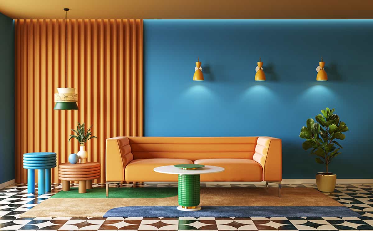
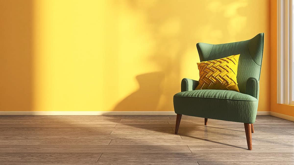
Amber is a very vibrant color, which means that for most people, it will be too intense to use as the base color in a room. Instead, amber works great as an accent shade to add personality and vitality to a space.
Many interior designers use the 60:30:10 color method when decorating a room, which helps to achieve a good balance between different colors or shades. In this method, you will select three colors to use as your color palette and designate each one to be used in the varying ratios of 60, 30, and 10.
Your main color will be used across 60 percent of the space, your secondary color will be used across 30 percent of the space, and the accent color will be used across 10 percent of the space.
Since most people will agree that amber is too striking to be used as the primary color in a home color palette, you should choose a different color for the 60 percent spot in your room, but amber can work well as either the 30 or the 10 position.
In a room where you really want to enjoy a decent amount of amber, choose it for the 30 percent option. A good color scheme here would be forest green, amber, and off-white.
Use forest green across 60 percent of the space, for example, as a wall paint, and for bed sheets, while amber could be used for cushions, curtains, and a rug across 30 percent of the space, and the final color of off-white would be used across 10 percent of the space, such as with a few cushions, lampshades, and photo frames.
Alternatively, if you wanted amber to feature less prominently, it would work well as the accent shade at 10 percent across the space. Interestingly it can make even more of a statement when used to a lesser extent, as the eyes will adjust to it at a different rate.
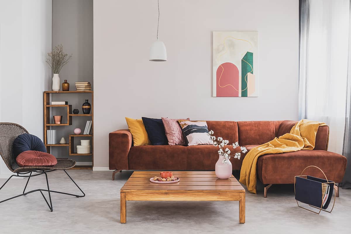
Upholstery
Velvet upholstery is very on-trend right now, and amber is one of the colors that looks really luxurious and elegant in velvet fabric. If you want to create a warm feel in a room that maintains a sophisticated style, then opt for velvet amber upholstery.
This could work as an accent chair in a living room or as an upholstered ottoman in a bedroom. For a heavier amount of amber, choose an upholstered amber sofa in a living room and tie it into the space with amber lamp shades.
Feature wall
Although amber is rarely a good option to use as a wall color across every wall in a room, it can be really effective as a feature wall. The main wall behind a bed is often the best wall to use as a feature wall in a bedroom.
Paint this wall in amber and the remaining walls in cream, then choose maroon bed sheets with cream and amber cushions layered on top for a room that feels bohemian and warm. In a living room, the feature wall could be positioned behind the fireplace or behind the main sofa.
Paint this wall in amber, or use a wallpaper that uses amber as its main color, and paint the remaining walls in navy blue. This will create a depth and intensity that feels rich and contemporary.
Fall theme
Amber is a color widely seen in the natural world during the season of fall, so it can work really well in a nature-themed room or in a cozy fall-themed space. To really emphasize a snug and comfortable feel, paint a room in maroon and choose amber accents with cream accessories to balance it out.
For a more natural fall-themed space, paint the walls in olive green and choose tan-colored sofas with amber velvet curtains and lampshades.
Colors to Use with Amber
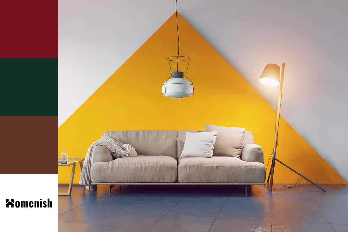
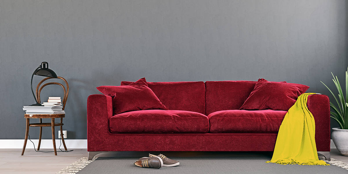
Maroon
| Shade | Hex Code | CMYK Color Code (%) | RGB Color Code | Color |
| Amber | #f7b900 | cmyk(0%, 25%, 100%, 3%) | rgb(247, 185, 0) | |
| Maroon | #77111d | cmyk(0%, 86%, 76%, 53%) | rgb(119, 17, 29) |
Maroon is a color that looks like brownish-red with a hint of purple. It is a warm and deep color that, when used with amber or burnt orange, will provoke feelings of cozy comfort. This is a color that is also associated with the season of fall, like amber, so it can also be used in a fall-themed color palette in home decor.
Forest green
| Shade | Hex Code | CMYK Color Code (%) | RGB Color Code | Color |
| Amber | #f7b900 | cmyk(0%, 25%, 100%, 3%) | rgb(247, 185, 0) | |
| Forest Green | #0c3026 | cmyk(75%, 0%, 21%, 81%) | rgb(12, 48, 38) |
Forest green is a dark shade of green that will contrast against amber. While amber is warm and bright, forest green is cool and deep.
Despite being contrasting shades, these colors look effortless together because they are seen alongside each other in nature, for example, on the changing colors of a deciduous tree’s leaves.
In a forest green room, amber will stand out nicely and create a vivid contrast that adds warmth and balance. In a room with a heavy ratio of amber, use forest green accents to tone down the warmth and intensity of the amber for a space that feels more even and palatable.
Brown
| Shade | Hex Code | CMYK Color Code (%) | RGB Color Code | Color |
| Amber | #f7b900 | cmyk(0%, 25%, 100%, 3%) | rgb(247, 185, 0) | |
| Brown | #623528 | cmyk(0%, 46%, 59%, 62%) | rgb(98, 53, 40) |
Brown is a neutral shade that goes hand in hand with amber as a natural and warm color. Use dark shades of brown with amber for a classic mid-century modern look. For example, opt for a dark brown wooden sideboard in a living room, set against a cream wall with amber-colored curtains.
These colors can also be put to good use in a rustic style interior, with brown sofas and amber-colored suede cushion covers in an off-white room. Light brown will also look effortless with amber as the two colors have a lot of similarities.
You could use these in a tonal, layered style room with light brown walls, dark brown hardwood floors, and an amber rug with amber curtains.