Home design & decorating tips about architecture, color schemes, paint colors, interior styles, and so on.
Decorating
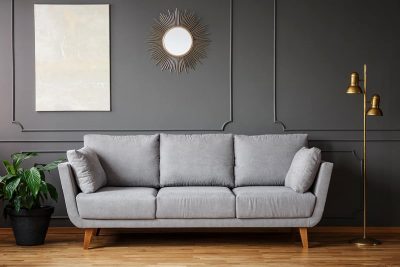
Neutral paint colors are go-to options for living rooms because this is a space in the home which is going to be used by numerous people, so you don’t typically want it to feel overly personalized. Here we take a closer look at what constitutes a neutral and the best neutral paint colors available for the living room.
Here we explore exactly why finding the perfect gray paint for your room is so hard, as well as tips for choosing gray paint and some of the best gray paint colors for living rooms.
Here we look at some tips for getting the perfect white paint color for your bedroom, along with some of the best white paints currently available.
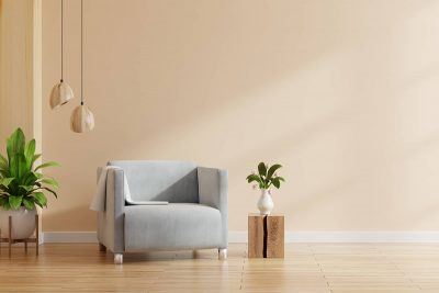
Sand dollar is a shade of paint available from a number of prominent paint manufacturers, including Benjamin Moore, Sherwin Williams, and Dunn Edwards. Sand dollars that are not heavily bleached will have a light beige color, while those that have been in the sun for longer can have a color that is closer to white. For this reason, the color of sand dollars can be disputed as anywhere from off-white through to medium beige.

If you are looking for a new paint color for the front door of your home, then you won’t be short of options. The range of colors available for exterior wood and metal paints over the last decade has exploded, and you can now even have paint customized to create the exact color you want to achieve.
If you want to paint the walls in a room with dark floors, then you may be thinking about ways you can complement the floor color or ways to decorate that will lighten up the feel in the room. Before you can learn about that colors work best with dark floors, you’ll need to identify the undertones in the floor. Here we look at some of the best paint colors for warm, cool, and neutral-toned dark floors.

Red brick houses are popular in ranch-style properties or in historical cities. It can initially be a challenge to find a good paint color for trim, front doors, and window frames on red brick houses, but if you can get to grips with the tones and complimentary colors for your shade of red brick, then you’ll find there are various different colors of paint that can look beautiful on a red brick house.
Blue is such a popular color that is used in many aspects of our life from business, marketing to home decor. And one of their most beautiful variations is cornflower. In this article, we’ll learn what cornflower color is, and how to use it in home decor and interior design.
Cool gray is a medium gray shade that is made from an equal amount of black and white mixed together with a generous splash of blue. Cool gray is grayer than it is blue, but the blue undertones in it are clear to see, giving the color an obviously cool temperature.
Jet black is a deep and dark shade of black. It is used to describe the darkest color of black hair, and it is considered to be the most intense shade of black you can get before you get to total black. Black is a neutral color that, by its very definition, lacks any color at all, whereas jet black will have a slight but typically imperceptible undertone.
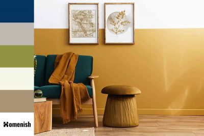
Honey is a golden orange color that is mostly seen in home decor as a finish for wood. Honey oak was very popular in the 1980s and 1990s, and as a result, many homes which have not been renovated still have honey oak flooring, cabinetry, and trim. Other types of wood might also have a honey-colored finish if they have had a honey oak stain applied.
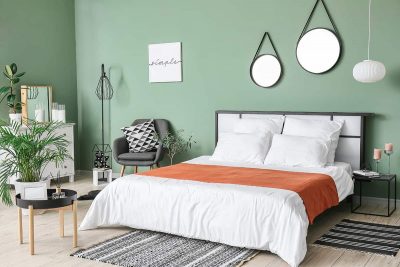
Green is a very trendy color in interior design right now, predominantly because of its links to nature, growth, and new beginnings. The onset of the global pandemic, which meant that many people were stuck to the confines of their homes for long periods of time, has resulted in a need to invite the outdoors in, making us feel closer to nature. One of the best ways to link the outdoor world with the interior of your home is to use color, and since green is the color of nature’s backdrop, this is the perfect color to use.