Yellow is a cheerful and vibrant shade, but it can feel too stimulating in home decor, which might be one of the reasons that bright yellow isn’t commonly used as a wall paint choice or for soft furnishings in homes.
However, as a pastel color, pastel yellow presents a much softer and more delicate color which makes for a warm and cozy atmosphere that is joyful without being intense. Pastel yellow feels tender and lowkey, but it still possesses a positive vibe that is considerably more subtle than other more saturated shades of yellow.
Pastel yellow is not hailed as a particularly modern color, and in fact, when you think of yellow, you might think of your grandma’s kitchen or a dated patchwork bedroom with lemony floral prints; however, there are plenty of ways to use pastel yellow to achieve a contemporary style.
The colors to use alongside yellow are going to impact the vibe that the room gives off, so pay special attention when pairing up pastel yellow with other shades in your home decor.
Table of Contents
Best Colors for Pastel Yellow
Periwinkle blue

| Shade | Hex Code | CMYK Color Code (%) | RGB Color Code | Color |
| Pastel Yellow | #eae556 | cmyk(0%, 2%, 63%, 8%) | rgb(234, 229, 86) | |
| Periwinkle Blue | #a5d1f8 | cmyk(33%, 16%, 0%, 3%) | rgb(165, 209, 248) |
Periwinkle blue is a soft shade of blue with purple undertones. It is named after the periwinkle flower, which bears blooms of the same color. Periwinkle blue is also sometimes known as lavender-blue because it is the same color as some types of lavender, which produce flowers that are bluer toned than purple.
This shade of blue contrasts really nicely against yellow because of the purple hues in it. This is because yellow and purple are opposing colors on the color wheel, which means they are both contrasting and complementary. Periwinkle blue and pastel yellow, due to the fact that they are both quite subdued colors, make for a pretty and subtle contrast.
Periwinkle has a very calming and soothing quality which plays out beautifully against the warm and positive vibes of pastel yellow, resulting in a space that is relaxing and uplifting to be in. This is a color scheme that would work well in any area of the home and can be applied in a variety of ways to achieve different styles.
In a farmhouse-style kitchen, paint walls in pastel yellow and choose periwinkle blue kitchen cabinets and other accessories in blue such as curtains or coffee pots. Choose solid fabrics for a modern feel or patterned fabrics for a more traditional look.
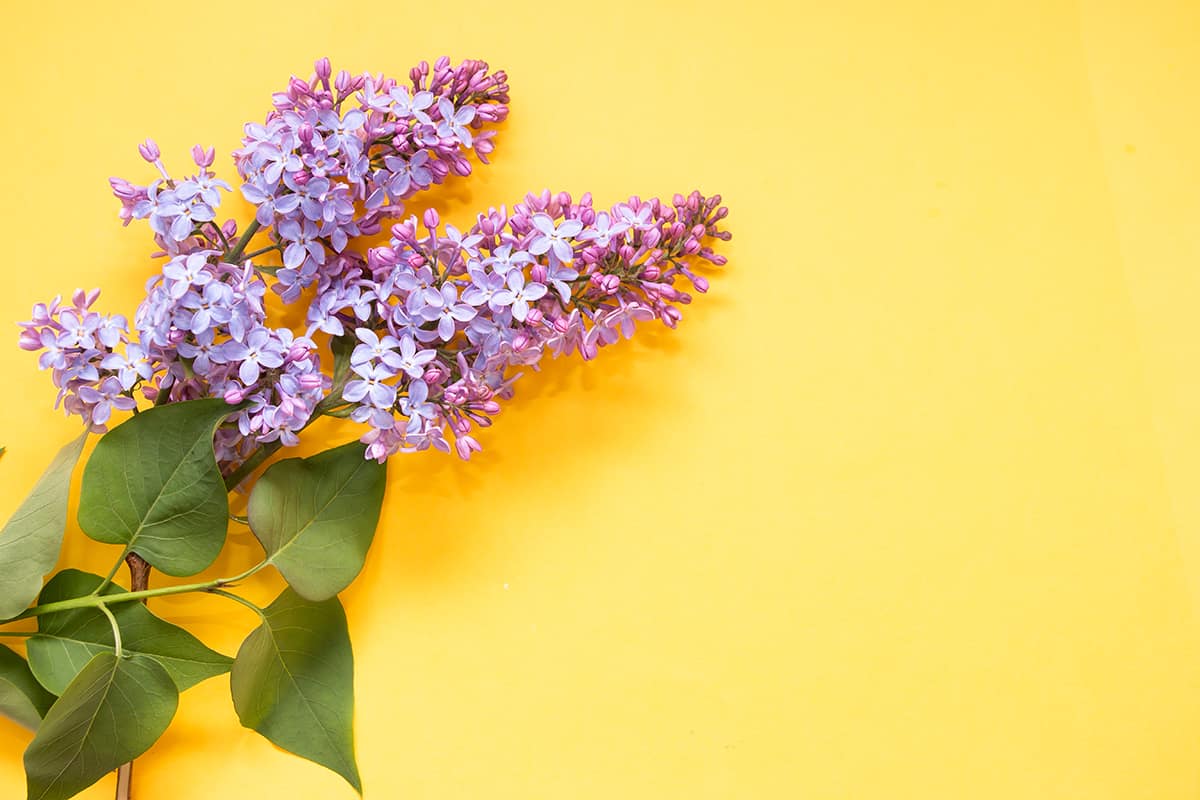
Lilac
| Shade | Hex Code | CMYK Color Code (%) | RGB Color Code | Color |
| Pastel Yellow | #eae556 | cmyk(0%, 2%, 63%, 8%) | rgb(234, 229, 86) | |
| Lilac | #deaaf2 | cmyk(8%, 30%, 0%, 5%) | rgb(222, 170, 242) |
Lilac is a pastel shade of purple, and purple and yellow are opposite colors on the color wheel. So yellow is a nice color that goes well with lilac,
They create an obvious contrast that is not too startling due to the fact that both shades are quite muted; however, they have the ability to make each other more intense. This color scheme works really well in living rooms for a relaxed take on a glamorous look.
Choose a pastel yellow cotton upholstered sofa with velvet lilac cushions trimmed with pom poms or tassels for added interest and texture. Lavender scented candles and lilac sheer drapes against pastel yellow walls will help to make this color scheme feel stylish and contemporary.
Lilac and pastel yellow create a distinctly feminine vibe without any hint of pink, so these are great colors to use if you want a feminine space that isn’t predictable pink. It can be used to great effect in a teenager’s room if you want to maintain an innocent yet gradually maturing look, and it also works well in an adult bedroom for a fresh, spring-like vibe.
Choose petite floral fabrics if you want to highlight the pretty side of this color scheme or geometric patterns for a more modern take.
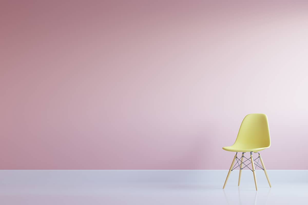
Pastel pink
| Shade | Hex Code | CMYK Color Code (%) | RGB Color Code | Color |
| Pastel Yellow | #eae556 | cmyk(0%, 2%, 63%, 8%) | rgb(234, 229, 86) | |
| Pastel Pink | #d9bacb | cmyk(0%, 14%, 6%, 15%) | rgb(217, 186, 203) |
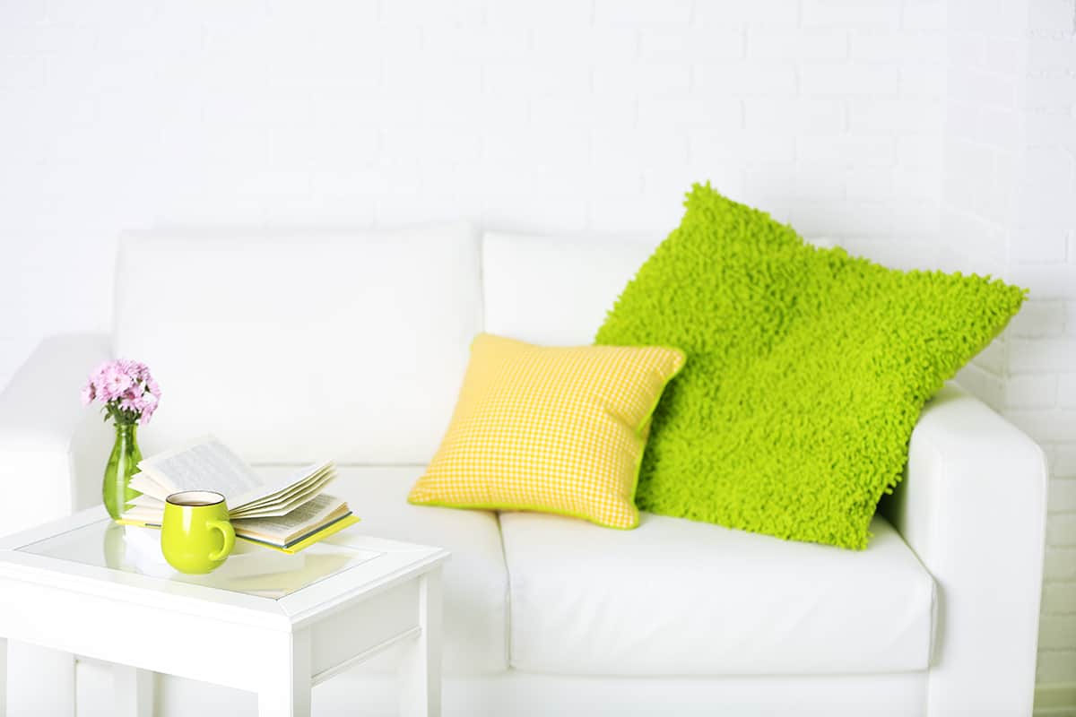
Pastel pink and pastel yellow make for a really sweet combination of colors that might remind you of a vanilla and strawberry ice cream dessert. These colors can be put to great use in a nursery for a pretty baby room that is cute and bright, but they can also work well in more common living areas of the home, such as bathrooms and dining rooms.
To avoid creating a space that is too sickly sweet, choose a third neutral color to help separate these colors, such as white or cream. Pale gray can also work well as a neutral base for pastel pink and pastel yellow accessories because it goes really nicely with both of these shades.
Choose fabrics that contain both of these colors to help tie them together in a dining room, such as pink and yellow striped curtains set against pale gray walls and pastel pink plates set on pastel yellow placemats on the dining table.
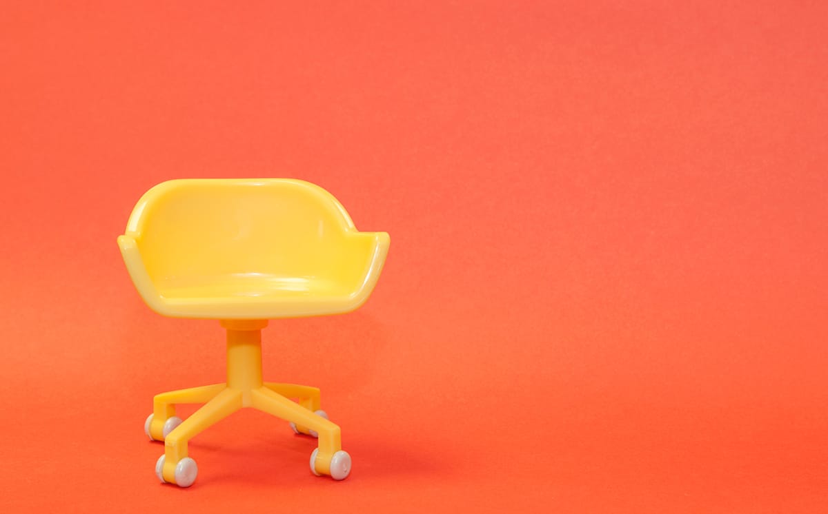
Orange
| Shade | Hex Code | CMYK Color Code (%) | RGB Color Code | Color |
| Pastel Yellow | #eae556 | cmyk(0%, 2%, 63%, 8%) | rgb(234, 229, 86) | |
| Orange | #fc6c54 | cmyk(0%, 57%, 67%, 1%) | rgb(252, 108, 84) |
Orange is a bright and vibrant color that seems to go hand in hand with yellow. As two warm and positive colors, this pairing will make for a cheerful space that feels creative and full of good energy. Bold orange set against bright yellow can be too overwhelming, but pastel yellow creates a slightly more muted look with orange.
You could also choose burnt orange with pastel yellow for a warmer and more cozy feel as opposed to bright orange, which will make for a more exuberant vibe. For a fresh yet cozy feeling living room, choose a pastel yellow sofa with thick knit burnt orange wool blankets casually draped over the side.
Lime green
| Shade | Hex Code | CMYK Color Code (%) | RGB Color Code | Color |
| Pastel Yellow | #eae556 | cmyk(0%, 2%, 63%, 8%) | rgb(234, 229, 86) | |
| Lime Green | #8cd00a | cmyk(33%, 0%, 95%, 18%) | rgb(140, 208, 10) |
For a fresh and lively atmosphere in a room, pair pastel yellow with lime green. Any shade of green creates a feeling of new life and energy, but lime green, in particular, is a very vital shade that is synonymous with vigor and high spirits. This is a great color combination for a kitchen where most people want their space to feel fresh, clean, and uplifting.
For a modern tropical take on these colors, use a wallpaper with a pastel yellow background, and a bold leaf print in lime green then set this against brown hardwood floors and white kitchen cabinets. Tie in the yellow and green shades with accessories such as lime green candles lined up on a windowsill or pastel yellow tea towels.
Cream
| Shade | Hex Code | CMYK Color Code (%) | RGB Color Code | Color |
| Pastel Yellow | #eae556 | cmyk(0%, 2%, 63%, 8%) | rgb(234, 229, 86) | |
| Cream | #faead0 | cmyk(0%, 6%, 17%, 2%) | rgb(250, 234, 208) |
Pastel yellow is an easy color to pair with cream as it is a neutral shade and the two colors are actually very similar. Cream is essentially white mixed with a small amount of yellow and orange, so in a way, it could be considered as an extremely pale shade of yellow. The two colors are both muted and warm, so they are a nice choice in a space where you want to feel quite relaxed and subtle.
These are not strong colors, so they won’t force a bold personality onto a space, so they are also a good option for common living areas in the home such as a living room, as well as a guest bedroom.
Cream and pastel yellow create a soothing yet uplifting feel when used together, and they can work to achieve a traditional or modern style depending on the furniture and accessories you use.
Apricot

| Shade | Hex Code | CMYK Color Code (%) | RGB Color Code | Color |
| Pastel Yellow | #eae556 | cmyk(0%, 2%, 63%, 8%) | rgb(234, 229, 86) | |
| Apricot | #f09d53 | cmyk(0%, 35%, 65%, 6%) | rgb(240, 157, 83) |
Apricot is an orange-yellow shade that is named after the color of the apricot fruit; however, it is a more muted, pastel version compared to the color of real apricots.
Apricot is a warm and gentle color; so the pastel yellow and apricot color scheme creates a soothing yet fresh feeling.
This is a warm and gentle color that will look soothing yet fresh next to pastel yellow. Use these colors in a bedroom for a welcoming space you want to chill out in.
Apricot-painted walls will look pretty alongside pastel yellow bed sheets, creating an atmosphere that leans slightly towards feminine but not overly so.
Pale gray
| Shade | Hex Code | CMYK Color Code (%) | RGB Color Code | Color |
| Pastel Yellow | #eae556 | cmyk(0%, 2%, 63%, 8%) | rgb(234, 229, 86) | |
| Pale Gray | #b2b1ba | cmyk(4%, 5%, 0%, 27%) | rgb(178, 177, 186) |
Gray and yellow are a classic color combination, but darker shades of gray will feel too intense alongside the gentle pastel yellow, so instead, try softer shades like dove gray.
If you want to use pastel yellow in your home decor but are concerned that it will look too traditional or old-fashioned, then choose pale gray to use with it to ensure a modern style is achieved. Gray and yellow work together to create a look that is somehow timeless yet contemporary, and this will be enhanced if you choose modern prints or patterns on fabrics such as geometrics.
These colors are a popular choice for a gender-neutral nursery; paint walls in a soft shade of gray and opt for pastel yellow accessories such as curtains and blankets, or paint the walls in pastel yellow and go for gray carpets and gray painted furniture.
If you are conscious of wall colors being future-proof, then gray will be a good choice as you can swap out the pastel yellow accessories at a later date if your child decides they want something more suited to their personality because gray is a modern neutral shade that will work with almost any other color you choose.
Gray and yellow can also look really nice in a kitchen for a contemporary take on a farmhouse kitchen style.
Choose gray and pastel yellow striped curtains and gray kitchen cabinets with pastel yellow tea and coffee storage jars.