Hot pink is a very distinctive color that is a medium pink shade, being neither pale nor dark.
It is heavily saturated and very intense, with an electric, almost neon quality to it. It has some magenta tones in it, but with a heavier ratio of red to make it definitively pink rather than purple.
Though pink, at least since the mid-1900s, has been associated with innocence and femininity, hot pink has a completely different feel. While lighter or more muted shades of pinks have a pretty and delicate air to them, hot pink instead feels strong, powerful, and independent.
As a result, hot pink has actually been adopted as the antithesis of paler shades of pink and is used by people who want to display signs of rebellion or standing out from the crowd.
Hot pink, when used with black, is synonymous with the punk movement. It has taken on an almost ironic attitude as a shade of pink that refuses to conform with the rest of the dainty pink shades.
While hot pink can be seen as rebellious in some contexts, it also has associations with femininity, as it is very close in color to barbie pink.
As such, hot pink is a color that is popular among young girls and is therefore commonly used in children’s fashion and interior design.
Table of Contents
What Colors Go With Hot Pink?
Mint green
| Shade | Hex Code | CMYK Color Code (%) | RGB Color Code | Color |
| Hot Pink | #dc1b74 | cmyk(0%, 88%, 47%, 14%) | rgb(220, 27, 116) | |
| Mint Green | #9bbdb0 | cmyk(18%, 0%, 7%, 26%) | rgb(155, 189, 176) |
The opposite color to pink on the color wheel is green, which means pink and green are both contrasting and complementary colors. They can be used together to create an appealing sort of clash that makes both colors appear brighter and more vivid.
Hot pink makes a nice pairing with mint green because it contains the right hues to contrast against the pink; however, its pastel nature of it means that the contrast isn’t too intense. While hot pink can hold up against brighter colors, it works well with pastels to create a color scheme that is easier to live with.
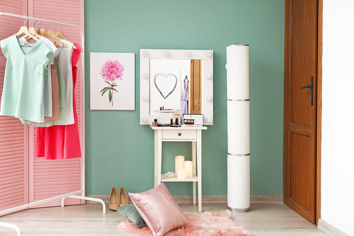
Mint green has refreshing and soothing energy that helps to balance out the strong and vibrant energy of hot pink. In a white bathroom with mint green tiles, choose hot pink towels to give the space a fun vibe.
Lime green
| Shade | Hex Code | CMYK Color Code (%) | RGB Color Code | Color |
| Hot Pink | #dc1b74 | cmyk(0%, 88%, 47%, 14%) | rgb(220, 27, 116) | |
| Lime Green | #c9d164 | cmyk(4%, 0%, 52%, 18%) | rgb(201, 209, 100) |
Lime green is a vibrant, yellow shade of green that makes for a really striking look when set against hot pink. As a shade of green, lime green is a contrasting and complementary shade with hot pink, but unlike mint green, it is certainly not mellow.
Pick the pink and lime green color combo in a space where you want bold and bright energy, such as a tropical-themed dining room. Since these colors are so impactful, they need to be balanced out with a third neutral shade.
In a white dining space, choose lime green placemats and lime green curtains, with a pink vase as the centerpiece and wooden chairs painted in glossy hot pink furniture paint.
Aquamarine

| Shade | Hex Code | CMYK Color Code (%) | RGB Color Code | Color |
| Hot Pink | #dc1b74 | cmyk(0%, 88%, 47%, 14%) | rgb(220, 27, 116) | |
| Aquamarine | #57a9b5 | cmyk(52%, 7%, 0%, 29%) | rgb(87, 169, 181) |
Aquamarine is a blue-green color that is a lot like turquoise, but with slightly more white added to give it a lighter shade. As this color contains some green hues, it provides a contrast with pink; however, the contrast is more subtle due to the prominence of blue in aquamarine.
The energy of aquamarine feels both calming and refreshing, and it makes for a nice backdrop to hot pink because it has a soothing presence.
You can use pink to pair with aquamarine in a variety of styles. It will look young and fresh in a child’s or teenager’s bedroom, with hot pink and white striped walls, set off with aquamarine bedding and curtains.
These colors will also work well in an exotic style space, with a hot pink wallpaper based around birds and tropical flowers and a flashy aquamarine upholstered sofa.
For a more dramatic look, paint the walls of a dining room in black and opt for aquamarine and pink dining chairs and a fresh bunch of hot pink flowers in an aquamarine glass vase.
Black
| Shade | Hex Code | CMYK Color Code (%) | RGB Color Code | Color |
| Hot Pink | #dc1b74 | cmyk(0%, 88%, 47%, 14%) | rgb(220, 27, 116) | |
| Black | #000000 | cmyk(0%, 0%, 0%, 100%) | rgb(0, 0, 0) |
Black and hot pink are two colors that create a particular atmosphere when they are used together. The hot pink and black color schemes inspire a sense of attitude, non-conformity, and rebellion, which is why they are sometimes linked to the punk movement.
If you want to display an outlandish personality, hot pink and black can be fun to use in home decor. In a living room, paint the walls white and choose black sofas with hot pink cushions and throws. Choose pictures of your favorite musicians printed in hot pink ink, and hang them in simple black frames.
For a rock and roll vibe, display a black electric guitar on the wall with a hot pink strap, or frame some vinyl LP covers which feature black and hot pink.
Orange
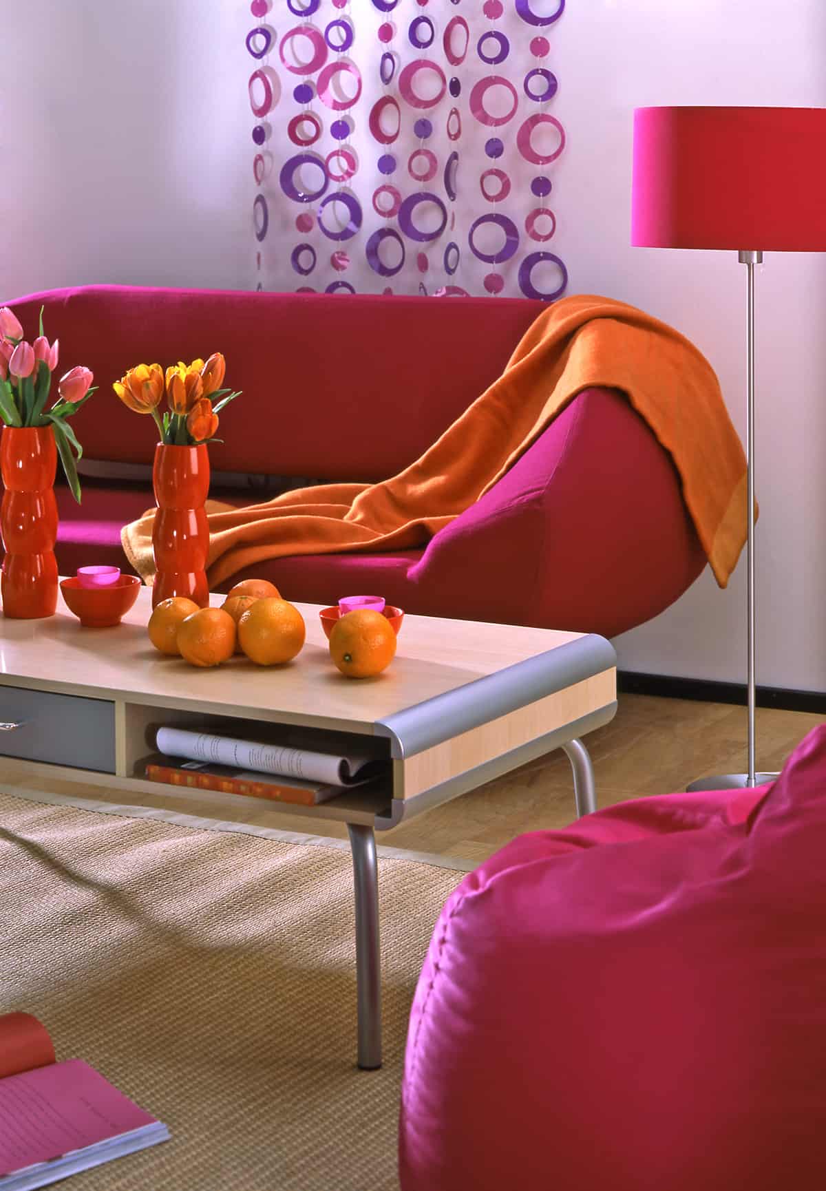
| Shade | Hex Code | CMYK Color Code (%) | RGB Color Code | Color |
| Hot Pink | #dc1b74 | cmyk(0%, 88%, 47%, 14%) | rgb(220, 27, 116) | |
| Orange | #ff8651 | cmyk(0%, 47%, 68%, 0%) | rgb(255, 134, 81) |
Bright orange looks really interesting alongside hot pink in an analogous color scheme. These two colors do not contrast against each other but instead are quite close to each other on the color wheel. They will be too intense when used alone, but with a third color that is neutral, they can be very expressive.
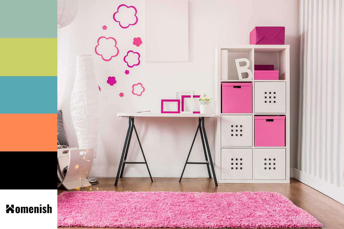
Opt for white walls in a teenager’s bedroom and use both hot pink and bright orange accessories and home furnishings, such as a hot pink rug and a hot pink ceiling light, with orange curtains, orange bed sheets, and a comforter that features both hot pink and orange.
These colors make for a style that feels modern and fun, and they can work in any room.
Using Hot Pink in Home Decor
Eclectic look
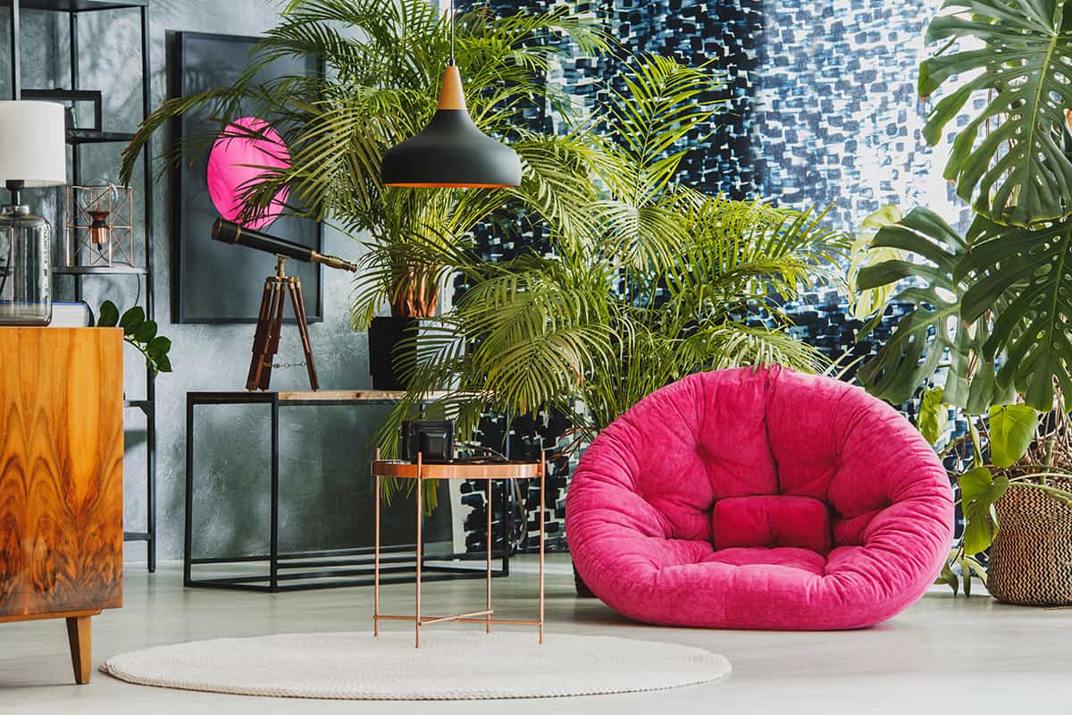
Since hot pink has free-spirited energy, it works perfectly in quirky, eclectic decor styles. It can be mixed with other vibrant colors against a neutral backdrop for a really interesting look. For example, paint living room walls in a very pale shade of gray, and select an armchair upholstered in hot pink velvet, with cyan plant pots, emerald green blankets, and a yellow and pink patterned rug.
The eclectic style works best when it doesn’t look too put together as if it has happened completely organically with no prior planning, but of course, to achieve this in reality, you need to carefully plan each aspect of the room, probably even more so than in interior styles where a more definitive color scheme is used.
With an eclectic look, you will typically use five or six different colors compared to the three you would ordinarily use in a standard color scheme. This can make things complicated, especially when you’re trying to ensure a balanced look that looks casual and fun without being too chaotic.
Choose hot pink as one of your main colors, along with a neutral shade, and use these more heavily than your other accenting shades.
Tropical style
Hot pink is popularly used in tropical patterns and tropical decor because it is such a lively color that it is reminiscent of bright and bold summer fun, with tropical flowers and tropical-inspired cocktails. For a room that is tropical-themed, paint the walls in lime green and use hot pink and white accents.
In a bedroom with lime green walls, choose white curtains, white bed linen, and a white rug, with hot pink cushions, hot pink lampshades, and some framed prints on the walls based around a tropical theme with plenty of hot pink features. This might be a rainforest picture, a botanical picture, or maybe a flamingo.
Wallpaper
As a very bold color, hot pink can be too intense when it is used in plain fabrics or as plain swathes of paint on the walls. To feel the energy of hot pink without having it feel overwhelming, opt for a wallpaper that is predominantly hot pink or has heavy hot pink accents in it.
In a bathroom, using a hot pink wallpaper on all of the walls will make the space appear very modern and edgy. Choose an accent color for the accessories in the room, such as the towels and soap dispenser, which will contrast against the hot pink wallpaper without causing too much of a clash. A dark forest green would work well, or a soft gray.
In a bedroom or living room, hot pink wallpaper would make for an interesting feature wall, and this is another way that you can introduce hot pink into a space without it appearing over the top.
Accessories

Hot pink is a color that most people will choose because they want to make an impact. This typically works best when you use the color sparingly because when the room is saturated in hot pink, it will feel overstimulating, and you won’t achieve the desired results.
Instead, choose accessories in hot pink to make a statement, such as hot pink cushions on a pale blue sofa or hot pink plant pots lined across a white marble countertop. To ensure the style looks contemporary and cool, rather than excessive, use hot pink in moderation and enjoy the benefits of this bold and striking color.