Pistachio is a rich, earthy green that can be used to add color and depth to your wardrobe. It’s also a popular choice for interior designers, who often use pistachio as an accent color in kitchens and dining rooms. Pistachio is an easy-to-find color that can be used in decorating and fashion to great effect.
Keep reading to learn what it is, how to make it, and how to use it well in home decor.
Table of Contents
What is Pistachio Color?
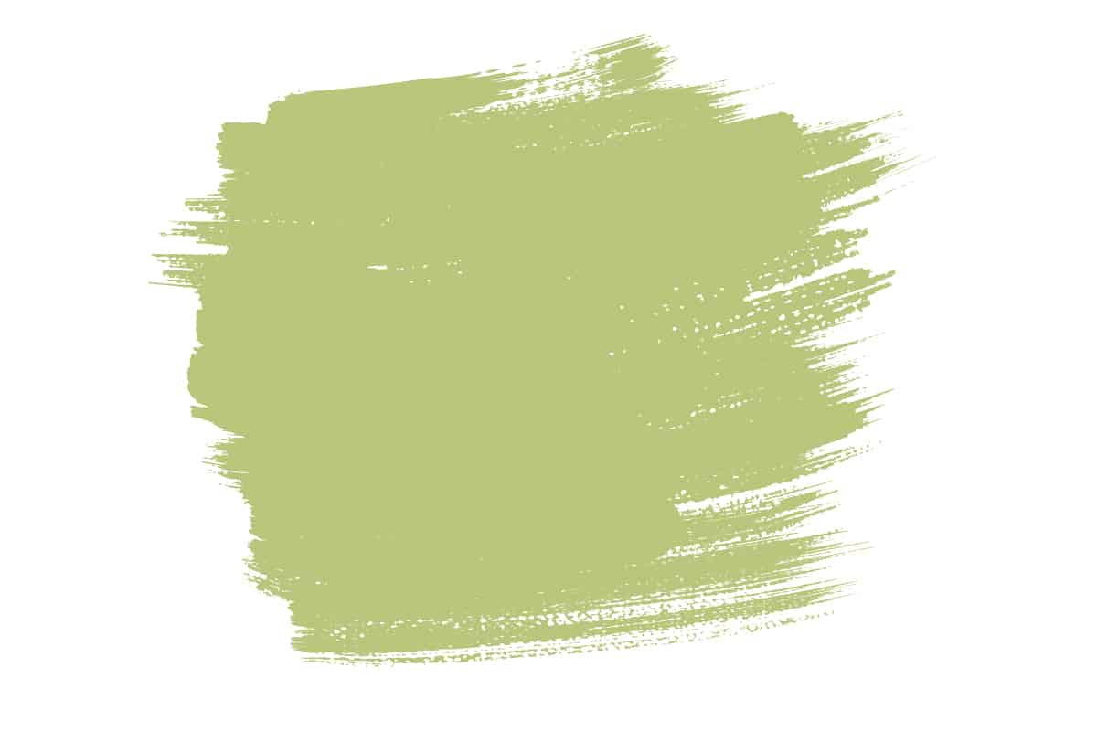
Pistachio is a light-green color that is more bright than pastel. Pistachio is often used to describe the color of the shell of pistachios, but it can also be used to describe any object that is greenish-yellow in coloration.
The word pistachio comes from the French word for nut, pis tache, which means “testicle” or “piss stain,” presumably because there’s something about them that reminds you of these body parts.
Pistachio usually has some yellow in it (sometimes even just slightly tan) and some blue; however, if you see something described as a pure pistachio color or a rich pistachio hue, then this means that it contains no red at all and has been tinted with blue to make it stand out more vividly.
For example: If someone says they have “rich” or “pure” green eyes without any hint of brown or other colors mixed in, then they probably mean these colors look like they’re glowing from within their own bodies rather than having any sort of tint on top.
Pistachio is a shade of green that falls somewhere between yellow and blue. It’s brighter than most mints, with more yellow in it. When you think about how the fruit looks, you’ll notice that the outer shell is a little more yellowish than the inside meat. Pistachio is also an example of a color whose name doesn’t accurately describe its appearance.
The word “pistachio” implies something bright and vibrant–but in reality, this shade leans more towards subtlety and refinement than flashiness or boldness.
Pantone 7489 C is one example of this color: it’s a light green hue with just enough warmth to feel like something you’d find in nature (rather than on your dining room walls).
On the darker end of the spectrum, you can find Pantone 7492 C, which is still pretty bright but has a little bit more ‘muddy green’ in it. The darker end of the spectrum would be Pantone 7492 C, which is still pretty bright but has a little bit more ‘muddy green’ in it. You can find this color in many different paint chips and online, and it’s a great choice for any decorating project.
How to Make Pistachio Color
Using paint tints, you can make a light pistachio color by mixing white with yellow and green. When you have a paint tint, you can use it to make your own light pistachio color. To make a light pistachio color for your painting, mix the following:
- White with yellow and green. This will create a middle-toned pistachio shade.
- White with red and blue. This will create a very light pistachio shade that’s almost pure white with just enough red/green to give it some warmth and depth.
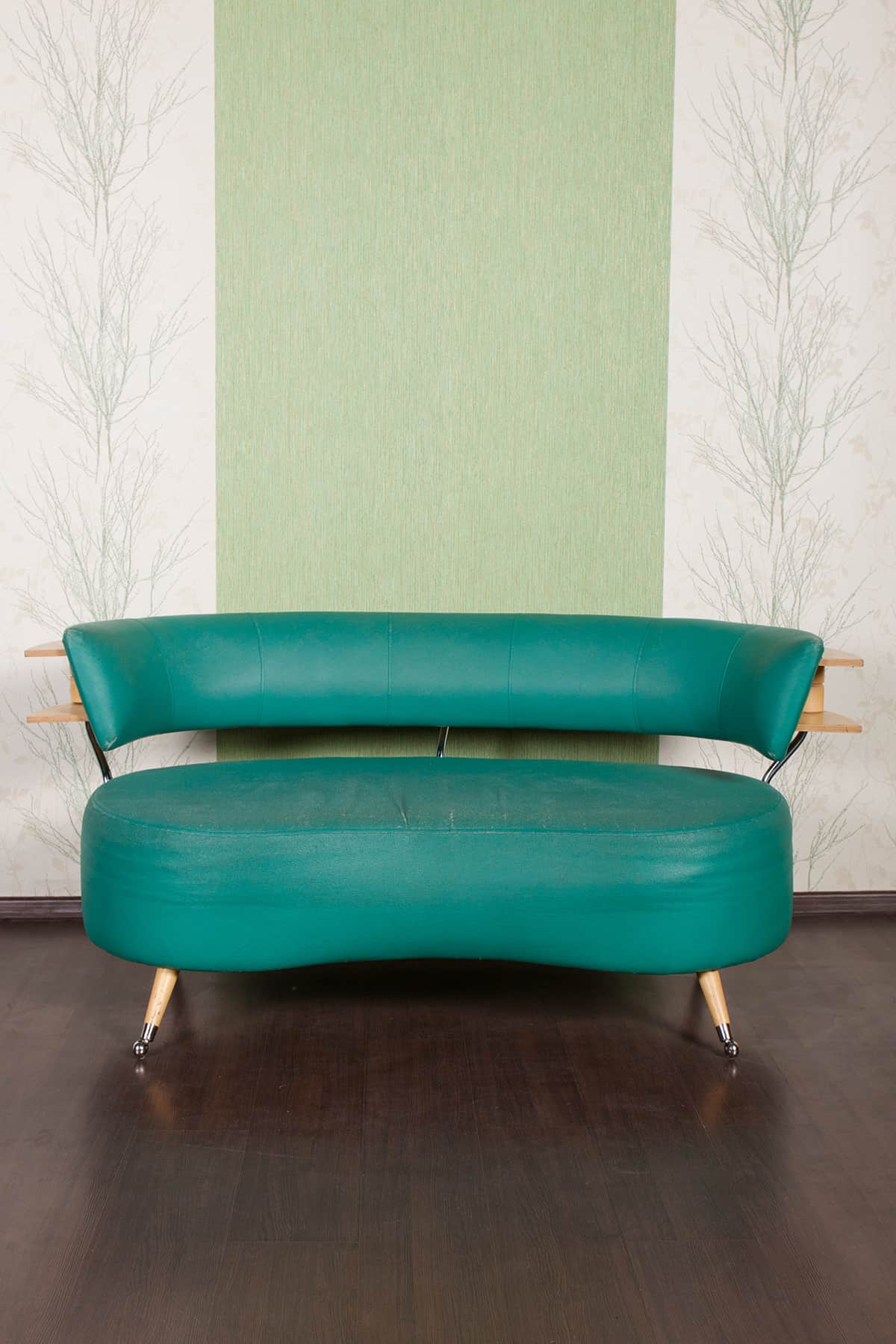
How to Use Pistachio Color in Home Décor and Fashion
Pistachio is the color that stands out. It’s definitely not one you see every day, but it can be used in decorating and fashion accessories to great effect. You may have seen pistachio-colored food coloring, or maybe even on the menu at your favorite restaurant. You might have also seen it on some clothing or other items before!
The best part about this bright, vibrant green color is that it’s easy to find. If you don’t want to go out of your way to get pistachio paint for your walls or buy clothes with the color already printed on them (or if neither of those options are within reach), there are plenty of other options available:
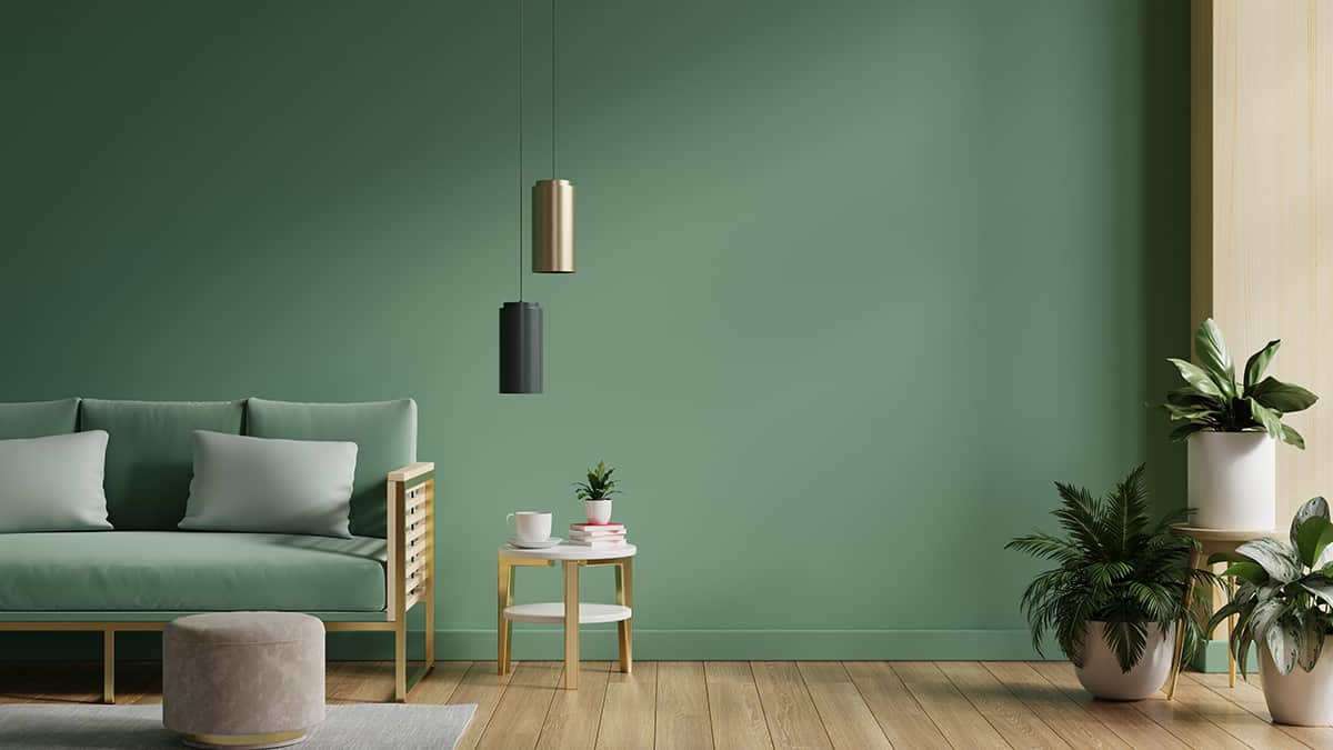
If you’re thinking of painting a room in your home, consider buying a tinted paint. Tints are often used in home decorating and give the room a bolder feel. For example, if you have an empty wall that needs some color, consider purchasing pistachio-colored paint and adding it to the wall.
You can also use tints when painting furniture pieces like bookcases or desks that are made out of wood. If using this technique on wood furniture pieces isn’t working for you, and you would rather see what happens when using tints on fabric items like curtains or tablecloths, then go ahead! As long as it looks good, then who cares how creative someone was with their design?
When using pistachio for decorating or fashion, try to pair it with other complementary colors such as white and cream or strawberry red and coral.
To add some flair to your pistachio-colored space, try pairing it with other complementary colors such as white and cream or strawberry red and coral. Patterns are also an excellent way to add interest to your room.
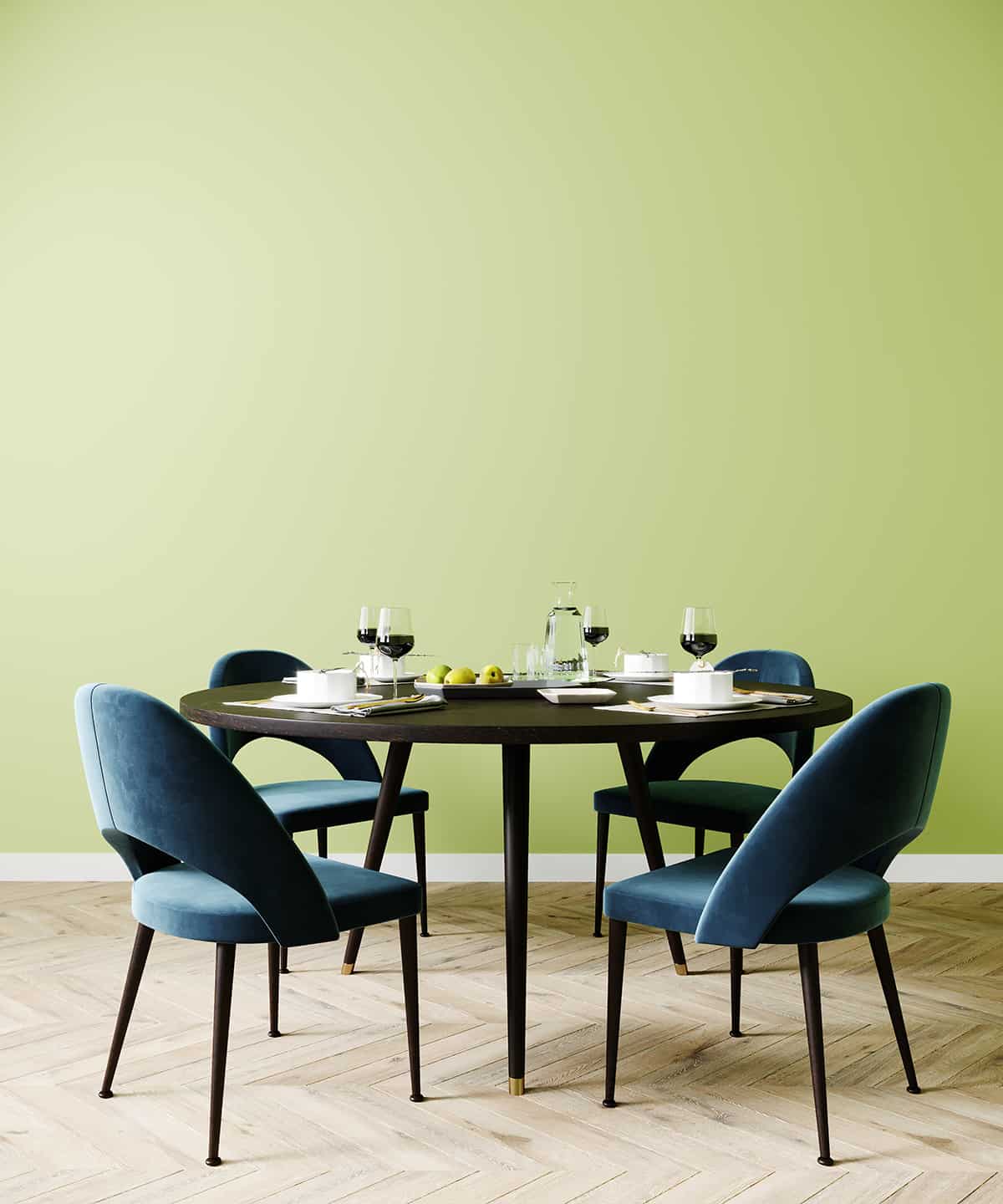
Pistachio pairs well with other green tones like blue-greens or turquoise, so you could create a patterned scheme on the wall or floor that includes these colors. When using pistachio for decorating or fashion, try to pair it with other complementary colors such as white and cream or strawberry red and coral.
Another idea is to use it as a background for other colors (e.g., aqua). If you have a lot of natural light in your room, this color will really shine! Lastly: if there is something about the architecture of your home that stands out—such as trimming around windows—pistachio will make it pop!
If you have skin tones that are cool, pistachio will warm them up and make them look more flattering than they might otherwise appear.
If you have warm skin tones, however, using this color may give your face a flushed appearance—so if that’s the effect that you’re going for (say, with a high-contrast outfit), go right ahead! Just be aware of how it may affect other people’s perception of how healthy or vibrant their appearance is before deciding whether or not to incorporate it into your own wardrobe or home décor choices.
Colors to Use with Pistachio
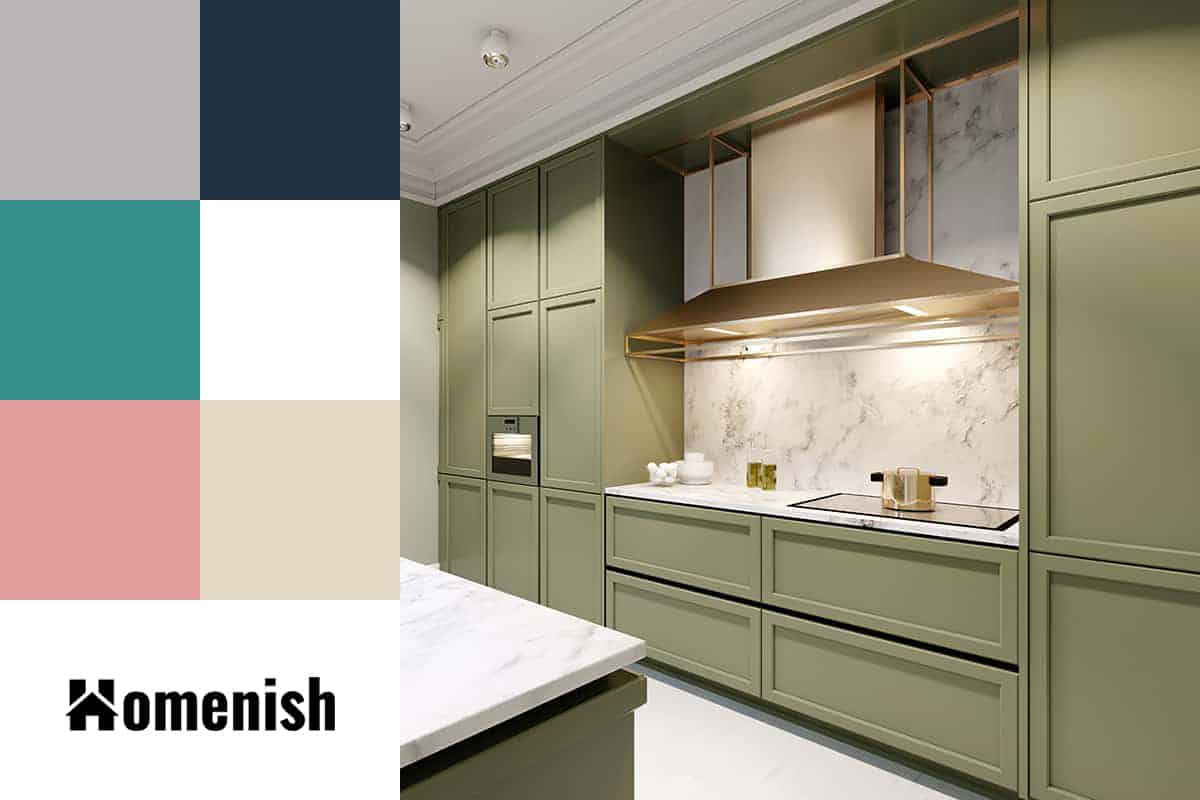
Gray (color family)
| Shade | Hex Code | CMYK Color Code (%) | RGB Color Code | Color |
| Pistachio | #abb76d | cmyk(7%, 0%, 40%, 28%) | rgb(171, 183, 109) | |
| Gray | #b9b4b8 | cmyk(0%, 3%, 1%, 27%) | rgb(185, 180, 184) |
Gray (or “cool gray“) is one of the most versatile colors on the color wheel. It’s a great neutral in that it can be paired with almost any other color and look great.
When paired with a warm tone like pistachio, gray brings out the green in the color and will make it appear more vibrant. Gray is also known for being a chameleon color—it will change based on its surroundings, so if you’re unsure about how two shades might look together, try combining them as neutrals before choosing another hue to go with them!
| Shade | Hex Code | CMYK Color Code (%) | RGB Color Code | Color |
| Pistachio | #abb76d | cmyk(7%, 0%, 40%, 28%) | rgb(171, 183, 109) | |
| Navy Blue | #1d3140 | cmyk(55%, 23%, 0%, 75%) | rgb(29, 49, 64) |
Navy blue is a deep shade of blue. Navy blue is sometimes described as blue-black, but this is not correct. Navy blue is a dark shade of blue that isn’t actually black but rather a bluish-black or dark shade of blue.
Turquoise
| Shade | Hex Code | CMYK Color Code (%) | RGB Color Code | Color |
| Pistachio | #abb76d | cmyk(7%, 0%, 40%, 28%) | rgb(171, 183, 109) | |
| Turquoise | #368f89 | cmyk(62%, 0%, 4%, 44%) | rgb(54, 143, 137) |
Turquoise is a blue-green color that may be used to describe the color of the gemstone turquoise. It is also a shade of cyan, not to mention one of the signature shades in Christina Aguilera’s wardrobe.
If you’re looking for a way to create contrast but don’t want to stray too far from pistachio, consider using turquoise as your bold choice. You can pair it with pastel shades like lilac and peach or even browns and blacks!
Rouge Pink
| Shade | Hex Code | CMYK Color Code (%) | RGB Color Code | Color |
| Pistachio | #abb76d | cmyk(7%, 0%, 40%, 28%) | rgb(171, 183, 109) | |
| Pink | #e49e9e | cmyk(0%, 31%, 31%, 11%) | rgb(228, 158, 158) |
You can use this color to bring out the pink undertone in a pistachio green room.
Rouge pink is a feminine color that reminds me of rose petals and wine, which makes sense since it’s also called “raspberry.” I love how it looks on the walls of my bedroom.
If you’re feeling bold and want to use this as an accent color for your pistachio-green kitchen, try mixing it with matte black accents like hardware or cabinets by painting them rouge or deep red to create contrast and balance between warm and cool colors. If you don’t want anything too drastic (or expensive), simply adding some rouge touches throughout your space will do the trick!
Gold
| Shade | Hex Code | CMYK Color Code (%) | RGB Color Code | Color |
| Pistachio | #abb76d | cmyk(7%, 0%, 40%, 28%) | rgb(171, 183, 109) | |
| Gold | #e3d9c4 | cmyk(0%, 4%, 14%, 11%) | rgb(227, 217, 196) |
Gold is a warm color, which means it works well with cool colors like pistachio. It also pairs nicely with colors like beige, caramel, and brown.
When selecting furniture and accessories for your interior design scheme that includes pistachio, gold accents will add a touch of elegance and sophistication to your space.
White
| Shade | Hex Code | CMYK Color Code (%) | RGB Color Code | Color |
| Pistachio | #abb76d | cmyk(7%, 0%, 40%, 28%) | rgb(171, 183, 109) | |
| White | #ffffff | cmyk(0%, 0%, 0%, 0%) | rgb(255, 255, 255) |
White is a versatile color that goes with almost any color. It’s a good choice for weddings because it makes everything look more elegant and sophisticated.
White is also a good choice for formal wear or decorating, especially if you want to create an airy feeling in your room. If you have no idea what colors to use with pistachio, then start with white!