If you love a bright and happy color tone in your home, the marigold color could be one of the best options. Here we’ll uncover what makes marigold color, what it means, and how to pair with it.
Table of Contents
What is Marigold Color?
Marigold is one of the colors in the RYB color space model. RGB values for marigold are 235, 138, 30, and CMYK values are 0, 41, 87, 8. Its hex code is #FFD700 .
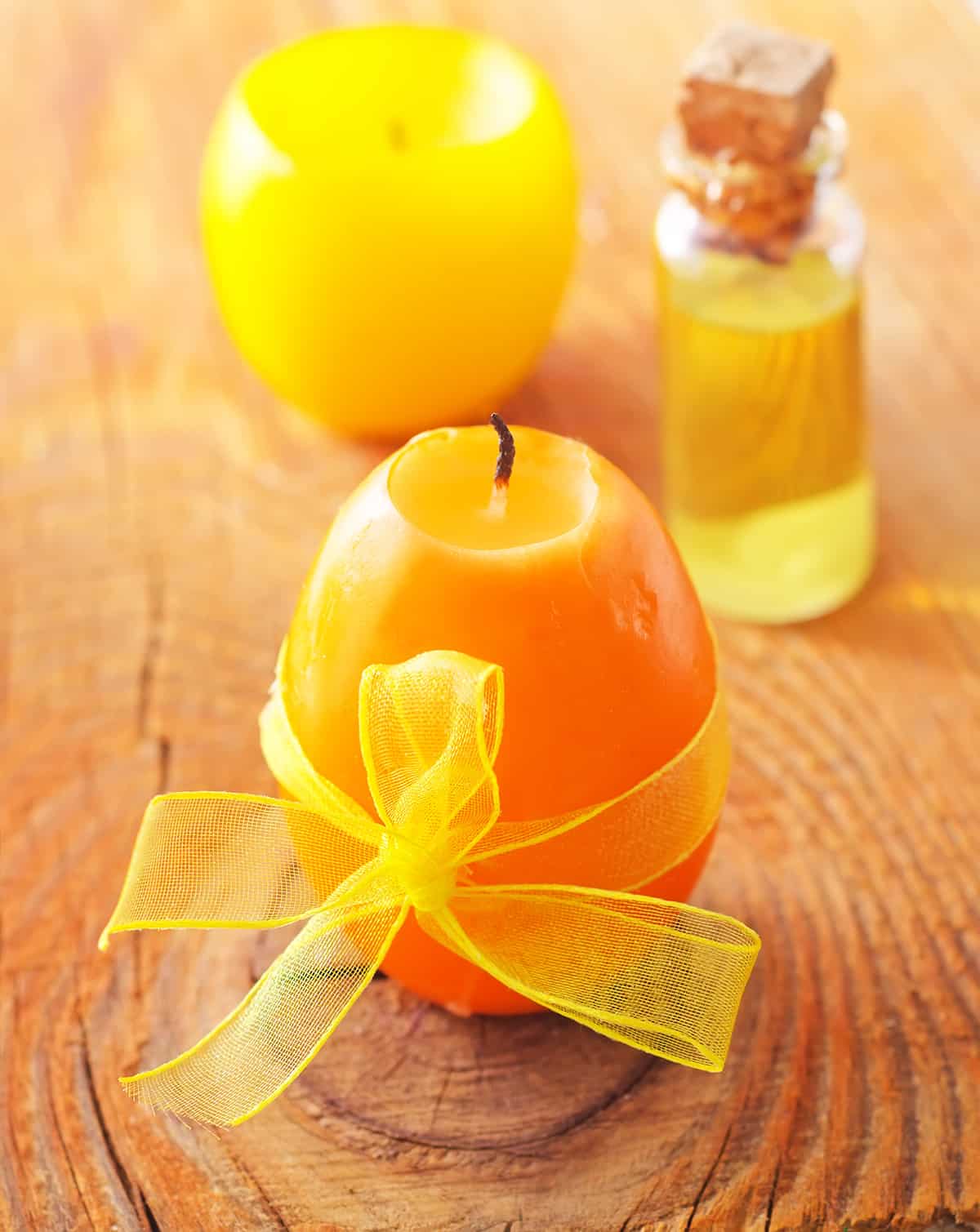
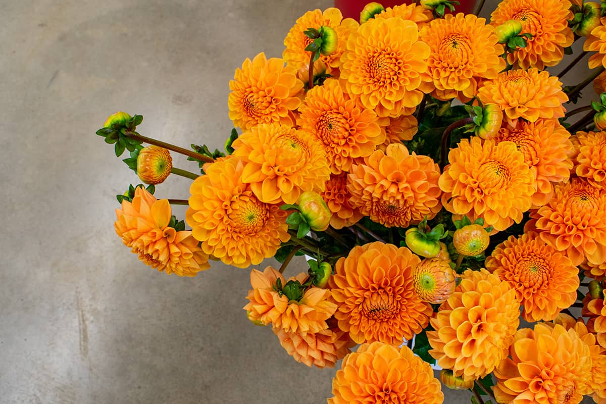
Marigold is a yellow-orange color that has some red undertones to it. It’s named after the flower of the same name because of its resemblance to marigolds as they grow in gardens.
Marigold can be found in nature. It is an orange/yellow flower that can be seen during late summer and early fall.
Marigold Color Meaning
The marigold color meaning has a lot to do with the sun, which is also why it’s linked to warmth and happiness. This flower grows in the aridest regions of the world and thrives in harsh conditions. The meaning of the marigold symbolizes creativity, passion, energy, and sunshine. It represents joy, excitement, and optimism—all things that you want to feel when wearing this beautiful hue.
The golden yellow color of this flower can evoke feelings of warmth which makes it ideal for colder months like fall or winter when you need something that will keep you feeling cozy!
A symbol of the sun, marigold is a flower that blooms in the fall and summer seasons. Marigolds are used for decorations during the Day of the Dead and are also used for events such as weddings. Orange marigolds represent passion, whereas yellow marigolds represent creativity.
Most people use marigolds during weddings as part of their floral arrangements because they symbolize love, happiness, beauty, and fertility.
Orange marigolds are often used when someone wants to express their feelings of affection towards another person or group of people, while yellow marigolds can represent creative thoughts or ideas related to art forms such as music writing projects like songs lyrics which may require creativity from writers or musicians who work together on these types of projects together regularly.”
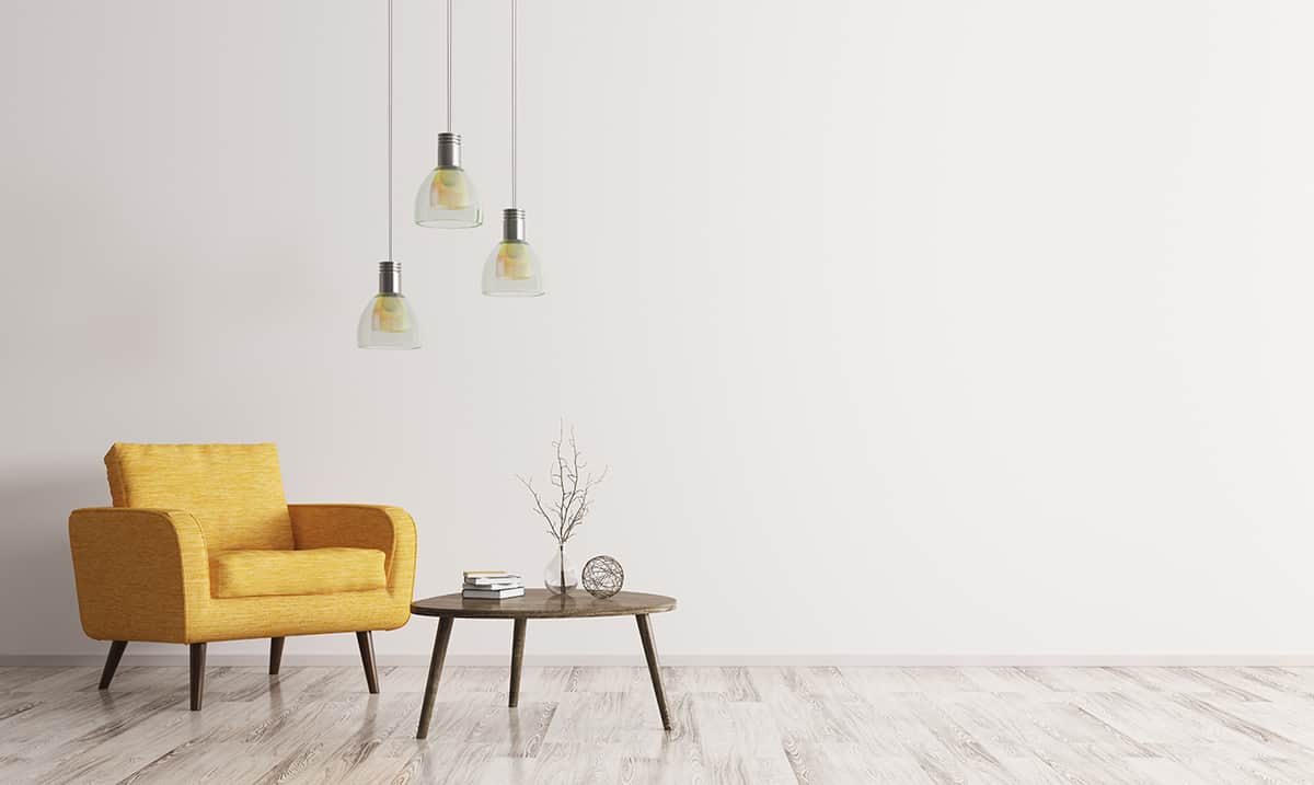
Marigold Color in Home Decor
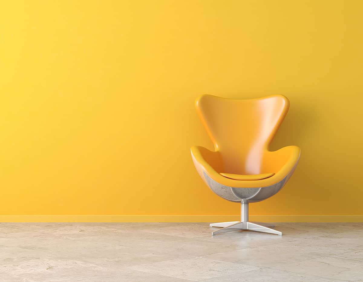
Marigold is a warm color, meaning it has a warm or yellowish cast. Marigold can be used in home decor for a tropical look or as an accent color to spice up the interior of your home.
Marigold is also popular in art because it has been used to create works that depict Caesar’s Palace in Las Vegas and The Wizard of Oz movie poster, among other things. It’s also featured on many fashion pieces, including clothing and accessories like scarves and handbags. Marigold was even used to create some of Oprah Winfrey’s outfits when she hosted her talk show!
Foods that feature marigold include ice creams such as pistachio gelato with marigolds, cookies with sprinkles made out of candied petals (which would make an excellent snack), and salad dressings that have been tossed with diced vegetables as well as tea cakes filled with currants (a sweet fruit).
In addition, many dishes can be served topped off by these tasty petals, such as tacos stuffed with chicken or pork along with lettuce leaves, while others use them fresh atop nachos instead of cheese sauce!
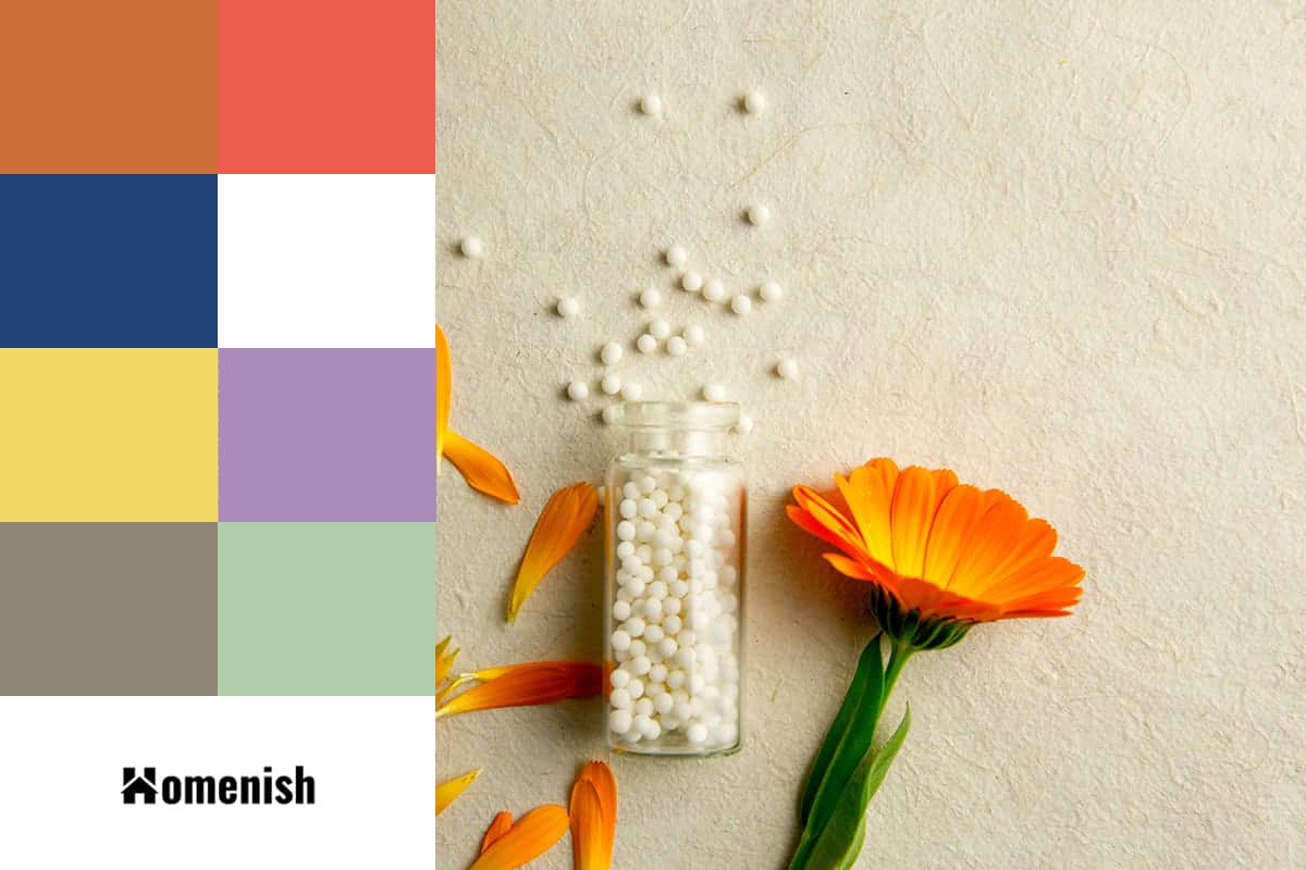
Colors to Use with Marigold
You can pair marigold with many bright and neutral colors to create a unique look. Here are some of the most appealing color pairings to try.
White
| Shade | Hex Code | CMYK Color Code (%) | RGB Color Code | Color |
| Marigold | #ffd700 | cmyk(0%, 16%, 100%, 0%) | rgb(255, 215, 0) | |
| White | #ffffff | cmyk(0%, 0%, 0%, 0%) | rgb(255, 255, 255) |
White is a color that can be used in many ways with marigold. You can use it as an accent, or you can paint your entire room white and use marigold accents to create a cozy, bright space. White complements many other colors and is the perfect backdrop for marigolds’ bold hues.
Try using white walls with cabinets painted in a warm orange-red hue, such as cadmium red or burnt sienna; this will create a dynamic contrast between the wall color and cabinet color that has been shown to increase appetite for some people!
Tangerine
| Shade | Hex Code | CMYK Color Code (%) | RGB Color Code | Color |
| Marigold | #ffd700 | cmyk(0%, 16%, 100%, 0%) | rgb(255, 215, 0) | |
| Tangerine | #cb6f38 | cmyk(0%, 45%, 72%, 20%) | rgb(203, 111, 56) |
Tangerine is a great color to use with marigold because it’s warm, so it adds more life to the flower. It’s also fantastic for accent pieces, like curtains or pillows.
Grapefruit Pink

| Shade | Hex Code | CMYK Color Code (%) | RGB Color Code | Color |
| Marigold | #ffd700 | cmyk(0%, 16%, 100%, 0%) | rgb(255, 215, 0) | |
| Grapefruit Pink | #eb5c4e | cmyk(0%, 61%, 67%, 8%) | rgb(235, 92, 78) |
If you are looking for a complementary color to use in your room, you can use a combination of pinks and oranges. Grapefruit pink is an ideal color for this purpose as it is very bright.
You can use this color when you have a lot of marigold in your room or just want to add some brightness to your space. The grapefruit pink shade is also great for girls’ bedrooms because it makes the room look lively and fun!
Blue
| Shade | Hex Code | CMYK Color Code (%) | RGB Color Code | Color |
| Marigold | #ffd700 | cmyk(0%, 16%, 100%, 0%) | rgb(255, 215, 0) | |
| Blue | #234277 | cmyk(71%, 45%, 0%, 53%) | rgb(35, 66, 119) |
Lagoon Blue: This is a complementary color to orange, which means it will accentuate the warmth of marigold. It’s also the cool alternative to yellow or red, so it can give your room a serene and calming feel when used in moderation.
Sky Blue: Just like lagoon blue, sky blue is a cool color that will help you achieve that natural look you want for your kitchen or dining room.
Turquoise: If you want something more vibrant than the other blues listed here (or if this is your favorite shade), turquoise is another option for pairing with marigold flowers.
The only caution I have about using turquoise with this flower is that it may clash with some other colors in your home—so make sure you test out different shades before committing!
Mint Green
| Shade | Hex Code | CMYK Color Code (%) | RGB Color Code | Color |
| Marigold | #ffd700 | cmyk(0%, 16%, 100%, 0%) | rgb(255, 215, 0) | |
| Mint Green | #b1ceab | cmyk(14%, 0%, 17%, 19%) | rgb(177, 206, 171) |
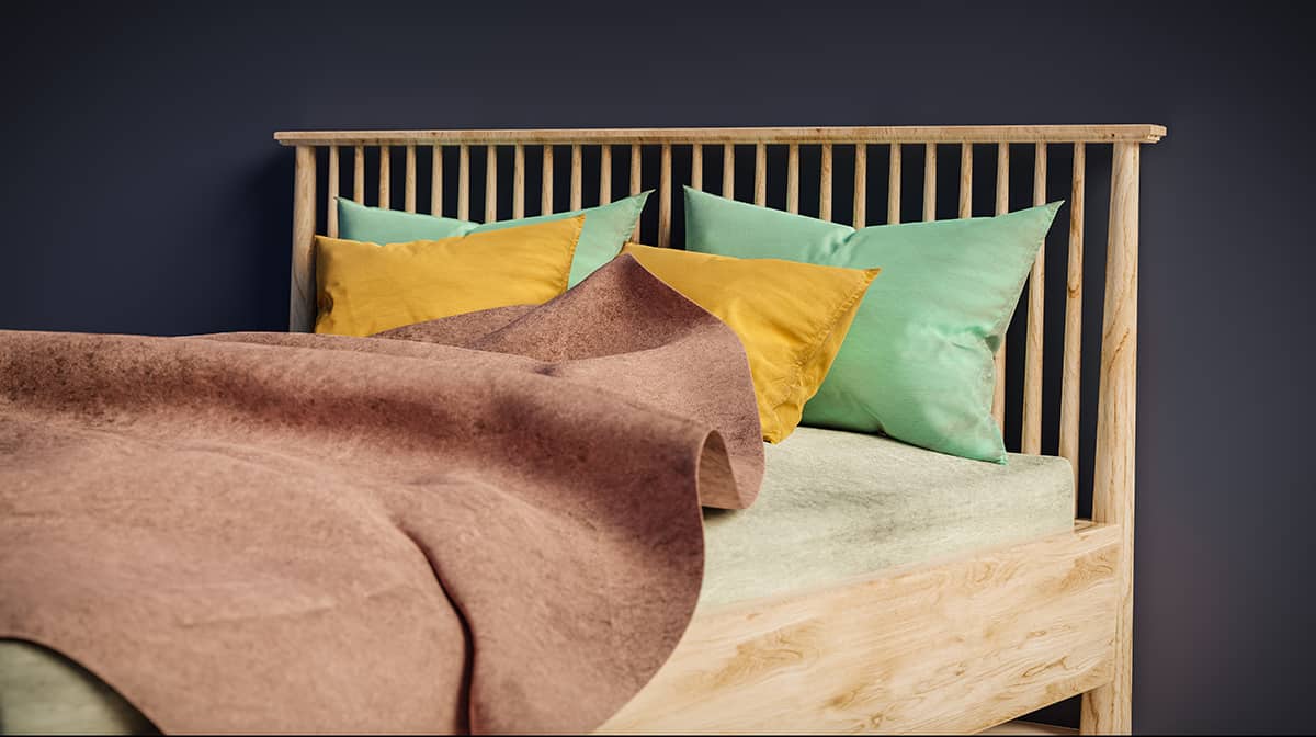
Marigold is a color that makes a great complementary color with mint green. This shade of green is not too bright, but it’s not too dark either. It’s somewhere in between light green and dark green, which makes it very popular for walls and furniture.
Lemon Yellow
| Shade | Hex Code | CMYK Color Code (%) | RGB Color Code | Color |
| Marigold | #ffd700 | cmyk(0%, 16%, 100%, 0%) | rgb(255, 215, 0) | |
| Lemon Yellow | #f3d865 | cmyk(0%, 11%, 58%, 5%) | rgb(243, 216, 101) |
Lemon yellow is a brilliant way to pair with marigold. It’s similar in tone but not exactly the same as marigold. It has a sunny, cheerful quality that will make your kitchen pop!
Use this combination sparingly—it’s bold and would be overwhelming if you used too much of it. Pairs well with black, white, cool shades like grey or navy blue (you can even use some lime green), cream tones such as ivory or sandstone.
Plum Purple

| Shade | Hex Code | CMYK Color Code (%) | RGB Color Code | Color |
| Marigold | #ffd700 | cmyk(0%, 16%, 100%, 0%) | rgb(255, 215, 0) | |
| Plum Purple | #ab8bb7 | cmyk(7%, 24%, 0%, 28%) | rgb(171, 139, 183) |
Both purple and marigold are bright, energetic colors. The marigold color scheme with purple creates a bold, vibrant look that’s sure to catch people’s attention.
The trick with pairing these two colors is finding the right balance between them. Purple is the opposite of yellow on the color wheel, so this means that it will intensify or complement whatever hue you choose for your accent color.
A common misconception about purple is that it will clash horribly with all other colors—especially when paired with yellow! However, if you find yourself in need of some inspiration for combining these two shades into an eye-catching palette, then keep reading below!
Gray
| Shade | Hex Code | CMYK Color Code (%) | RGB Color Code | Color |
| Marigold | #ffd700 | cmyk(0%, 16%, 100%, 0%) | rgb(255, 215, 0) | |
| Gray | #8f8576 | cmyk(0%, 7%, 17%, 44%) | rgb(143, 133, 118) |
Gray is a neutral color, which means that it can be used on its own or with other colors. Using a gray tone with marigold will make the room look more sophisticated. If you want to incorporate this combination in a bedroom, choose a light grey and use it sparingly.
How to Using Marigold Well
Marigold is a bold color, but with some restraint in your palette, you can give it a sophisticated and stylish look. To choose the right colors for an interior design project that uses marigold, follow these three steps:
Choose Your Accents
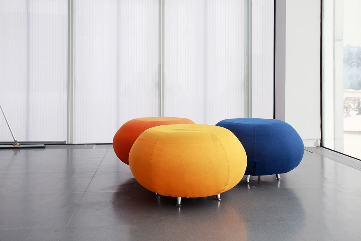
Marigold’s high-contrast nature means that it will stand out in any space. That makes choosing where to use Marigold essential. The easiest way to do this is by choosing accent pieces in Marigold—it’s best used as an accent color rather than as the main color of a room or object (if you want Marigold accents, try pillows or vases).
If you want to bring out more of the warm tones of this bright yellow hue, consider adding warm browns and oranges as accents around your home.
This can give off relaxed vibes while still standing out with boldness thanks to its intense saturation levels (which also make a pretty good contrast against neutral-colored walls). You could also experiment with using other bolder hues like fuchsia pink or teal blue instead of marigold so long as they don’t clash too much; these will complement each other nicely!
Add Accent Colors from Other Palettes
For anyone who doesn’t want their entire house being covered from floorboards all the way up into the ceiling beams but still wants something eye-catching enough, not just any old boring white walls will suffice.
Marigold paint can be a great choice, but be sure not to overdo things. If you’re going to have marigold walls, choose to place furniture or artwork featuring colors from other palettes.
And be careful when choosing which pieces go where because too much variation might take away from both the original purpose of the wall color (which was originally just to give some color to the room) and the intent not to make the room too busy.