Table of Contents
What is Crimson?

Crimson is a bright shade of red that has blue undertones, giving it a very subtle purple hue. The name was derived from the word ‘kermes’ because red dye was originally made by crushing the bodies of kermes vermilio insects.
What Does Crimson Mean?
Crimson is a bright, saturated shade of red which is said to be the color of human blood. As a result, crimson can have violent connotations, and it is a color that will often be used on the cover of horror movies or horror novels to express the brutal and violent nature of the contents.
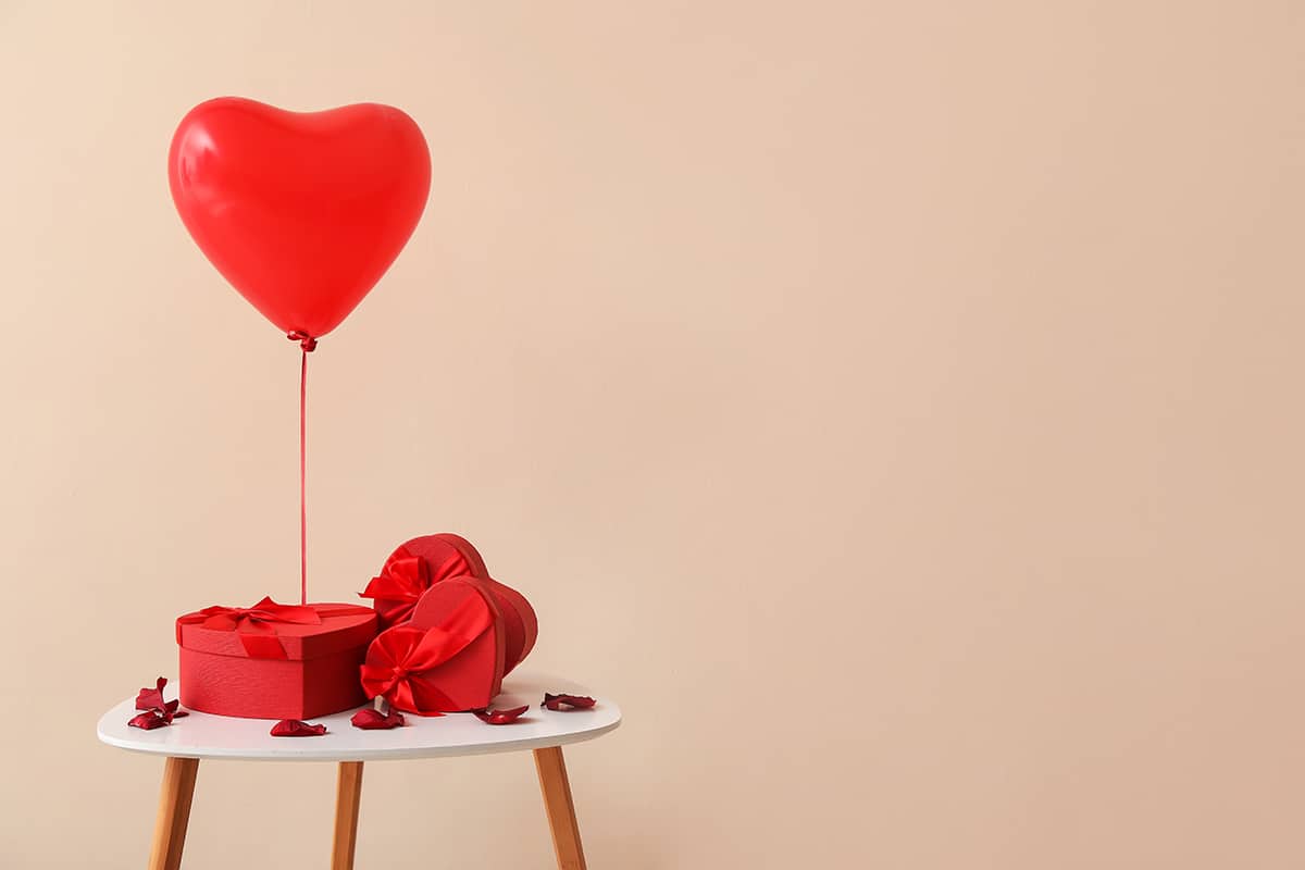
However, the intensity of crimson means that it is also associated with passion and romance. Crimson-colored dresses are thought of as sexy and seductive, and crimson roses are widely bought as gifts on Valentine’s Day.
Crimson can also be used to achieve a festive atmosphere since it is a fall color that is commonly used in decoration around Thanksgiving and Christmas.
When it comes to color psychology and how crimson can make us feel, this is one of the most controversial shades. This is because crimson can inspire feelings of rage and anger, though it can also inspire feelings of lust. This might be because red is a fiery and passionate color, and passion is often involved in both anger and lust.
Crimson is also associated with danger since it is often used as a color in warning and danger signs, and even in language, we use red as a negative color. For example, you might hear the phrase ‘red flag,’ which refers to a trait in a person which indicates there is something wrong with them.
The way that a person responds to crimson might be very personal, but typically people do have strong reactions to this color, whether they be positive or negative. If you are decorating your home to enjoy for yourself and you love the color crimson, then it can look great, but if you are painting your home to sell it, then avoid using this color at all because it could have the opposite effect that you want.
Similar Colors to Crimson
Scarlet

Scarlet is a darker shade of red compared to crimson, but it has a similar red-purple hue. You could use these shades interchangeably in home decor, as they will work amongst the same color schemes.
However, scarlet will produce a more intense and heavily saturated look, while crimson will be brighter.
Ruby

Ruby red is named after the gemstone, and it is a deep, true shade of red without any obvious warm or cool undertones. It offers a similar intensity as crimson and can work well with other jewel tones.
Cherry
Cherry red is named after the skin of the fruit and has a rich, deep, intense effect. Cherry is darker than crimson, but it has a similar hue since the undertones of cherry are quite cool and bluish.
How to Use Crimson in Home Decor
Crimson isn’t a widely used color in interior design, but if you’re a fan of this shade, there are plenty of ways to incorporate it into your color scheme.
Create Comfort
Crimson is a color that is able to add warmth and comfort to a space without feeling dated or traditional since it has warm overtones with cool undertones. The presence of blue in this color makes it feel modern and striking, rather than brown or orange-toned reds, which can feel more behind the times.
In a room with low light, use crimson accents to add a sense of comfort to the space, such as crimson-colored cushions on a beige sofa or crimson curtains in a home office. Adding small touches of this color to a cool space will make it feel more welcoming and transform it into a room you want to spend more time in.
Accent Wall
Crimson can be used across all walls in a room if this is a color you feel strongly about; however, for most people, it will feel too overwhelming when it is entirely surrounding you. However, you can still enjoy the benefits of crimson by using it as a paint color on an accent wall. This will cement the color as an integral part of the color scheme without creating the sense that it is too intense.
Choose the main wall behind a fireplace or TV unit in a living room or the wall behind the head of the bed in a bedroom, and paint it with a deep shade of crimson. Link it in with the rest of the space by positioning small crimson items around the room, for example, include red lampshades and a red rug.
Soft Furnishings
Since crimson is an intense color, it makes sense to use it on soft furnishings rather than on walls, as it will make for a more subtle effect. Choose luxurious fabrics in crimson to make sure the color feels soft and warm, for example, velvet curtains or crushed silk cushion covers.
Patterned soft furnishings containing crimson details is also a nice way to introduce the color to a room in a subtle way. A woven rug in crimson, navy, and cream would look stylish in a Mediterranean-themed room, or opt for a crimson and beige plaid fabric for a blanket draped over the back of a sofa or over the end of a bed.
Soft furnishings in crimson can have the effect of making you feel like you want to snuggle up on the sofa on a cold winter’s night, but pairing them with the right background shades will be key.
Opt for muted neutral shades to achieve a comfortable and cozy style, and avoid other intense colors like black and purple, as these will compete against the crimson and make for a space that feels overwhelming to spend time in.
Brighten
Crimson is a bright shade of red, and as such, it is a great color option for adding brightness and vibrancy to a room. This works particularly well in kitchens, where crimson can take on a retro or vintage-inspired feel.
Opt for glossy surfaces in crimson so that they diffuse light and add to the bright effect, such as high gloss crimson red subway tiles for a backsplash or a shiny stand mixer in crimson red displayed on the countertop.
Wall art featuring crimson can be another nice way to brighten up a kitchen and make it feel more lively, as well as accessories like a crimson framed clock or a crimson apron hanging from a wall hook.
Colors that Go with Crimson
The intensity of crimson can make it difficult to pair with other colors. Avoid using other bright and bold colors with crimson unless you want a visually loud space. Instead, choose muted shades that will allow crimson to shine or opt for neutral colors to help tone down the crimson intensity and create a more balanced look.
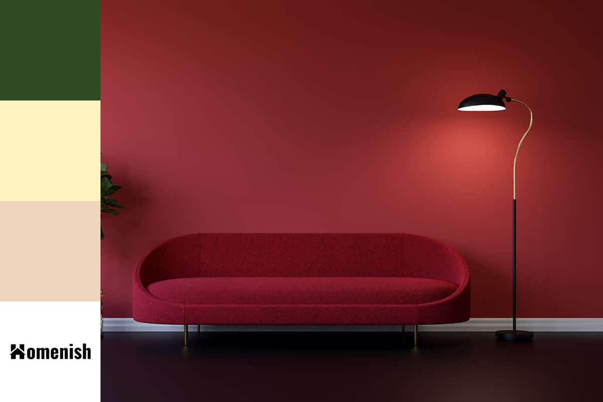
Forest green
| Shade | Hex Code | CMYK Color Code (%) | RGB Color Code | Color |
| Crimson | #d50f36 | cmyk(0%, 93%, 75%, 16%) | rgb(213, 15, 54) | |
| Forest | #2f4b24 | cmyk(37%, 0%, 52%, 71%) | rgb(47, 75, 36) |
Crimson and forest green are two colors that, when used together, look instantly timeless. These are colors that would commonly be seen together in grand Victorian homes, for example, with crimson painted walls and forest green upholstered armchairs. These colors are also used together for festive decorations as they are the two main shades associated with Christmas.
When you pair crimson with forest green in decor, it will create a style that feels homely, wholesome, and family-oriented since these colors are so closely linked with the festive period.
You can also use forest green and crimson in contemporary styles, as well as mid-century modern styles. Add a third neutral shade to the mix, such as off-white or pale gray, to balance out the intensity and depth of both the green and red while also ensuring that the colors have definition.
Since crimson is a warm color and forest green is a cool color, these shades contrast nicely against each other; however, since forest green is quite heavy and earthy, the contrast is not jarring.
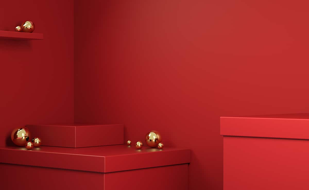
Gold
| Shade | Hex Code | CMYK Color Code (%) | RGB Color Code | Color |
| Crimson | #d50f36 | cmyk(0%, 93%, 75%, 16%) | rgb(213, 15, 54) | |
| Gold | #fff3c1 | cmyk(0%, 5%, 24%, 0%) | rgb(255, 243, 193) |
Crimson is a color that works perfectly with gold metal to highlight the warmth and ensures the color feels classy and elegant. Choose crimson cushion covers with gold tassels at the corners and crimson velvet lampshades on gold lampstands.
This is a color scheme that will look decadent and boudoir-like in a bedroom or glamorous in a bathroom.
Beige
| Shade | Hex Code | CMYK Color Code (%) | RGB Color Code | Color |
| Crimson | #d50f36 | cmyk(0%, 93%, 75%, 16%) | rgb(213, 15, 54) | |
| Beige | #efd5be | cmyk(0%, 11%, 21%, 6%) | rgb(239, 213, 190) |
Beige is a warm neutral color that can vary from pale oatmeal right through to tan. Though the shades of beige are seemingly endless, it is guaranteed that pretty much any of them will pair nicely with crimson.
Beige is able to tone down the intensity of crimson, giving it a comfortable feel.
While beige is sometimes perceived as a bland color, it provides the perfect background shade for crimson accents. In a bedroom with light beige walls and dark beige carpets, opt for crimson patterned curtains and a crimson comforter on the bed.