Ochre is often confused with mustard yellow, but while mustard is a dark shade of yellow, ochre is a dark orange-yellow. It can have varying levels of orange or yellow tones, which can affect which colors it will go best with.
A shade of ochre which is more orange-toned, for example, will be most striking with blue because orange and blue are contrasting colors, whereas a shade of ochre, which is most heavily yellow-based, will be more vibrant with purple.
Ochre can work well as both a base color and an accent color in interior design. It can be used in vintage-style decor to create a retro theme, or it is ideally suited to modern luxury styles.
Here we will look at how to use ochre in home decor and which colors it goes best with.
Table of Contents
Using Ochre in Home Decor
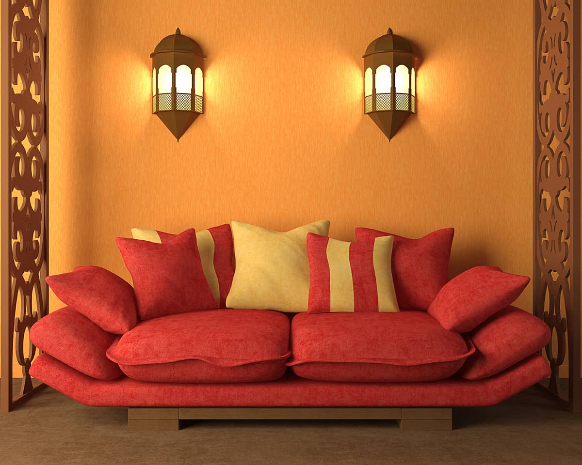
Upholstery
If you want to use ochre to make a bold impact in a room, then the best way to achieve this is with a statement piece of upholstered furniture. In a room with royal blue painted walls and gray accessories, you can liven up the color scheme by adding in an ochre velvet sofa for a sharp contrast, or choose ochre upholstered dining chairs in a green dining room.
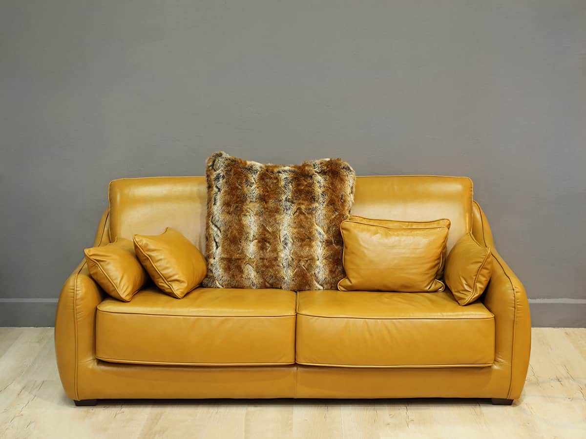
An upholstered armchair in an ochre linen fabric will look elegant in a mid-century modern cream-painted room, or a set of ochre leather armchairs could be a focal point in a rustic living room.
The best way to make a statement with ochre upholstered furniture is to keep other ochre accessories to a minimum to let the furniture be the centerpiece. It will stand out better if there are a limited number of other ochre pieces around it, so ideally, just add in a few small ochre candles or other small accessories so the upholstery can shine.
Accent wall
An ochre accent wall can be a really distinctive feature in a room that is otherwise quite neutral. A charcoal-painted room will look modern and stylish with an ochre accent wall, and the color will help to prevent the space from feeling too dark or gloomy.
In a cream room, an ochre accent wall will add personality and interest. You can use ochre paint to create a solid-colored accent wall or use decorator’s tape to make a pattern such as stripes or a randomly angled geometric design.
Wallpaper is also a great choice for an accent wall. Using just one wall in a room gives you an opportunity to choose a bold pattern that you wouldn’t necessarily use over a whole space.
You can also customize the level of ochre on your accent wall by carefully choosing the wallpaper. For example, if you want an intensely ochre accent wall, choose a wallpaper that primarily features this color, or for a more subtle ochre effect, choose a more muted wallpaper with occasional ochre features on it.
Accessories
Since ochre is a heavily pigmented color, you might find it is too intense to use as the main color in a room. However, the intensity of this shade is what makes it such a great accent color because it stands out and makes a bold impact when used correctly.
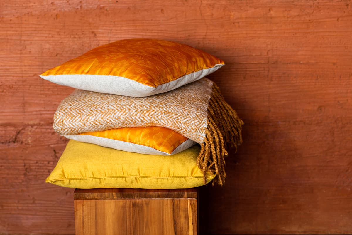
Choose some well-placed accessories in your room to create a stylish effect, such as an ochre vase on a low coffee table and ochre cushions on a gray sofa. You can experiment with texture so that the color doesn’t look flat, for example, a crocheted ochre storage basket or glossy metal ochre photo frames.
Soft furnishings
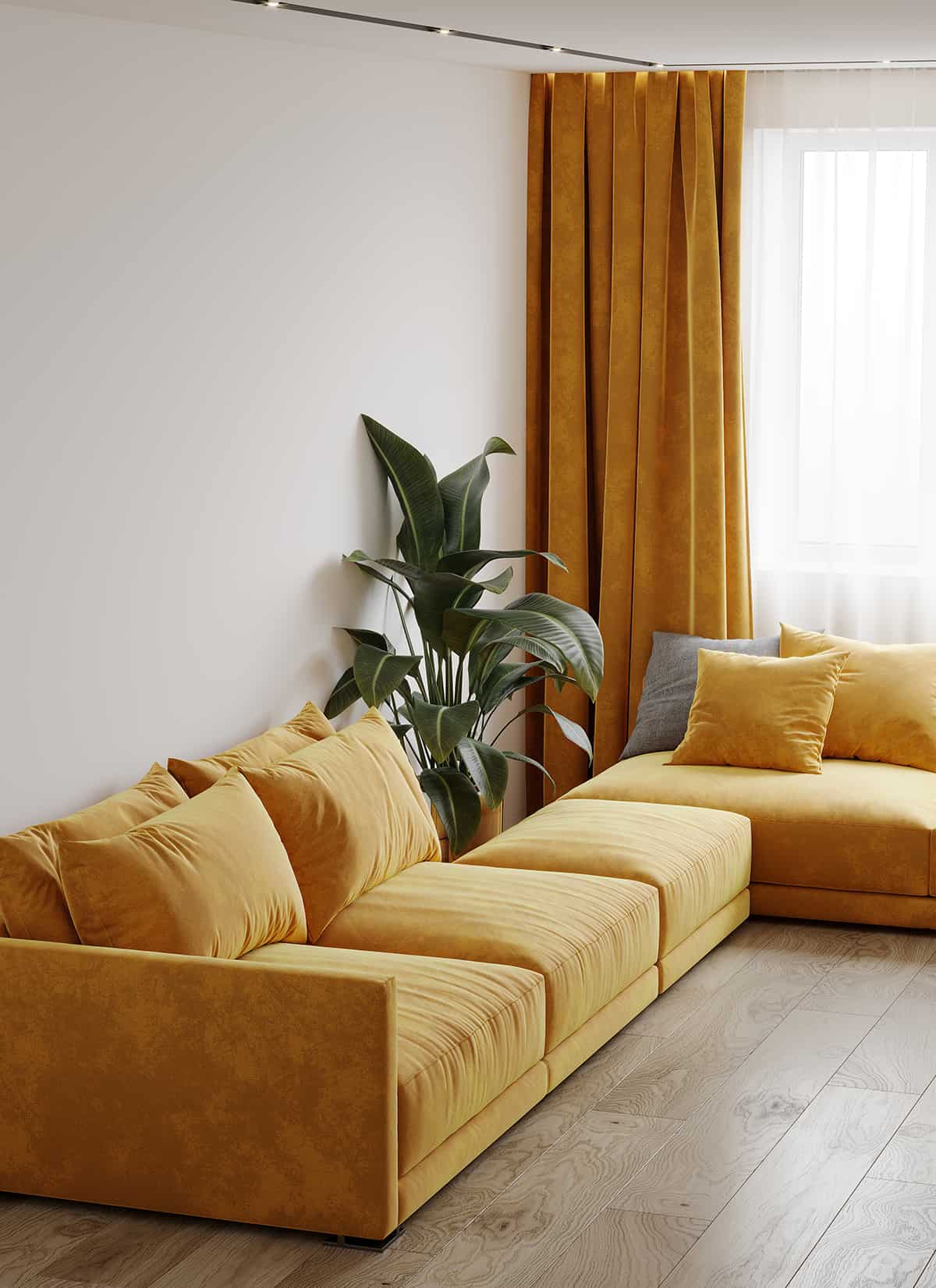
Ochre is a deep color that looks stunning in a wide range of fabrics which can be used to achieve a variety of styles when used for soft furnishings. For a vintage or retro look, choose ochre corduroy and pair it with other warm colors like brown and orange.
For a fresh and modern style, ochre looks great in linen and other cotton fabrics. Ochre curtains in a white room will draw attention to the window and help to frame the view while also making the space feel more welcoming.
Blankets are another good way to add a sense of comfort to a space; you can drape an ochre blanket over the back of a sofa, over the end of a bed, or fold it on top of an ottoman. Blankets can also be rolled up and stored in a woven basket for a casual yet comforting style.
Colors to Use with Ochre
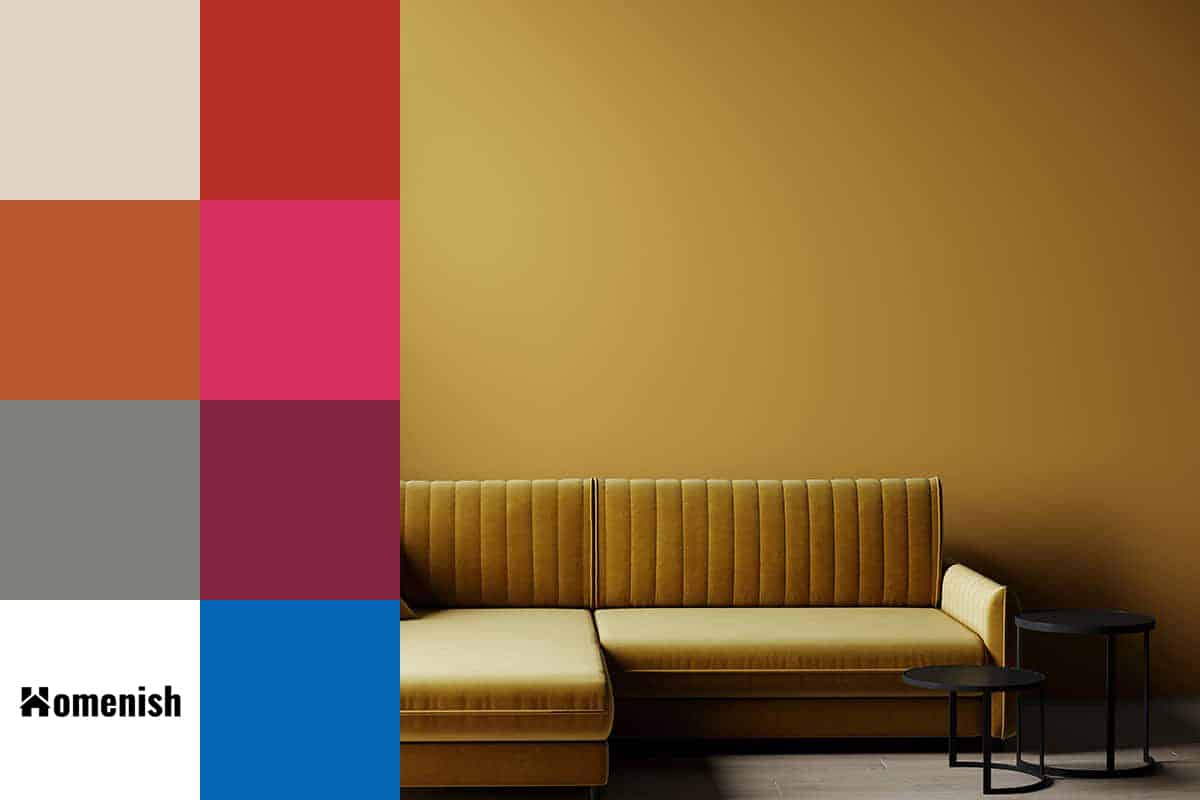
Cream
| Shade | Hex Code | CMYK Color Code (%) | RGB Color Code | Color |
| Ochre | #8a5a15 | cmyk(0%, 35%, 85%, 46%) | rgb(138, 90, 21) | |
| Cream | #e0d4c3 | cmyk(0%, 5%, 13%, 12%) | rgb(224, 212, 195) |
Cream is a good choice of background color to use with ochre accents. It has a warm temperature, like ochre, and so these colors, when used together, can make a room feel cozy and inviting while still being bright and spacious.
Typically when you create a space that is cozy, it will have some dark features, but a color scheme of cream and ochre is a great way to achieve a warm and inviting atmosphere while also maintaining a light appearance.
Paint walls in cream and choose an ochre sofa or ochre curtains and bedsheets in a bedroom. Gold metals will work well with this theme if you want to make it feel glamorous, such as gold light fittings or gold chair legs.
For a more rustic or earthy vibe, use dark wood accents for coffee tables and other solid furniture.
Rust red
| Shade | Hex Code | CMYK Color Code (%) | RGB Color Code | Color |
| Ochre | #8a5a15 | cmyk(0%, 35%, 85%, 46%) | rgb(138, 90, 21) | |
| Rust Red | #b52f26 | cmyk(0%, 74%, 79%, 29%) | rgb(181, 47, 38) |
Rust red is a shade of red that has brown-orange tones. It is a warm color that feels more casual compared to most other reds. Use this as an accent shade in an ochre room, for example, rust-colored cushions in a room with ochre and cream wallpaper.
These colors can work to create a Mediterranean or Mexican look, or they can be used to achieve a laid-back bohemian style. Rust red and ochre used without a third shade can look quite intense, so if you want your space to feel more easygoing, add in another color that is neutral to balance them out.
Terracotta
| Shade | Hex Code | CMYK Color Code (%) | RGB Color Code | Color |
| Ochre | #8a5a15 | cmyk(0%, 35%, 85%, 46%) | rgb(138, 90, 21) | |
| Terracotta | #b7562d | cmyk(0%, 53%, 75%, 28%) | rgb(183, 86, 45) |
Terracotta is a more orange version of rust red. It sits somewhere between red and burnt orange, and it is another warm shade; so ochre is one of the colors that go well alongside terracotta.
To add this color to a room, consider using clay pots and planters to benefit from the texture as well as the shade. This will look especially effective in an earthy or natural-themed space.
Cerise

| Shade | Hex Code | CMYK Color Code (%) | RGB Color Code | Color |
| Ochre | #8a5a15 | cmyk(0%, 35%, 85%, 46%) | rgb(138, 90, 21) | |
| Cerise | #d7305e | cmyk(0%, 78%, 56%, 16%) | rgb(215, 48, 94) |
Cerise is a bright pink color that will look very vibrant next to ochre. These two colors will contrast against each other and help to make both shades look even bolder and more intense. They can be used to great effect in a white or black room to create a fun or whimsical atmosphere.
In a bedroom with white painted walls, choose cerise curtains with an ochre pom pom fringe and a patterned ochre bedspread with some cerise cushions.
Gray
| Shade | Hex Code | CMYK Color Code (%) | RGB Color Code | Color |
| Ochre | #8a5a15 | cmyk(0%, 35%, 85%, 46%) | rgb(138, 90, 21) | |
| Gray | #7e7d78 | cmyk(0%, 1%, 5%, 51%) | rgb(126, 125, 120) |
Gray is an easy color to pair with ochre because gray and yellow always work well together in any combination. Pale gray will help to release the vibrancy of ochre, while dark shades of gray will give it a more muted appearance.
In a bathroom, paint all of the walls in charcoal and add ochre-colored towels and bathmats for a high-end, modern appeal. Stick to cool-toned gray shades because this will help to balance out the warmth of the ochre and result in a contemporary look.
For a casual living room, paint walls in pale gray and use ochre soft furnishings or upholstery in informal fabrics such as cotton and linen to add warmth and personality. This would look great in a mid-century modern style with dark wood or black framed artwork on the walls and some sturdy side tables.
Plum
| Shade | Hex Code | CMYK Color Code (%) | RGB Color Code | Color |
| Ochre | #8a5a15 | cmyk(0%, 35%, 85%, 46%) | rgb(138, 90, 21) | |
| Plum | #832740 | cmyk(0%, 70%, 51%, 49%) | rgb(131, 39, 64) |
If your shade of ochre is predominantly yellow, then it will look striking against plum-colored accents. This works because plum is a deep shade of purple, which is the opposite color to yellow on the color wheel.
By using a dark shade of purple rather than a bright shade, you can achieve a contrast next to the ochre that won’t be too potent. The fact that ochre is also a deep and muted shade also helps these shades to balance against each other.
In a room with plum-colored walls, add in ochre lampshades and an ochre rug. You can also invert the color scheme for a brighter space, with ochre walls and plum-colored sofas.
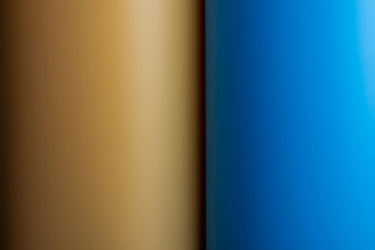
Royal blue
| Shade | Hex Code | CMYK Color Code (%) | RGB Color Code | Color |
| Ochre | #8a5a15 | cmyk(0%, 35%, 85%, 46%) | rgb(138, 90, 21) | |
| Royal Blue | #0165b4 | cmyk(99%, 44%, 0%, 29%) | rgb(1, 101, 180) |
If the shade of ochre you have selected has more obvious orange tones in it, then pairing it with blue will create a stronger contrast. Choose royal blue for a quirky, elegant look, with a velvet royal blue sofa highlighted with ochre cushions.
The ochre color schemes with royal blue appear brighter and bolder, but since they are not especially bright colors themselves, the overall effect is not too overwhelming. If you want to create a more muted style, add a third neutral color.