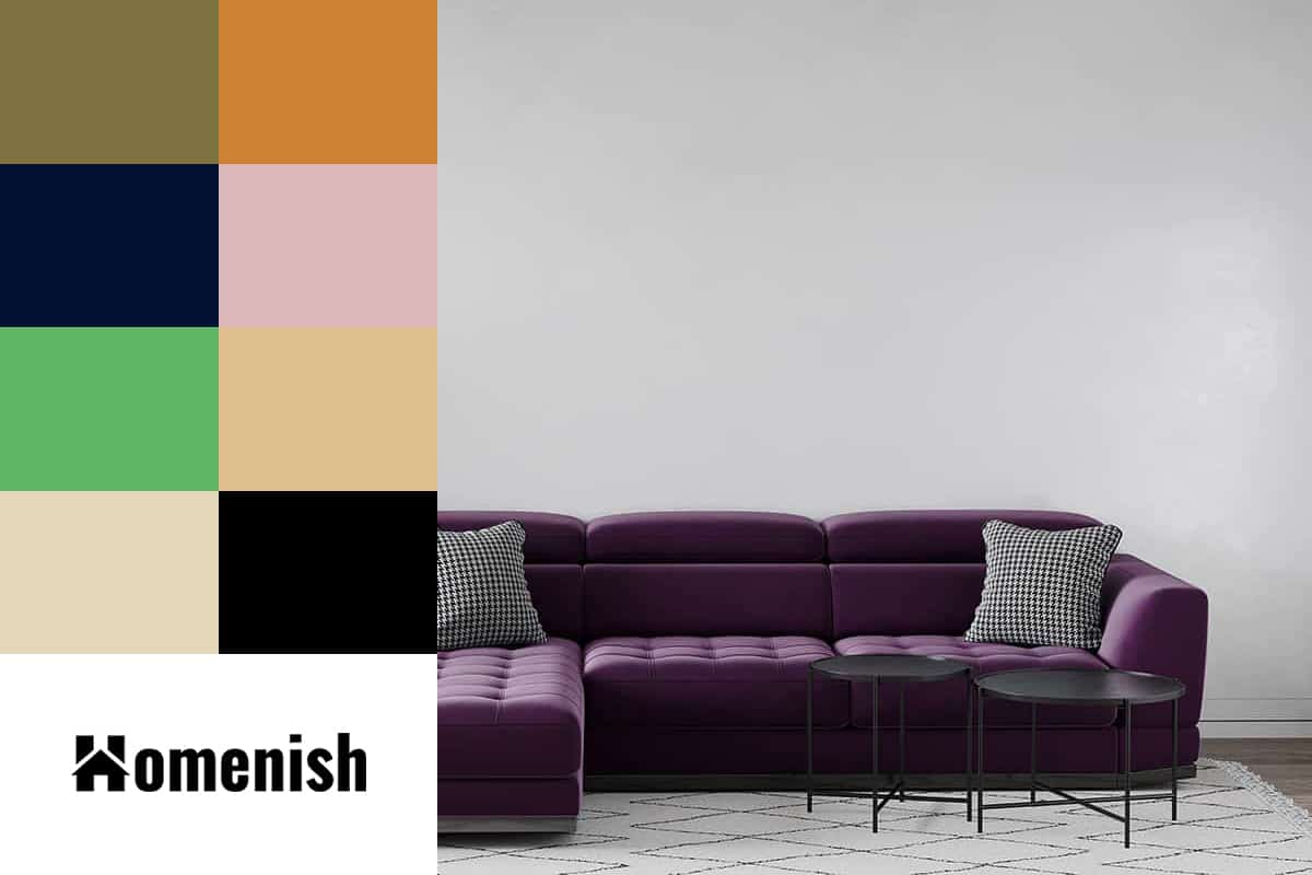
Plum is a dark shade of purple, named after the color of the plum fruit’s skin. Plum is a rich and warm shade, with a hint of deep red present in it.
This is a color that is very on-trend right now, both in interior design as well as fashion; however, it is also a color that stands the test of time and never looks old-fashioned or outdated, making it a strong choice for investment pieces that you can keep for many years.
Here we will look at some key ways to add plum to your interior decor, along with assessing which colors go well with a plum color scheme.
Table of Contents
Using Plum in Interior Decor
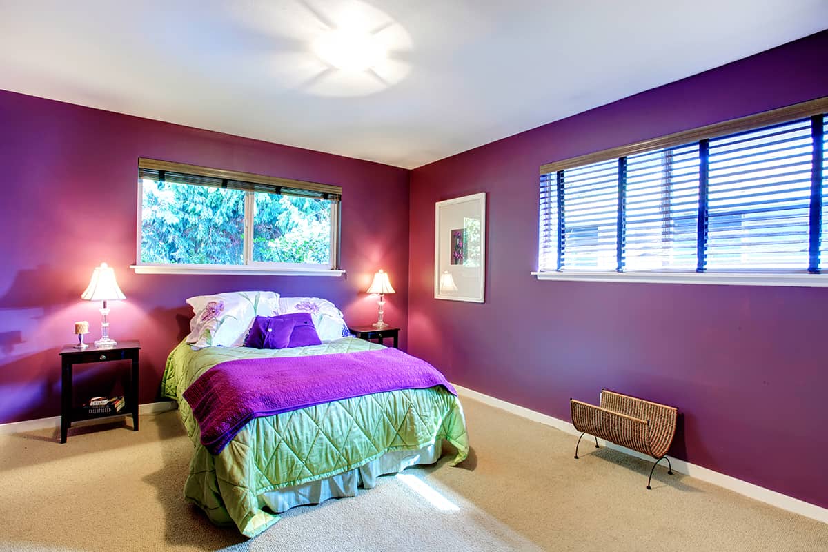
Dark Walls
Plum is such a rich and deep color that it can be unnerving to consider it for a wall paint color. However, dark walls are all the rage at the moment, and this is a trend that isn’t expected to disappear anytime soon. Dark walls add depth and dimension to a room, and they look equally great in both big and small spaces.
In a large room such as a living room, dark walls feel like they are wrapping you up, creating a safe and cozy atmosphere. In a small room, such as a bathroom, dark walls create the illusion of depth, which can actually make a space feel bigger than it really is. Deep plum-colored walls will feel decadent and dramatic, achieving an intimate feel in a space.
The shade of plum you choose will affect the style of the room. For example, opt for a plum color with warm red undertones for a luxury look, pairing it with gold accessories. Or, for a more natural style, choose a shade of plum with gray undertones, which will give a room a more earthy vibe.
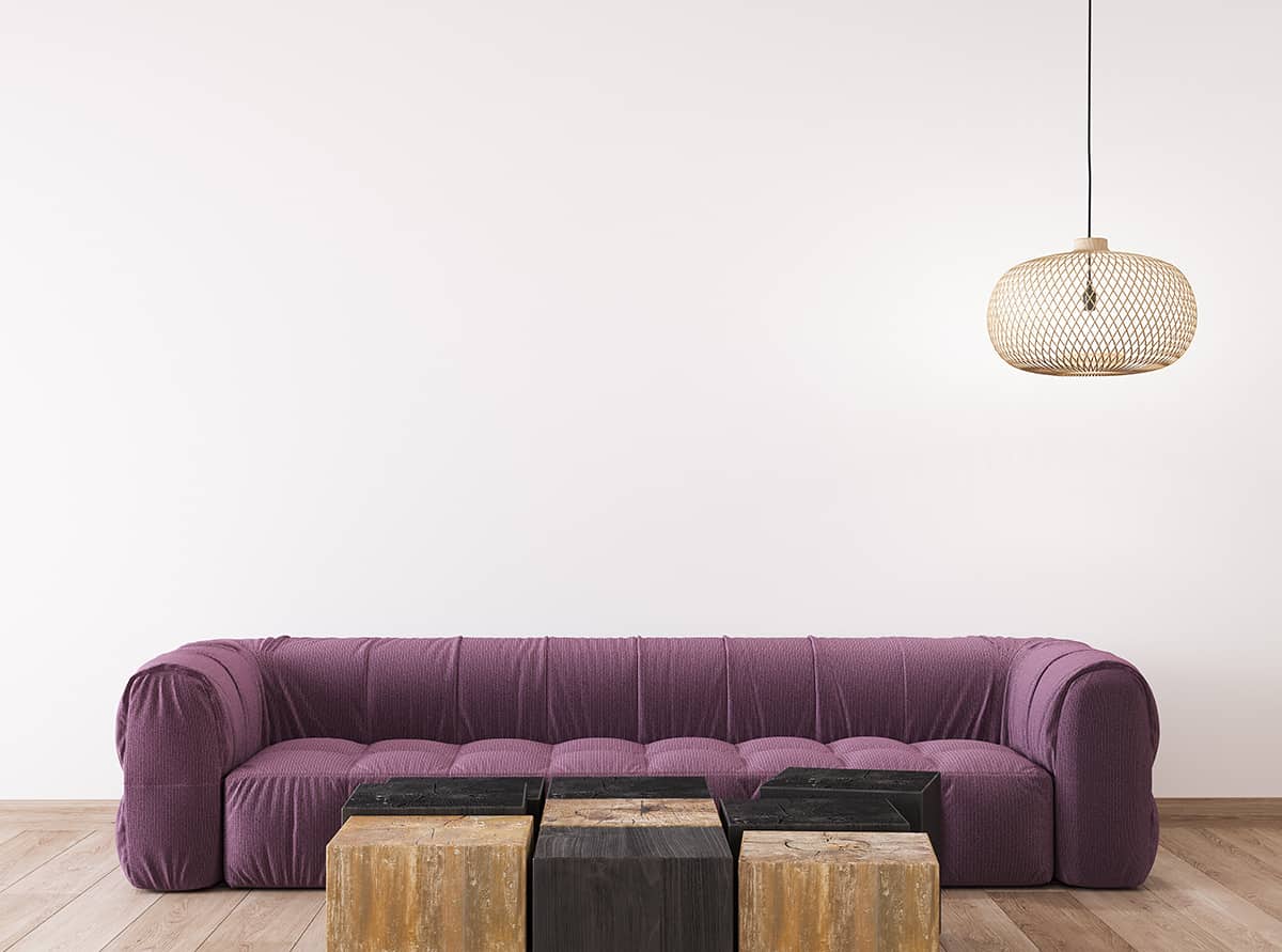
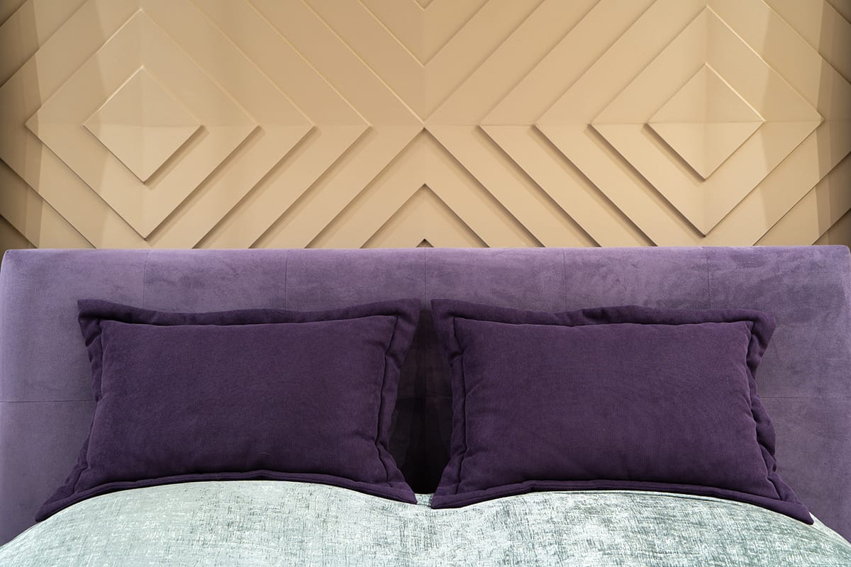
Upholstery
Plum is stylish and sophisticated, and it can be used in a wide range of interior design styles, with plenty of different color schemes. This makes it a nice choice for upholstered furniture, which you can transform the look of by switching up wall colors and accessories if you want to change the style in a room.
Plum is a lavish color that lends itself well to velvet and suede fabrics, and these will highlight the warming and decadent side of this shade. For an updated classic style, choose tufted sofas and chairs in soft plum fabrics.
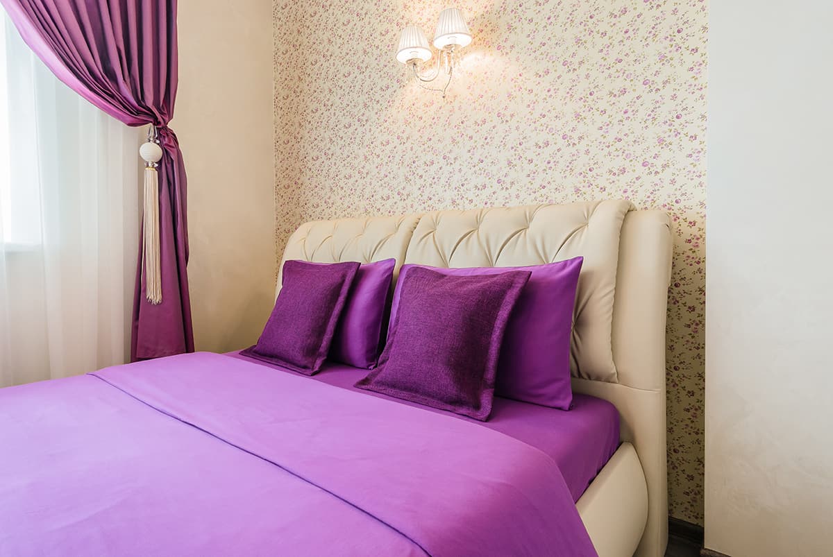
Accent Wall
If you love plum but don’t want to entirely cover all of your walls in it, try out an accent wall in this shade. A single wall painted in plum can look dramatic without involving the same level of intensity as painting all of the walls.
You could also consider a wallpaper with plum tones to create an accent or feature wall. Tie the plum shade in with the rest of the room by adding accessories or soft furnishings in plum throughout the space.
Colors that Pair with Plum
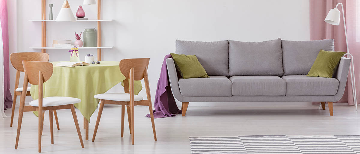
Olive Green
| Shade | Hex Code | CMYK Color Code (%) | RGB Color Code | Color |
| Plum | #642f45 | cmyk(0%, 53%, 31%, 61%) | rgb(100, 47, 69) | |
| Olive Green | #7d7240 | cmyk(0%, 9%, 49%, 51%) | rgb(125, 114, 64) |
Purple and green are colors that complement each other really well, and this duo is an especially good example of this. Olive green is a muted and understated shade of green that feels earthy and natural, and it can be used alongside plum to really ground a room and create a subdued look.
Plum is such a color that works really well with olive green. As plum can be quite overwhelming in some scenarios, olive green balances out the intensity of this shade while still allowing it to shine. Add rich plum velvet cushions to an olive green sofa, or choose an olive green rug in a room with plum-colored walls.
If you have a room that is predominantly olive green with an earthy atmosphere, add a spot of glamor and a striking contrast to the space by incorporating plum accessories. A plum lampshade on a standing lamp would look edgy, along with some berry-scented plum-colored potpourri or candles.
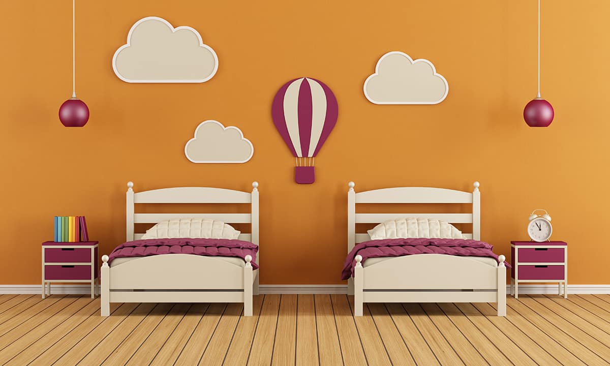
Ochre
| Shade | Hex Code | CMYK Color Code (%) | RGB Color Code | Color |
| Plum | #642f45 | cmyk(0%, 53%, 31%, 61%) | rgb(100, 47, 69) | |
| Ochre | #cd8133 | cmyk(0%, 37%, 75%, 20%) | rgb(205, 129, 51) |
Ochre is a rich shade of yellow that can be deep and golden or have more orange and red hues in it. The word ‘ochre’ translates from Greek to mean ‘pale yellow,’ but the color we regard as ochre today is far from pale. It is a shade that sits somewhere between mustard yellow and cinnamon. The richness and depth of this color mean that it is able to stand up against plum as an equally strong shade.
As purple and yellow are contrasting and complementary colors on the color wheel, this means they look very striking when used together.
You could pair the plum and ochre color scheme together in home decor for a lavish look using sumptuous fabrics and gold metal accessories, or they could also be used to create a more vintage bohemian style if you lean towards more natural textures and raw wood finishes.

| Shade | Hex Code | CMYK Color Code (%) | RGB Color Code | Color |
| Plum | #642f45 | cmyk(0%, 53%, 31%, 61%) | rgb(100, 47, 69) | |
| Navy Blue | #021033 | cmyk(96%, 69%, 0%, 80%) | rgb(2, 16, 51) |
Navy blue and plum are two dark and deep colors that can create a sophisticated style in a room. Navy tends to have quite a formal feel to it, which can make plum appear more serious.
For this reason, these colors work well in dining rooms or formal living rooms, though they can also be used to achieve a casual style if you focus on more informal fabrics and soft edges.
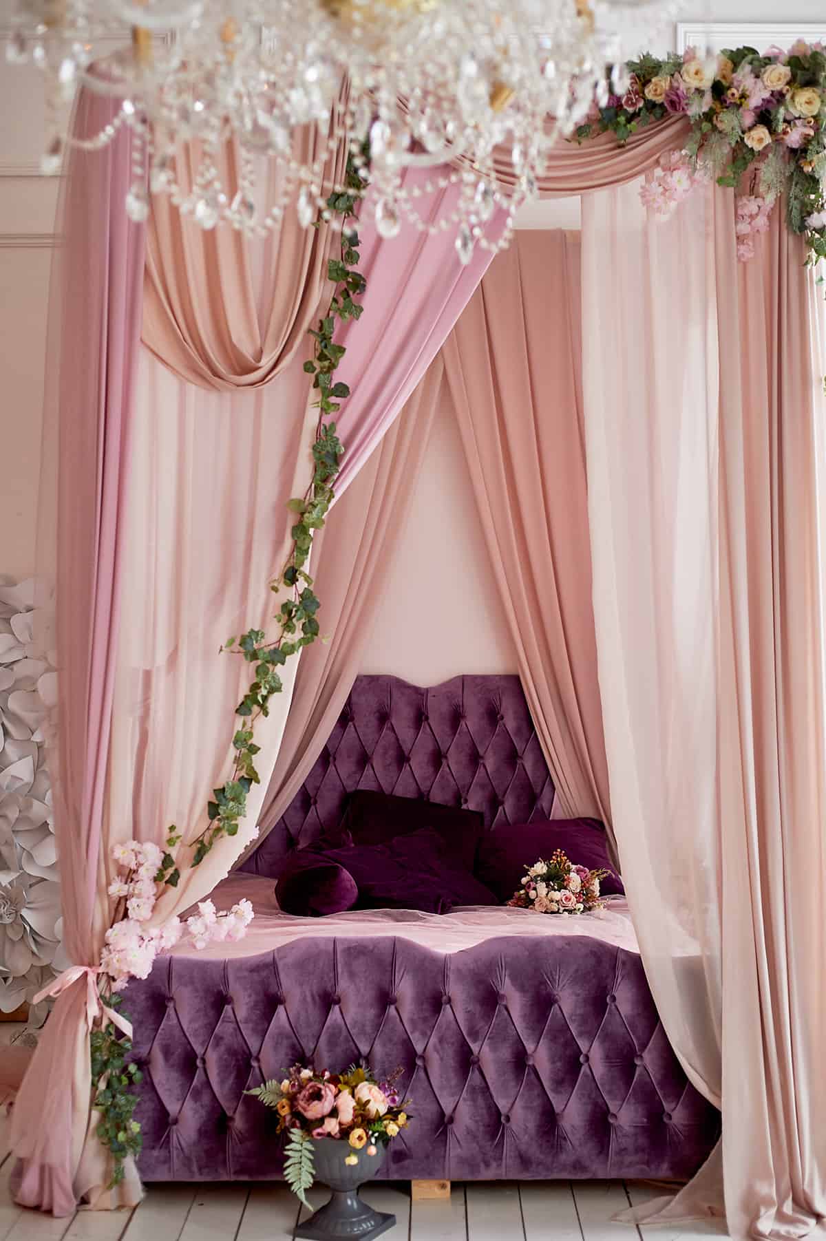
Blush Pink
| Shade | Hex Code | CMYK Color Code (%) | RGB Color Code | Color |
| Plum | #642f45 | cmyk(0%, 53%, 31%, 61%) | rgb(100, 47, 69) | |
| Blush Pink | #dbb7b9 | cmyk(0%, 16%, 16%, 14%) | rgb(219, 183, 185) |
Blush pink is a soft and subtle shade of pink that is intrinsically feminine without being frilly. If you want to add depth and dimension to a blush pink room, adding plum accessories or soft furnishings will achieve this and also add a level of maturity to the space.
As a shade of purple, plum still has a slightly feminine look, but it is much more understated than the femininity associated with blush pink.
The two colors compliment each other really well while also creating a contrast between light and dark, soft and heavy. Layer up blush pink and plum cushions on a bed, and choose a plum-colored art print to hang on a blush pink wall.
Lime Green
| Shade | Hex Code | CMYK Color Code (%) | RGB Color Code | Color |
| Plum | #642f45 | cmyk(0%, 53%, 31%, 61%) | rgb(100, 47, 69) | |
| Lime Green | #61b665 | cmyk(47%, 0%, 45%, 29%) | rgb(97, 182, 101) |
Lime green is a very vivid and refreshing color that sits somewhere between green and yellow. It is bright and vibrant and is associated with a sense of vitality and freshness. It is at complete odds with plum, which is what can make these two shades a fun pairing. Lime green offers vibrancy against plum’s depth, light to its darkness, and playfulness to its drama.
If you want to use plum in a room and avoid creating a heavy or gothic look, then lime green as an accent shade will ensure this. Lime green will look shocking against plum because the contrast is very intense, so use it in small hits to prevent an overwhelming feel.
In a plum-colored room, add in some lime green accessories such as a vase or some neutral-colored cushions with lime green embroidery or printing.
You could also use plum as an accent color to ground a lime green room. In a space that has lime green walls, or a kitchen with lime green cabinets, consider plum as the shade for a few small accessories. This can create contrast on a smaller and less intense scale.
Black
| Shade | Hex Code | CMYK Color Code (%) | RGB Color Code | Color |
| Plum | #642f45 | cmyk(0%, 53%, 31%, 61%) | rgb(100, 47, 69) | |
| Black | #000000 | cmyk(0%, 0%, 0%, 100%) | rgb(0, 0, 0) |
Plum can look very gothic and even mysterious when used with black. To really lean into this type of atmosphere in your home decor, choose plum as the paint color for your walls and black upholstery such as black sofas or a black bed frame.
You could lighten this up with white-painted furniture or white bedsheets or avoid pale colors entirely and embrace the almost medieval aspect of plum and black as a pair.
Alternatively, you could create a modern and minimalist space with black and plum by opting for sleek finishes and sharp edges. For example, choose plum-colored high-gloss kitchen cabinets with black granite countertops.
Beige
| Shade | Hex Code | CMYK Color Code (%) | RGB Color Code | Color |
| Plum | #642f45 | cmyk(0%, 53%, 31%, 61%) | rgb(100, 47, 69) | |
| Beige | #dfbe8f | cmyk(0%, 15%, 36%, 13%) | rgb(223, 190, 143) |
Beige and plum are a duo of shades that are easy to be around, achieving an inviting and comforting living space. Paint a lounge in beige paint with a plum accent wall, and add plum-colored cushions to a sofa.
The warmth of beige is counteracted by the depth of plum to bring a nice balance to a space. These colors are quite commonly used together, so it isn’t too difficult to find decor pieces that combine both shades, such as beige and plum rugs, beige and plum cushion covers, and beige and plum curtains.
Cream
| Shade | Hex Code | CMYK Color Code (%) | RGB Color Code | Color |
| Plum | #642f45 | cmyk(0%, 53%, 31%, 61%) | rgb(100, 47, 69) | |
| Cream | #e5d8b9 | cmyk(0%, 6%, 19%, 10%) | rgb(229, 216, 185) |
If you want to use a pale neutral shade with plum, then cream is going to be your best option. White can look too harsh next to plum unless you are trying to achieve a stark contemporary look.
For a comfortable and casual style, cream is a soft take on off-white, which makes it pair more easily with a strong color like plum. Painting walls in cream will give you a nice base from which plum will stand out without being too extreme. In a room that has plum walls, opt for cream sofas and cream curtains to bring a feeling of calm to the space.