When it comes to increasing your white home’s curb appeal, there are many improvements you can make to your front entrance. While a cobblestone driveway or landscaped front garden makes beautiful scenery, nothing is quite as outstanding as a stunning front door color.
A front door is one of the first things guests notice about your home so it’s important to get creative in terms of aesthetics.
When selecting the best front door colors for a white house, don’t be afraid to experiment with bold and cool hues in order to get your desired result. For ideas, take a look at our front door paint options right here.
Table of Contents
Front Door Colors for a White Exterior
Ruby Red
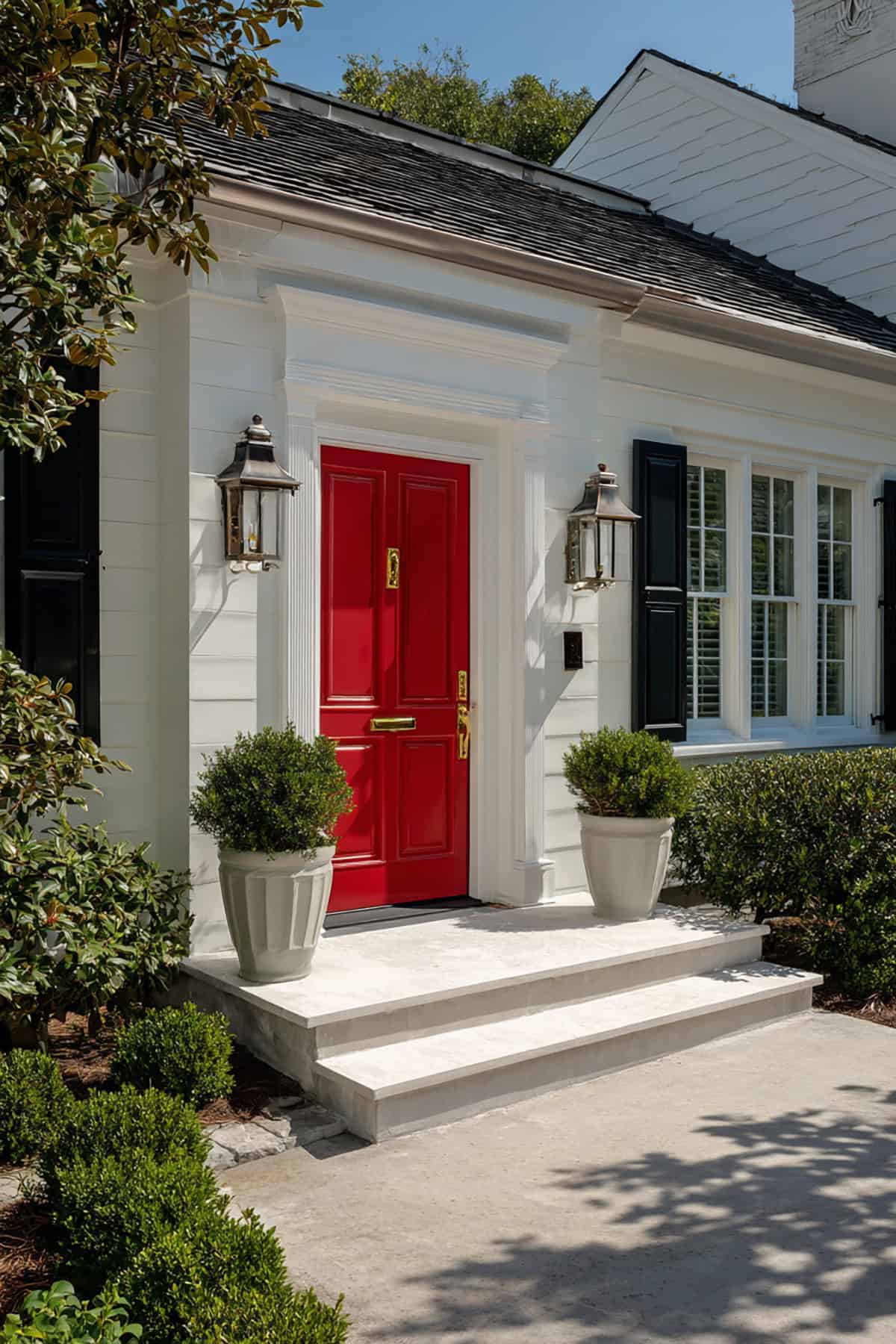
Red is a classic front door color as it goes well with a variety of exterior colors including neutrals. It is certainly a vivid and romantic choice for front doors.
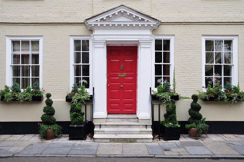
A bold red front door with a white siding makes an impactful statement, no matter which shades you select. Ruby red is our favorite as it brings a crisp and elegant vibe to your white home’s aesthetic. This shade can successfully draw the eye towards the entryway and stand out from other houses.
If you want to bring warmth to your front door area, consider an exciting shade of red like the one shown here. This door has gold brushed metal hardware for a chic look and looks stunning next to the white brick siding. The ruby-red front door is further enhanced with white trims and sash windows.
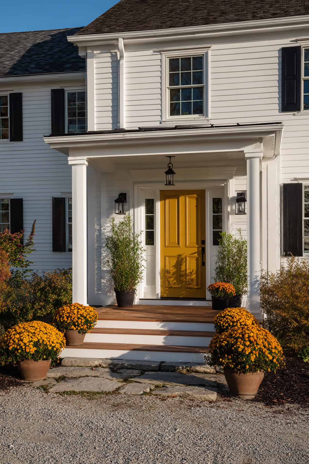
Soft Yellow
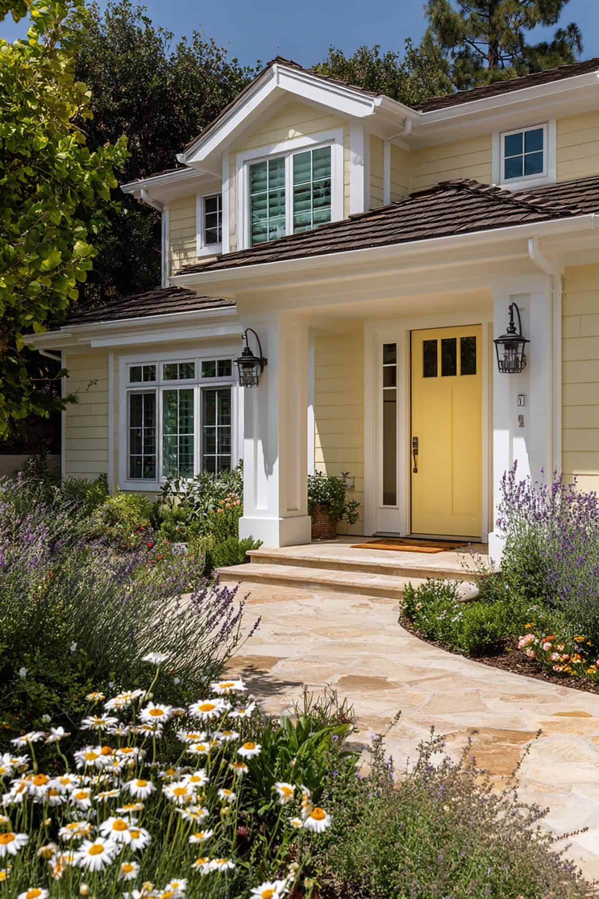
Yellow is associated with happiness so it makes sense to use this cheery paint color for your front door. A soft yellow door can reinvigorate your white home’s exterior and draw the eye instantly to the entry.
This showstopping color is actually more popular than other bold hues, regardless of whether you go for a soft warm shade or a fun bright one. In fact, all shades of yellow look great on neutral exteriors, including door trims and metal hardware.
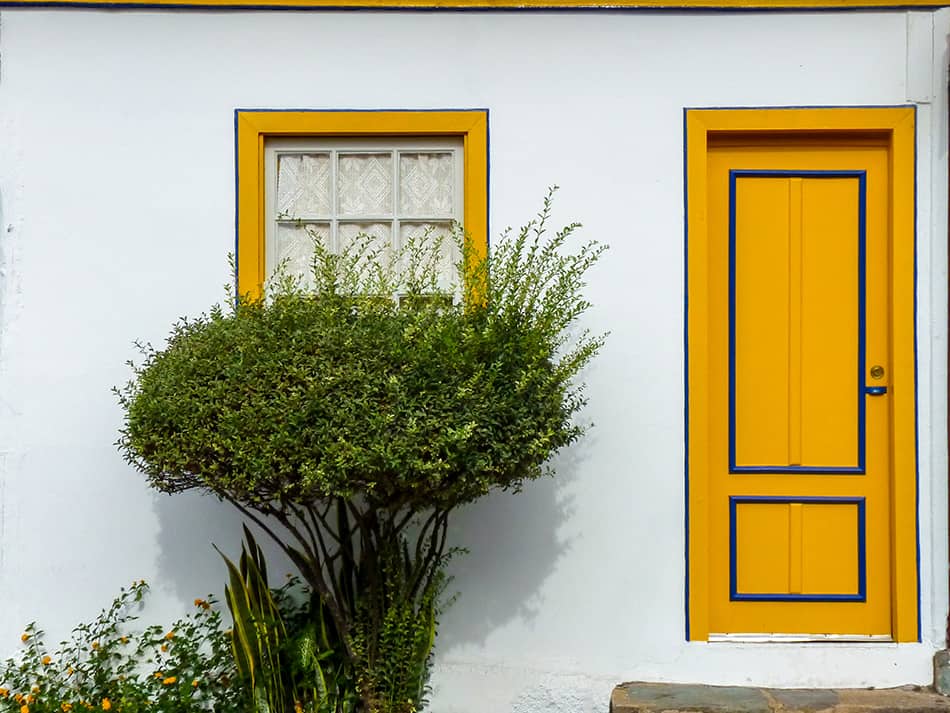
This soft yellow door proves that a bold hue works even with a traditional home. The vivid yellow with a hint of blue brings warmth to the white exterior and there is the matching window frame that completes the look.
This contrasting color has given the traditional style exterior an elegant and refined touch. The beautiful plants and bushy hedges have further enhanced the curb appeal of this home.
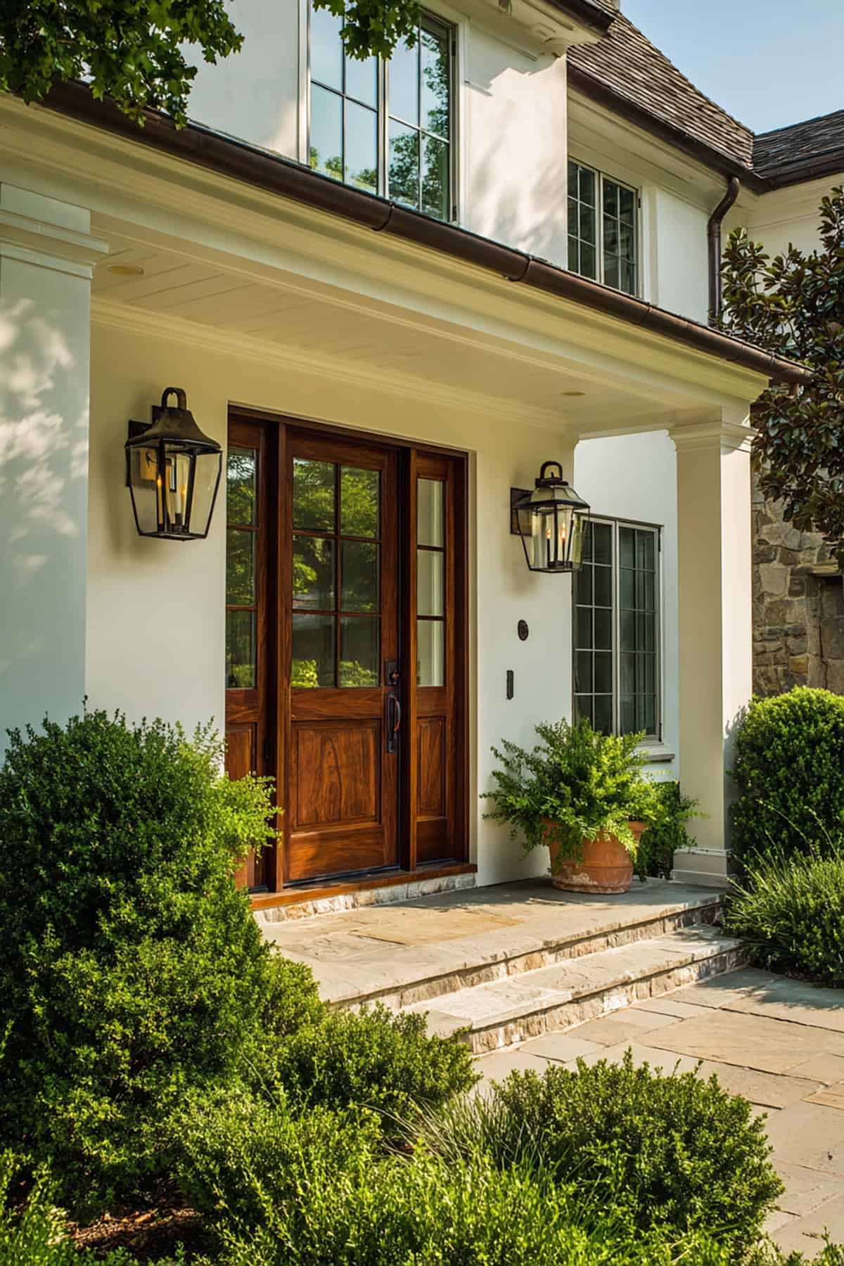
Wooden Door
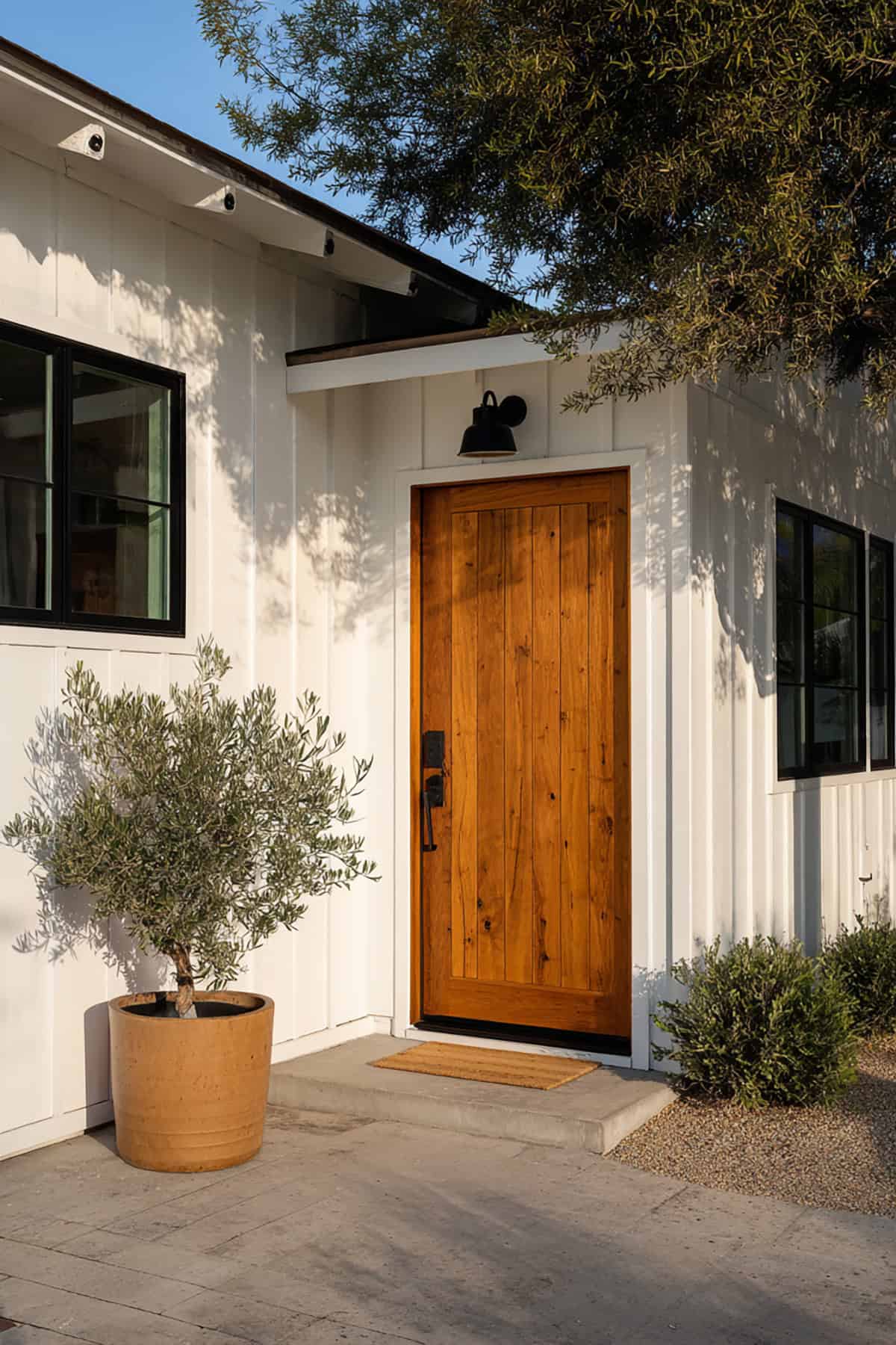
It’s not just the color of a front door that you should experiment with. The material of the door can also make an impact. A wooden door, for example, brings natural warmth to your white home’s entry.
This brown wooden front door boasts brushed metal hardware with classy wall lights and a glass panel. The rustic quality of the door goes beautifully with the white exterior of the house. We love the black shutter, which coordinates with the brown and white colors.
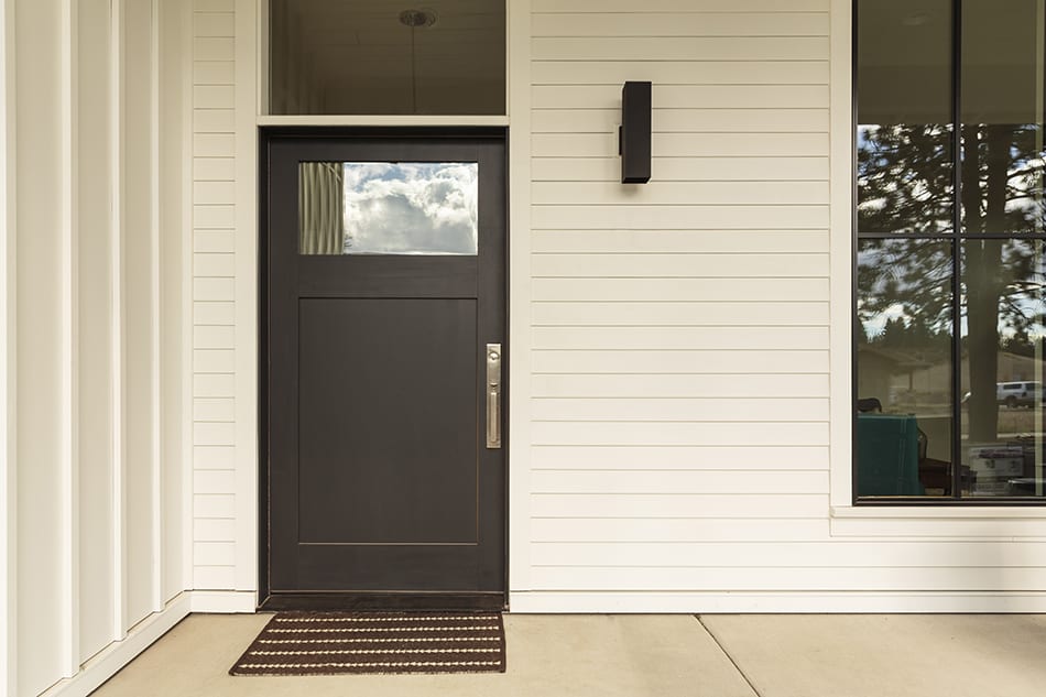
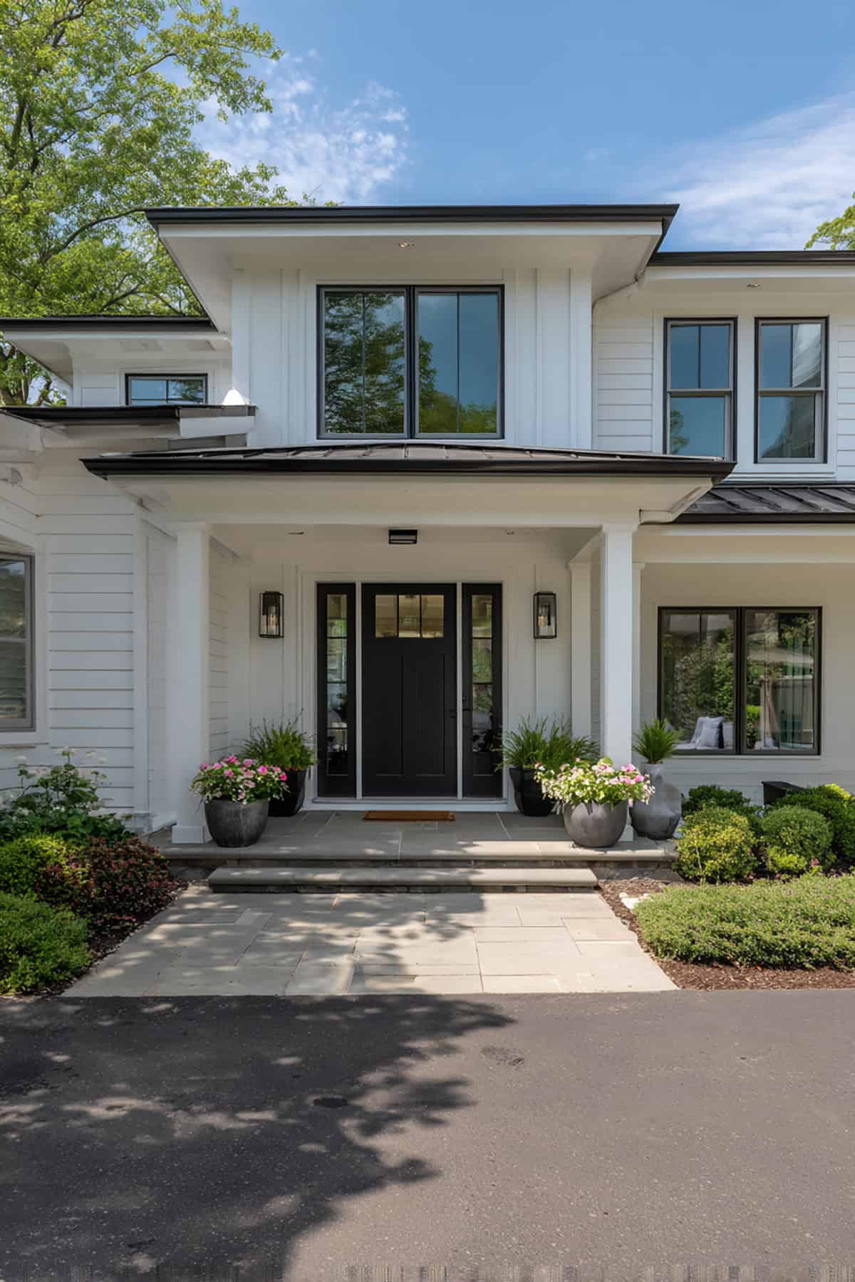
Jet Black
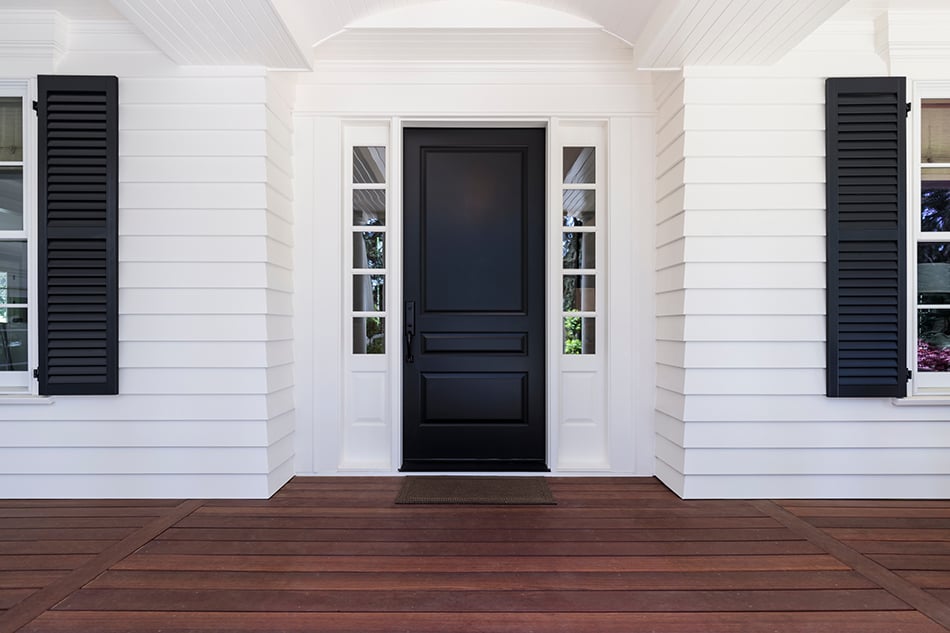
A jet black or elegant black front door makes a dramatic statement next to white. Black is a color that stands the test of time, but it suits some homes more than others.
On classical style exteriors, black is, without a doubt, a sophisticated paint color option. When paired with black shutters, it will make your entryway look refined.
This classic color is a contrast to white so it makes a bold appearance. And the best thing is, you can choose whatever porch flooring color you like to coordinate with your black and white exterior.
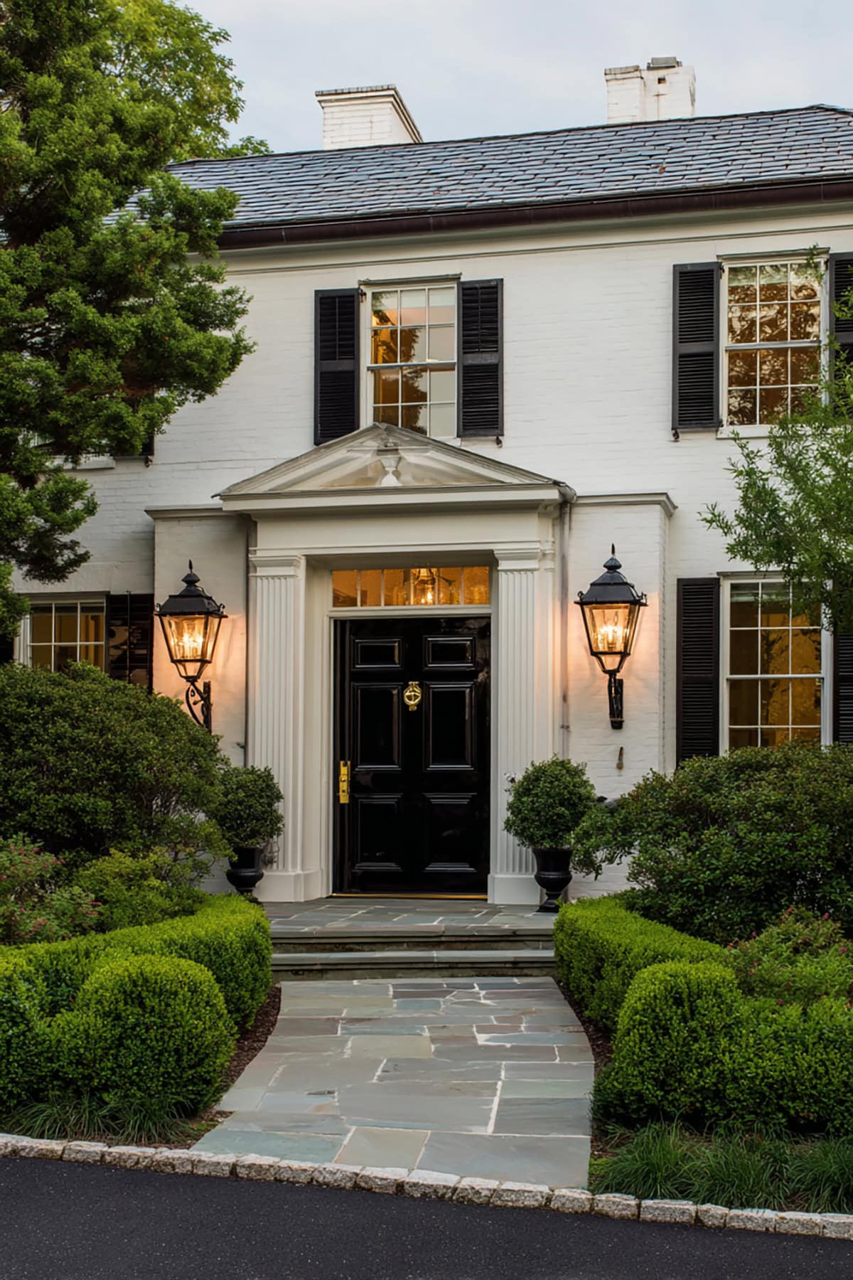
Doesn’t this white, stylish house look stunning with its jet black front door and matching shutters? We especially like the glass panels on both sides of the door and the dark brown porch flooring.
Elegant black is also a nice front door color for a tan house.
Creamy Pink
Pink is a fun, vibrant color choice for front doors. After all, this hue brightens up the white exterior walls and gives you endless decorating options.
Any shade of pink will go beautifully with landscaping and the trims of a white exterior. Whether you add metal hardware or a simple wreath to your door, a vivid pink paint color will definitely stand out.
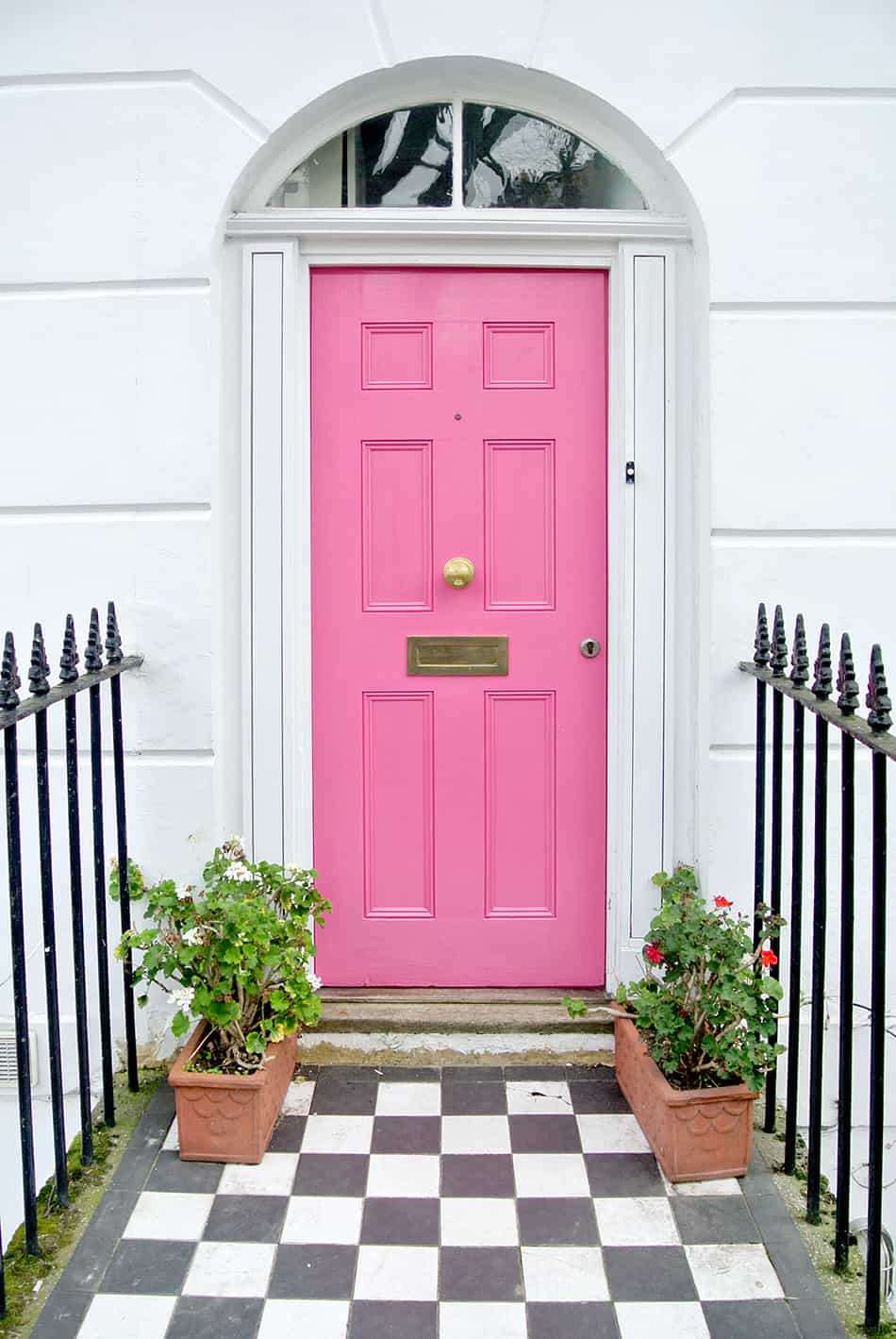
This creamy pink front door looks stylish next to the white exterior and checkered flooring. It implies the homeowner is a fun-loving character with a sense of humor.
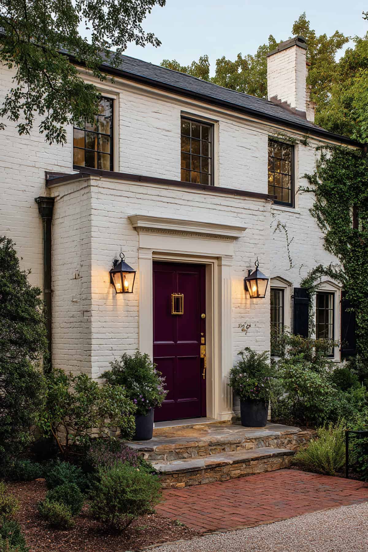
Violet Purple
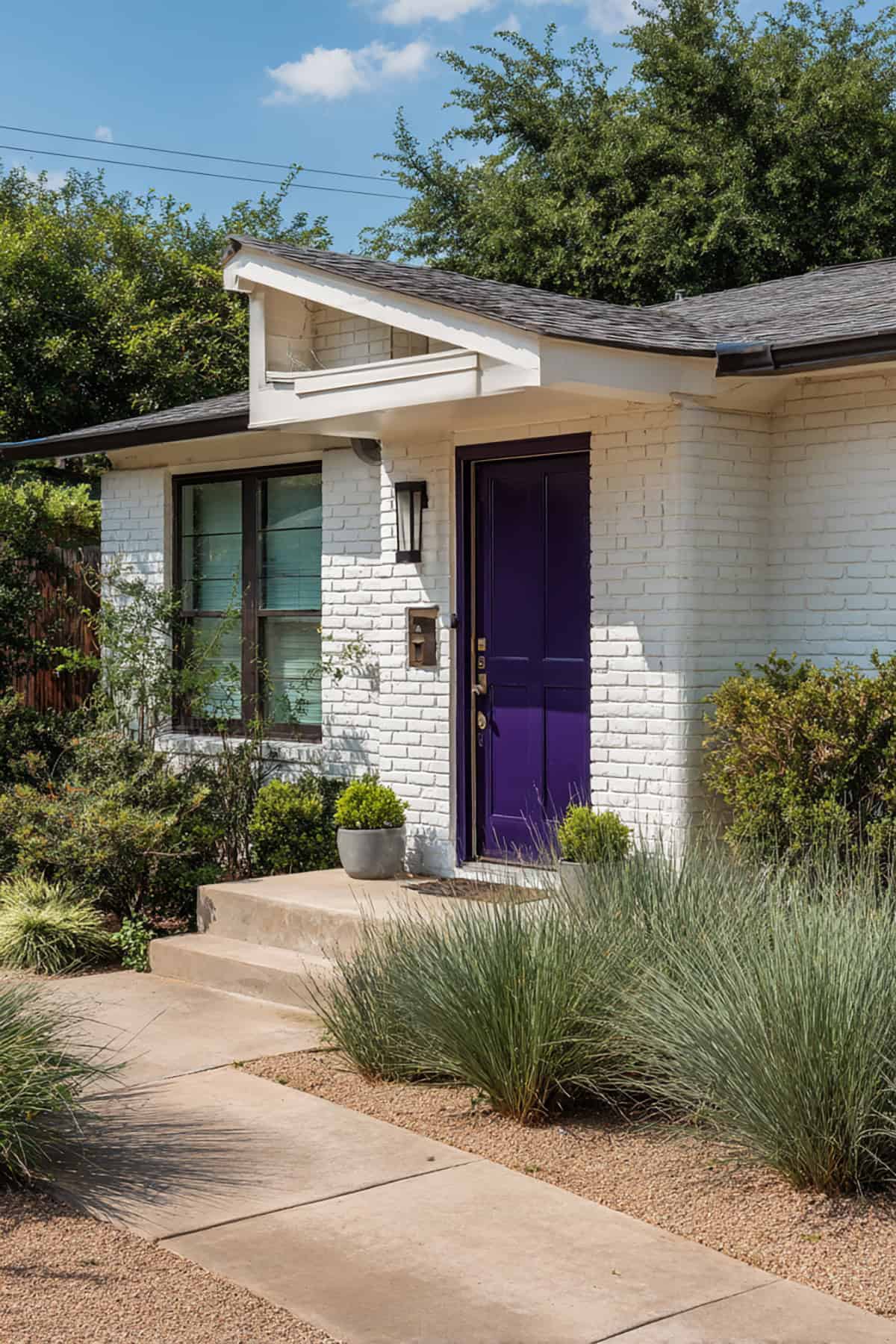
Purple is an exciting color for a front door. It is an especially elegant choice next to white exteriors. This rich color brings warmth and vibrance, but it’s best used with neutral colored themes like white or beige.
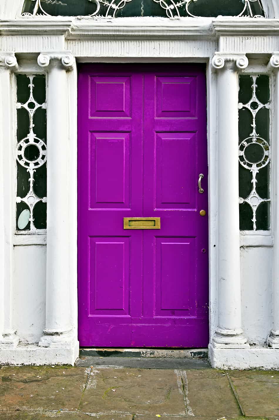
Here is a Georgian-style white house with a front door in a beautiful violet paint color. The purple shade is a unique choice and goes well with the gold hardware. We love the intricately designed framed door that makes this entryway incredibly unique.
Spring Green
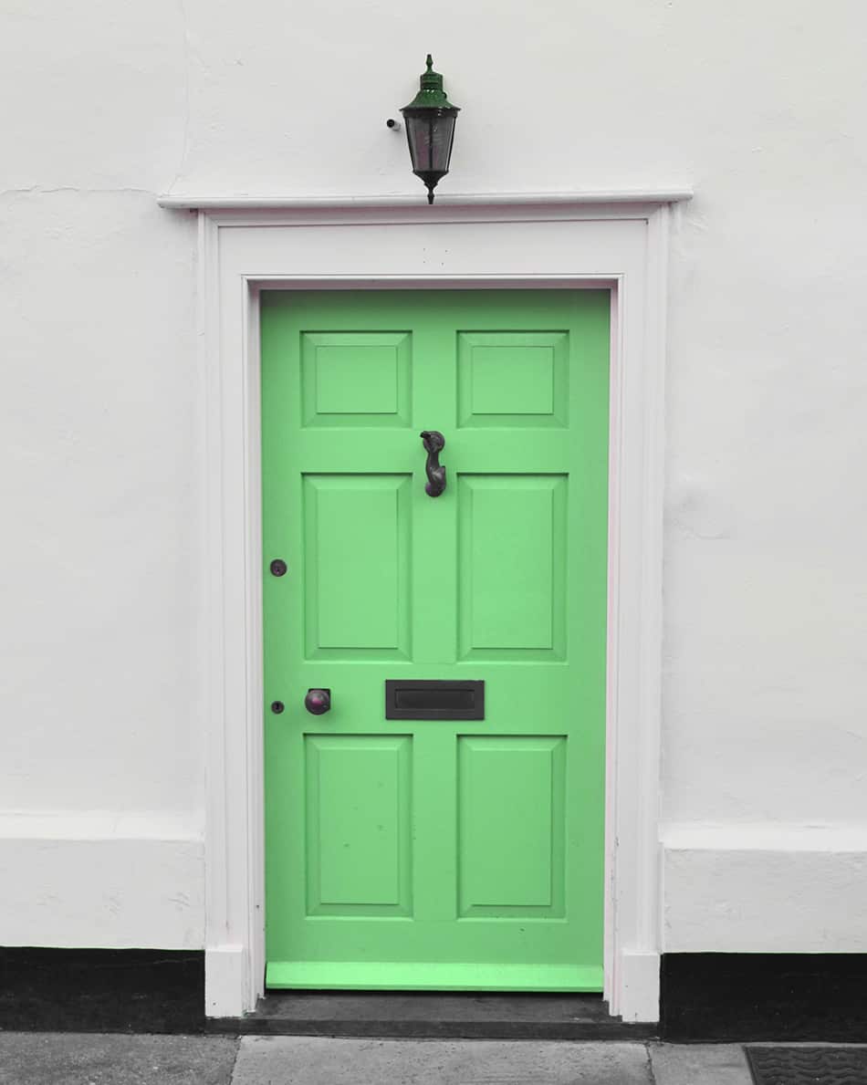
Green is an inviting paint color for the front door as well as being a natural hue. A white exterior with a front door painted with green shouldn’t go amiss, regardless of whether the siding is made from stone, brick, or wood. Green next to white will complement the overall decor so the brighter shade you choose the better.
In this example, the spring green front door stands out next to the plain white exterior since this particular shade leans to a bold rather than muted hue. To spice up the entryway and soften the look, dark metal hardware and golden overhead lighting are added.
Tiger Orange
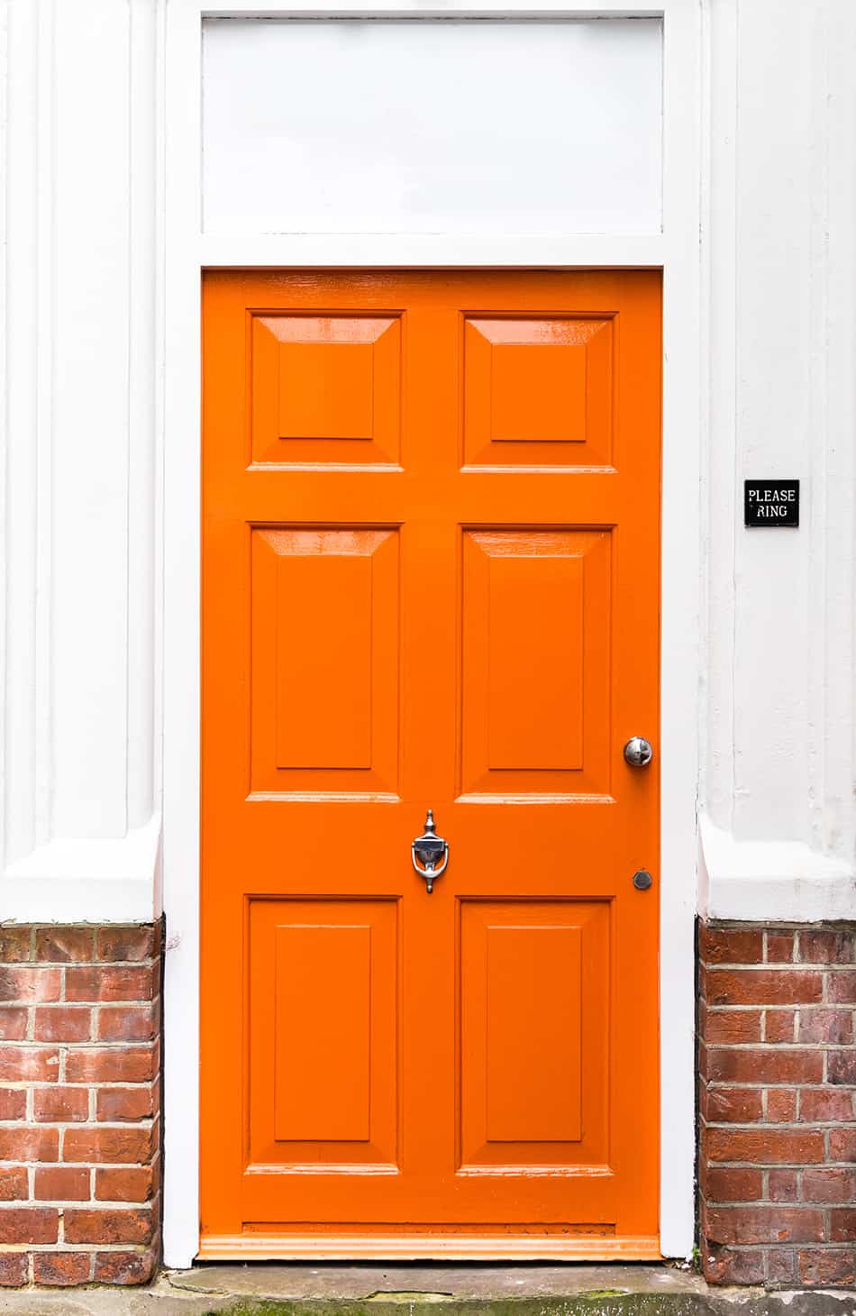
Have you ever considered an orange paint color for your white exterior’s front door? Sure this is a daring color choice, but it can bring much-needed freshness to any entryway.
If you want to make your entrance stand out from other homes, consider adding some brightness by going for a bold shade of orange. We can assure you that a vivid shade of orange won’t overwhelm your white home’s entry, but rather, it will draw attention instantly.
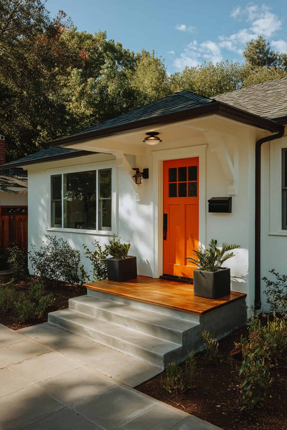
Orange is a warm tone that emits warmth. You can see from this example how the tiger shade of orange has transformed the entry of this white house. The owners of this house have shown their sense of adventure by opting for such a bright door color.
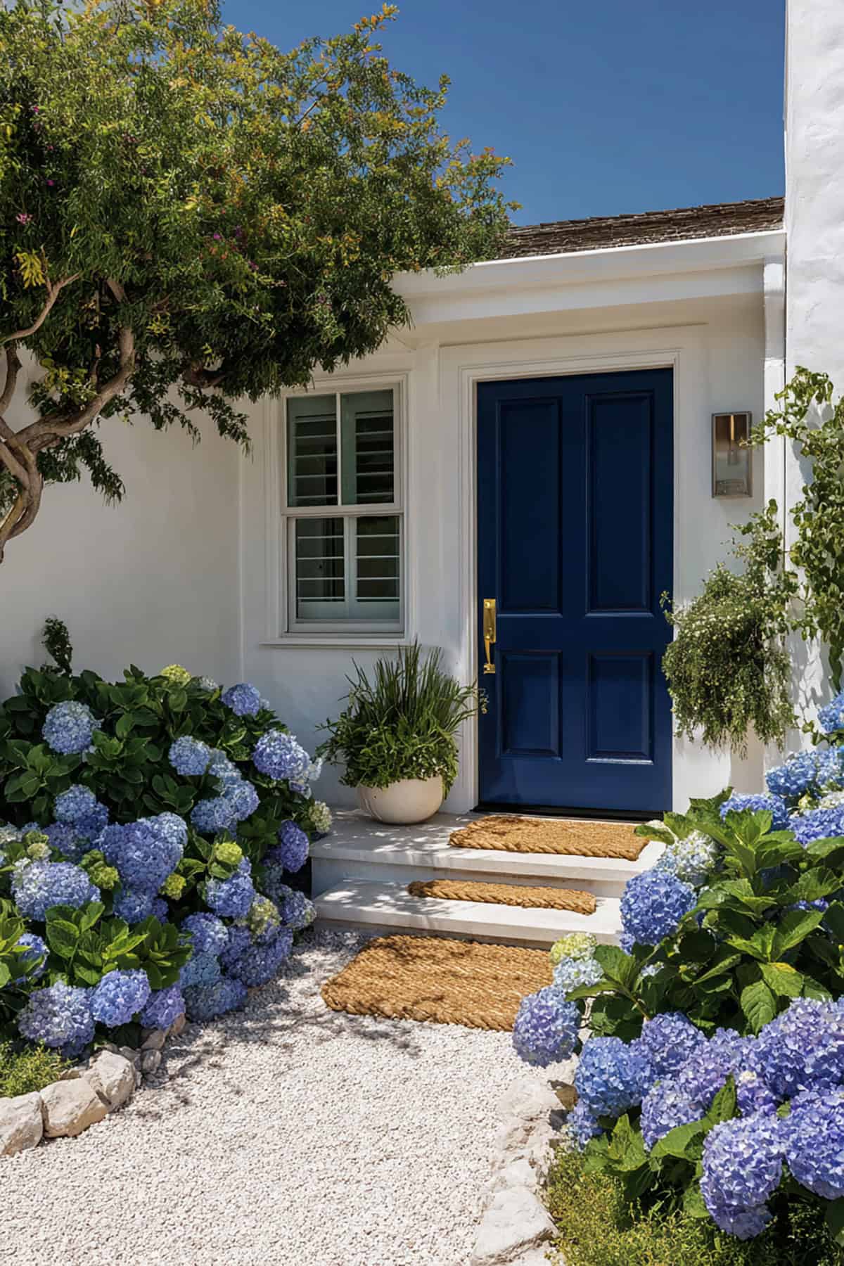
Blue is perhaps the most versatile color that goes with any exterior hue. All shades of blue are trendy, especially the bold ones like navy and peacock. To make your white house stand out, go for a classic shade, such as navy as this is a timeless hue that always looks amazing next to white brick, wood or stucco siding.
Here is a nautical-themed entrance with a navy blue door and windows for a welcoming feel.
Royal Blue
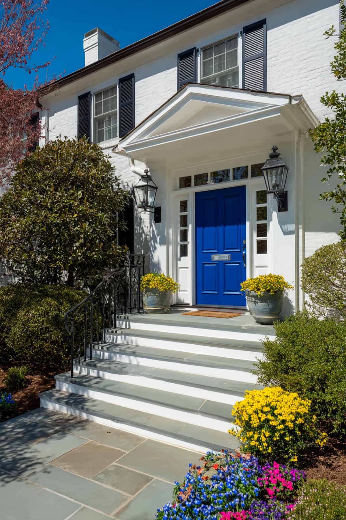
Another beautiful shade of blue that we just had to include is royal blue. This vividly deep shade is calming and works with most house colors. It can also serve as an accent color next to white exteriors.
Royal blue is a timeless choice for any season, plus you can enhance the door color by hanging a wreath or adding gold hardware.
See how this white brick house oozes curb appeal with its royal blue door and full white trim. All colors pull together nicely to create a one-of-a-kind entrance.
We think royal blue is the perfect shade that goes with any exterior color. With the addition of green landscaping, the entrance will look even more appealing.
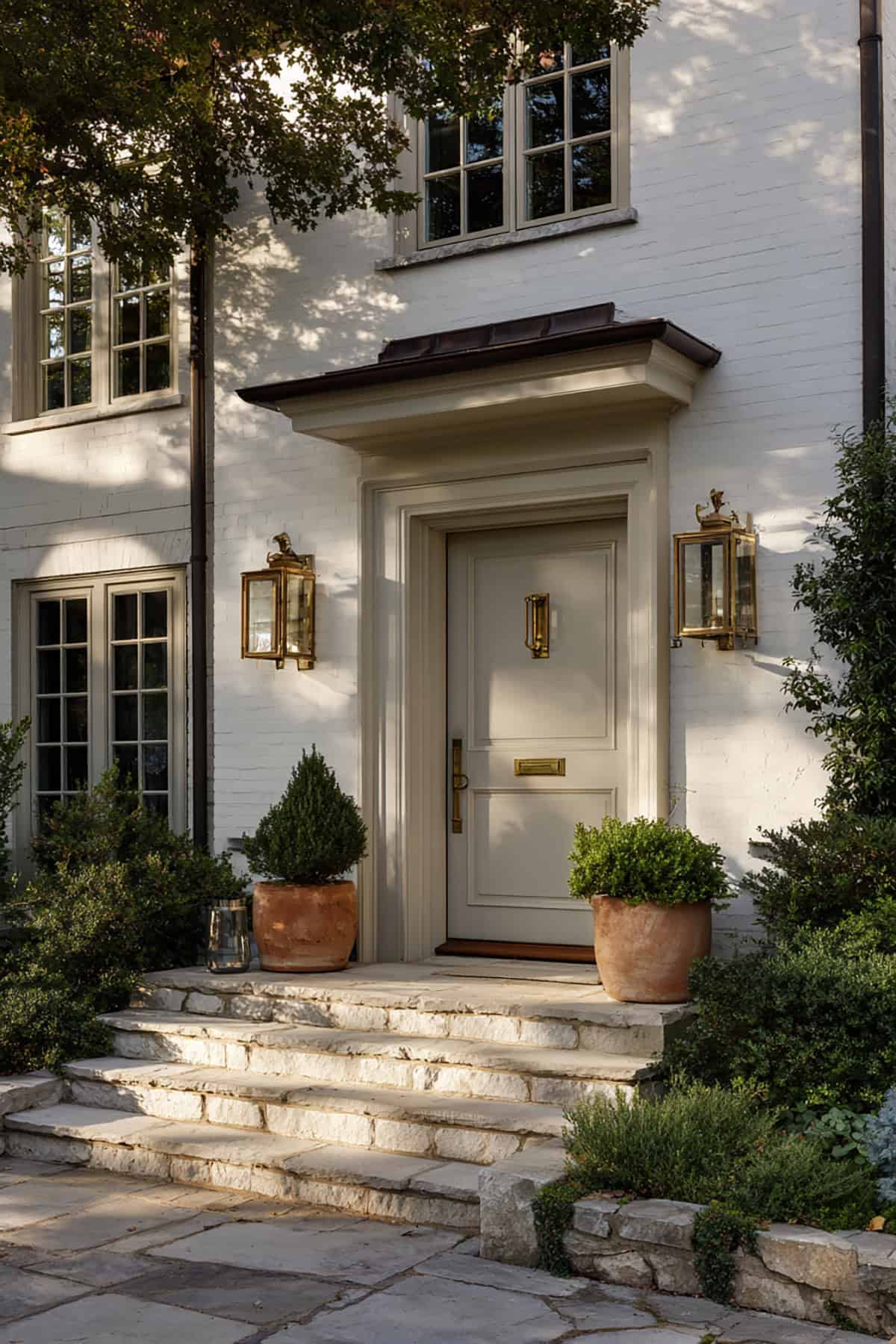
Soft Gray
If you don’t want to take the daring route and paint your front door a bright color, why not opt for a soft gray hue as a sophisticated choice? This elegant neutral color goes perfectly with white house siding, especially on modern exteriors.
This subtle shade of gray front door blends seamlessly with the modern white house. The muted gray gives this home a holiday feel, which further enhances its curb appeal.
Gray is a great choice for homeowners who don’t want their entrance to attract attention. Whether you like the dark or light shades, your modern white exterior will certainly appreciate such a classy front door color!
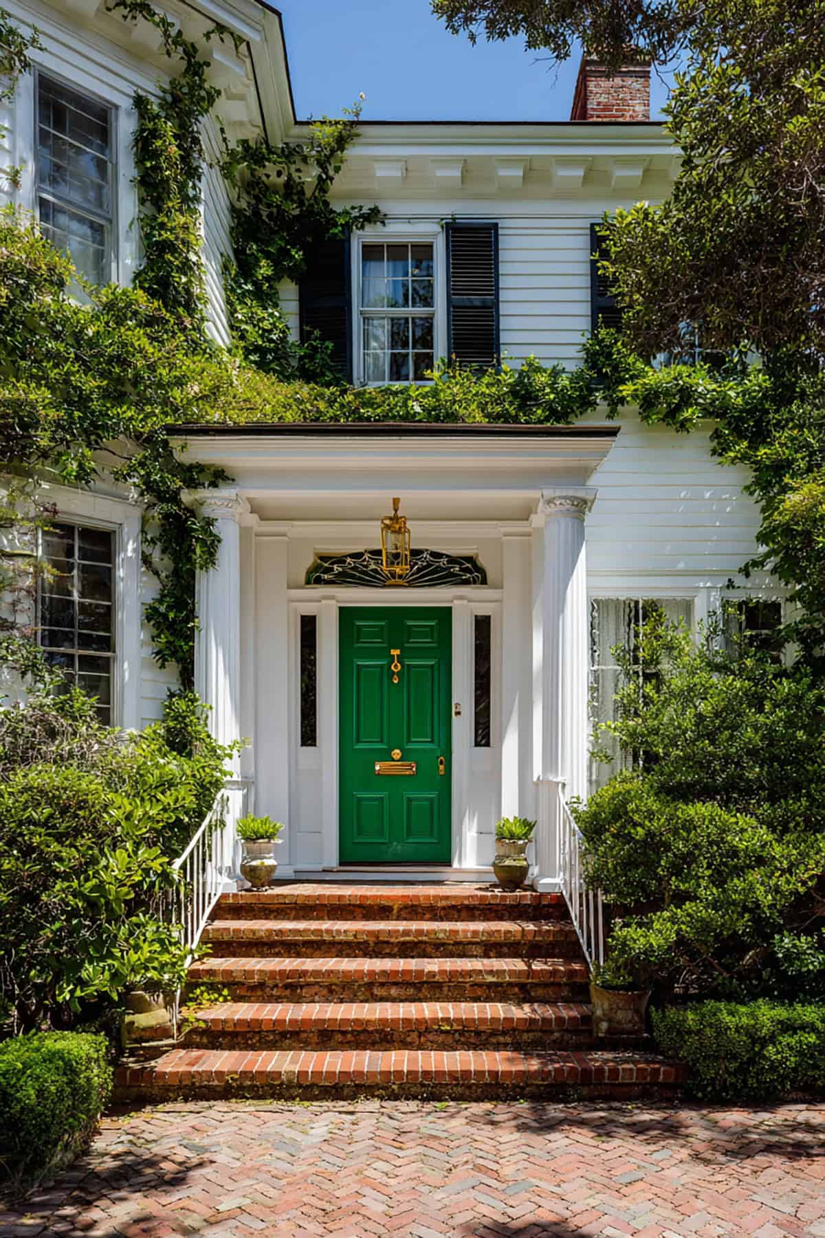
Forest Green
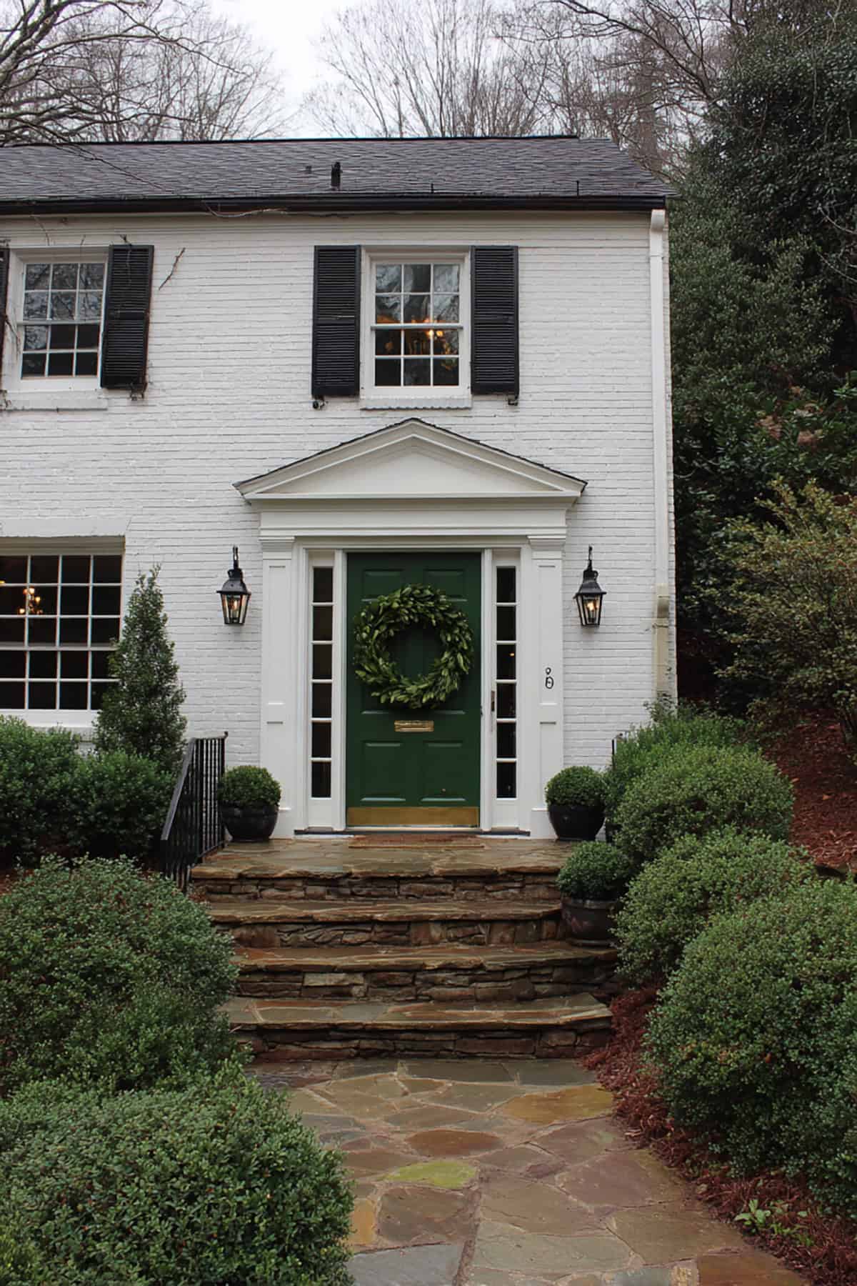
Going with a deep green door gives you solid contrast but doesn’t feel harsh. It’s a classic move, especially for colonial or Georgian-style homes. Dark green just works with white trim and black hardware.
Looks best if your roof is neutral—think gray or black. If you’ve got stone or brick nearby, even better. Satin or semi-gloss finishes keep the color looking fresh, even in the shade.
Forest green feels especially at home if you’ve got mature trees or hedges. The greenery ties in and makes the entryway feel more connected to the yard.
Sage Green
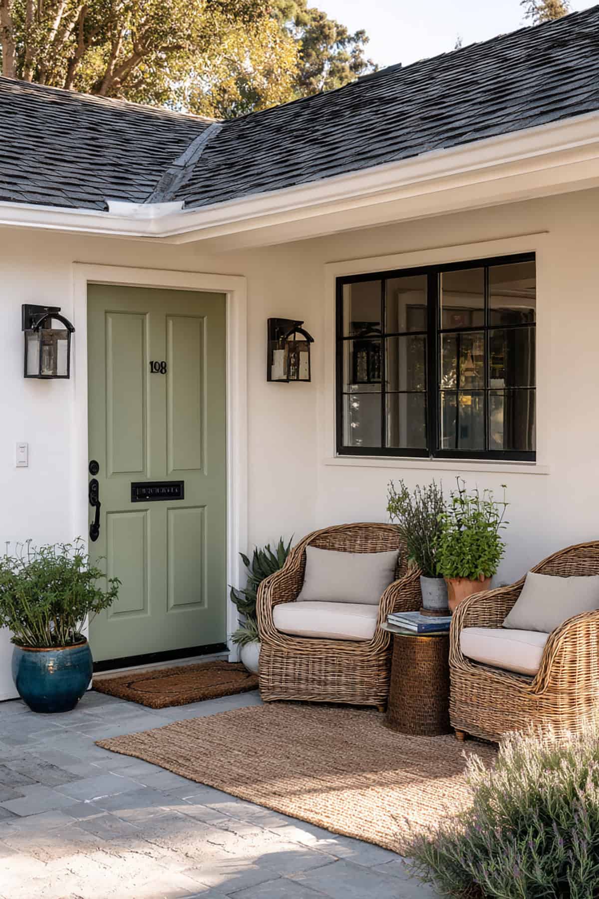
If you want something softer, sage is a nice middle ground. It’s calm, balanced, and doesn’t weigh down the look. Great for cottages, farmhouses, or those in-between styles.
Pairs nicely with beige stone or a warm gray roof. Sage won’t create a jarring break—everything just sort of flows. Matte or low-sheen finishes keep it chill.
Sage is for folks who want a bit of color without the drama. Your door stands out, but it’s never fighting with the rest of the house.
Teal
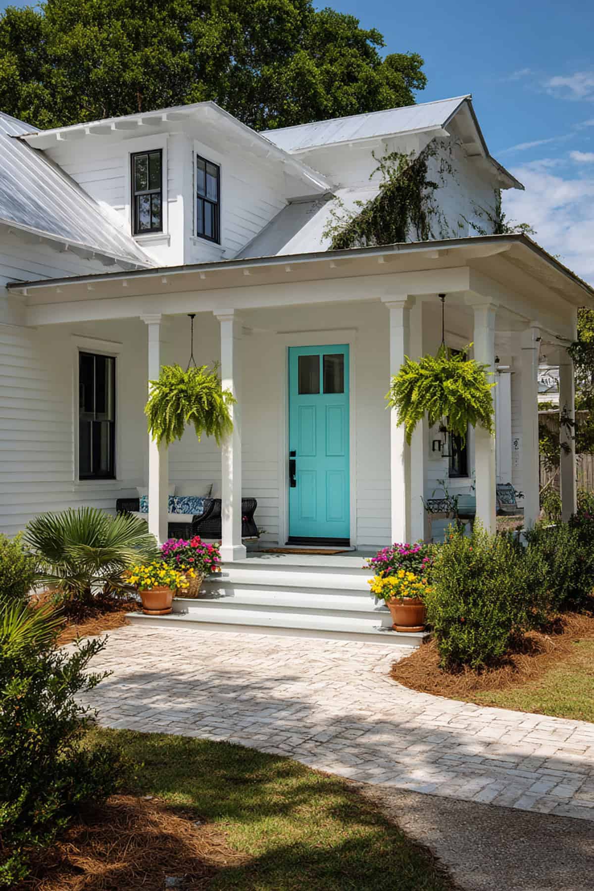
Teal brings in some energy but still feels grown-up. It’s a blue-green that adds personality without being over the top. Simple façades let teal shine.
Brushed nickel or brass hardware looks sharp here. White trim keeps things crisp. A bit of gloss helps the color pop.
Teal feels right for coastal spots, mid-century places, or even a traditional home that wants a twist. It’s fresh, but not wild.
Deep Burgundy
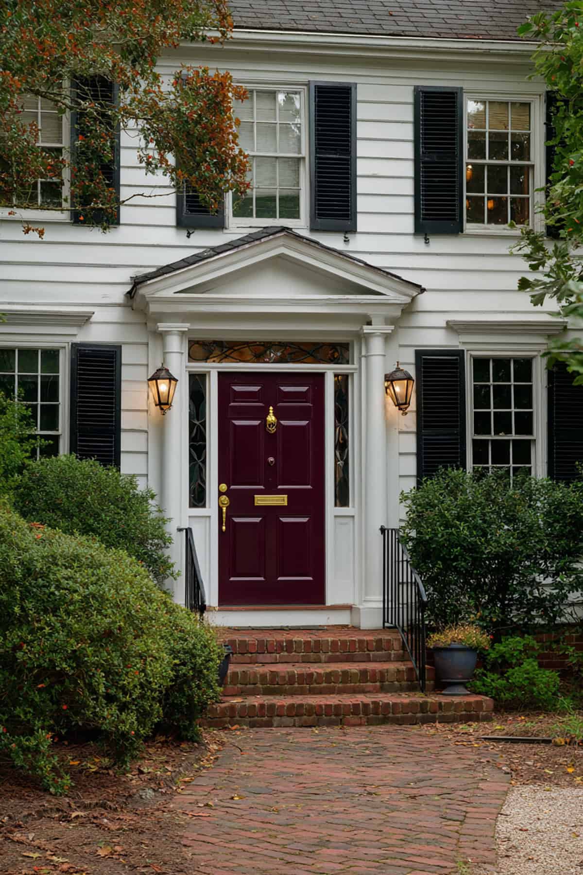
Go with a dark red if you want richness and a touch of formality. Burgundy contrasts nicely with white, but it’s not in-your-face.
Darker shutters or railings make this color work even better. Black or oil-rubbed bronze hardware fits the vibe. Glossy finishes help keep the color from looking dull.
Burgundy is at home with brick walkways and classic columns. If your materials are super cool-toned, though, it might not be the best match.
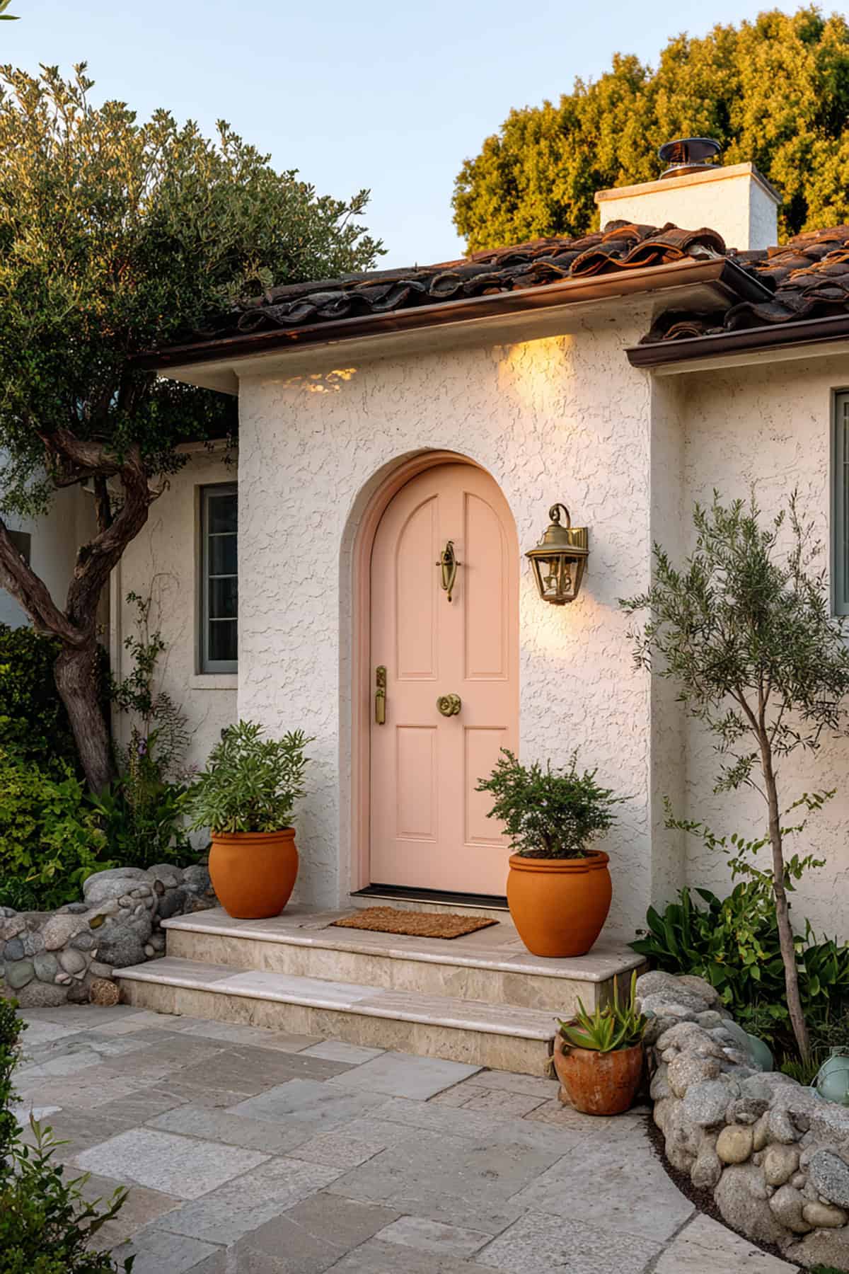
Terracotta
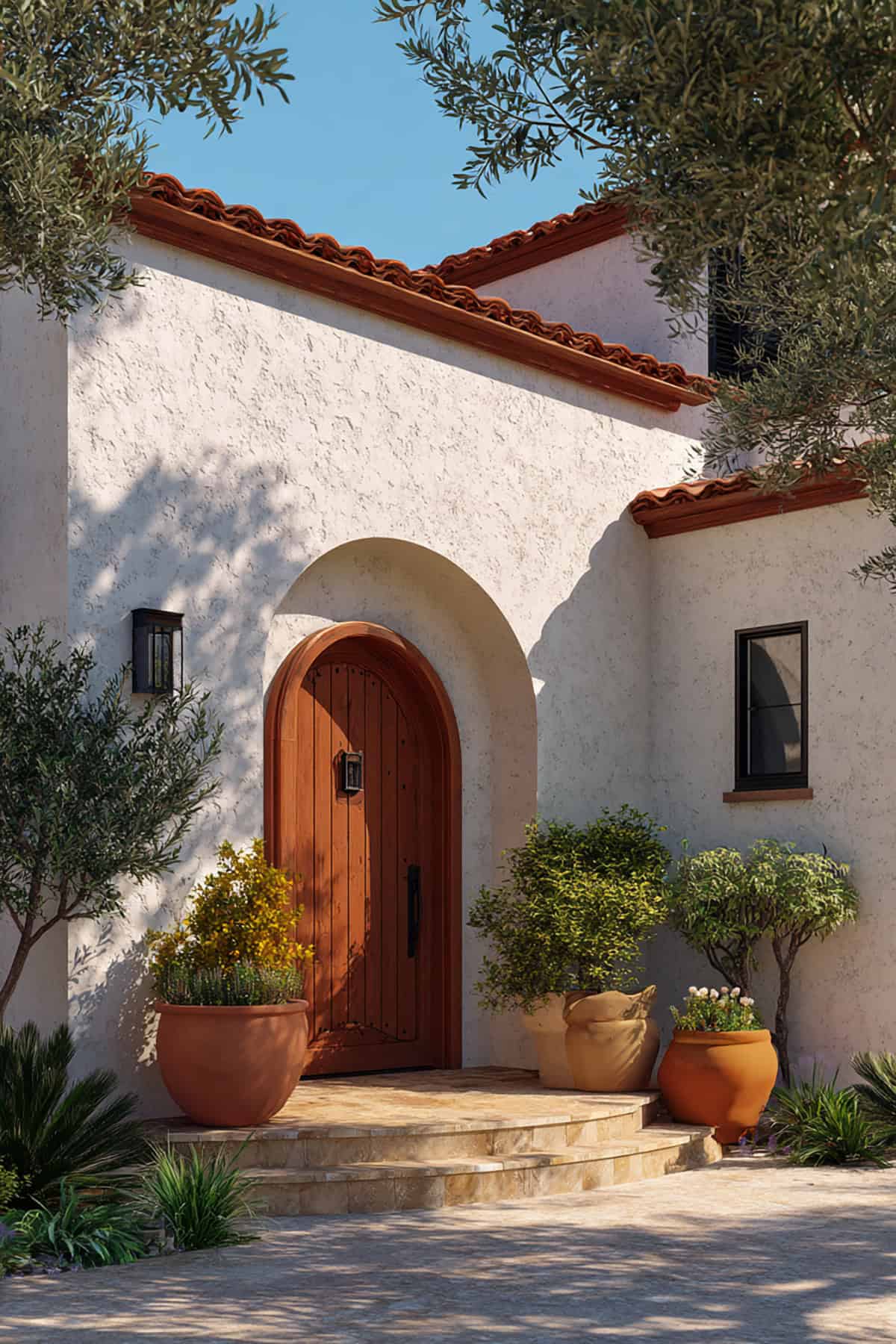
Earthy orange-reds like terracotta bring warmth and a grounded feel. The contrast is softer, not stark.
Works best if you’ve got stucco, clay pavers, or wood accents nearby. Matte finishes keep it natural. Sunlight really brings out the depth in this color.
Terracotta is perfect for Mediterranean or Southwestern looks. The entry feels welcoming, not just decorative.
Chocolate Brown
Deep brown is subtle. It doesn’t scream for attention, but it’s solid and dependable.
Pairs up well with wood beams, stone, and neutral roofs. White trim still pops, but without harshness. Satin finishes keep things clear.
If you’re after cohesion and a sense of permanence, chocolate brown fits—especially for traditional or rural homes.
Charcoal Gray
Charcoal gives you contrast, but it’s not as intense as black. It looks clean and modern against white siding.
It’s a good call if you’ve got metal railings or concrete steps. Matte or satin finishes keep reflections in check. Chrome or black hardware both work.
Charcoal suits minimalist or updated classic styles. It defines the entry without adding clutter.
Greige
Blending gray and beige, greige gives you balance and flexibility. It softens a white exterior and keeps things refined.
Greige is pretty adaptable—works with stone, brick, or composite stuff. Low-sheen finishes keep it looking even.
Great for people who want something neutral but not boring. The door supports the overall look instead of taking over.
Copper-Tone Metallic
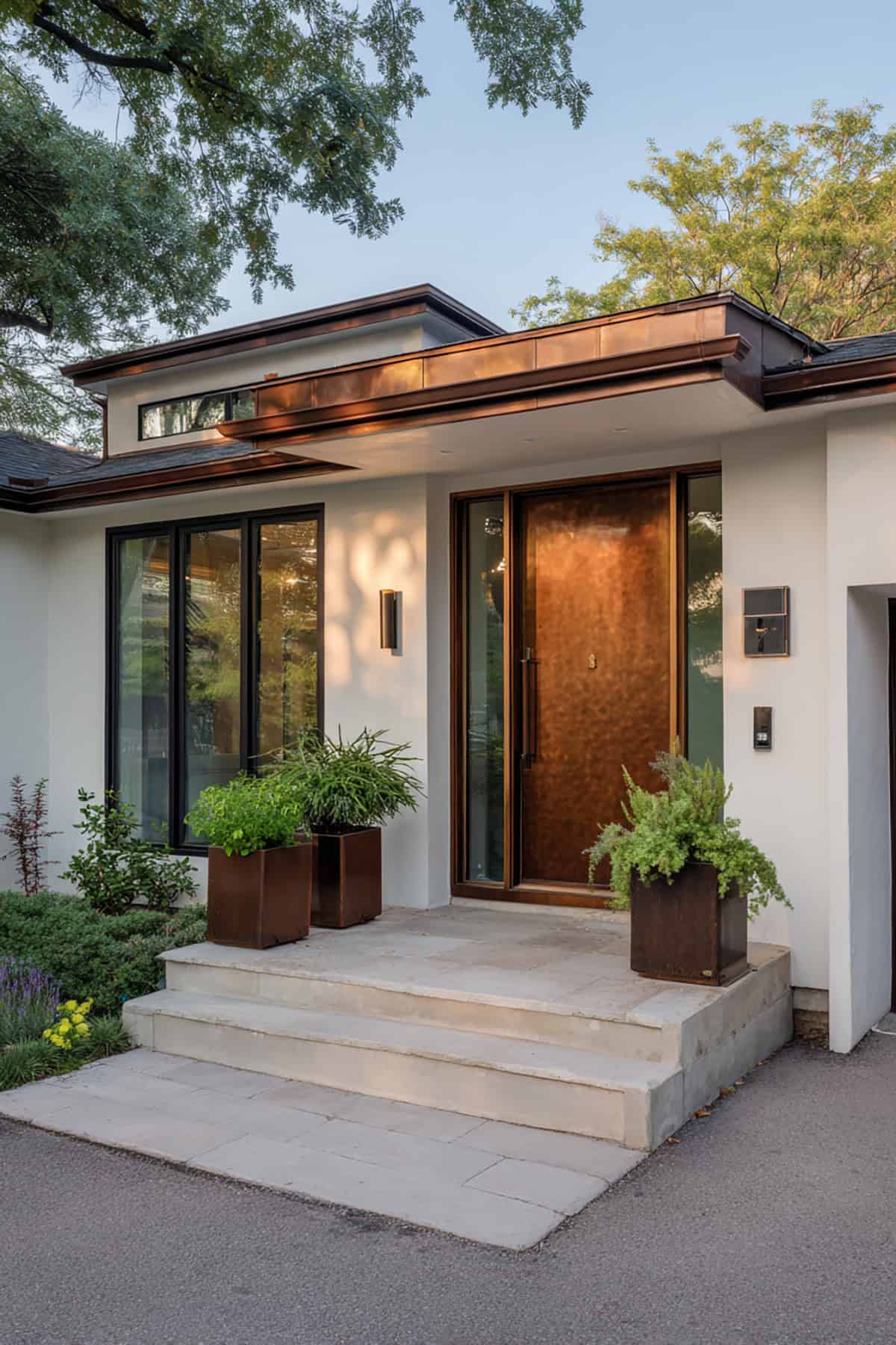
Metallic copper adds a bit of shine, but in a controlled way. It’s more curated than flashy. Brushed finishes mean you get some reflection without glare.
Looks best with dark trim and clean lines. Keep other colors understated, and let the hardware match or fade into the background.
Copper tones are ideal for modern or industrial homes. It’s a focal point, but it’s about the material as much as the color.
Dusty Blue
Muted blue brings in color without high contrast. Dusty blue feels calm and a little nostalgic next to white siding.
Pairs with light gray roofs and white trim. Satin finishes keep things soft. Brass hardware adds a touch of warmth.
Dusty blue fits coastal and suburban homes. You get a little personality, but it never shouts.
Mustard Gold
Mustard gold is a warm yellow-brown that adds depth and character. The contrast with white is clear, but not blinding.
Works best with darker accents and simple trim. Matte finishes avoid glare. Black hardware gives it a crisp edge.
Mustard is great for vintage or eclectic homes. If your façade is already super ornate, though, this color might be too much.
Plum
Deep purple like plum adds richness without feeling gimmicky. The contrast with white is intentional and interesting.
Looks good with gray stone and black trim. Satin finishes keep the color looking true. Best to keep the hardware minimal.
Plum is for formal or artsy homes. It stands out, but still respects the architecture.
Seafoam
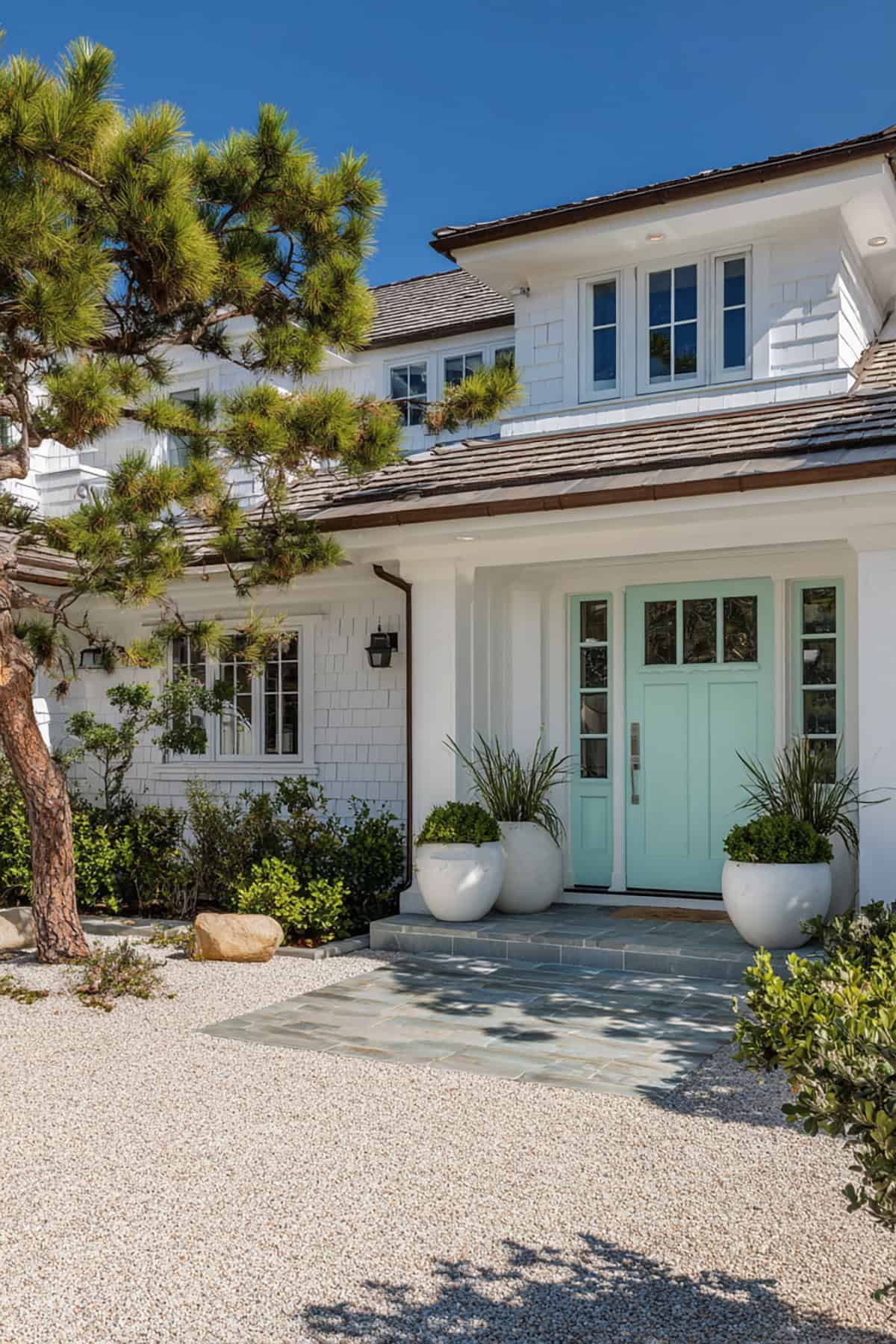
That pale green-blue door? It pops just enough, giving a gentle contrast. Seafoam’s got this breezy, almost controlled vibe—never shouts, just hangs back nicely next to white siding.
Honestly, it looks best when the sun’s out. White trim sort of melts into it, and nickel hardware keeps everything feeling tidy, not fussy.
Feels right for places near the coast or anywhere laid-back. You end up with a touch of color that still keeps the whole exterior feeling airy and easygoing.
Conclusion
When your home exterior is airy and crisp white, the possibilities for choosing the best front door color are endless. While any door color will look great next to white, it is important to select a paint color that goes well with your home’s trims, landscaping details, porch, shutters as well as the roof.
This will ensure the door color coordinates nicely with your bright white siding. The great thing about white is the vast options it offers you when choosing an inviting front door color. Use our ideas to pair your white siding with a pop of color to make your home stand out.