Home design & decorating tips about architecture, color schemes, paint colors, interior styles, and so on.
Decorating
Pastel pink can range anywhere from a sweet and soft pale bubblegum pink to a more subdued dusky gray-toned pink. Here we will look at the different ways colors that go with pastel pink can be used to transform the look of a room.
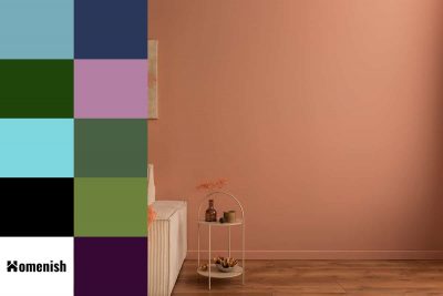
Salmon is a pink-orange shade named after the color of the flesh of this freshwater fish. It is neither subtle nor bright and instead sits somewhere between the two. As a color that is made up of both pink and orange, the main contrasting colors of salmon are green and blue
ilver is a metallic color that can be most likened to gray. The finish you choose for silver interiors is going to dictate the effect the color has on the room. Here we will look at some stylish ways to incorporate silver into your home decor and the best colors to pair with it.
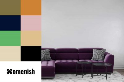
Plum is a dark shade of purple, named after the color of the plum fruit’s skin. Plum is a rich and warm shade, with a hint of deep red present in it. Here we will look at some key ways to add plum to your interior decor, along with assessing which colors go well with a plum color scheme.
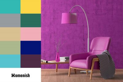
Magenta is a bright violet color that is made up of equal parts red and blue. It has a bold and feminine feel due to the string pink-purple shade. This is a color not commonly found in interior design because it is very showy and can look gaudy if not used carefully. However, magenta can make a really fun statement in some decor styles, so don’t shy away from it if this is a color you love.
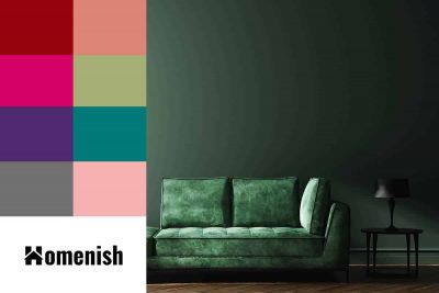
Hunter green is a color that has really exploded onto the interior design scene over the last year or two and is now an enormously popular shade of green to use in any room in the home. Here we will explore which colors go with hunter green to make it pop and how to incorporate this shade into your home decor.
A black and white color scheme will go with any third color that you want to put with it, making this palette extremely versatile. Here we will look at some of the most stylish colors in interior design right now that can work really well in a black and white room.
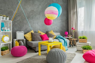
Neon green is an overtly bright and bold color that is very similar to lime green, though neon green is a tad darker and cooler with more blue undertones compared to lime green. This color is best suited to being an accent shade rather than a main base shade in interior design because it is so bright that it can be overstimulating.
Accent walls are a great way to easily bring style and character to a room. If you you like to incorporate grey with your current accent wall, read on to find out what the best color accent walls to use.
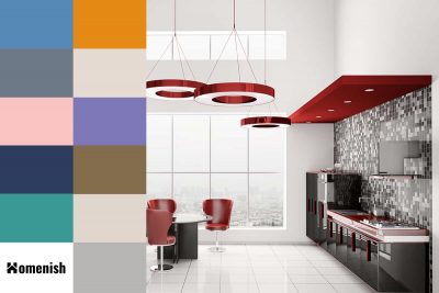
Black and red are two intense colors that have long been established as an iconic color duo. Think of a little black dress with a pair of killer red heels or a glossy black kitchen with red appliances such as a retro-style blender or a coffee machine. These two colors stand out really well against each other, but the contrast isn’t so extreme that it becomes overstimulating. Adding a third color to the mix is a good idea to help create balance and prevent the color scheme from being too bland or obvious.
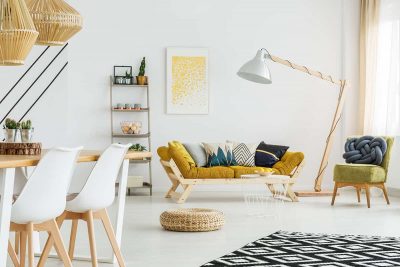
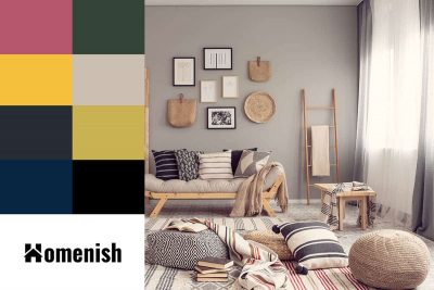
Mustard yellow is a beautiful color with a hint of brown and gold tone that reminds us of autumn. Depending on the intensity chosen, this soft yellow shade can transform any room in the house when used as part of the decoration.
There are more colors that go with everything than you might initially think. Black and white are probably the first colors that come to mind when pondering this issue, potentially along with cream or beige.