Explore popular colors that are used in home decor and ways to pair colors together with our in-depth ideas and tips
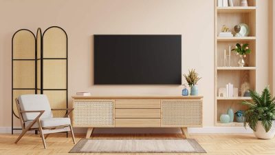
The term ‘accent color’ is thrown around liberally in the world of home decor and interior design, but have you ever stopped to think about what it really means? Accent colors are hues used to draw attention to, or contrast against, certain items or colors, but there’s so much more to learn about accent colors. Here we explore exactly what accent colors are, how to choose accent colors, and how to use them in the home.

White is a true neutral color since it lacks any other hues. It is broadly considered to be the color of purity and innocence, and it can help to brighten up any color scheme. Here we explore the meaning of the color white and explain the best way to use white shades in interior design.
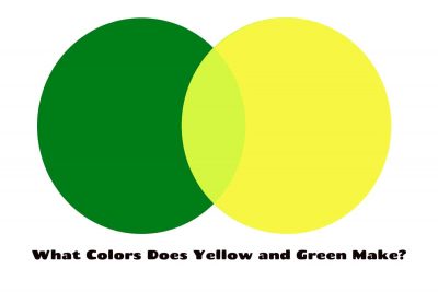
Yellow-green is a tertiary color that you will get when you mix yellow and green together. This color can also be referred to as ‘chartreuse’.
Iridescence can be a tricky concept to come to terms with, but it’s actually very easy to incorporate into a home decor style.
Ivory is a warm neutral that makes a perfect base for so many color palettes, but it can also be used effectively as an accent shade. Here we explore exactly what color ivory is, how to make it, and how to use it in home decor.
Cream is a warm and neutral color that can make a nice alternative to white or off-white in home decor. Here we explore how to make cream, and how to effectively use it in interior design.

The concept of warm and cool colors is central to interior design, and this forms the basis of many color schemes and home decor themes. Having an understanding of what warm colors are and how they can benefit an interior space is essential for creating rooms with appropriate atmospheres, and ensuring balance within a home. Here we explore warm colors, how to use them, and how to identify them.
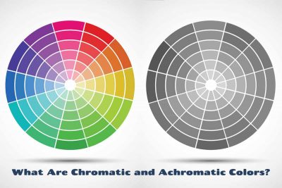
Having an understanding of chromatic and achromatic colors can help if you’re an artist or a designer. Here we uncover the definition of both of these terms and explain how they can be used in home decor.
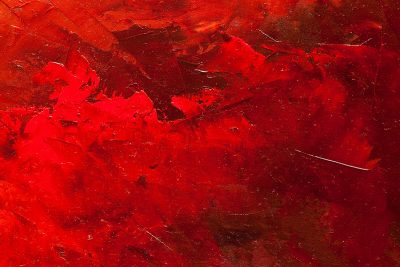
Red is one of the most prominent colors on the color wheel because of how bold and vivid it is. It is heavily used in art to make people or objects stand out, though it is lesser used in home decor because of its intensity. Here we explore the psychology of red and look at what colors make red.
On the standard color wheel, there are three types of colors; primary colors, secondary colors, and tertiary colors. The primary colors are red, yellow, and blue, and all of the secondary and tertiary colors are created by using these primary colors in varying combinations. There are six tertiary colors, which are blue-green, green-yellow, yellow-orange, orange-red, red-purple, and purple-blue. Here we explore how to make tertiary colors and how they can be used in home decor.
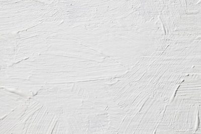
There is a lot of debate around whether white is actually a color since the very definition of white is that it lacks color, and white is not featured on the color wheel or on the color spectrum. If we believe that white isn’t a color, then how do we go about making white? Here we explore different suggestions and debunk some myths when it comes to creating white.
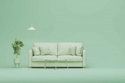
A monochrome color palette will contain various shades, tints, and tones of the same color, creating a look that offers depth and interest without any stark contrasts that might be overstimulating.