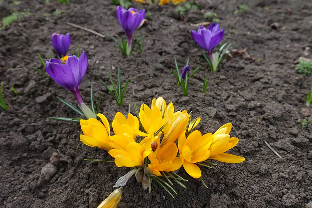
On the standard color wheel, there are three types of colors; primary colors, secondary colors, and tertiary colors. The primary colors are red, yellow, and blue, and all of the secondary and tertiary colors are created by using these primary colors in varying combinations.
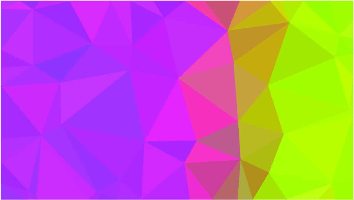
There are six tertiary colors, which are blue-green, green-yellow, yellow-orange, orange-red, red-purple, and purple-blue. Here we explore how to make tertiary colors and how they can be used in home decor.
Table of Contents
What are Tertiary Colors?
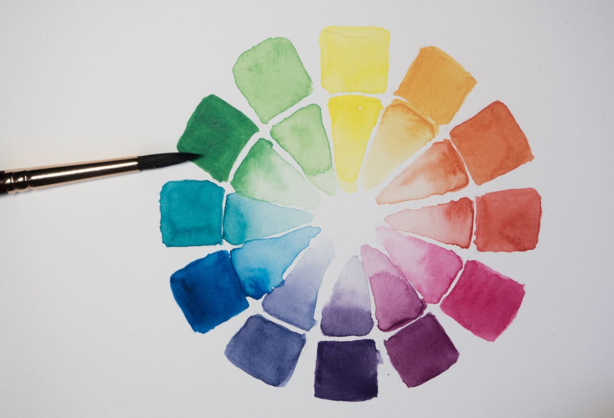
A tertiary color can also be known as an intermediate color. It is a color that sits in between primary and secondary colors on the color wheel.
There are six tertiary colors in total, which are blue-green (also known as teal), green-yellow (also known as chartreuse), yellow-orange (also known as amber), orange-red (also known as vermillion), red-purple (also known as magenta), and purple-blue (also known as violet). Tertiary colors are made by mixing pure or true colors together; they cannot be created by using tints, shades, or tones.
How to Make Tertiary Colors
There are two ways to make tertiary colors with paint, and the way you can do this will depend on whether you have access to just primary colors or if you also have access to secondary colors.
Making Tertiary Colors with Primary Colors
If you want to make a tertiary paint color using primary colors alone, this is certainly possible. Each tertiary color will be made from two primary colors in varying amounts.
Blue-green or Teal
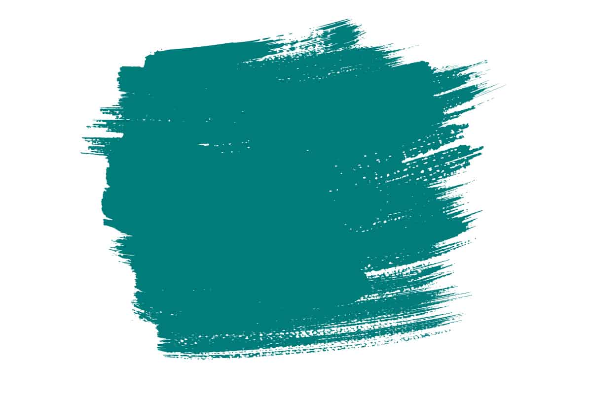
To make the tertiary color blue-green, also known as teal, you will need blue and yellow paint. This is because blue-green is made by mixing an even amount of blue with green, and while you already have the blue paint for this mixture, you can make the green with blue and yellow.
There are two ways to make blue-green using blue and yellow paint. The first is a two-step method. This first requires you to make green paint using 1 part blue and 1 part yellow. When you have your green paint, you can mix this with the blue; 1 part green to 1 part blue.
The resulting color is the tertiary color blue-green or teal. The alternative way to make this uses only one step. This involves mixing 3 parts blue to 1 part yellow. The result will be exactly the same since this method uses the same colors and quantities of paint, but it doesn’t break it down into two steps.
Green-yellow or Chartreuse
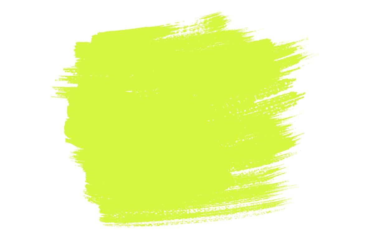
To make chartreuse or green-yellow using primary colors, you will need blue and yellow primary colored paints. You can first create green by mixing 1 part blue with 1 part yellow, and then use your green color in a mixture of 1 part green to 1 part yellow. This will give you chartreuse paint.
To skip one of the steps and get to this color more quickly, you can jump past the part where you make green, and instead just mix 3 parts yellow to 1 part blue. This will give you the same result.
Yellow-orange or Amber
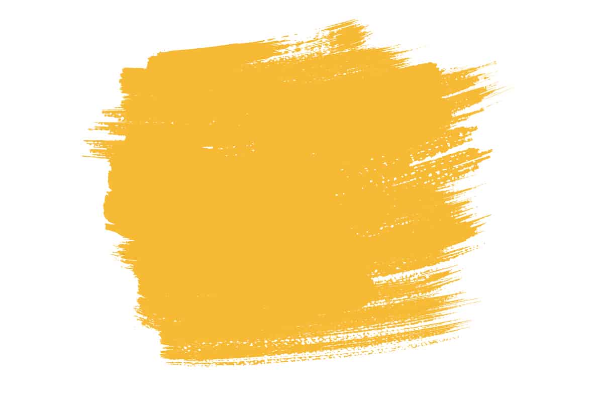
Amber or yellow-orange is made from yellow and red. To make paint in this color, first, make orange by mixing 1 part red with 1 part yellow. Now you have orange, mix 1 part orange with 1 part yellow, and the result will be amber, otherwise known as yellow-orange. You can also create this paint in one step by combining 3 parts yellow to 1 part red.
Orange-red or Vermillion

Orange-red is made with red and yellow primary colors. First, make orange with a mixture of 1 part red to 1 part yellow. Next, use your orange mixture in a proportion of 1 part orange and 1 part red to make vermillion or orange-red. Alternatively, mix 3 parts red with 1 part yellow and achieve the same color of paint in a shorter sequence.
Red-purple or Magenta
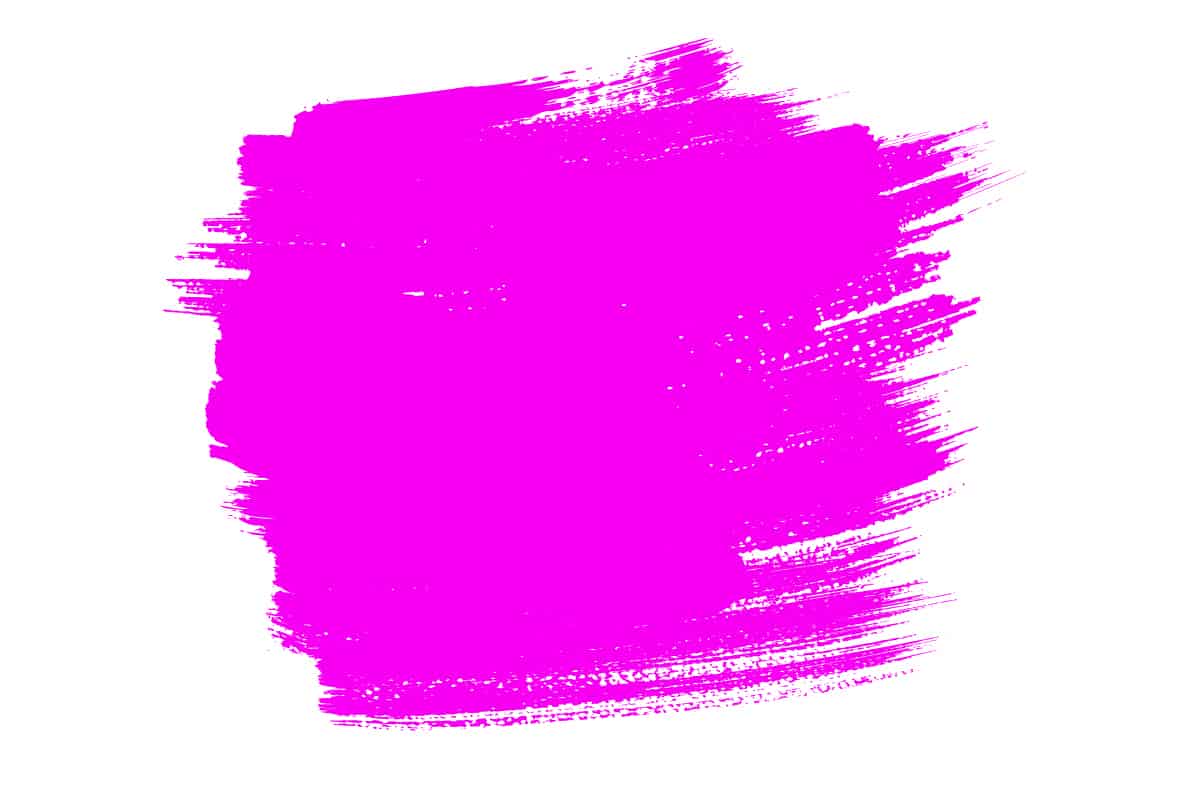
Red-purple or magenta is a tertiary color made using the primary colors red and blue. First, you can make purple by combining 1 part red with 1 part blue. Now use the purple paint in a mixture of 1 part purple with 1 part red. This will make magenta paint. You could instead skip the part where you make purple and instead mix 3 parts red with 1 part blue to achieve the same results in a shorter time frame.
Purple-blue or Violet
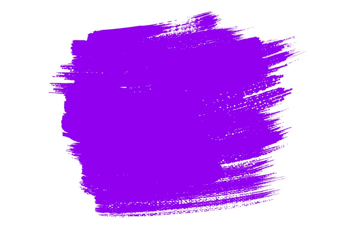
Violet, also known as purple-blue, is a tertiary color made using blue and red primary colors. Create a purple paint by mixing 1 part red with 1 part blue, and then use the purple you have created in a mix of 1 part purple to 1 part blue. This will give you violet paint. Alternatively, combine 3 parts blue with 1 part red to make the same color.
Making Tertiary Colors with Primary and Secondary Colors
If you already have both primary and secondary colors, you can make tertiary colors using these.
Green-yellow or Chartreuse
Chartreuse or green-yellow can be created using an equal proportion of green and yellow paints. This means 1 part green to 1 part yellow.
Yellow-orange or Amber
Amber or yellow-orange is a tertiary color that results from mixing 1 part yellow with 1 part orange.
Orange-red or Vermillion
Orange-red, or vermillions, can be made by combining 1 part orange with 1 part red.
Red-purple or Magenta
Make magenta or red-purple paint by using the primary color red and the secondary color purple. Combine these in equal proportions to achieve magenta.
Purple-blue or Violet
Violet or purple-blue can be made by combining 1 part blue with 1 part purple.
Contrasting Tertiary Colors
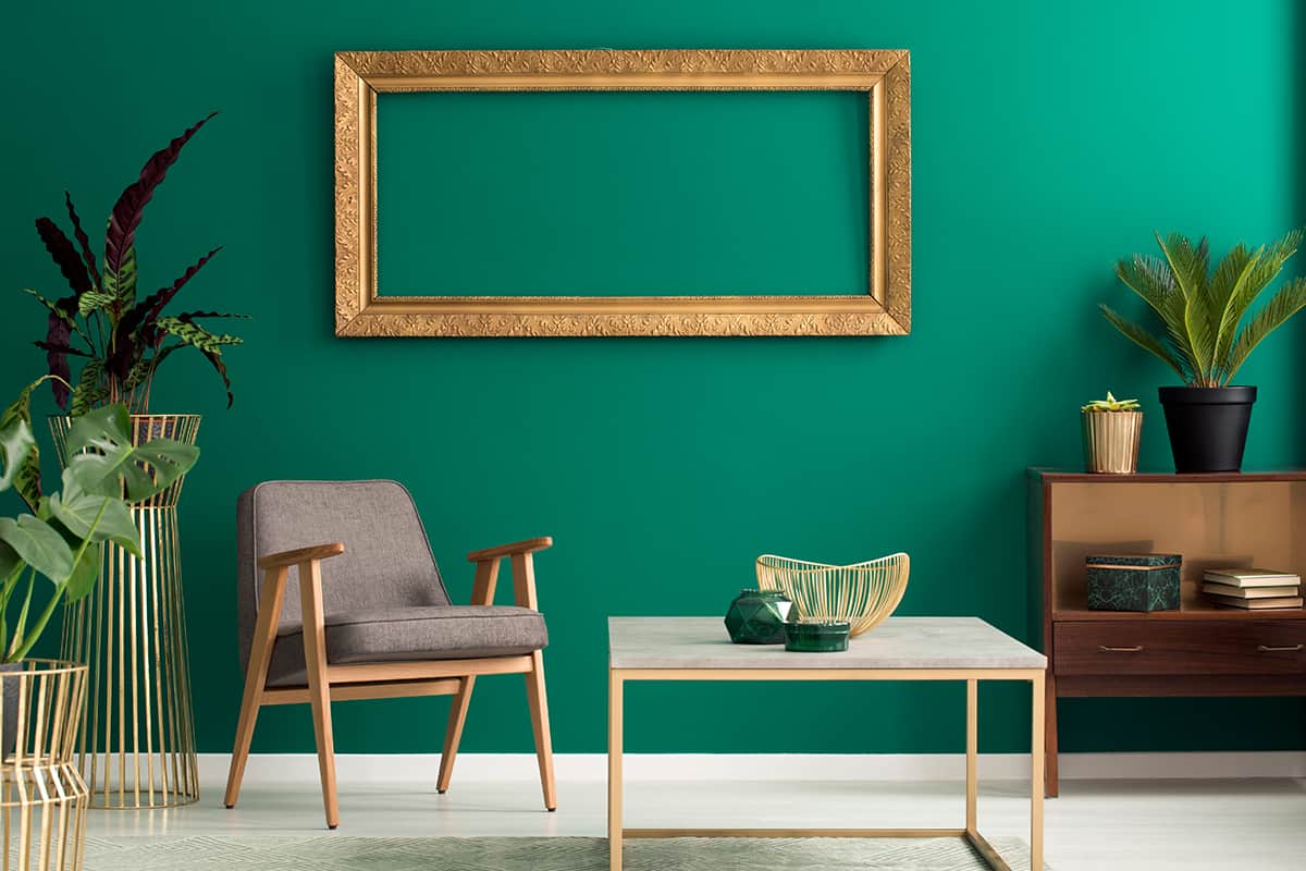
Contrasting colors are always useful to know, especially in design and home decor, because contrasting colors make each other pop. This can help to give a vibrant look to the home, and it also allows for a balanced look.
To find the contrasting color of any other color, all you need to do is look at the color wheel. The contrasting color is always positioned exactly opposite. You can make vibrant contrasts with pure tertiary colors or make the contrasts more subtle by using tints, tones, and shades of the tertiary colors.
Amber and violet
Amber and violet are contrasting colors and therefore make each other appear more intense and saturated. These colors look striking in any color scheme, but one which uses tints or tones of these colors will generally be more appealing. This is because tints and tones make color more muted, subtle, or light.
For example, if you use the fully saturated versions of amber and violet as a color scheme in a room, you will likely find that the space feels overstimulating, and it will be hard to relax in. Instead, use a toned-down version of this color scheme by using tints or tones of these colors.
An example would be peach and pale violet. The addition of a third color is always a good option to help level out the color scheme and prevent it from becoming too intense. For example, paint a bedroom in a neutral off-white color, then opt for peach-colored bedding with pale violet curtains and pale violet cushions.
Vermillion and teal

Vermillion and teal are tertiary colors that face each other on the color wheel, and therefore they are also contrasting colors. These two colors can be used to great effect in a home decor color scheme because they make each other appear more vibrant. You can also use softer or more muted versions of these colors if you want a contrasting look that doesn’t feel like an attack on the senses.
For example, mix gray with teal to get a toned-down version of teal to use with vermillion. This will allow you to maintain the contrast while reducing the intensity.
Vermillion and teal look modern and edgy when used in a color scheme with gray. Paint the walls gray and use soft furnishings and accessories in a light shade of teal and vermillion.
Magenta and chartreuse
Magenta and chartreuse bounce off each other really well, creating a lively and fresh feel. These are two contrasting tertiary colors that are commonly used together during the summertime, as they bring a real zestiness to any space. Use these colors with a bright aqua blue or a hot pink to decorate an outdoor dining space for a garden party.
They bring a tropical vibe that is quite excitable and uplifting. You can also use these colors in home decor, though you might prefer to tone them down somewhat for a less stimulating effect. For example, add gray to chartreuse to get a toned-down version of the color that will be similar to light olive green.
This will work well with a magenta tint, which has been lightened with the addition of a generous amount of white. These two colors will make for a beautiful botanical-themed space. Paint the walls in your olive-toned chartreuse, and select a pale magenta for floral printed cushions and a vase with sprigs of dried lavender in it.