The concept of warm and cool colors is central to interior design, and this forms the basis of many color schemes and home decor themes.
Having an understanding of what warm colors are and how they can benefit an interior space is essential for creating rooms with appropriate atmospheres and ensuring balance within a home. Here we explore warm colors, how to use them, and how to identify them.
Table of Contents
What is a Warm Color?
Warm colors are those which are associated with heat and sunlight and therefore have the effect of making us feel warm and comforted.
These colors can be great for reducing stress and making us feel relaxed, and they can also help to make a room feel more cozy because they are able to appear closer to us compared with cool colors.
Which Colors are Warm?
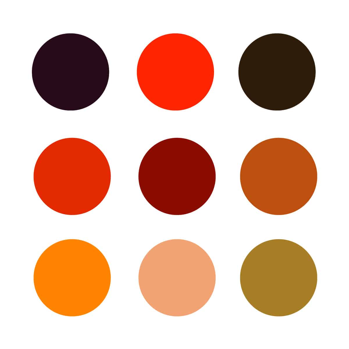
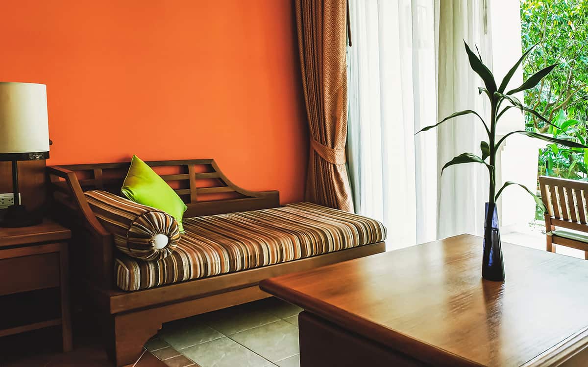
Warm colors are red, yellow, orange, and any variation of these colors, for example, burgundy, terracotta, mustard, or lemon. Beige and brown are also warm colors because they typically have undertones of yellow, orange, or red.
You can also get warm shades of purple, for example purple colors that are made up of more red than blue, however as standard you can expect purple to be considered as an excellent color.
How to Use Warm Colors at Home
Increase coziness
One of the main reasons people choose a warm color for a room is to increase the level of coziness in the space. As warm colors are closely associated with fire, heat, and the sun, warm colors are able to make us feel simultaneously comforted and energized. The type of warm color you choose will largely dictate the atmosphere in a room, for example, dark red will feel more passionate, while pastel yellow will feel more lighthearted.
However, the overwhelming feeling of any warm color will be of warmth and coziness. You can use this to your advantage if you have a room which gets little natural light and therefore appears quite dull and lifeless. Using a cool color in a room such as this can make the space feel cold and harsh, while a warm color will make for a sunnier, more uplifting atmosphere.
Aside from the link to warm elements, warm colors also increase coziness because of the way they appear on the walls. Cool colors such as blue and green appear further away when painted on walls, which is why a blue or green room will feel bigger or more airy. By contrast, warm colors seem to advance towards us, making a room feel more cozy.
If you have a large room which feels a little vacant or impersonal, you can paint the walls in a warm color and it will feel like the room is wrapping you up in a warm hug.
You can also add a cozy feeling to a room even in a space that is predominantly decorated in cool colors. Creating a balance between warm and cool colors can make a space feel more interesting and grounded, giving you the best of both worlds.
In a room with cool off-white walls that is designed to feel open and airy, add in a burnt orange rug and some terracotta plant pots to ensure the space doesn’t feel harsh or lifeless.
Balance out cool colors
Balancing out cool colors with warm colors works well in almost any home decor style. Erika Dale, an interior designer, says, “One of the best design tricks in the book is creating a nice balance of warm and cool colors in a space. While the dominant colors in a room can dictate the overall mood, what makes the design feel grounded and cohesive is balancing that out with elements of the opposite color temperature.”
This can mean using a cool color and a warm color as your main color palette, for example, peach and mint green, or it could mean having a predominantly cool color palette with occasional accents of warmth. Using soft furnishings is a nice way to incorporate warmth into a space because this will also add a texture that highlights the effect of comfort.
Embrace fall
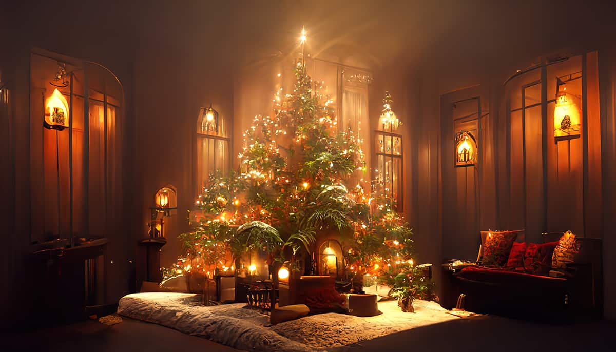
Fall is synonymous with warm colors, when it seems as though all of the green leaves around us are fading to rich hues of gold, brown, red, amber, and bronze. This is a time of year when warm colors seemingly surround us, and bring a sense of comfort and heat in a season that is actually quite physically cold.
Designer Erika Dale comments, “Fall is the perfect time to embrace warm colors in your home, as the natural autumn color palette ranges the whole warm side of the color wheel. Refreshing your textiles, art, accessories, or floral arrangements with these autumnal hues can embrace the coziness and warmth of the season.”
While you might not want to entirely redecorate your home every fall, there are simple ways you can update the look in a room to reflect this warming season. For example, drape a cozy orange knitted blanket over the back of an arm chair, or display some dried orange and brown leaves in a vase. Small touches such as this can help a room to gently transition from one season to another.
Are White and Black Warm Colors?
White and black are not intrinsically warm colors, but they can be. Pure black and pure white are considered to be true neutrals, because they don’t have any undertones of any color at all.
In fact, the definition of a true neutral is the absence of a color. However, when it comes to fabrics and paints in the world of interior design, there is a lot of crossover between colors. In paint especially, there are thousands of different shades of white, including colors such as ivory, pearl, milk, cream, and antique white.
These colors are broadly known as shades of off-white, and they can be cool or warm colors depending on the dominant pigment they are mixed with. When a shade of white has brown, red, orange, or yellow undertones, it will be classed as a warm shade of white. Examples include cream, which has a yellow base, and pale beige, which has a brown base.
Shades of white which have a dominant blue, green, or purple pigment will be cool shades of white. The same goes for black paints. Some shades of black, such as Greenblack by Sherwin Williams, will have cool undertones which will mean the black color falls into the category of cool.
There are also many shades of black that have warm undertones, for example, brown-black colors. These can be employed in exactly the same way as regular warm or cool colors, with warm shades of black or white making a room feel comforting and cozy, while cool shades of white or black will give a room a more crisp and fresh look.
Can You Use Warm Colors on the Ceiling?
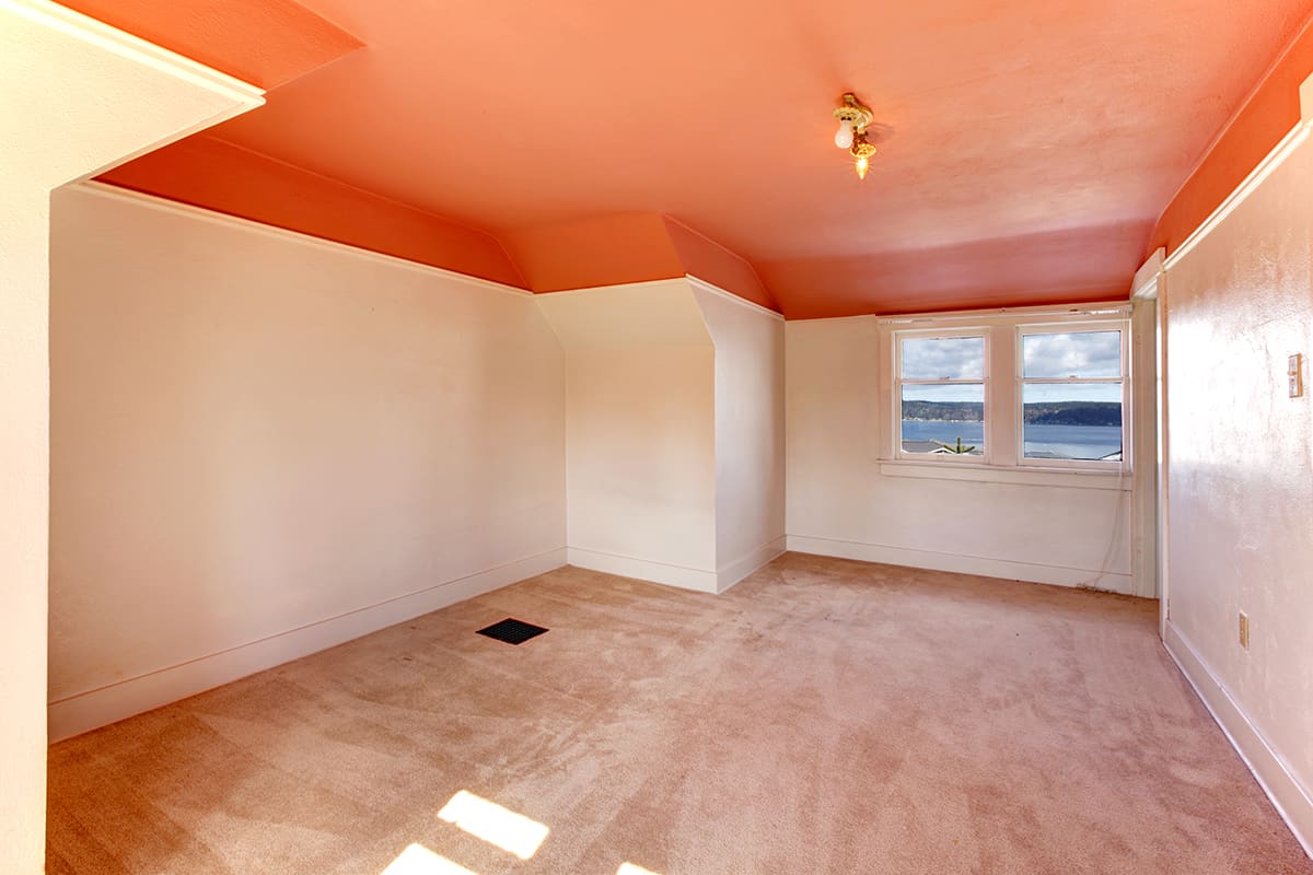
Warm colors can be used on the ceiling in any room, though be warned that they will have the effect of making the space appear to be smaller. This is because warm colors have the ability to advance towards us, which makes the surfaces they are painted onto appear closer than they really are.
This is one of the ways that a room painted in a warm color seems to be cozier because it actually makes it feel smaller like the room is enveloping you in an embrace. When you paint a ceiling in a warm color, the effect will be of the ceiling feeling like it is coming closer to you, which may or may not be the type of look you are trying to achieve.
In a large space that feels a little vacant, painting the ceiling in a warm color, such as rust, can make the room feel more safe and cozy. However, if the room already feels somewhat stuffy, then painting the ceiling in a warm shade is only going to make this worse. Most designers advocate for using cool colors in the ceiling to give the sense of greater height in a room.
How to Recognize a Warm Color
Warm colors are usually easy to recognize because they are colors that are associated with heat and warmth. If you can identify an undertone of red, yellow, or orange in a color, then you can be sure this is a warm color. If you have trouble figuring out what sort of undertone a color has, then the easiest way to know for sure if you are looking at a cool or warm color is to consult the color wheel.
The color wheel can be divided into two halves, with cool colors on one side and warm colors on the other side. The dividing central line runs between yellow and yellow-green and red-violet and violet. All of the colors which fall onto the half of the wheel where red, orange and yellow are positioned are warm. All of the colors on the opposite side, with blue, green, and purple, are cool.