Cream is a warm and neutral color that can make a nice alternative to white or off-white in home decor. Here we explore how to make cream and how to effectively use it in interior design.
Table of Contents
What is Cream Color?
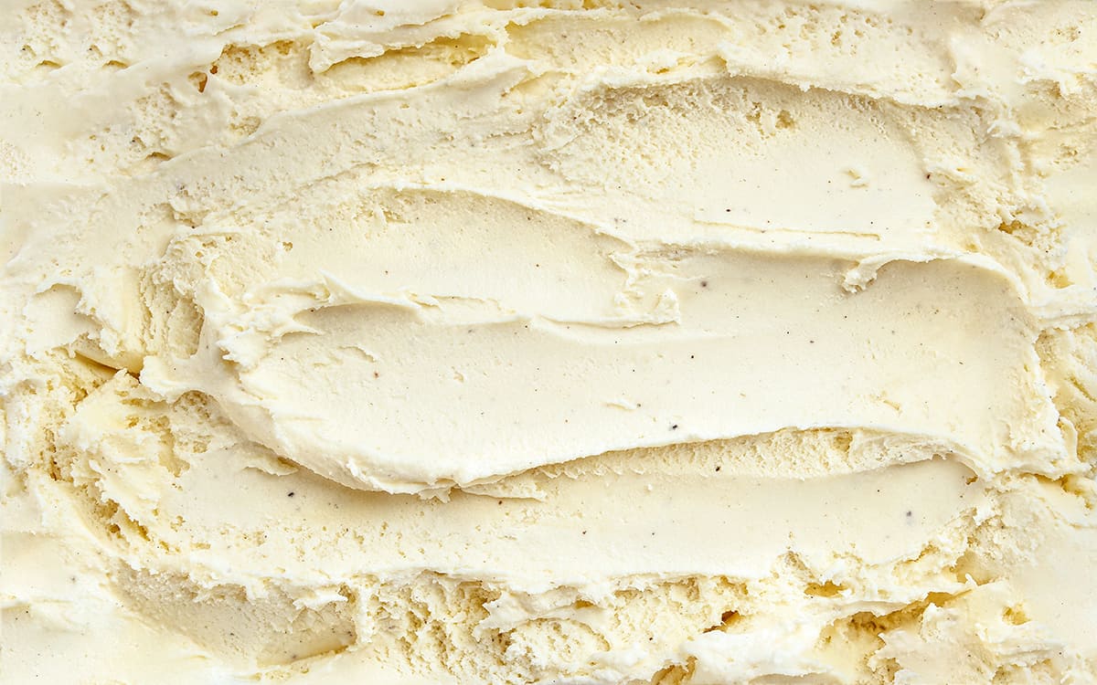
Cream is a color that is made up of a large proportion of white and a small amount of yellow. This gives it a creamy color, much like the dairy product it is named after. The yellow undertones in cream give this color a warm and relaxing energy, making it popular as a paint color for walls in homes.
Despite being obviously warm on the temperature scale, cream reads as quite neutral because it is so soft and subtle. It is sometimes regarded as a shade of off-white. However, it does appear to have more obvious undertones compared with most other shades of off-white, such as ivory and pearl.
Meaning of the Color Cream
Cream is a very muted shade of yellow, so you might expect that it holds a similar meaning to the color yellow, such as joyfulness, positivity, and warmth. While the cream is certainly a warm color, it isn’t closely linked to the sun like yellow and instead includes a much higher proportion of white.
The resulting subtle shade of cream is, therefore, more synonymous with elegance and sophistication. Cream is often seen as a demure color, worn by refined and distinguished members of society through pearl necklaces and champagne-colored silk handkerchiefs.
It is broadly associated with innocence, tastefulness, and dignity and is worn as the color of a wedding dress for brides who find white to be too stark. Cream, while not really off-white, is considered to be an alternative to white which has a more classic and graceful style.
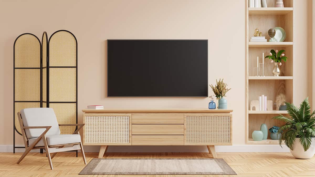
In home decor, cream is very popular as a wall color because of all of these factors, as well as the way in which cream is neutral enough to be paired with almost any other color. The neutrality of cream makes it easy to work with in interior design and fashion, and it has a classic look that doesn’t go out of style.
As a neutral color, cream is also seen as soothing and relaxing, which makes it a good choice in any room of the home where it will create a calm and comforting energy.
How to Make Cream Color
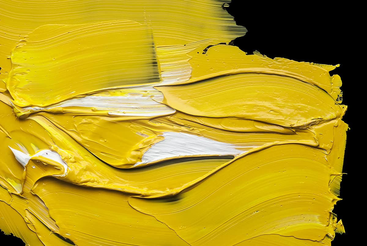
Cream is made by adding a small amount of yellow pigment with white paint. Cream is considered to be a pastel shade of yellow to some, though for a true cream color, you will need to mute pastel yellow even further until it is almost a shade of ivory.
While ivory and cream are both very similar colors, cream has a slightly more obvious yellow hue than ivory. If your paint mix looks too pale, add in a drop more yellow to create a creamier-looking cream.
Shades of Cream with Hex Codes
Cream is a specific color all by itself, with the hex code #FFFDD0. There are a number of colors that are very similar to cream, such as beige, which is marginally darker than cream, and ivory which is more light and subtle.
Some shades of off-white are considered to be varieties of cream, for example, snow. Here we explore cream and some other similar colors, along with their hex codes, and how to use them in home decor.
Cream- Hex Code #FFFDD0

Cream is a light and subtle shade that sits somewhere between white and yellow. It is often used as a skin color amongst artists and is popular in home decor for classic or traditional style spaces. In an RGB color space, cream comprises of 100% red, 99.2% green, and 81.6% blue.
In a CMYK color space, cream is made of 0% cyan, 1% magenta, 18% yellow, and 0% black. This color has a hue angle of 57.4 degrees, with a saturation of 100%, along with a lightness of 90.8%.
Using Cream in Home Decor
Cream is a warm and soft neutral that works well as a wall color, especially in rooms with low light where you want to achieve a bright and airy space.
The level of white in cream means that cream walls will have good light reflection levels, helping to make a room feel bigger than it really is. Some people find cream to be too sickly or traditional, and in this case, ivory might make for a more contemporary decor style.
Beige- Hex Code #F5F5DC
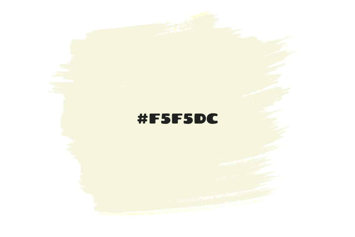
Beige is darker than cream, but it has similar undertones. Like cream, beige has a warm temperature that is a result of the yellow pigments in the color. It is predominantly made of white, which is what gives it a light and subtle look. Beige can encompass a range of colors, from almond to light tan.
It features a hint of gray, giving it a slightly more modern look than cream, but it still maintains an overall warm vibe. In an RGB color space, the color beige is made of 96.1% red, 96.1% green, and 86.3% blue. In a CMYK color space, it is made of 0% cyan, 0% magenta, 10% yellow, and 4% black. The color beige has a hue angle of 60 degrees, a lightness of 91.2%, and a saturation of 55.6%.
Using Beige in Home Decor
Up until recently, beige was seen as boring and bland, and in fact, this color was commonly used to reference a dull or boring personality.
However, beige has seen a resurgence in popularity and has once again become the go-to neutral color in interior design. In a world of gray, beige provides much warmer energy while still not coming across as overly warm. It makes an excellent base color in a color scheme or works as an accent in a crisp white room to add texture and warmth.
Ivory- Hex Code #FFFFF0

Ivory is a very similar color to cream, but with a higher percentage of white, which results in an even more subtle shade. It has very mild and muted yellow undertones and therefore comes across as more of a shade of off-white as opposed to a color in its own right. In an RGB color space, ivory is made with 100% red, 100% green, and 94.1% blue.
In a CMYK color space, ivory comprises 0% cyan, 0% magenta, 6% yellow, and 0% black. It has a hue angle of 60 degrees, with a saturation of 100%, and a lightness of 97.1%.
Using Ivory in Home Decor
Ivory is a more subtle shade of cream that can be used anywhere that cream, beige, or off-white would be used. It makes for a bright and light wall paint in rooms where you want a crisp and clean feel with a hint of warmth.
It is also a popular alternative to pure white for ceilings and trim, as people are beginning to move away from the starkness and predictability of pure white. Use it with cool colors such as blue and gray to balance out the temperature in a space.