Having an understanding of chromatic and achromatic colors can help if you’re an artist or a designer. Here we uncover the definition of both of these terms and explain how they can be used in home decor.
Table of Contents
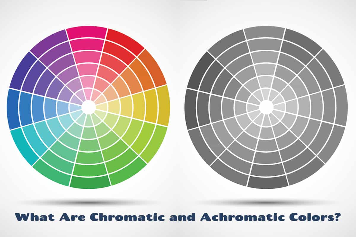
What is a Chromatic Color?
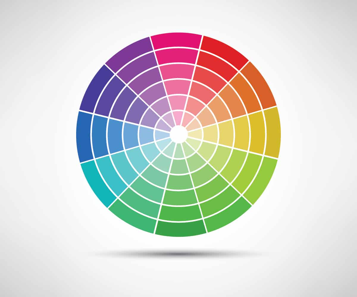
A chromatic color is a color that has a distinct hue. Chromatic colors can be primary colors, secondary colors, or tertiary colors.
Their defining feature is that they can be characterized according to their hue. This means they will contain a pure color, such as blue, red, purple, or green.
What is an Achromatic Color?

An achromatic color is a color that falls under the category of black, white, or gray. These types of colors lack hue, which means they couldn’t be described as having any undertone.
Achromatic colors are the types of colors you would see in a black-and-white movie or an old black-and-white photograph. They lack color and therefore have a very neutral look.
Difference Between Chromatic and Achromatic Color
The difference between a chromatic and an achromatic color is the presence or lack of hue. Chromatic colors will have a hue, while achromatic colors do not.
A hue is defined as a pure pigment that can be found in the color spectrum. Chromatic colors have a hue and are not lightened or darkened by the addition of black or white. Therefore, they come across as very vivid and vibrant. By contrast, achromatic colors lack hue, and as a result, they read as much more plain and neutral.
How to make a Chromatic Color
A chromatic color can be made by mixing any two primary colors or by mixing a primary color with a secondary color. For example, you can mix red and yellow to make orange or red and blue to make purple.
Primary colors themselves also count as chromatic colors because they have a distinct hue that is visible in the color spectrum.
How to make an Achromatic Color
An achromatic color is any shade of black, white, or gray. These can be made by mixing white and black together in varying proportions. Black paint with a hint of white will give you dark gray, while white with a small amount of black will give you light gray. Achromatic colors include every shade in between white and black when these two colors are combined in any proportion.
Using Chromatic Colors in Home Decor
Chromatic colors are useful to create vibrancy and contrast in interior design. You can use several chromatic colors together for a strong look or use them amongst neutral colors for pops of interest.
Chromatic colors all have different feels, which enable us to create different atmospheres in a room depending on what we are trying to achieve. Here we explore how each chromatic color can affect how the energy in a room is perceived and how you can use these colors to your advantage.
Blue
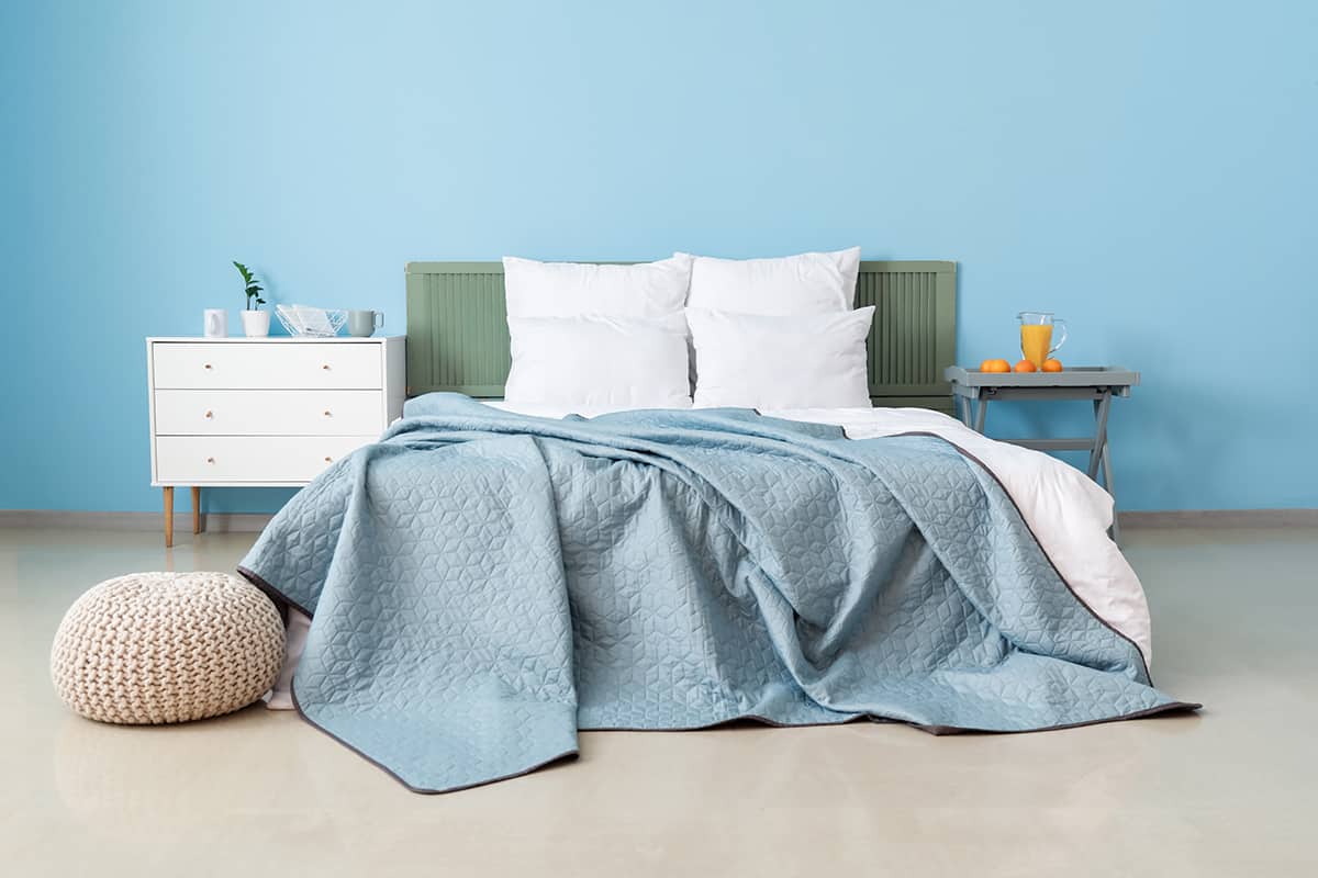
Blue is associated with the color of the sky and the color of the ocean, which in turn means that this chromatic color is mostly used to create a calm, serene, or soothing effect. This is because most people feel calm and at ease when standing beneath a clear blue sky, or looking out at a still blue ocean.
Blue is also a cool color, which means it reads crisp and fresh when used in home decor. Since blue is widely recognized as a peaceful and serene color, it is hugely popular in interior design. In fact, it is believed to be one of the most commonly chosen paint colors for bedrooms, where people want to feel relaxed enough to easily drift off to sleep.
For a peaceful room, use blue as your paint color and pair it with white soft furnishings; for example, opt for a sky blue wall paint in a living room, and choose sheer white drapes and a white sofa. Blue can also create a soothing atmosphere when used with gray or beige accents. Team blue with green for a really fresh, crispy vibe.
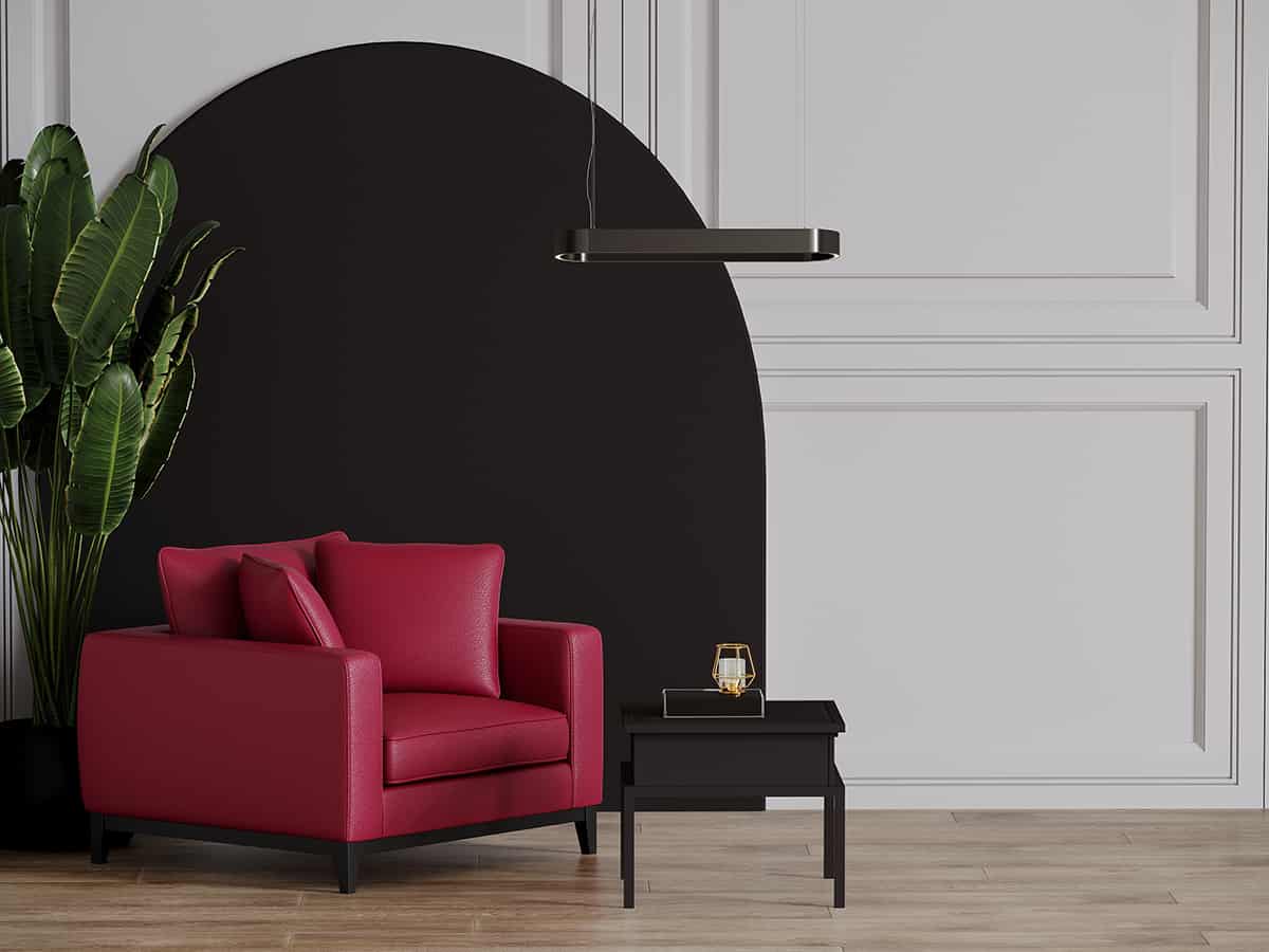
Red
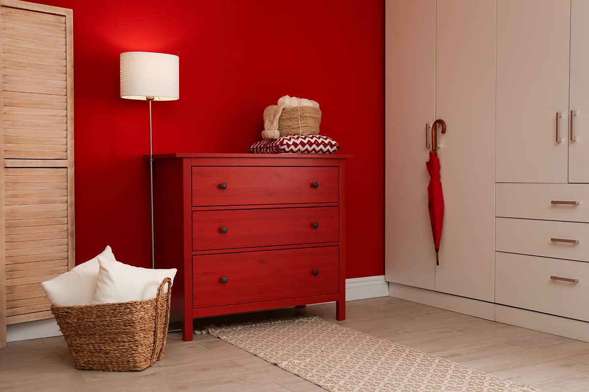
Red is a primary color that is associated with passion, fire, and intensity. It is closely linked with romance and lust and is widely seen on greeting cards and gifts around Valentine’s Day. Interestingly, red is also the color of blood, violence, and sacrifice, so it has to be used carefully in home decor to ensure it doesn’t read as scary or offensive.
Since red is such a strong color, it is best used as an accent color in interior design. Red works well in small doses in retro or antique interior themes.
For example, in a kitchen themed on a 1950s US diner, have a black and white checkered floor covering, with white countertops and some bright cherry red appliances such as a toaster and blender.
In an Edwardian-themed living room, use dark red heavy fabrics such as suede or velvet, and create a subtle contrast with dark forest green accents.
Yellow
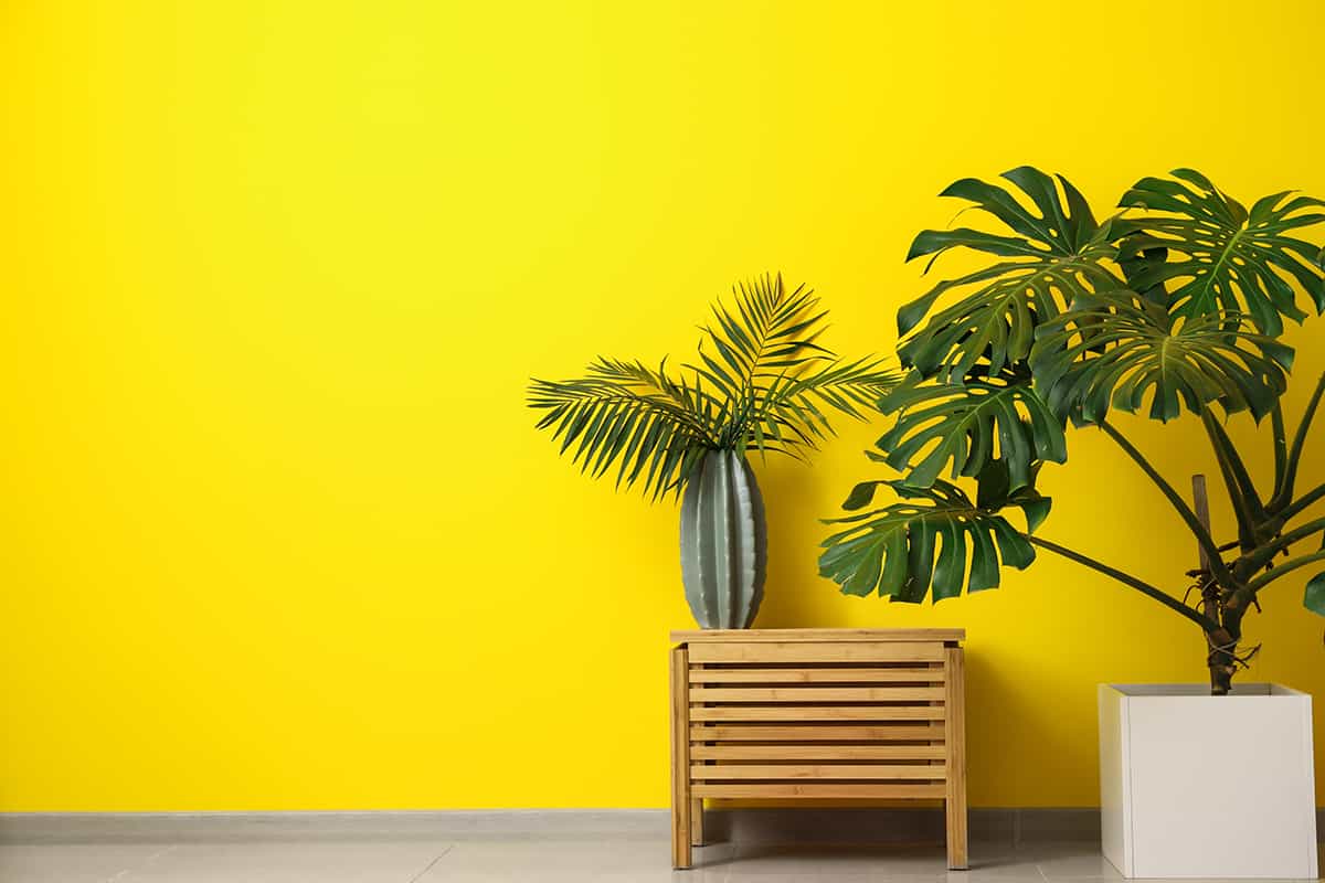
Yellow is a joyful chromatic color that is synonymous with sunny skies and golden sandy beaches. It is a good color choice in home decor when you want to create an atmosphere that feels inspiring and uplifting, as it injects positivity into any space it encounters.
Yellow is mild enough that it can be used as a paint color across all of the walls in a room without becoming too overstimulating, but it is most commonly used as an accent color. Bright yellow looks modern and sleek when used with gray, or it pairs nicely with blue for a coastal style.
The contrasting color to yellow is purple, so these colors help each other to appear more vivid. Use lilac and lemon yellow for a soft and sweet style, or consider eggplant purple and mustard yellow for a more dramatic effect.
Green
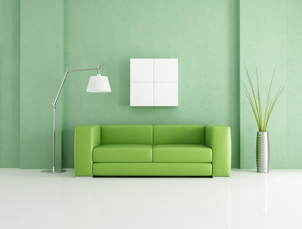
Green is a chromatic color that is associated with nature. It is the color of leaves on trees, lawns, grassy meadows, and shrubs and plants in home gardens. The link that green has to nature means that most shades of green help us feel hopeful and positive, as it is connected with growth, rebirth, fresh starts, and springtime.
You can use green in your home in a number of ways depending on how you want to feel in the space. Lime green will invoke a fresh and invigorating atmosphere, while olive green is more relaxing and comforting. Most shades of green are neutral enough to be used as the main color in a room, but green is also a nice accent color in many color schemes.
Orange
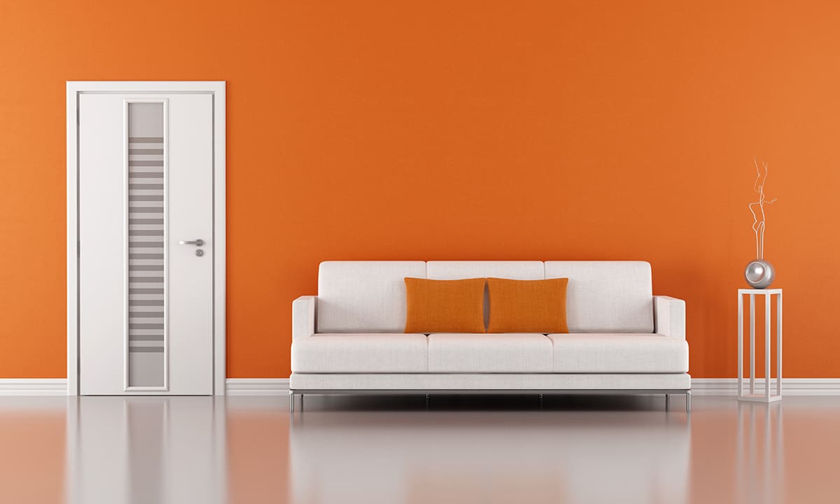
Orange is a chromatic color that signifies warmth and creativity. It has the ability to engage and uplift people, bringing happiness and positive energy.
Bright shades of orange are considered to be fun and playful, while deeper oranges signify a deep connection, Use lighter shades of orange, such as peach and apricot, to create a youthful space, for example in a child’s bedroom, and use deeper shades of orange, such as cinnamon, to achieve a cozy and comfortable living area. Orange contrast well against blue, but it also works well with pink, yellow, and gray.
Purple
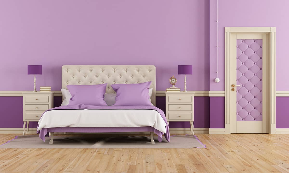
Purple is a chromatic secondary color achieved by combining blue and red. This color can lean more towards a warm or cool temperature depending on the amount of red or blue in the mix.
Purple is associated with wisdom, wealth, royalty, and prestige, so it can be put to good use in interior design if you want to style a room in an opulent or sophisticated way. Purple is also linked with femininity, so it can be a good replacement for pink in some scenarios. Contrast deep purple with gold, yellow, orange, or green.
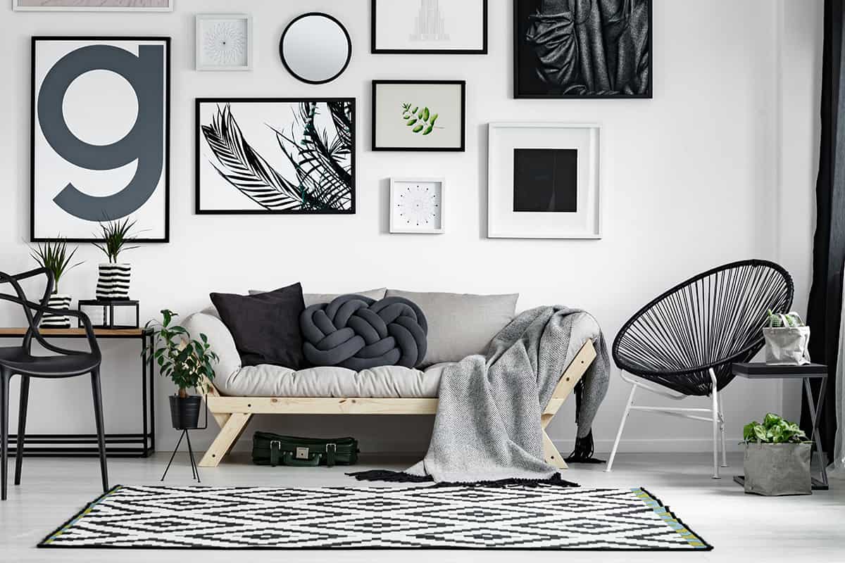
Using Achromatic Colors in Home Decor
Black
Black is the darkest of all achromatic colors, with heavy saturation. It contains no hints of any other color and is great for creating depth or definition in home decor.
Historically black is linked to death and depression, but in fashion and interior design, black is more synonymous with elegance and sophistication. Paint an accent wall in black to create shadows and mystery, or paint trim in black to help outline a space.
White
White is an achromatic color that technically lacks any color at all since it has no hue. White is light and can appear bright in home decor because it reflects natural light and therefore helps to create the illusion of more space. White is a classic choice of paint for walls and ceilings that can be used in any color scheme.
Gray
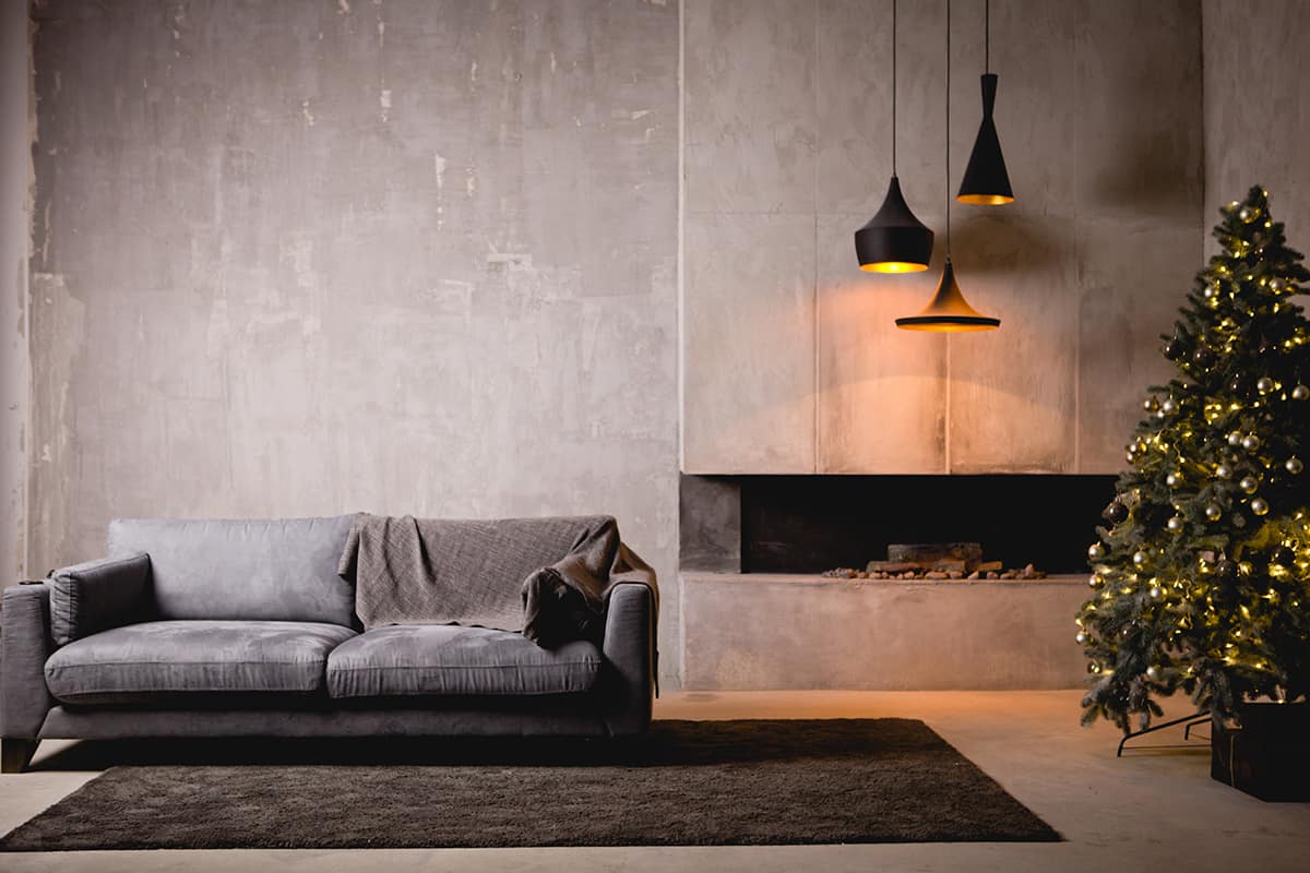
There are so many shades of achromatic gray, which encompass all of the varying shades between black and white. Gray is known for being modern and industrial, and as such, it is very popular in home decor in instances where a contemporary and cool atmosphere is trying to be achieved.
Gray works especially well with yellow and orange for a contrasting look, but you can use it in almost any color scheme with the confidence that it will look stylish.