The term ‘accent color’ is thrown around liberally in the world of home decor and interior design, but have you ever stopped to think about what it really means?
Accent colors are hues used to draw attention to, or contrast against, certain items or colors, but there’s so much more to learn about accent colors. Here we explore exactly what accent colors are, how to choose accent colors, and how to use them in the home.
Table of Contents
What is an Accent Color?
An accent color is one of the colors in a color scheme that accentuates the whole look. In most color schemes, you will have a prominent color used across most of the space in a room, which is called your main color, or your primary color.
The main color will be used across anywhere from 60 to 90 percent of the space; for example, in a living room, your primary color might be the wall color and the sofa color, or in a kitchen, the primary color is usually the color of the cabinets.
Your accent color will be the lesser-used color in a color scheme, sometimes only appearing in around 10 percent of the space. The job of the accent color is to highlight particular objects or areas in the room, as well as bring the whole look of the room together. An interior decor style can read as flat and bland without an accent color.
Purpose of an Accent Color
Accent colors can be used to achieve various goals all at the same time.
Highlight objects
One way an accent color can be used is to highlight certain objects in the room. Since accent colors stand out against the primary color, when an object features the accent color it is going to be highlighted.
You could use an accent color to draw attention to a particular piece of art, for example by choosing a frame in your accent color, or you could bring the focus to a particular part of the room, for example by using an area rug in your accent color.
Make a statement
Accent colors will usually contrast against the main color in a color scheme in some way. The accent color might have a hue contrast if you have chosen colors that sit opposite each other on the color wheel, or they might have a shading contrast if you have chosen a light and dark shade of the same color.
It is the contrast between the primary color and the accent color that causes the accent color to stand out. This can be used to your advantage to make a real statement in a room. For example, if you have a predominantly mint green living room you can make a real statement by selecting an armchair in a bright, neon pink fabric.
Create a focal point
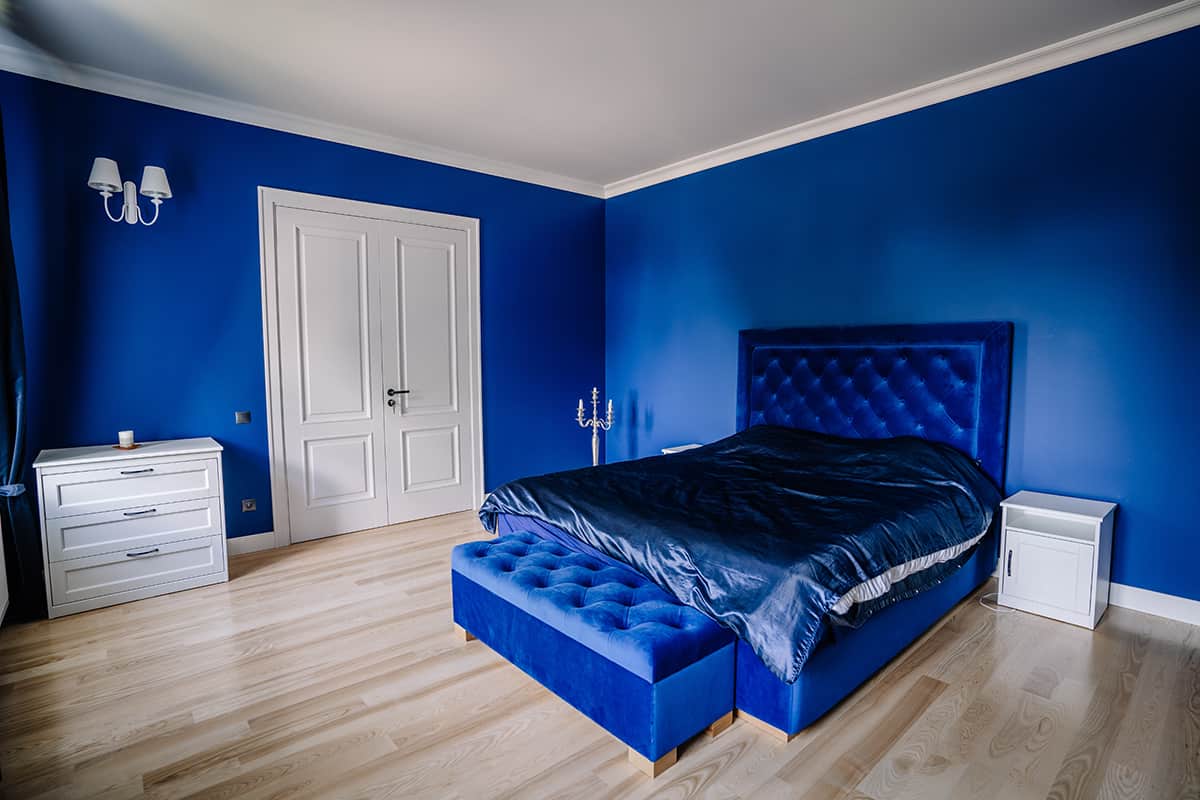
An accent color is useful for creating a focal point in a room, especially to highlight the area of the room where you want attention to be drawn. For example, you might want to paint a fireplace in an accent color to signify that this is the focal point in the living room, or in a bedroom, the headboard of a bed could be in an accent color to show that this is the focal point in the space.
You can also use accent colors to define the focal point in a room, even when you don’t have an object or item of furniture to highlight. For example, in a dining room, use a selection of picture frames in an accent color, all grouped together on one wall to signal that this is the feature wall. Or in a bathroom, draw attention to the window by lining up an array of candles in your accent color.
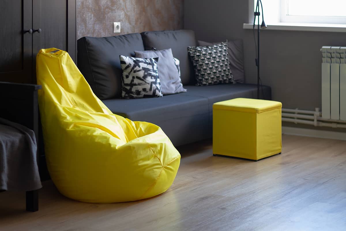
Bring the room together
The most common way that an accent color is used is to bring the whole room together while adding an extra dimension. You could create an all-gray room with gray walls and gray furniture, and while this will create a consistent color scheme, it will look quite flat.
To add dimension, place yellow accents around the room, such as a yellow plant pot on the windowsill, some yellow cushions on the sofa, and some yellow candles on the fireplace.
This adds depth and dimension to the room while also linking all of the individual areas of the room together. The result is a well-put-together space that feels interesting and cohesive.
How to Choose an Accent Color
If you’ve already decided on the main or primary color in your color scheme, then choosing an accent shade can be fun and easy if you understand a few basic principles. Having access to a color wheel will be helpful for this.
Complementary
Complementary colors are those which sit opposite each other on the color wheel. These are also known as contrasting colors. Every pair of contrasting colors will include one warm color and one cool color, so any room decorated using one of these pairings has the benefit of feeling balanced.
Examples of complementary color pairings include red and green, orange and blue, and yellow and purple. To choose a complementary accent color, locate your chosen main color on the color wheel, look directly across it, and select the accent color.
Analogous
Analogous colors sit next to each other or close to each other on the color wheel. This includes color schemes such as green and blue, or orange and yellow.
You can find an analogous accent color by locating your chosen main color on the color wheel and choosing an accent color that sits alongside the main color. This type of accent color won’t create a contrast like complementary colors, instead, it will result in a more harmonious feel.
Monochromatic
A monochromatic color scheme uses the same color in varying degrees, for example light blue and dark blue. This creates a contrast in shade rather than hue. A monochromatic color scheme will usually be more muted and subtle compared with other color schemes, but a monochromatic accent color will still be able to serve the purpose of highlighting certain objects or areas, and pulling the whole look together. One of the most popular monochromatic color schemes is white, gray, and black.
How to Use Accent Colors in the Home
Most interior color schemes use a color palette of three colors. The 60:30:10 method is the most common recommendation for this, whereby the main color is used across 60 percent of the space, the secondary color is used across 30 percent of the space, and the accent color is used across the remaining 10 percent of the space.
If you only have two colors in your color scheme, then you should be using the main color across roughly 70 to 80 percent of the space and the accent color across 20 to 30 percent of the space.
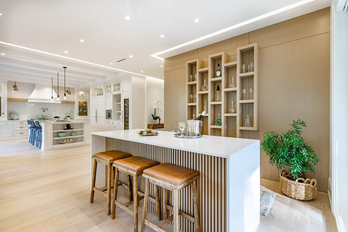
Kitchen
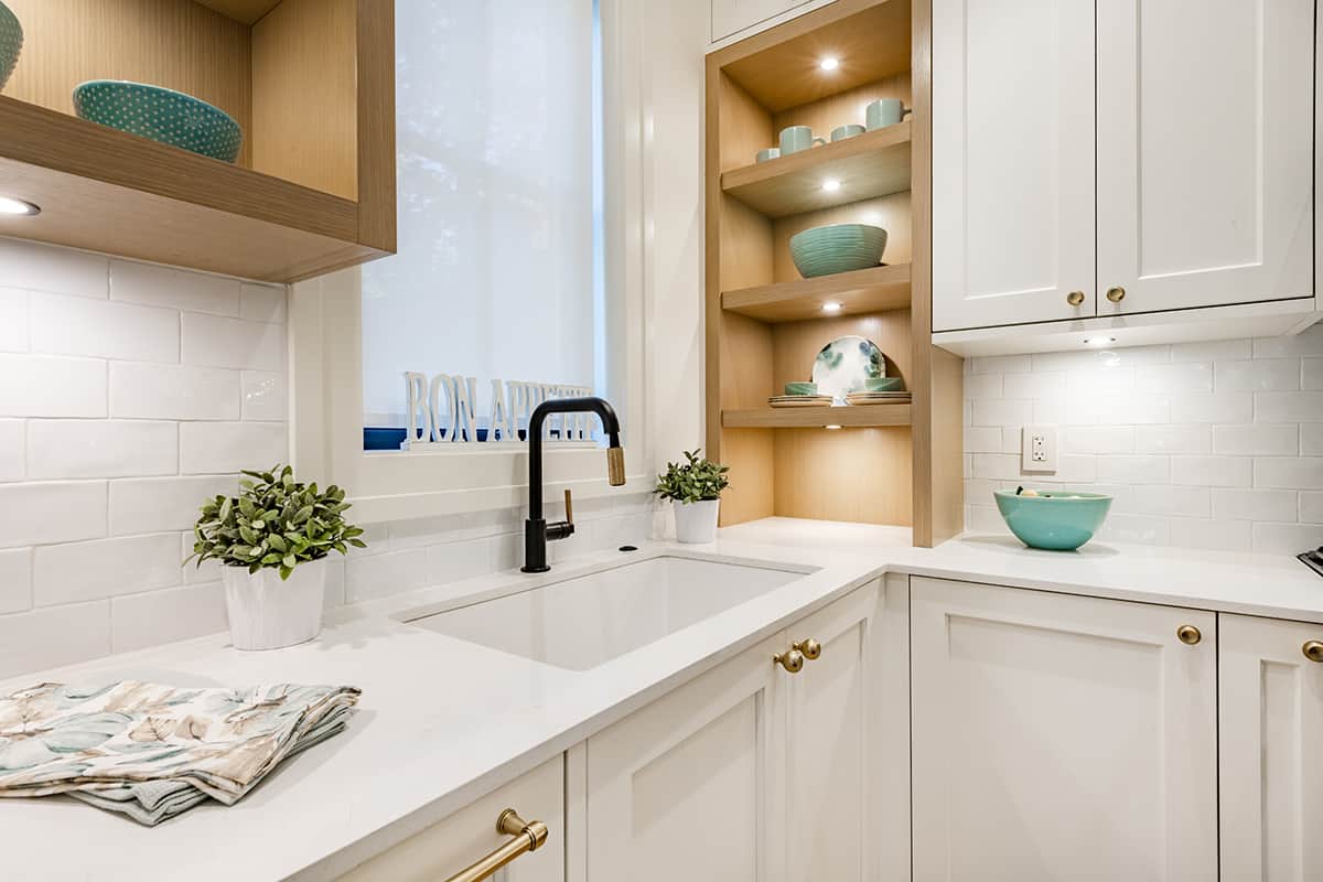
In the kitchen, the best way to use your accent color will depend on how many colors are in your color scheme. If there are three key colors, your accent color should be used across less space. In this scenario, consider decorative items in the accent color, such as a wall clock, a plant pot, or a vase.
Functional, smaller items can also work well in accent color, such as mugs that will be on display, placemats, or even appliances like a toaster or a blender. If you want to use the accent color across more of the space, you can use it for the kitchen window blind, the tile backsplash, or even for the flooring.
Living Room
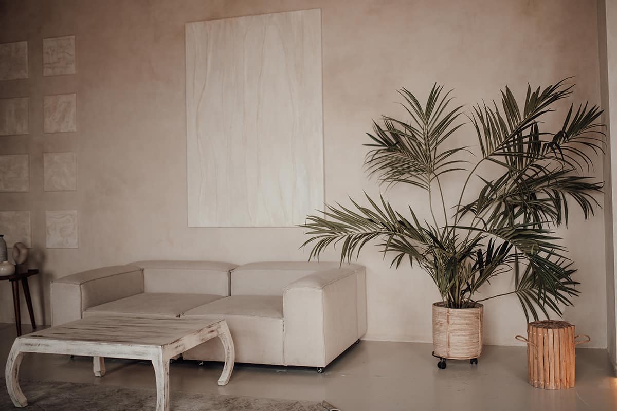
The living room is usually the easiest place to use an accent color because it’s a room that naturally we want to fill with soft furnishings and accessories.
Ideal items for coordinating your accent color include cushions, throws, curtains, rugs, candles, vases, picture frames, ornaments, and lampshades. If you want to make a bold statement with your accent color, paint the color onto a piece of furniture, such as a coffee table.
Dining Room
The dining room is a good opportunity for creating layers with your accent colors, especially for table settings. On your dining table, choose placemats in your accent color, plates in a neutral color, or in your main color, and then add a napkin on top of the plate in the accent color.
This creates a layered look which adds depth and interest to the table. Coordinate this with a central vase in your accent color in the middle of the table.
If you want the room’s focus to be the dining table, stop there. However, if you want to balance out the room more evenly, add more accent colors to the perimeter, for example, with art on the walls or drapes at the window.
Bedroom
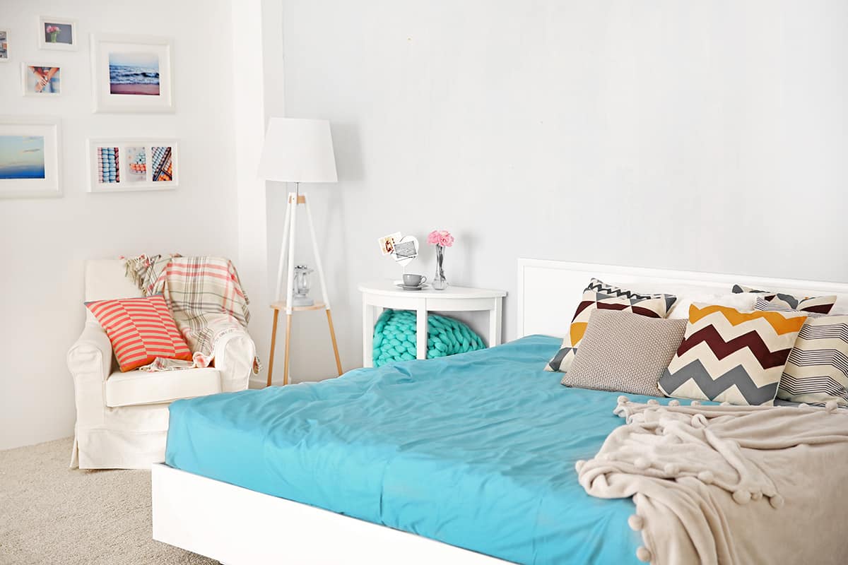
The bedroom can be accessorized with an accent color in much the same way as a living room. Focus on soft furnishings such as bedsheets, a throw blanket, cushions and pillows, curtains, and rugs.