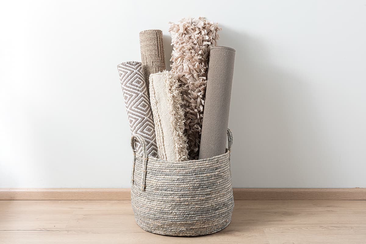
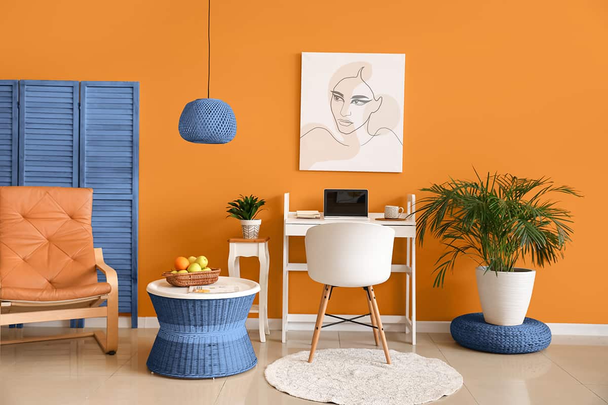
Muted colors are all the rage in interior design right now as we seek to make our homes a comfortable habitat where we want to spend time. Muted colors have the benefit of being easy to be around, and even when contrasting muted colors are used together, the contrast is not intense or severe.
Muted colors are more subtle than their more saturated counterparts, and they can be used in a number of ways in any area of the home.
Let’s explore exactly what a muted color is, how to make a muted color, and how to use muted colors in home decor.
Table of Contents
What is a Muted Color?
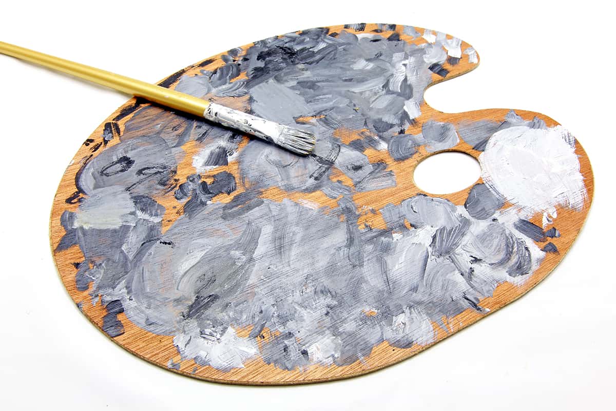
A muted color is essentially a color that has been diluted with gray to make it less saturated. When a color is mixed with gray, it becomes neither lighter nor darker but simply more subtle and more dull. It’s a common misconception that mixing white with a color will make it more muted, but this is incorrect.
When you mix white with a color, you will make that color lighter, and in some cases, adding white can actually make the color appear brighter. Conversely, when you add black to a color, the original color is going to get darker and deeper. For a color to appear muted, it will need to be mixed with gray or with an even amount of both black and white.
The addition of gray to any color will create a washed-out shade, and the more gray that is added, the more washed out the color will look. Though the idea of a ‘washed out’ or ‘dull’ color may not sound very appealing, muted colors are actually excellent choices of color for the home because they give us a hint of color without overwhelming the space. They offer subtlety instead of an obvious hit of color, and this can often make them much more pleasant to be around compared with saturated colors.
How to Make a Paint Color More Muted
If you want to make your own muted paint color, you will need a starting color and either gray or black and white paint. It’s not uncommon for people to want to mute their own paint; typically, this happens when you buy a paint color from the store without first trying out a tester pot.
When you get home and apply the paint to the wall, you can find that it looks much brighter or more intense than you were expecting, so you’ll want to try to alter the paint to make it more appealing before you paint the whole room in it.
To tone down the intensity of a paint color, you’ll first want to pour all of your paint into a container that will be able to hold all of your original color, as well as the gray you’re going to add to it.
This is because you need to create your new muted color in one batch so that all of your walls will be exactly the same color. Trying to create two matches of the same color by hand is almost impossible. Next, you can start adding the gray paint to your original paint, doing so using a small amount of gray at a time and mixing it in to observe how it affects your original color.
If you don’t have gray paint, you can add equal amounts of black and white for the same effect. As more gray is added, the original color will become more muted. When you reach a color you are happy with, you can stop adding gray and begin to use the paint on the walls.
How to Use Muted Colors in the Home
Muted colors are more popular than ever right now, as they are both stylish and comfortable to be around. You can incorporate muted colors into your interior decor in a wide range of ways, from adding muted cushions to a neutral sofa, or using muted wall paint next to a bold accent wall.
Muted Color Schemes
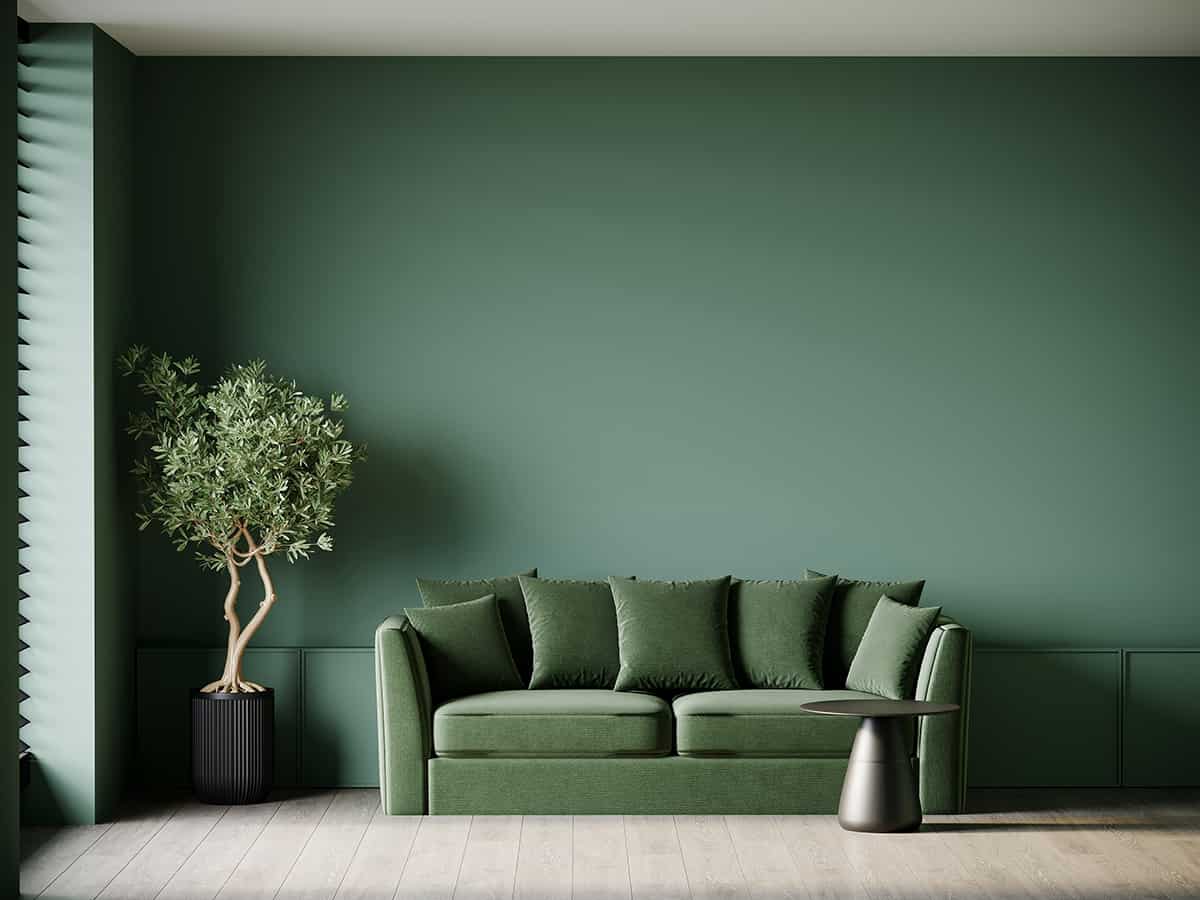
Color schemes that use a palette of entirely muted colors can make a space feel soothing and relaxing. Whether you opt for cool muted blues and greens or warm muted oranges and yellows, a muted color palette reads as comfortable and casual.
With any muted color scheme, you’ll want to select one color that is the more dominant shade, and this will be the color that is used across most of the space. In a living room or bedroom, the wall color usually represents the dominant color, though in a kitchen, this could be the color of the cabinets.
Your muted color scheme could have a complementary theme an analogous theme, or even a monotone theme. Start with your favorite muted color and select at least two more colors that will work with your chosen shade.
If you want to ensure a muted color scheme doesn’t fall flat, opt for a contrasting color to accent your main color; for example, you could use a muted dusky blue as your main color and contrast this with muted orange accents.
Muted Accent Colors
If you’ve chosen a bold, bright, or dark color for your main color in a room, then opting for a muted accent color can help to ensure the whole look doesn’t feel overwhelming or too stimulating.
For example, pairing a bright emerald green with a bright cherry red could look too intense and dramatic, whereas if you were to use a muted red with emerald green, the overall effect would be much more palatable, while the contrast between the two colors is still retained.
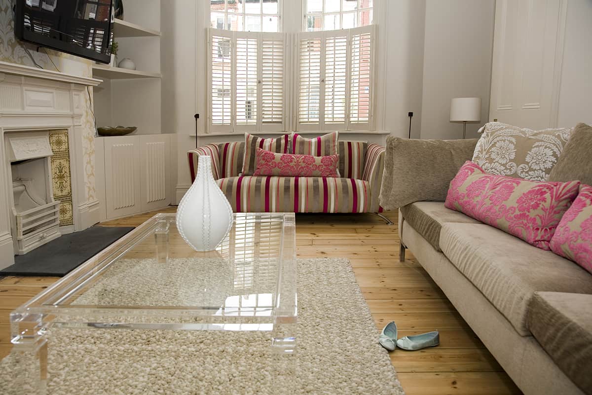
Using a muted accent color is a really good way to soften the look of your home decor without compromising on interest or style. Muted accent colors don’t always have to contrast against your main color, and actually, you can create some really interesting looks with accessories and soft furnishings in muted colorways.
For example, on an olive green velvet sofa use muted dusky pink cushions for a subtle contrast and a playful twist. On a navy blue wall, opt for muted sage curtains to encourage a casual style and maintain a harmonious feel.
Muted Paint Colors
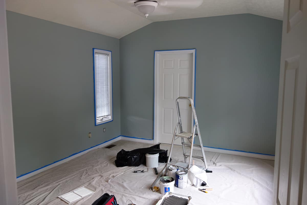
Using a muted paint color on the walls in your home can set the tone for the whole space. Muted paint colors are easy to be around because they aren’t harsh or intense, so they’re a good choice for common rooms in the home where people tend to spend a lot of time, such as living rooms and kitchens.
If you’re renovating your home in preparation for selling it, muted paint colors, just like neutral paint colors, present a good option because they are not likely to be offensive to potential buyers.
Muted paint colors are easily palatable and help to make a space feel comfortable and relaxing, whether you opt for a cool muted color such as Wethersfield Moss by Benjamin Moore or a warm muted color such as Redend Point by Sherwin Williams, which is the 2023 Color of the Year.
If you want to add some stronger personality to a room that has been painted in muted colors, you can do this with bright or bold accents and accessories.
For example, a muted pink bedroom can be made to feel more lively with the addition of bright turquoise cushions on the bed, or vivid yellow curtains. Muted paint colors are a good choice for longevity because they aren;t going to go out of style as quickly as more bold paint shades. You can change the feel of a room painted in a muted color quite easily, by switching up the furniture or accessories, so you won’t need to think about redecorating the space very often.
Muted Accessories
Accessories or soft furnishings in muted colors can be useful to create calm pockets in a room, especially if the other colors in the space are quite vivid.
For example, in a bedroom painted in a bright shade of blue, you could use muted tan bedsheets and a muted brown rug to prevent the room from feeling too overwhelming. Muted accessories will also look stylish in a room that has muted colors on the walls for a space that has a serene and easy-going atmosphere.
Contrasting Muted Colors
Contrasting colors are also known as complementary colors; they are those colors that sit opposite each other on the color wheel. Contrasting colors help to set each other off and make both colors appear more vibrant, however, this isn’t always a desirable look. By using contrasting muted versions of colors, you can create an interesting look without the harsh disparity between the two shades.
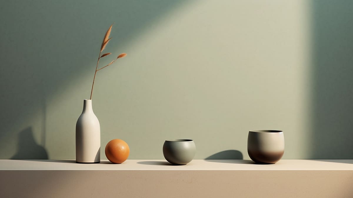
An example of this is using a color scheme based around a muted gray-blue color and a muted burnt orange color. Blue and orange are contrasting colors, but by using muted versions, the distinction between them feels softer and gentler.
