Understanding complementary colors is essential in interior design because it is one of the key concepts you will be working with.
Here we delve deeper into the mechanics of complementary colors and how you can use them to your advantage.
Table of Contents
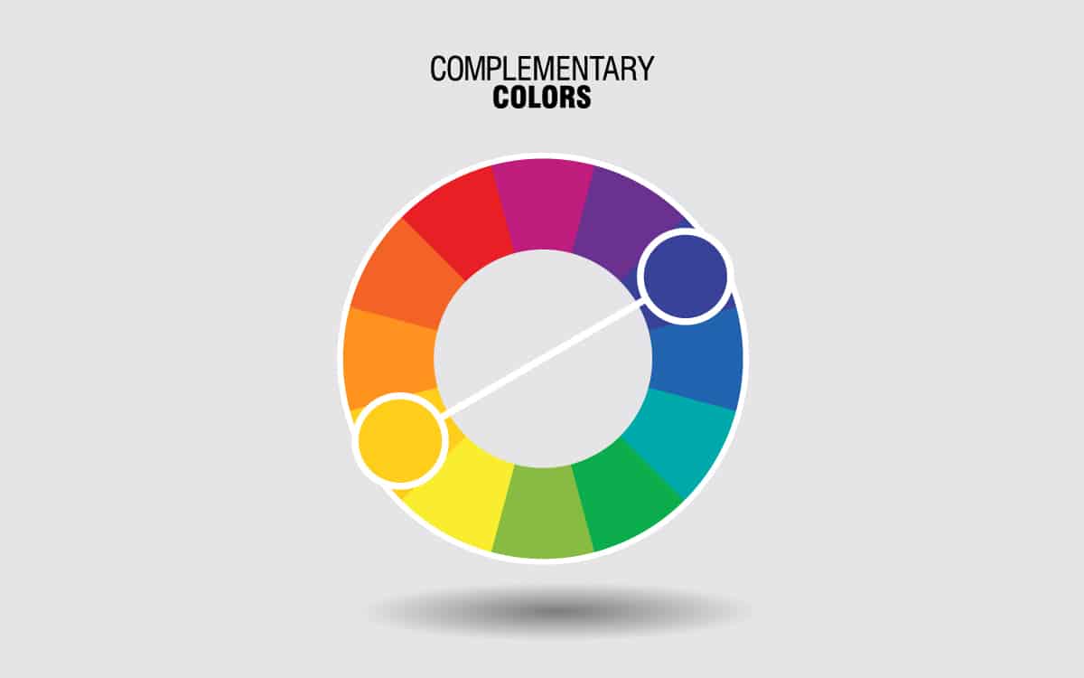
What are Complementary Colors?
Complementary colors are the colors that face directly across from each other on the color wheel. Complementary colors are polar opposites, and as a result, they share no similarities. This enables them to contrast against each other to create drama, but you can also use complementary colors as a way to help your chosen colors stand out more.
Balance
Since complementary colors are opposites, they help to balance each other out. For example, orange and blue are complementary colors since they face directly opposite each other on the color wheel. Blue is cool, while orange is warm, which means in terms of temperature, they are able to balance each other out, ensuring a room feels neither too cool and hostile or too warm and intense.
Vibrancy
Complementary colors can also be used to make each other appear more vibrant or more true. For example, if you have a lilac wall that is looking a little gray due to the light, you should accessorize it with a complementary color to make it appear brighter and more lilac-like.
Since purple is the original version of lilac, and yellow is the complementary color to purple, it would be advisable to use yellow accessories in this instance. When you add yellow curtains or a yellow sofa to a lilac wall, this serves to make the lilac color appear more vivid and vibrant. This is a technique that works with all complementary colors, since the main function of complementary colors is to create contrast.
How to Identify Complementary Colors
Complementary colors are easy to figure out if you have access to a color wheel. On a color wheel, the complementary color for any color is the color that sits exactly opposite it on the wheel. Simply draw a straight line from your chosen color, cutting exactly across the center of the circle to see which color you land on. This is the complementary color for the color you started with.
How to Use Complementary Colors in Interior Design
Complementary colors can be used in interior design in a range of ways. The type of complementary colors you choose will alter the atmosphere or style of your space. Here we look at ways to use complementary colors in both bold and subtle styled rooms.
Bold Effect
To achieve a bold effect in interior design, choose complementary colors in vivid shades. This requires choosing the brightest shade of the color you have chosen or one of the brightest shades available. For example, in a complementary color scheme of blue and orange, the boldest combination will be achieved using bright blue and bright orange.
For most interiors, a bold use of complementary colors will need to be broken up with a third color. This is because an entire room decorated in just two bright complementary colors would look overstimulating and can make the room feel too intense to spend any time in.
To achieve a more palatable look without compromising on the bold effect, choose a third color which is neutral. For example, for a blue and orange color scheme, break them up by adding black or gray to the mix. This is where applying the 60-30-10 rule is going to help ensure the room doesn’t look out of balance. You will need to choose one of your complementary colors to occupy 10% of the space, and the other complementary color and the neutral color can be used for the remaining 30% and 60%.
Using our example of blue, orange, and gray, this could, in practice, mean that blue covers 60% of the space, gray covers 30% of the space, and orange covers 10% of the space.
In a living room, for example, paint the walls in blue and use a blue area rug, choose gray sofas and gray curtains, then add small splashes of orange, such as orange cushions and an orange lamp shade. This will result in a space that has a clear contrasting color scheme, encouraging a bright and vivid appeal, without coming across as too intense.
Subtle Effect
You can also use complementary colors to achieve a more subtle effect. This tends to result in a more modern, relaxed environment. The way to achieve a contrasting color scheme while maintaining a subtle feel is all related to the tone and shade of the colors you choose.
Continuing with our example of blue and orange as complementary colors, you can tone these colors down so that the contrast is more muted yet still evident.
For example, for a more subtle complementary color scheme, choose a darker or lighter shade for one of your colors while leaving the other color as a bright shade. This could be bright blue with a faded pastel orange or bright blue with a dark, almost brown shade of orange.
Alternatively, this would also work with bright orange and a pale pastel blue, or bright orange and dark navy blue. By choosing more muted shades of one of your colors, the result will be a color scheme that still contrasts but not in a way that inspires a harsh reaction.
You can take this technique one step further to create a heavily muted color scheme that still maintains an element of contrast. You can do this in various ways depending on the result you desire. For a very soft and subtle contrasting color scheme, use muted versions of both of your complementary colors.
This would be a dusky pale blue, and a sweet shade of pale pastel orange. The other option is to take both of your complementary colors to the darker end of the color spectrum. For example, choose dark navy blue, with a dark shade of burnt orange. This will ensure a contrast is achieved in a deep and dramatic way, without the intensity of a brightly contrasting color pairing.
Complementary Interior Color Schemes
Blue and orange
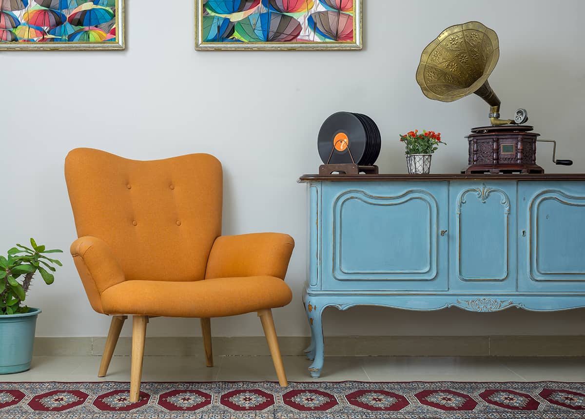
Blue and orange are complementary colors that can be used to create a modern, gender-neutral aesthetic. This color scheme is great for the apartments of young professionals or to create a creative yet calming environment in a home office.
Alter the shades of these two contrasting colors to suit your home decor design. For example, if you want an art deco look, choose turquoise blue and a peachy shade of orange.
Green and red
Green and red is a color scheme that works really well with some other colors for vintage and classic style spaces. Opt for emerald green and a dark shade of red such as maroon to evoke a sophisticated and formal atmosphere. In a living room, opt for deep maroon walls with emerald green velvet sofas, and balance out the intensity with touches of gold.
This color scheme can also be put to good use in a natural-themed room. Choose an earthy shade of green, such as olive green, and a rusty red color that mimics desert soil. Since these colors are found together in nature, they make for an interior style that helps connect us to nature, resulting in a space that feels relaxing, soothing, and peaceful.
Purple and Yellow
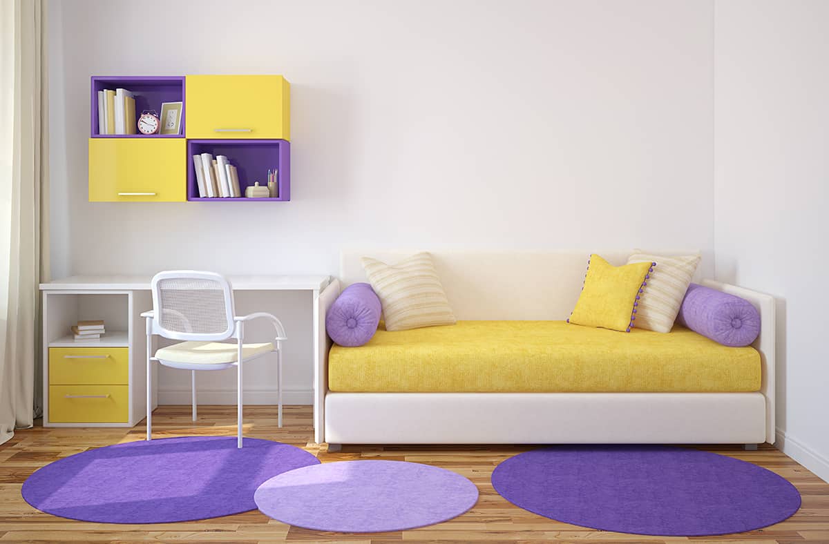
Purple and yellow are complementary colors that can be used in a variety of ways. Purple can feel royal and regal when a darker shade is chosen, while pale purple colors feel pretty and playful. Meanwhile, yellow is a distinctly uplifting and joyful color in any shade.
For a cheerful bedroom, choose a medium to light shade of purple, such as lavender, and pair this with a gentle buttery yellow. A floral motif will work well with these delicate and pretty colors, so a wallpaper print featuring flowers could work well. Apply a lavender and yellow floral wallpaper to the wall behind the head of the bed, and paint the remaining walls in pastel yellow.
Add lemon yellow bedsheets, a lavender comforter, and lavender throw pillows to the bed. The resulting look will be lighthearted, feminine, and playful, hinting at the beauty of spring and nature. You could also use purple and yellow for a more dramatic and formal interior style, for example, with mustard yellow or ochre and a deep shade of purple such as eggplant.
This color scheme would look great in a dining room where you want to achieve an intimate, atmospheric feel. Paint the walls in eggplant purple, and hang heavy suede mustard-colored drapes at the windows for a dramatic effect. For the table settings, use a variety of purple and yellow accessories, such as dark purple placemats and mustard-colored napkins.
To keep the style modern, stick to bold block colors, or to create a more elegant or interesting look, you could mix some prints into the space, for example, a geometric patterned lamp shade or a floral print area rug beneath the dining table.