Discover the harmonious blend of green and blue in interior design and unlock the potential of this color pairing to transform your space.
Green and blue, sitting side by side on the color wheel, naturally evoke a sense of balance and tranquility, offering a seamless aesthetic appeal. To elevate your decor, introducing a third color can add dimension and contrast, enhancing the visual interest.
In this article, we’ll explore the vast array of green and blue shades and the complementary colors that can optimize their impact in your home.”
Table of Contents
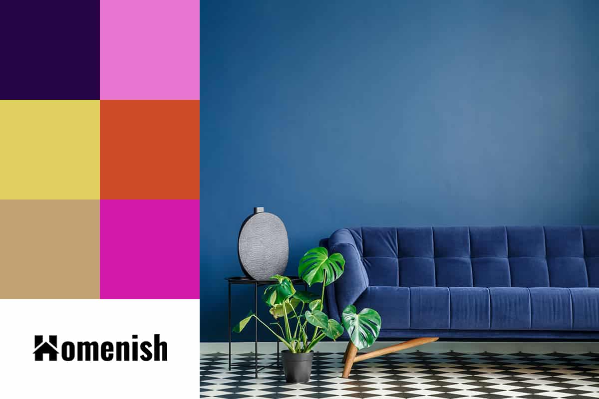
Purple + Green + Blue
| Shade | Hex Code | CMYK Color Code (%) | RGB Color Code | Color |
| Green | #007c00 | cmyk(100%, 0%, 100%, 51%) | rgb(0, 124, 0) | |
| Blue | #054576 | cmyk(96%, 42%, 0%, 54%) | rgb(5, 69, 118) | |
| Purple | #270448 | cmyk(46%, 94%, 0%, 72%) | rgb(39, 4, 72) |
Green and blue are colors that work really well with purple because it sits next to blue on the color wheel, and therefore the three together present an analogous color set that feels balanced and coordinated.
Choose each color in a jewel shade for a rich and indulgent style, such as sapphire blue walls with an emerald green velvet sofa topped with sumptuous amethyst purple cushions.
The vibrancy of violet can also be used to add bold splashes of color to a relaxed room to liven it up.
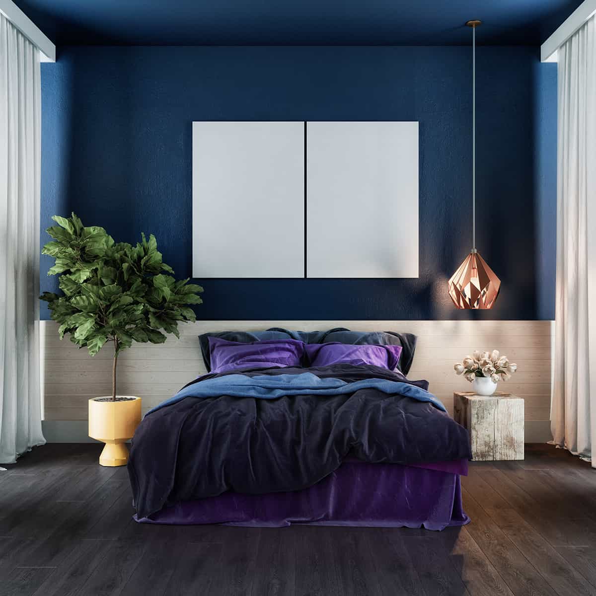
This image shows a bedroom where violet bedding adds luxury to the serene blue walls, while a green potted plant brings in natural vibrancy, illustrating how violet can seamlessly connect the calm of blue with the freshness of green for a balanced and stylish look.
Lavender + Green + Blue
| Shade | Hex Code | CMYK Color Code (%) | RGB Color Code | Color |
| Green | #007c00 | cmyk(100%, 0%, 100%, 51%) | rgb(0, 124, 0) | |
| Blue | #054576 | cmyk(96%, 42%, 0%, 54%) | rgb(5, 69, 118) | |
| Lilac | #e675cf | cmyk(0%, 49%, 10%, 10%) | rgb(230, 117, 207) |
As lavender is a lighter shade of purple-blue, it also works well as an analogous color to blue and green. This is an uplifting color that can be put to good use in a pretty spring-themed space or a room with a botanical-inspired style.
Choose a muted soft blue shade for the walls and use sprigs of lavender and rosemary as your guide for introducing these purple and green shades to the space. Fresh green cushions with lavender trim would look refreshing, along with a green rug and lavender-colored plant pots.
A floral motif could be used to achieve a country cottage or modern farmhouse botanical style. For example, choose curtains that feature a purple flower print with green leaves or install some floral art prints on your walls.
Floral wallpaper on a feature wall that incorporates all the colors of your color scheme is an excellent way to tie the whole look together and make it feel professionally designed.
Yellow + Green + Blue
| Shade | Hex Code | CMYK Color Code (%) | RGB Color Code | Color |
| Green | #007c00 | cmyk(100%, 0%, 100%, 51%) | rgb(0, 124, 0) | |
| Blue | #054576 | cmyk(96%, 42%, 0%, 54%) | rgb(5, 69, 118) | |
| Yellow | #e1d161 | cmyk(0%, 7%, 57%, 12%) | rgb(225, 209, 97) |
Blue and green are colors that make a nice pairing with yellow because they sit next to one another on the color wheel. Choose a green-toned yellow, such as chartreuse, to achieve this look of balance and harmony. An example of this could include a kitchen with dark blue cabinets, lime green walls, and chartreuse accessories.
Alternatively, you could opt for a warmer shade of yellow, which has more orange or brown undertones in it, such as mustard yellow or turmeric yellow. This shade of yellow will contrast against the blue in your color scheme since blue and orange are opposite shades on the color wheel.
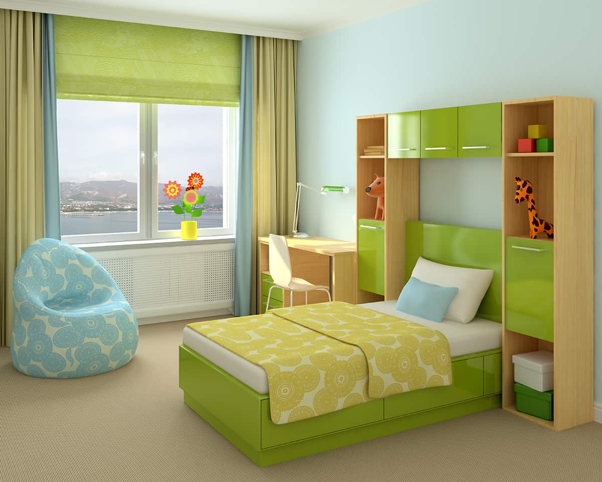
Bright yellow touches on the bedspread and in the floral arrangement in this room provide a cheerful contrast to the calming blue backdrop and refreshing green tones of the room’s decor, resulting in an energetic yet peaceful environment.
Burnt Orange + Green + Blue
| Shade | Hex Code | CMYK Color Code (%) | RGB Color Code | Color |
| Green | #007c00 | cmyk(100%, 0%, 100%, 51%) | rgb(0, 124, 0) | |
| Blue | #054576 | cmyk(96%, 42%, 0%, 54%) | rgb(5, 69, 118) | |
| Burnt Orange | #cd4d27 | cmyk(0%, 62%, 81%, 20%) | rgb(205, 77, 39) |
Burnt orange is a rich shade of orange with brown undertones. Although orange is generally a creative and energetic color, burnt orange can be used to make a room feel cozy and comfortable because of the depth and warmth it offers.
If you have found that a blue and green room feels too cold or uninviting, add swathes of burnt orange to level out the temperature and make it feel more like a space you want to snuggle up in. A thick crocheted burnt orange blanket draped over a sofa will work wonders, or consider a shaggy, thick-pile burnt orange rug for a cozy and casual living room.
As orange is the opposite and contrasting shade of blue, blue is such a complementary color to orange, but they can be overstimulating if the shades you use are too bold. In a room with burnt orange, choose dark or soft shades of blue and green, such as navy blue, duck egg blue, forest green, and pale olive green.
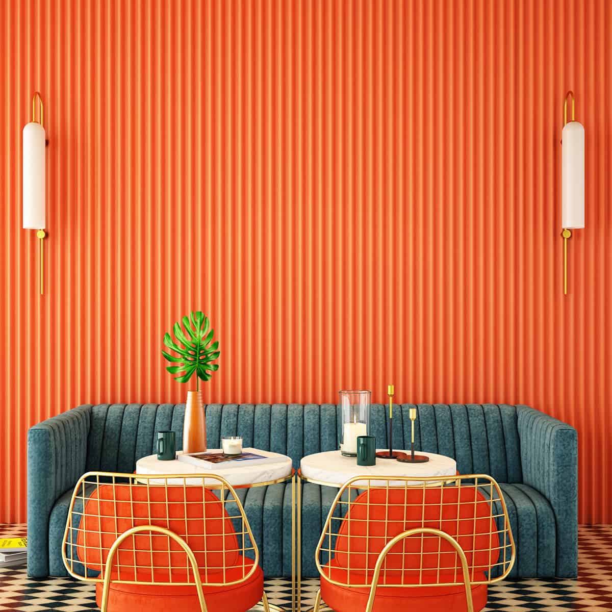
In this setting, the burnt orange wall creates a vivid backdrop that accentuates the deep green sofa and blue undertones. The orange chair frames echo the wall color, tying the space together, while the green and blue provide a cool contrast that is pleasing to the eye. Gold light fixtures add a sophisticated touch, seamlessly blending with both the warm orange and the cool green and blue.
Sand + Green + Blue
| Shade | Hex Code | CMYK Color Code (%) | RGB Color Code | Color |
| Green | #007c00 | cmyk(100%, 0%, 100%, 51%) | rgb(0, 124, 0) | |
| Blue | #054576 | cmyk(96%, 42%, 0%, 54%) | rgb(5, 69, 118) | |
| Sand | #c2a273 | cmyk(0%, 16%, 41%, 24%) | rgb(194, 162, 115) |
Sand is a warm, pale shade of beige. It works really nicely as a neutral with a blue and green color scheme instead of gray or white, which can make a green and blue room feel stark or cold. If you want to create a space that feels refreshing and soothing while also being inviting, then choose sand with a blue and green color scheme.
If sandy beige is going to be your wall color, then you can use almost any shades of blue and green as your accent shades because, with a sand base, they won’t be too intense or overwhelming. If your sand color is going to be an accent color with blue or green as a base shade, then you’ll want to choose blue and green colors that are a little more muted.
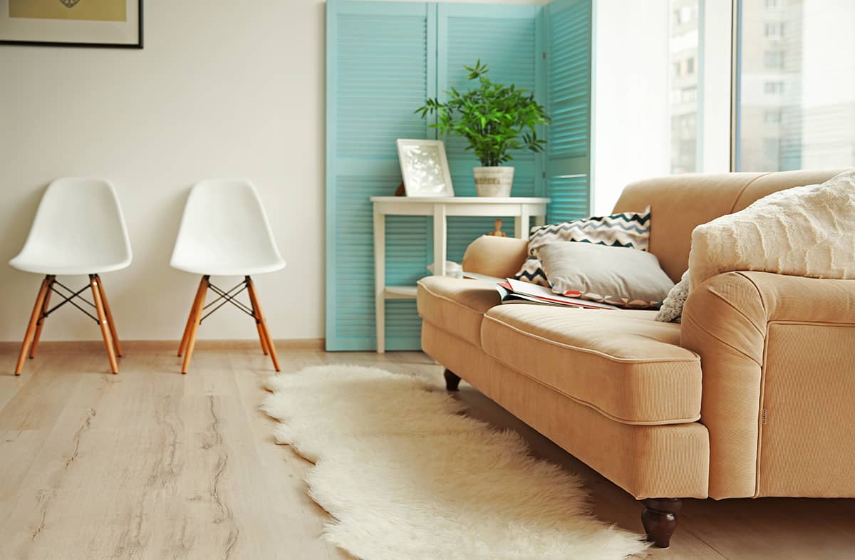
The sandy-colored sofa in this image provides a neutral base that harmonizes with the lively green of the potted plant and the soothing blue of the closet doors. The natural light filtering through the window enhances the warmth of the sand tone, creating a comfortable and welcoming environment.
Pink + Green + Blue

| Shade | Hex Code | CMYK Color Code (%) | RGB Color Code | Color |
| Green | #007c00 | cmyk(100%, 0%, 100%, 51%) | rgb(0, 124, 0) | |
| Blue | #054576 | cmyk(96%, 42%, 0%, 54%) | rgb(5, 69, 118) | |
| Pink | #d11aaa | cmyk(0%, 88%, 19%, 18%) | rgb(209, 26, 170) |
Pink is a really popular accent color to use in a green and blue room, and with good reason. Blue and green are traditionally seen as masculine colors, so pink touches will add a little femininity to help balance out the atmosphere.
Pink can also be seen as a very pale version of red, and as red and green are contrasting colors, this means that pink will also provide an appealing contrast next to green. If you choose an orange-toned shade of pink, such as salmon or peach, then it will contrast against both blue and green since orange is the opposite color on the color wheel from blue.
You can use a vivid shade of pink, such as bubblegum pink with bright blue and green, for an energetic and fun style, or choose dusky pink with jewel tones, blues, and greens for a sultry style. Paint walls in a dark indigo blue and opt for deep forest green sofas, then lighten up the space and add drama with blush pink curtains and cushions.
You could also invert this color scheme, using soft pink as a wall color with dark blue and green accessories to tone down the femininity and create a more balanced decor look.