Whether you are designing a room in your home, putting together an outfit, or creating a new logo for your business, you will need to know how to put colors together to create an appealing effect.
Some people are able to throw different colors together and make them look great, but this isn’t a skill that comes naturally to everyone. Here we will look at colors that go with each other and tactics you can use to ensure your color schemes always look perfect.
Table of Contents
Contrasting and Complementary Colors
Most people are familiar with the color wheel, or color circle as it is also known, which features pie-shaped segments of colors in a particular order to form a circle. This is a tool that every budding designer should have access to, as it makes pairing colors so much easier.
Contrasting and complementary colors are colors that sit opposite each other on the color wheel. The effect these colors have on each other can be vibrant and energetic when they are heavily saturated, or a more subtle contrast can be created if the colors are muted.
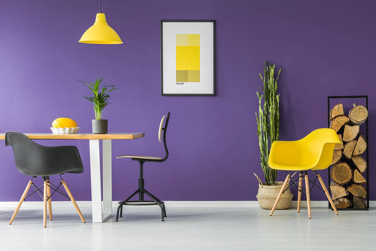
Contrasting colors have the ability to bring out the best in each other and also make each other look more intense and truer. For example, the opposite color to purple is yellow, and so this is a pair of contrasting colors.
When you put these two shades next to each other, they are automatically brought to life. The purple will look stronger and more vibrant, and the yellow will be brighter and more joyful.
It’s useful to know about complementary colors so that you can use them to create effective contrasts, but they can also be used to help tone down colors you don’t want.
For example, knowing that yellow will make purple even more vivid, if you have painted a room in a shade of gray that has purple undertones, but you want to play down the purple and make it appear grayer, then the one thing you need to do is avoid yellow. Including yellow accessories in the space, such as yellow curtains, would make purple tones in the gray stand out and become more prominent.
If you want to downplay a color, then you should stay away from its contrasting shade, as this will serve to make it bolder. Examples of contrasting and complementary colors include orange and blue and red and green.
You can move one color along on the color wheel and still achieve a nice contrast in most instances. For example, if red and green sound too intense of a color pairing, change the red to pink for a softer but equally attractive contrast.
There are many examples of scenarios where contrasting shades can work well in pairs, but if you don’t want your color scheme to be too overwhelming, it’s a good idea to add in a third color that is a neutral. For example, wearing a black dress with a purple coat and yellow shoes will look stylish and quirky, whereas wearing entirely purple and yellow with no third neutral color can look a little wacky.
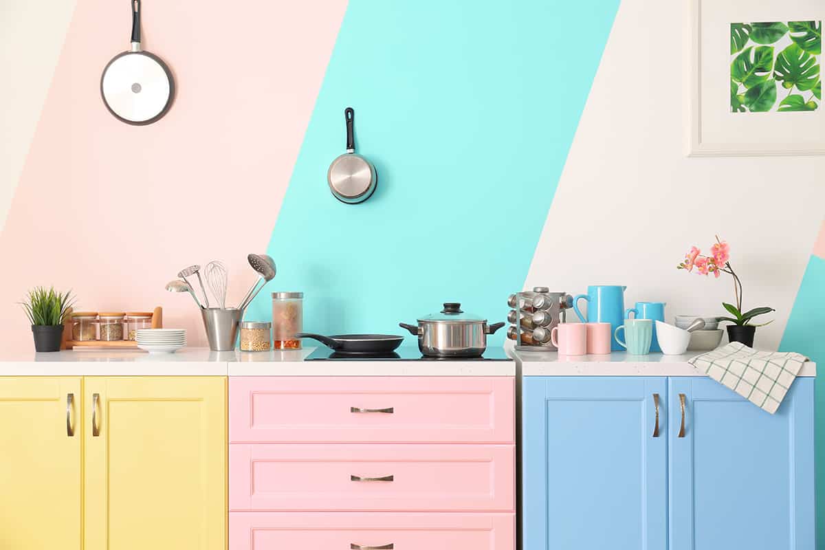
The same applies to interiors. For example, a gray painted room with purple sofas, yellow cushions, and yellow curtains will be much easier to live with compared to a room that is entirely purple and yellow. There are exceptions to this, of course, and that is, typically, that when the colors are muted, then a third neutral shade is not essential.
In the case of the example above, if the purple was a soft shade of lavender, and the yellow was a pale buttery color, then you could use these across a whole room with no neutral color, without the space feeling too stimulating.
Analogous Colors
Analogous colors are three colors that sit next to each other on the color wheel. If you want to create a space that feels safe and comforting, then use the analogous color method to choose three shades for your interior decor. The resulting effect of doing this will feel calmer and more easygoing compared with contrasting colors, which are better for invigorating and energizing spaces.
An example of analogous colors is orange, orange-yellow (such as apricot), yellow, or blue, blue-green (such as teal), and green. Analogous colors blend into each other nicely to create an interior that feels layered with subtle depth. These are easy color schemes to follow and also have fun with.
Triadic Colors
Triadic colors are colors that make an equidistant triangle on your color wheel. For example, green, orange, and purple, or red, yellow, and blue.
These are colors that create more harmony and balance compared with contrasting colors; however, they still enable each color to pop. If you find that contrasting colors are too over-stimulating for you, but you still want your color scheme to be vibrant, then triadic colors represent a good middle ground.
When choosing your triadic colors, you can choose any shade variation of that color and still have good results. For example, dark forest green with lilac and pale orange, or pale olive green with dark purple and burnt orange.
Triadic colors make for a contrast that is softer and less work for the eyes and brain to contend with compared with directly contrasting colors; however, there is still enough contrast to make each shade stand out and look interesting.
Warm and Cool Colors
Knowing the difference between warm and cool colors is vital for choosing colors that go with each other. To separate warm and cool colors on the color wheel, draw a line right down the center of your wheel, with yellow through to red on one side and purple through to green on the other side.
The temperature of colors is the driving force behind the kind of atmosphere and feeling they will create, so understanding how this works will help you judge which colors are most appropriate.
For example, if you are promoting a wellness brand, then yellow and orange are good color choices for a logo because they represent vitality, joy, and youth, and they have a warm temperature that is inviting and likable.
For a health spa retreat, green and blue are good color choices as they have a cool temperature that will make people feel fresh, calm, and soothed. In this instance, you would want to avoid warm shades because they invoke a feeling of coziness, which is not the atmosphere you want to achieve in a refreshing spa.
When it comes to interior design, knowing the feeling you want to create in a room is important before settling on your colors because this will help you to focus on the colors that are going to work best for the results, you want.
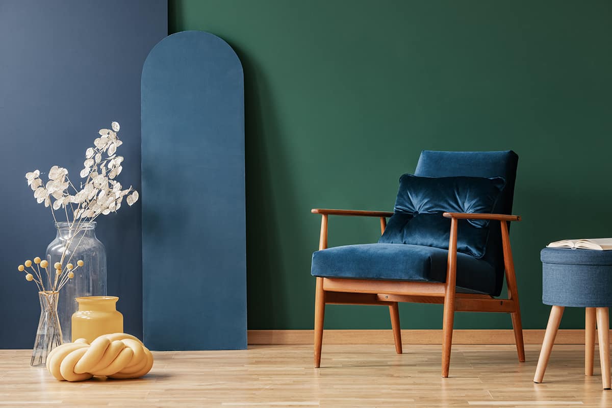
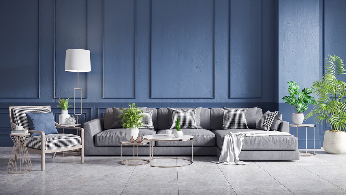
For example, if you want a room that feels calm and serene, then you are going to want to choose a main color in a shade of fresh gray, blue, or green.
To maintain this theme, choose an analogous color to go alongside it, such as purple, as this is also a cool color. Alternatively, you could create some contrast and balance by introducing a warm color into the space with a cool color, such as yellow with gray, which will result in a fresh and cheerful room.
Neutral Colors
Neutral colors are technically colors that lack color, such as black and white. However, most people agree that neutral shades also include those which are background shades in nature, such as brown, tan, beige, and gray. These colors are useful to use as base colors because they go well with a wide variety of other shades.
If you paint a room in a neutral color, then you can be confident that if you change your mind about your bedding color, you can just swap it out for a different shade in the knowledge that it will still look good with your neutral wall color.
However, there are certain colors that neutrals work well with, more so than other colors. Beige looks welcoming and cozy with tan, brown, and cream, or it will look formal and classic with black and white. Brown can work well with other earthy shades such as green and gray, or you can use brown to achieve a stately and royal feel with navy blue or deep purple.
White works well with any color, though it goes especially well with red and blue. Black will also go with any other color, in particular white, yellow, green, and pink. Gray is a slightly trickier shade to work with because it can be warm or cool depending on the undertones.
If you have chosen a cool gray color with blue, green, or purple undertones, then pair it with another cool shade, or black and white. Warm gray will have a brown or beige undertone and looks great with other warm colors such as merlot red and burnt orange.