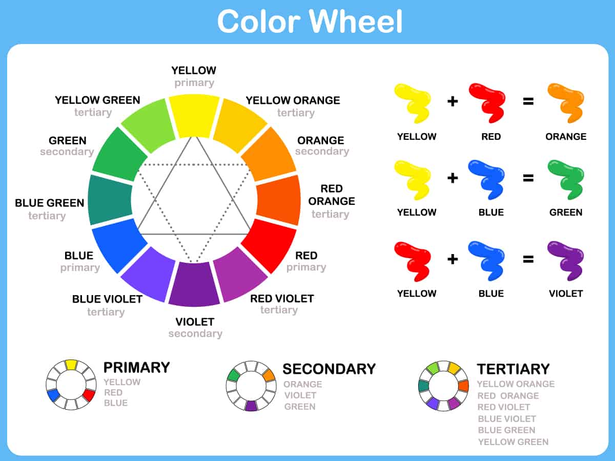
A color wheel is, to put it simply, a series of colors arranged in the shape of a circle. The way that the colors are arranged helps us to easily identify which colors go well together, but an understanding of how the color wheel works is important to be able to do this.
Here we look at how the colors on the color wheel are arranged and how you can use a color wheel in interior design to heighten the look of your rooms.
Table of Contents
How is a Color Wheel Arranged?
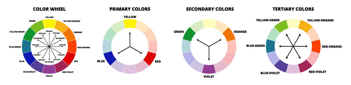
The colors are arranged on a color wheel in a specific order, which you can learn all about here.
Warm and Cool
Most colors, with the exception of true neutrals, have a warm or cool temperature. A color with a warm temperature will usually create feelings of warmth and comfort, while cooler colors are more refreshing or relaxing. On a color wheel, the warm colors are all grouped together on one side, and the cool colors will all be grouped together on the opposing side.
Blue sits right in the very center of the cool section of the wheel, and its opposite color, orange, sits in the center of the warm colors. As the warm and cool sections work their way toward each other, you will find colors that have both warm and cool components, and these can be difficult to distinguish as cool or warm colors. These include purple and pink.
To identify if one of these colors is cool or warm, you would need to figure out what the dominant tone in the color is. A red shade of pink is going to have a warm feel, while a blue shade of purple will feel cool.
Primary Colors
There are three primary colors that most of us learn about when we are very young. These are blue, yellow, and red, and they are the three colors that are used to make all of the other colors on the color wheel.
These colors are positioned at the points of a triangle shape on the color wheel. If you were to draw a perfectly equilateral triangle over the color wheel, each of these three primary colors would sit at a different corner of the triangle.
Secondary Colors
Secondary colors are shown at triangular points within the color wheel, just like primary colors. If you arranged two triangles on the color wheel to form the shape of a star, the primary color would sit at the points of one triangle, and the secondary colors would sit at the points of the other triangle.
Secondary colors are achieved by mixing the primary colors together, and their place on the color wheel is determined by this. For example, to achieve the secondary color of green, you would mix primary colors blue and yellow.
Therefore, green sits in between blue and yellow on the color wheel. The other secondary colors are orange and violet, which are a result of mixing red and yellow and blue and red.
Tertiary Colors
Tertiary colors are the colors that sit in between each primary and secondary color on the color wheel. A tertiary color is created by mixing a primary color and a secondary color together, and their place on the wheel will be determined by this. For example, if you mix the primary color of yellow with the secondary color of green, the result will be yellow-green. As such, yellow-green sits in between yellow and green on the color wheel.
The other tertiary colors are yellow-orange, red-orange, red-violet, blue-violet, and blue-green. In interior design, you may know these tertiary colors by different names; for example, red-violet might be considered burgundy or maroon, and yellow-orange might be considered apricot.
How to use a Color Wheel in Interior Design
A color wheel is a really useful tool in interior design if you know how to use it. You can use a color wheel to easily identify which colors will go well together and what sort of impact they are going to have. Here we look at the types of color schemes you can choose using a color wheel.
Complementary Colors
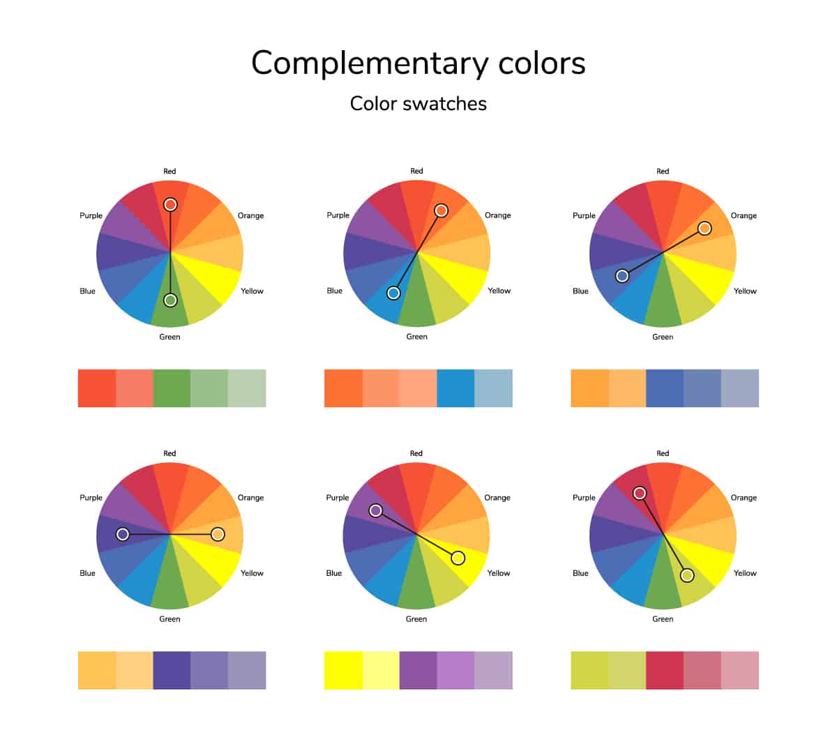
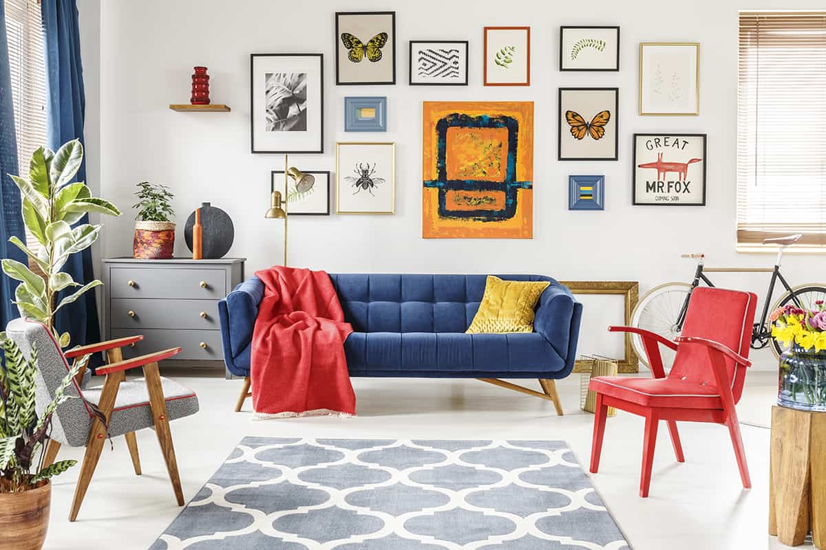
Complementary colors are those that contrast against each other. When used together, complementary colors help each other look brighter and more vivid and make the colors appear in their truest sense.
For example, if a dark shade of orange is reading like a sludgy brown color, put it next to a bright shade of blue, and this will make the orange instantly appear more vibrant and orange-like. This is because orange and blue are complementary colors.
Complimentary colors are easy to find because they always face directly opposite each other on the color wheel. All colors on the color wheel have an opposite complementary color, no matter if they are primary, secondary, or tertiary colors. The complementary color for green is red, the complementary color for purple is yellow, and the complementary color for orange is blue.
When using complementary colors in interior design, you don’t always need to choose the directly opposite color, but you could move one space to the left or right, depending on how intense you want your contrasting shades to be.
For example, purple and yellow are complementary colors, but if this color pairing feels too harsh or intense, you could sidestep from yellow on the color wheel to yellow-green or yellow-orange. These tertiary colors will still be complementary to purple because they are almost directly opposite the color on the color wheel, but the contrast will be slightly softened.
Monochromatic Colors
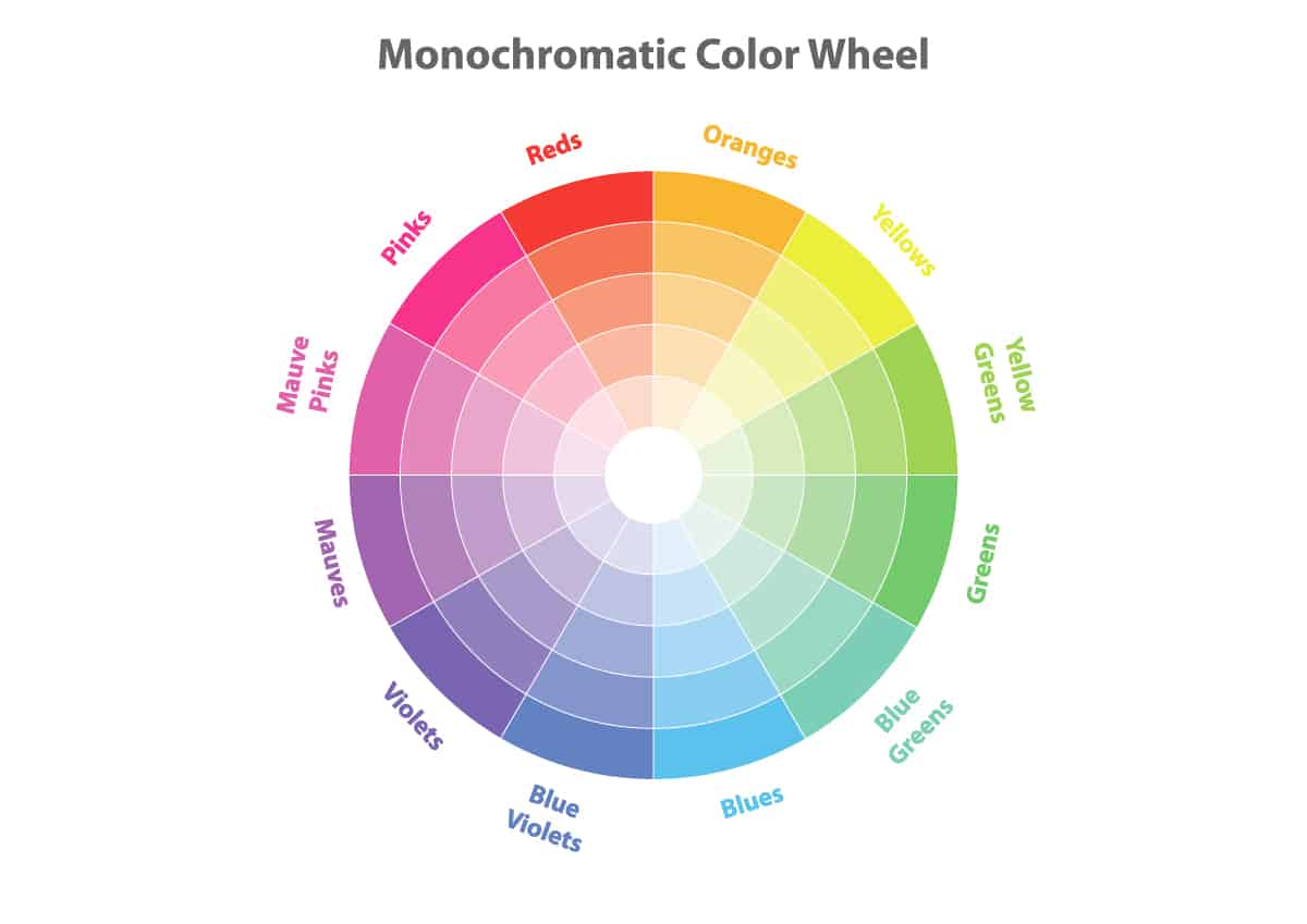
Monochromatic color schemes use three colors that sit side by side on the color wheel. This type of color scheme focuses on creating harmony rather than contrast. However, it is fair to say that monochromatic colors still complement each other, but in a different way than you might expect. A monochromatic color scheme is quite a modern look. This is because the colors you use will be similar to each other, and the result can look layered in either a formal or casual way.
An analogous color scheme could be green, yellow-green, and yellow when choosing from a fairly basic color wheel, but if you have a more extensive color wheel, you might opt for colors that are even more closely related to each other, such as medium red, dark red, and burgundy.
You can use monochromatic colors to add depth and definition to a room by using dark and light as the vehicles for contrast, rather than the temperatures of the color.
For example, you could create a definition on a bed with a monochromatic color scheme, by layering pale butter yellow throw pillows with bright lemon yellow throw pillows.
For a more intense shade contrast, consider a soft gray-blue set against navy blue. To select a monochromatic color scheme by using a color wheel, all you need to do is identify a color you like and select the other two colors that sit on either side of it.
Since this color scheme relies on three colors, you should aim to use them at a ratio of 60-30-10 to achieve a balanced look and ensure your monochromatic colors don’t fall flat. For example, if you are using red, red-orange, and orange, use red at a ratio of 60% across the room, orange at a ratio of 30%, and red-orange at a ratio of 10%.
Analogous Colors
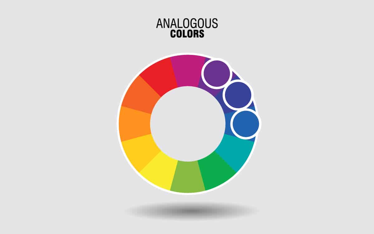
This type of color scheme can be used when you want a mix of monochromatic and complementary colors. It is a good way to soften the impact of contrasting colors and make a space feel contemporary and relevant while also achieving a balanced look.
To create an analogous color palette using the color wheel, choose two colors that sit next to each other, such as red and red-orange, and then choose a third color that subtly contrasts against one of or both of your chosen shades.
You can find this by selecting a color that is neither directly opposite your chosen colors but also not directly next to them. For example, a color that works with red and red-orange could be yellow or purple.
Choosing Color Schemes based on the Color Wheel
Whether you are opting for a complementary, monochromatic, or analogous color scheme, remember that once you have selected your colors you can swap them out for lighter or darker shades of the same color, to alter the resulting effect.
For example, blue and orange are complementary colors but might seem too intense and overwhelming when used in the brightest varieties.
To tone down the blue and orange color scheme, make one of your colors paler or darker to soften the impact. For example, use bright blue with a faded pastel orange or a bright orange with a dark navy blue.
This can also be applied to other color schemes. For example, a monochromatic color scheme of yellow, yellow-green, and green, doesn’t require all of the colors to have the same level of saturation. Mix it up by opting for a dark green with a pale yellow or lime green with dark yellow.