Blue and gray are well-favored colors in the interior design world, and they have been dominating home color palettes for the last 15 years. These are both cool colors that can read as neutrals, making them easy to live with while creating a modern look.
You can pair these colors with a range of accent shades to alter the style completely. Here we look at the best colors that go with blue and gray.
Table of Contents
Blue and Gray Color Palettes
Blue and gray are both cool colors since they lack warm undertones. This means that they can work well to create contemporary spaces which feel sleek and stylish. Both of these colors have a lot in common, which means they can come across as quite similar in an interior design color scheme.
To avoid a room that looks flat or lacks interest, be sure to choose shades of blue and gray that offer some sort of contrast. For example, if you are using a pale shade of blue then team this with a dark shade of gray.
Color schemes work best when you are using a combination of at least three colors, and ideally no more than five colors. Three colors are the preferred choice by most stylists since this will give a pleasant, balanced look. When decorating with three colors, you’ll need to decide which shade will be your dominant color, which will be the secondary color, and which will be the accent color.
Knowing this will be super useful in ensuring you create a cohesive look that feels even. A good guide to loosely follow is the 60-30-10 rule. This dictates that your dominant color is used across 60 percent of the space, with the secondary color used across 30 percent of the space, and the accent color used across 10 percent of the space.
With blue and gray, there are a vast number of different formulas you could choose from. If you opt for blue and gray as your dominant and secondary colors, then your accent color could be a bright and bold choice to liven up the space, or you could choose a neutral such as white to create harmony.
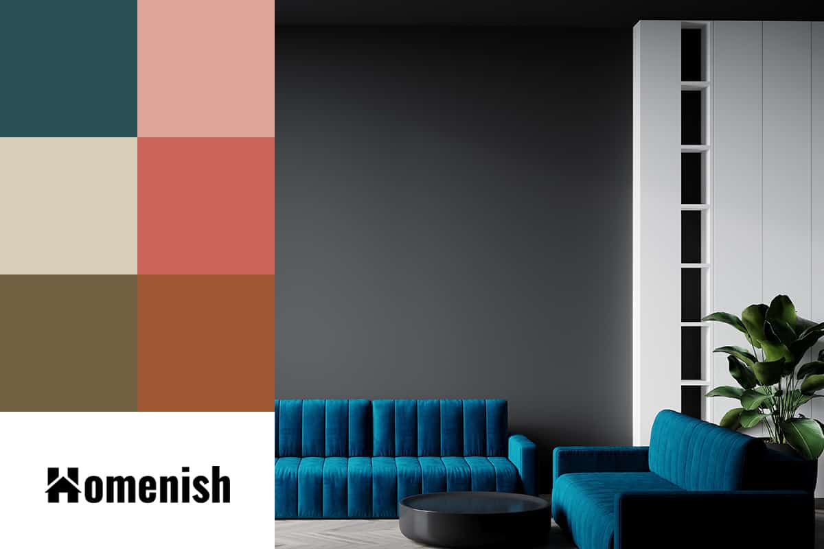
Blue, Gray, and Forest Green
| Shade | Hex Code | CMYK Color Code (%) | RGB Color Code | Color |
| Blue | #22698e | cmyk(76%, 26%, 0%, 44%) | rgb(34, 105, 142) | |
| Gray | #525558 | cmyk(7%, 3%, 0%, 65%) | rgb(82, 85, 88) | |
| Forest Green | #284f53 | cmyk(52%, 5%, 0%, 67%) | rgb(40, 79, 83) |
Forest green is a deep and dark shade of green that is evocative of lush evergreen trees and mounds of moss growing along forest floors. It is a very trendy color right now, alongside most shades of green, because it is thought of as nature’s neutral. The common result of being confined to our homes during the pandemic is that many people now want to feel closer to nature, and using green in our home interiors is a way of inviting the natural world inside, and linking our indoor spaces to the outside.
In a blue and gray color scheme with forest green, you should choose one of the shades to be lighter in color, to avoid overwhelming the room with dark shades. Dark navy blue, with forest green, and a pale dove gray would work well.
Green is a nourishing and refreshing color, so opt for this as your dominant shade if you want the atmosphere to be invigorating, while blue is a soothing color, so this could be best as the dominant color if you want to achieve a more relaxing space.
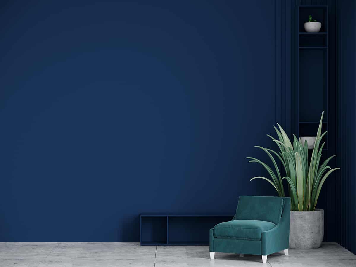
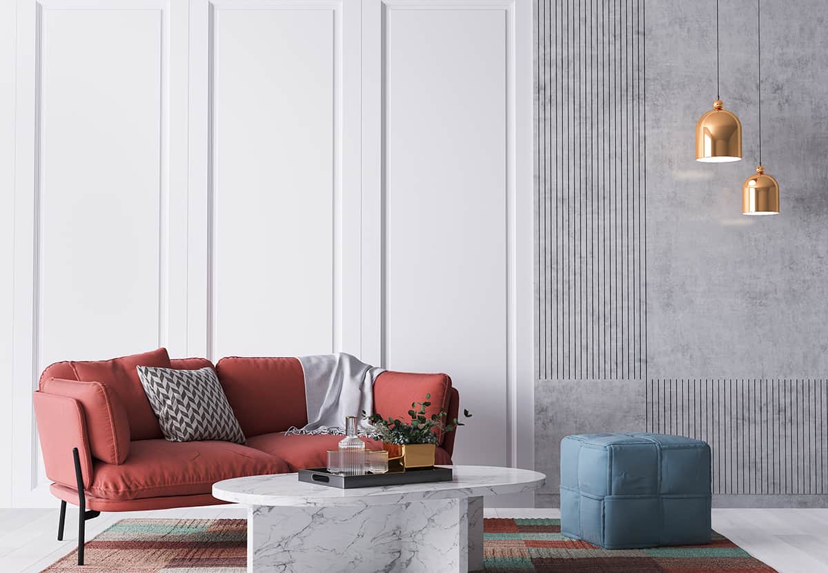
Blue, Gray, and Blush Pink
| Shade | Hex Code | CMYK Color Code (%) | RGB Color Code | Color |
| Blue | #22698e | cmyk(76%, 26%, 0%, 44%) | rgb(34, 105, 142) | |
| Gray | #525558 | cmyk(7%, 3%, 0%, 65%) | rgb(82, 85, 88) | |
| Blush Pink | #dda498 | cmyk(0%, 26%, 31%, 13%) | rgb(221, 164, 152) |
Blush pink is everywhere right now; in fact, you’d be hard-pressed to walk into any home decor store without finding a whole aisle dedicated to this fashionable shade. While blush pink was once a color reserved for ladies’ washrooms and little girls’ bedrooms, it is now a color liberally splashed across living room walls and kitchen cabinets.
Blush pink is the duskier cousin of pink, which offers a more subtle and alluring vibe. It works brilliantly against dark blue because it contrasts against it without being too bold or intense. The color which sits opposite to blue on the color wheel is orange, and blush pink is just a few spaces along from orange, making it a minor contrasting color for blue.
You could use dark blue as your dominant color in a room, with midnight blue walls, and a deep blue velvet sofa. Then opt for blush pink as your secondary color, with curtains, a rug, and cushions in the dreamy color.
Pale gray can then be your accent color, adding a neutral element to the space and keeping the entire color palette quite subtle. Use this for small pieces in the room, such as gray candles, a gray vase, and gray lampshades.
Blue, Gray, and Gold
| Shade | Hex Code | CMYK Color Code (%) | RGB Color Code | Color |
| Blue | #22698e | cmyk(76%, 26%, 0%, 44%) | rgb(34, 105, 142) | |
| Gray | #525558 | cmyk(7%, 3%, 0%, 65%) | rgb(82, 85, 88) | |
| Gold | #d7ceb6 | cmyk(0%, 4%, 15%, 16%) | rgb(215, 206, 182) |
Gray and gold are two colors that work beautifully together, and this color scheme can be further enhanced by the addition of blue. For an elegant and sophisticated space, use dark charcoal gray as your dominant color, with gold as the accent shade. This could look like charcoal painted walls with gold sconces and gold-framed mirrors.
Think about the smaller details too, such as switching out old silver cabinet handles for gold knobs. The reason these two colors work so perfectly is that gold is a metallic version of yellow, and yellow and gray are known for being well-suited to one another. The warmth of the gold/yellow balances out the cool tones in gold to ensure a room feels inviting while maintaining its modern, sleek vibe.
The warmth of the gold also offers a contrast against the cool tones of gray, which lifts up the color scheme to prevent it from feeling flat or one-dimensional.
Next, add teal blue to the color palette as the secondary color, with silk teal curtains and matching throw pillows. Teal is a blue-green shade that has minor undertones of yellow, making it a cool color with a warm edge. It will bring together the color scheme, resulting in a well-balanced, stylish space.
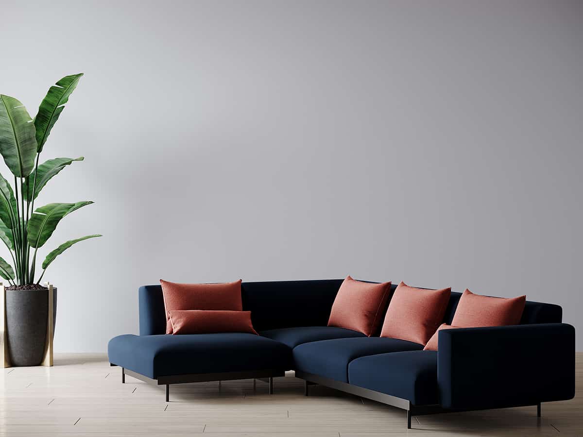
Blue, Gray and Red
| Shade | Hex Code | CMYK Color Code (%) | RGB Color Code | Color |
| Blue | #22698e | cmyk(76%, 26%, 0%, 44%) | rgb(34, 105, 142) | |
| Gray | #525558 | cmyk(7%, 3%, 0%, 65%) | rgb(82, 85, 88) | |
| Red | #cb645b | cmyk(0%, 51%, 55%, 20%) | rgb(203, 100, 91) |
Blue and red are contrasting colors, since orange is the direct opposite color of blue on the color wheel, and red sits next to orange. These two colors can make each other appear bolder and brighter, which is ideal if you want a more lively color palette.
Blue and red work well in nautical-themed spaces, or Americana-themed interiors, as the two colors are evocative of coastal regions, as well as the US flag. Incorporating gray into this color scheme will ensure the resulting look is both modern and stylish, with either pale gray, medium gray, or dark gray shades working equally well.
Blue, Gray, and Olive Green
| Shade | Hex Code | CMYK Color Code (%) | RGB Color Code | Color |
| Blue | #22698e | cmyk(76%, 26%, 0%, 44%) | rgb(34, 105, 142) | |
| Gray | #525558 | cmyk(7%, 3%, 0%, 65%) | rgb(82, 85, 88) | |
| Olive Green | #716341 | cmyk(0%, 12%, 42%, 56%) | rgb(113, 99, 65) |
Olive green is an earthy, neutral shade of green that is perfect for creating a natural style in a room. You could use it with mushroom browns and muddy cream colors for a warm and inviting color palette, or pair it with blue and gray for a cooler, sleeker look. Blue and gray can both be considered earthy shades inspired by nature if you choose the right shade.
Think of dark, inky blues which are reminiscent of wild ocean waters, and the rocky gray of mountain ranges. These colors paired with olive green will create a very contemporary, casual style that feels relaxed and easy to be around. Use a medium gray paint as your wall color, and olive green for large soft furnishings such as the sofa, curtains, rugs, or bed linens. Contrast this with inky blue accents, in the form of natural canvas cushion covers, and woven baskets, to complete the casual and earthy style.
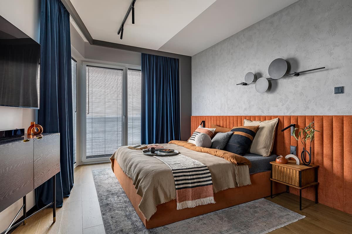
Blue, Gray, and Burnt Orange
| Shade | Hex Code | CMYK Color Code (%) | RGB Color Code | Color |
| Blue | #22698e | cmyk(76%, 26%, 0%, 44%) | rgb(34, 105, 142) | |
| Gray | #525558 | cmyk(7%, 3%, 0%, 65%) | rgb(82, 85, 88) | |
| Burnt Orange | #a05935 | cmyk(0%, 44%, 67%, 37%) | rgb(160, 89, 53) |
Orange and blue are directly contrasting colors, which means when used alongside each other, both colors will read as more vibrant and intense. Contrasting colors can come across as overstimulating when they are used in their purest forms, so when using blue and orange together in the home it works best to ensure that at least one of the colors is a muted or diluted shade.
Burnt orange is a more subtle shade of orange, with more obvious brown undertones. It looks stunning alongside medium blues through to dark blues, creating a contrast that can be stark without being too bold. This color scheme works well in living areas and bedrooms, with the warmth in orange adding a cozy vibe to a blue and gray space that may otherwise read as cold.
The use of gray in a blue and orange color scheme adds an extra dimension. It maintains a contemporary vibe while also ensuring that some of the space remains neutral, creating balance among the colors. For a low-key look that is also atmospheric, use dark gray as the dominant color by painting the walls in slate gray and choosing a dark gray rug. Blue is ideal as the secondary color, with a sofa and curtains in sapphire blue.
Finally, add hits of burnt orange to bring the whole look together. This could include burnt orange lamp shades, burnt orange knitted throw blankets draped over the sofa, or a burnt orange accent chair.