
The color spectrum, first demonstrated by Isaac Newton in 1666, is a way of understanding how light works to allow us to perceive different colors.
Having an appreciation for the color spectrum and how this can affect color perception is really useful in interior design since color theory and being able to put different colors together in an appealing way is a key element of creating spaces that people want to spend time in. Here we take a closer look at the color spectrum and how it can be used to the advantage of interior designers.
Table of Contents
What is the Color Spectrum?
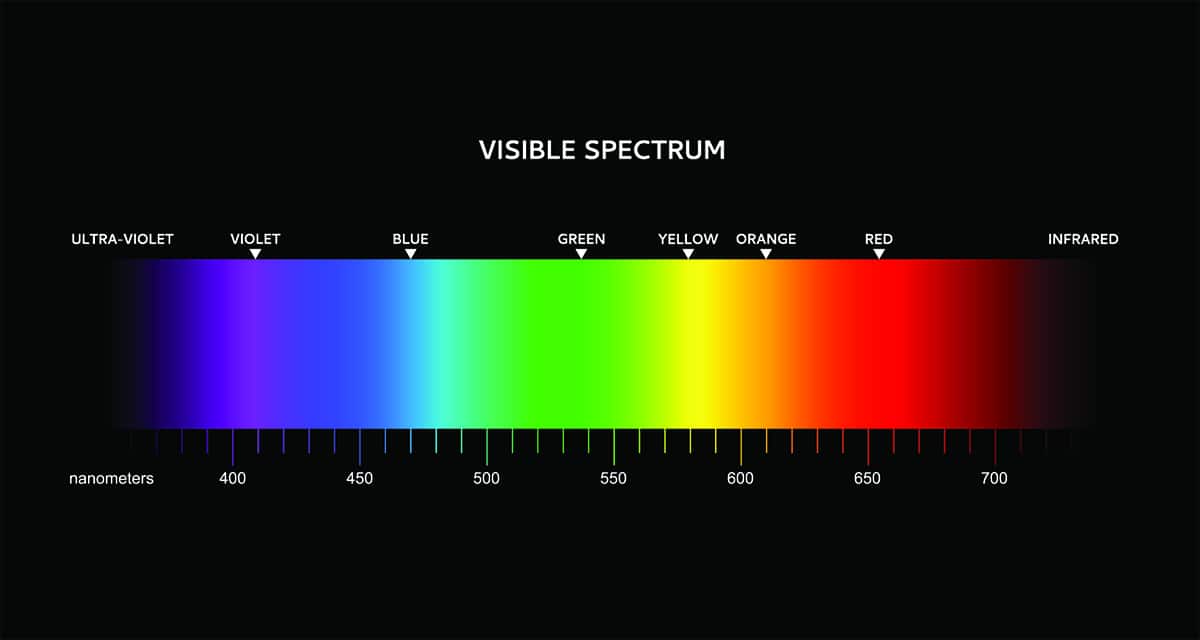
The color spectrum is a collection of pure colors, which, when combined together, create white light. This was first demonstrated by Isaac Newton in his 1666 experiment using a prism. The experiment was set up in a dark room during a bright day, and a window shade with a hole-in was used to allow a small stream of sunlight into the space.
A prism was positioned so that the ray of light passed through it, and Newton observed what happened to the light after passing through the prism. He found that the stream of white light which entered the prism emerged as a rainbow of different colors of light. These colors were identified as red, orange, yellow, green, cyan, indigo, and violet.
Newton concluded that white light is made up of a number of different colors of light, and these are refracted or bent, at different degrees. He also was able to mix different pure colors of light, to create colors not part of the natural spectrum. Magenta was one color which was achieved by combining violet light beams with red light beams. The pure colors in the color spectrum are called spectral colors, while those which are created by combining spectral colors are called non spectral colors.
In home decor, the color spectrum is important because it forms the basis of the color wheel, which interior designers use to create color themes. The original color wheel, or color circle, was first devised by Isaac Newton, containing the spectral colors, along with magenta, a nonspectral color.
Today, the color wheel of an interior designer typically features 12 colors. These are the three primary colors, three secondary colors, and six tertiary colors. Although the color wheel has evolved, the basis of it lies in Newton’s discovery of the color spectrum and his understanding of how light and colors are perceived.
Color Spectrum Vs. Color Wheel
The color spectrum is a range of pure colors of light which appear in a particular order. The color wheel is a circle that is broken up into segments, with each segment representing a color. The colors in a color wheel are based on those found in the color spectrum, with the colors following the same order.
The color wheel and understanding how to use it is a fundamental part of interior design and good home decor because it allows us to see how colors relate to each other.
Colors can be compared alongside each other or by looking across the wheel to find accenting or contrasting colors. Color wheels can help to determine a color scheme, for example, by finding a selection of colors in an analogous theme or in a complimentary theme.
Using the Color Wheel in Home Decor
The color wheel used by interior designers will typically feature 12 colors. Three of these are the primary colors, blue, red, and yellow. A further three are secondary colors which are made by combining two of the primary colors together. These are orange (made by combining equal parts red and yellow), green (made by combining equal parts blue and yellow), and purple (made by combining equal parts blue and red).
The remaining six colors on the color wheel are tertiary colors. These are achieved by mixing a primary color with a secondary color or by mixing two secondary colors together. The six tertiary colors on a color wheel are red-orange, orange-yellow, yellow-green, green-blue, blue-purple, and purple-red.
Color themes can be created by seeing how these colors relate to each other on the color wheel. An interior designer might look to an analogous color scheme for a relaxing or easygoing space, or a complementary color scheme if looking for a space that feels more contrasting or creative.
Types of Color Schemes
Analogous
An analogous color scheme uses three colors that sit side by side on the color wheel. For example, blue, blue-green, and green. This type of color scheme works well in spaces where you want to create a layered look with depth and intensity, and depending on the colors chosen can read as strong and dramatic or casual and soothing.
Colors that are analogous share a lot of commonalities, so it isn’t hard for the eyes to adapt to the changes when looking from one area of the room to another. This can further help the color scheme to feel accommodating and easy to be around. To achieve an analogous color scheme, the key is to use textures layers in your composition to ensure the similarities in the colors don’t read as flat. For example, opt for a dark blue sofa with blue-green cushions and a green throw over the sofa arm.
Complementary
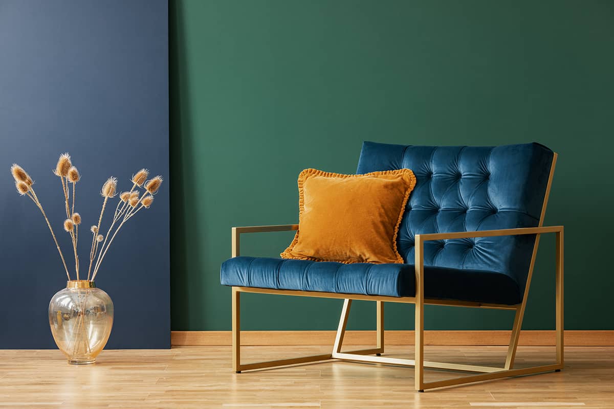
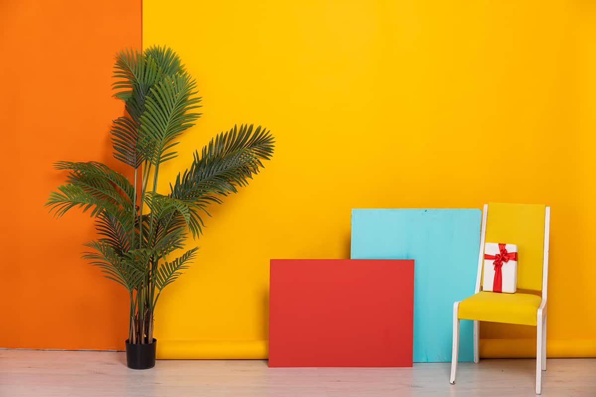
A complementary color scheme uses two main colors which sit opposite each other on the color wheel. It is easy to find a complementary color on the color wheel by selecting your favorite color and seeing which color is facing it on the other side of the wheel. A complementary color scheme can look bold and adventurous because the colors help to make each other appear more vivid, however, you can also create relaxing spaces using complementary colors by opting for more subdued shades.
For example, blue and orange are complementary colors on the color wheel. Using bright versions of these colors, such as tangerine orange and aqua blue, will make for a vibrant and lively space, but you could alternatively use midnight blue and burnt orange for a color scheme that is contrasting without being overwhelming.
It’s also a good idea to add a third neutral color into a complementary color scheme to help break up the contrasting tones and provide some balance. For example, a base of white, gray, or beige can work really well, with your complementary colors being used for soft furnishings and accessories.
Monochromatic
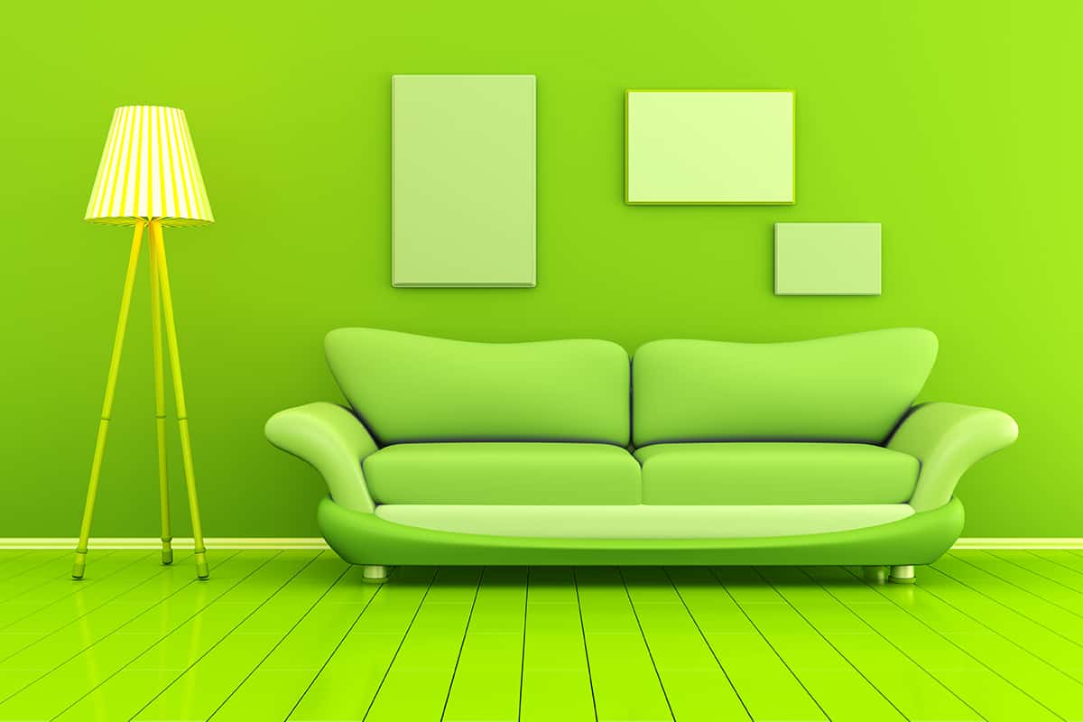
A monochromatic color scheme uses only one color from the color wheel or color spectrum. This can work well in minimalist style homes, but it doesn’t necessarily need to be stark or cold. When using a single color in a color scheme, you can use variations of that color to create tone and depth.
For example, in a green color scheme, you could use a very pale, almost white shade of green on the walls, with a forest green fabric for the sofa and olive green for accessories. This creates depth and interest while ensuring the overall feel remains soft and consistent.
Triadic
A triadic color scheme is created by drawing a triangle on the color wheel to link three colors together. This will help you to develop a color scheme that is more vibrant than an analogous color scheme but less contrasting than a complementary color scheme. The three colors in a triadic color scheme will be neither directly contrasting, but they also won’t share any similarities in hue.
An example of a triadic color scheme would be red, blue, and yellow, or purple, orange, and green. These color schemes work well when one of the colors is chosen as the dominant shade, and the remaining two colors work as secondary and accent shades.
Split-Complementary
A split-complementary color scheme is a slightly softer take on the traditional complementary color scheme, and it creates more room for subtle contrasts. A split-complementary color scheme uses four colors; two colors which sit next to each other, and their contrasting colors on the opposite side of the color wheel.
For example, if you want to base your color scheme on yellow, you would choose yellow and a color that sits alongside it, such as yellow-orange.
Next, find the complementary colors of both of these colors by moving to the opposite side of the color wheel. The complementary color for yellow is purple, and the complementary color for yellow-orange is blue-purple. This means the split-complementary color scheme in this scenario will be yellow, orange-yellow, purple, and blue-purple.
Tetradic
A tetradic color scheme uses four colors which are all evenly spaced around the color wheel, using two pairs of complementary colors, for example, blue and orange and green and red.
This creates a really balanced look that is great for spaces that you don’t want to appear too contrived or carefully planned out, but it actually takes a lot of work behind the scenes to get a good result because it’s easy for these colors to clash or become too heavily contrasting.