When most of us think about darkness, the color that springs to mind is black. While black is regarded as the ultimate dark color in interior design, it is not the only color that can represent darkness. There are many variations of dark colors that can work well to create a dim or shadowy atmosphere.
Here we’ll explore dark colors and how to put them to use in home decor.
Table of Contents
What Colors to Create a Darkness Theme for Your Home?
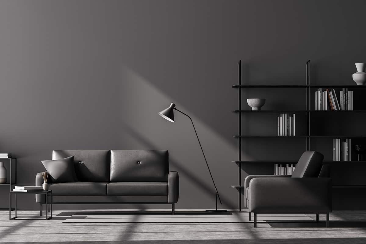
If you want to decorate a room inspired by the theme of darkness, then there are more options available to you than the typical black. Though black is the color most often associated with darkness, a dark night, or dark, murky waters are more commonly a deep shade of gray, blue, or green.
These colors can work beautifully for a room themed around darkness, creating a sense of depth and interest that you don’t necessarily get with a flat black. When looking for paint colors for a darkness-themed space, consider shades of dark green, dark blue, dark gray, and dark purple.
Do Dark Colors Make Rooms Feel Smaller?
One of the most frequent concerns people have before painting a room in a dark color is whether or not the space is going to feel smaller. Historically, we have been conditioned to believe that to make a room feel larger, it should be painted white or a light color, and to make a room feel smaller, it should be painted in a dark color.
In truth, painting a room in a dark color will not necessarily make it feel smaller, and actually, it can create depth which makes a room feel more expansive.
While white walls are great for reflecting light and making a space feel open and airy, dark paint can be used to make the walls feel as though they are receding, which can make a room feel more spacious. This can be especially useful in rooms where you want the vibe to be cozy or intimate without making the space feel suffocating.
How to use Dark Paint Colors in Home Decor
If you want a room inspired by darkness, there are plenty of ways you can use dark-colored paint to recreate the feeling of a dark, moody evening or the dark canopy of a dense forest.
Paint the ceiling
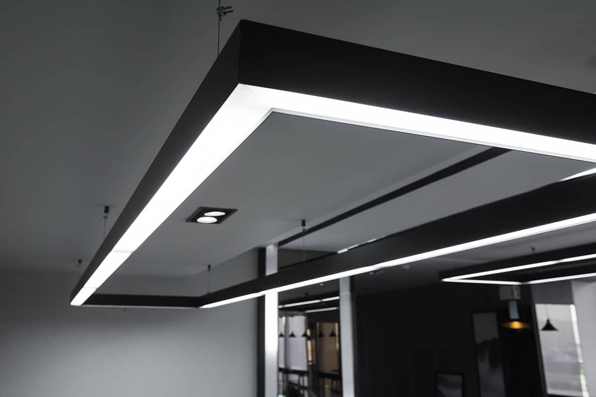
Ceilings are traditionally painted in a shade of white, but more and more interior designers and home decorators are exploring alternative paint colors for their ceilings. If you want to recreate the effect of a moonlit sky, you can do this by painting your ceiling in a dark color such as midnight blue or charcoal gray.
Recessed spotlights could operate as your shining stars or drape string lights across the ceiling for a more twinkling effect. Painting the ceiling in a dark color can make the room feel taller if your walls are also painted in a dark color; however, if you paint the ceiling in a dark shade and the walls in a light shade, it can make the ceiling feel as though it is closing in on you.
This is fine in a large space, but in smaller rooms, it’s best to paint the whole room, including the ceiling in a dark color.
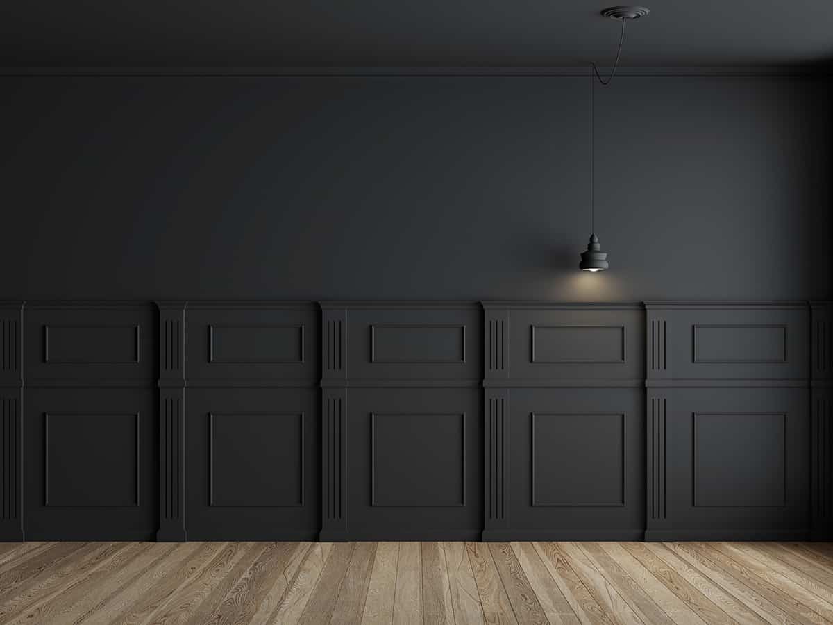
Paint a feature wall.
If you love the color of darkness but don’t want to be entirely surrounded by it, then painting a feature wall is a good compromise. This can make one area of the room feel dark and dramatic while still keeping a portion of the space light and airy. The contrast between a dark wall and a light wall can also make for an interesting composition.
A dark feature wall should ideally be a windowless wall so that the effect of darkness is potent and uninterrupted. Choose the wall behind the bed in a bedroom or a wall behind the fireplace or TV in a living room.
Paint all of the walls.
Using a dark color of paint on all of the walls in a room is a trend that continues to grow as we become less fearful of making a statement in our homes and move away from the belief that darkness makes rooms feel smaller.
The darker color you opt for, the more dramatic the effect will be, and the more the walls will appear to recede to create the illusion of more depth and space. For a completely immersive experience, paint both the walls and the ceiling in the color of darkness. This will allow you to feel enveloped by the darkness, for an atmosphere that feels safe and engulfing.
Paint half of the wall
If you don’t want to commit to a full wall of dark paint but still want to incorporate it into your design, you can use it only on half of the wall. Use masking tape to divide the wall into portions, and use the darker color on the bottom half of the wall for the best balance.
Paint trim and doors
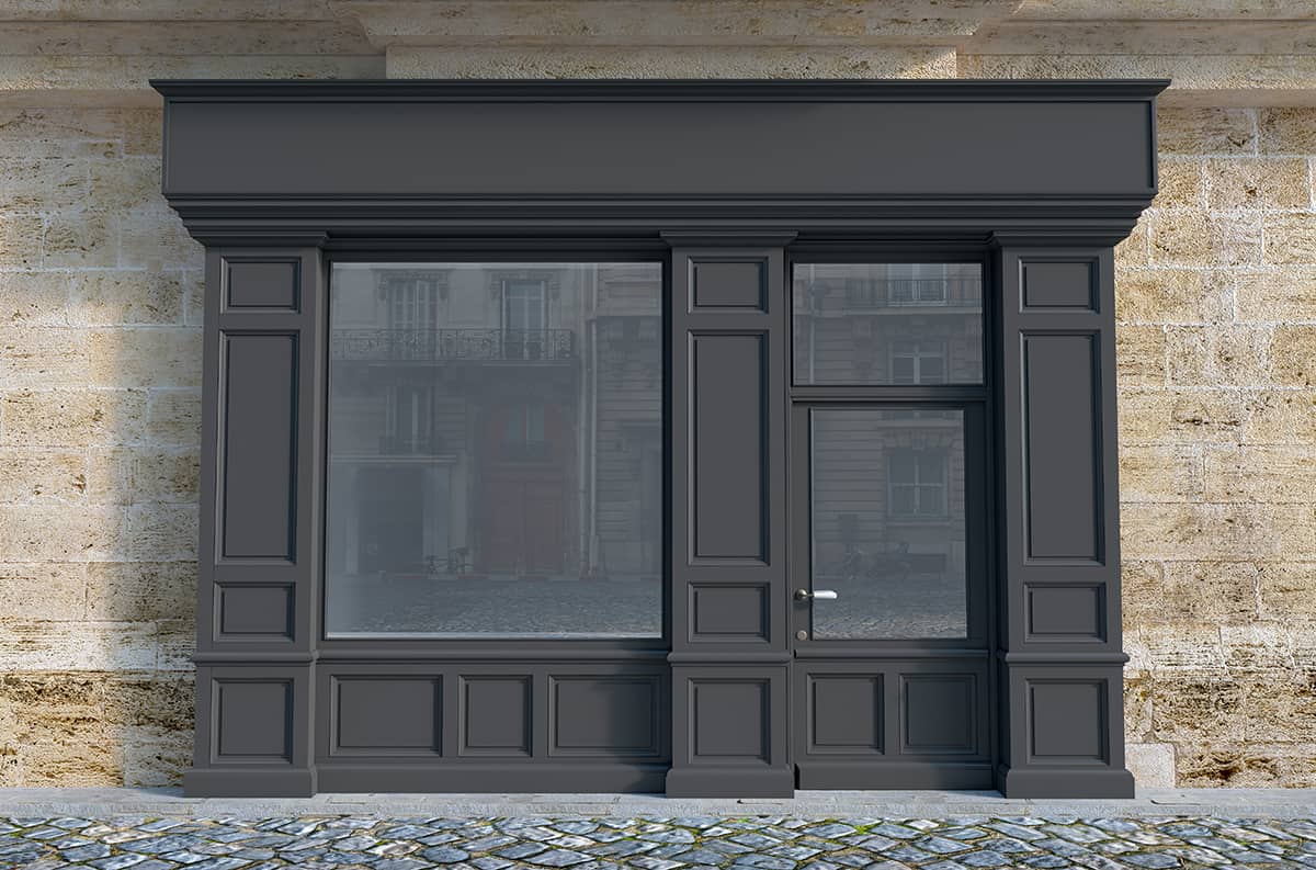
Using dark colors doesn’t mean that the room has to feel dark or gloomy. In fact, paint in the dark color can be bold and striking when used in the right way, to emphasize features in the home or to contrast against other colors.
Use a dark paint color on the trim in a room with pale or light walls for an intense contrast that makes a strong impact. Dark gray doors and trim look sleek and modern against walls that have been painted off-white or set against a dusky pink for a slightly more muted effect.
Dark Paint Colors
Dark Blue
Old Navy by Benjamin Moore

This shade of navy blue reads as the color of darkness when viewed in dim light, or when in the shadows of a room, with a deep and dramatic tone that is almost black. In brighter light, it has a more coastal feel, which lends itself well to use in beach themed decor.
Dark Night by Sherwin Williams
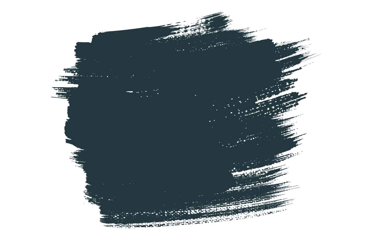
Dark Night is an inky blue color of paint that has slight green undertones, making it appear like a rich and dark shade of teal when in bright light. In lower light, it has a more mysterious aura, which would work well in a formal dining room with dark brown wooden furniture.
Dark Green
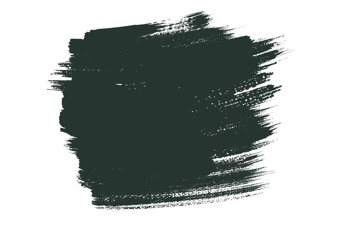
Black Evergreen by Behr
This paint from Behr is based on the magic of evergreen forests, and it can be used to replicate the feeling of being surrounded by darkness, deep in the woods. Black Evergreen is a smoky shade of dark green that feels cool and smooth, and pairs well with shades of gray, off-white, and other green hues such as olive and khaki.
Essex Green by Benjamin Moore
Benjamin Moore describes this color of paint as “A nearly black shade of green that inspires thoughts of historic estates overgrown with ivy.” It has a sense of heritage that makes it feel simultaneously stately and cozy. This color would be stunning painted across all of the walls in a room, as a backdrop for an aged tan leather sofa, and a roaring log burning fireplace. In low light it will read as almost black, but has a more earthy inspired vibe in brighter light.
Dark Purple
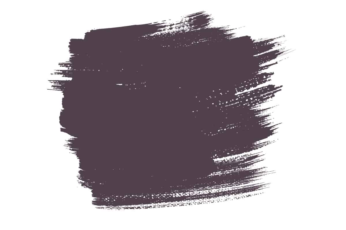
Black Currant by Valspar
This shade of purple is so deep and dark that it seems unfair to regard it as purple at all. It is closer to black but with purple undertones that create a magical and misty feel. In low to medium light, Black Currant will appear entirely black but will reveal hints of majestic purple when daylight shines upon it.
Use it for wood trim in rooms with soft lilac walls, or use it on all of the walls in a bathroom with gold fixtures and fittings for a dramatic, royal-inspired look.
Pelt by Farrow & Ball
This purple paint is rich and velvety, creating a sense of luxury and abundance. It will appear almost black in low light, or the color of eggplant skin in brighter light. Use it on walls with light cream trim for a classic look, or pair it with dusky pink accessories for a more playful, softer feel.
Dark Gray
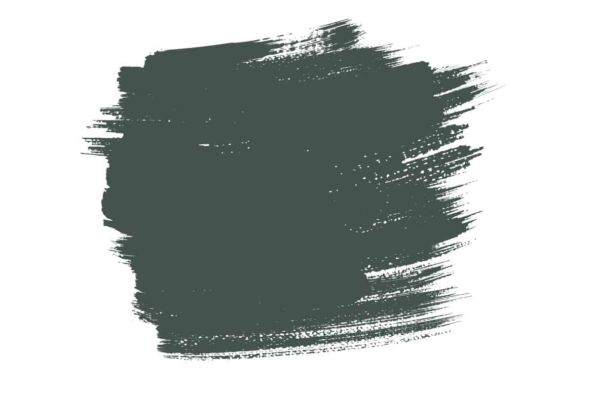
Cast Iron by Sherwin Williams
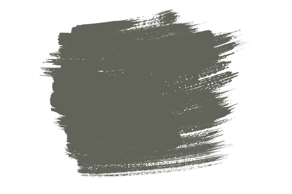
This is a dark shade of gray with very subtle moss green undertones. It’s a versatile color that can look cool and modern when paired with rattan plant pots and tribal patterned fabrics, or classic and cozy when used alongside brass candlesticks and leather wing-back chairs.
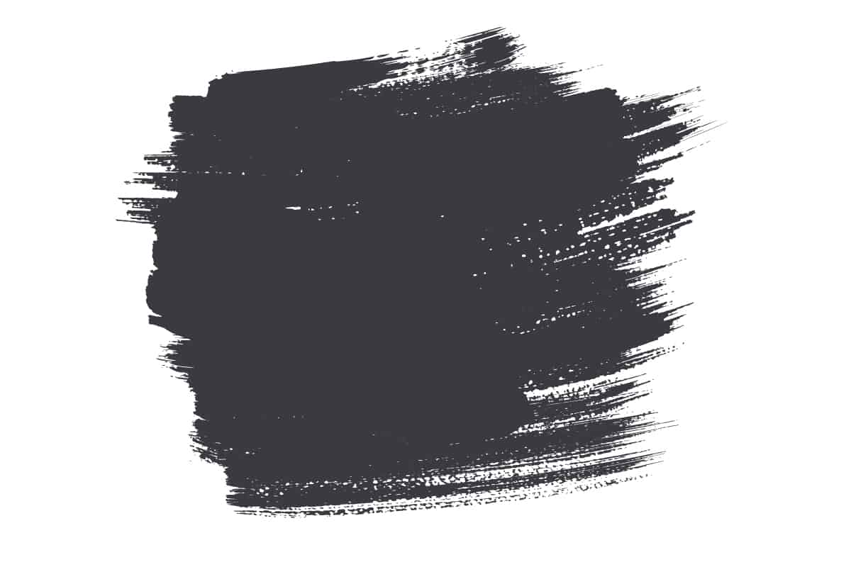
Cracked Pepper by Behr
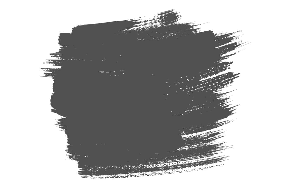
Cracked Pepper by Behr is a deep and dark gray paint with subtle blue undertones, which give it a cool and relaxing feel. Use this paint across all of the walls in a room, as well as on the ceiling, to create the ultimate sense of darkness. It’s also a great choice for trim because it reads as a very neutral shade of gray, so can pair well with any wall color.