Secondary colors are formed by mixing primary colors, and they can work well as both main colors and accent colors in interior design. The three secondary colors are green, purple, and orange, and these can be mixed with primary colors to create tertiary colors.
Table of Contents
What are Secondary Colors?
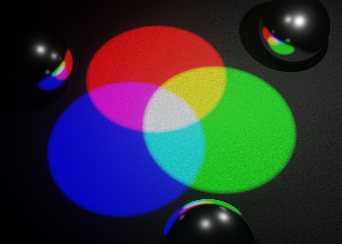
Secondary colors are colors that are created by mixing two primary colors. The primary colors are blue, red, and yellow, so secondary colors result from mixing any of these two colors together. When red and yellow are mixed the resulting secondary color is orange. When red and blue are mixed the resulting secondary color is purple.
When yellow and blue are mixed, the resulting secondary color is green. This gives us a total of three secondary colors; orange, purple, and green. In a basic color wheel, there will be 12 colors. Three of these are primary colors, three are secondary colors, and the remaining six are tertiary colors. A tertiary color is created by mixing a primary color with a secondary color.
How to Use Secondary Colors in Interior Design
Understanding the basics of primary, secondary, and tertiary colors will help you to create better color schemes in interior design because the best color schemes are usually a result of combining a range of primary and secondary colors or a range of primary, secondary, and tertiary colors.
Complimentary Theme
A complimentary theme is created by using a primary color and a secondary color as the two main colors in a room. The colors in a complimentary theme will sit opposite, or almost opposite, each other on the color wheel.
This creates a contrast that is considered complementary. Colors that contrast against each other make both colors appear more vibrant, and they also help to balance each other.
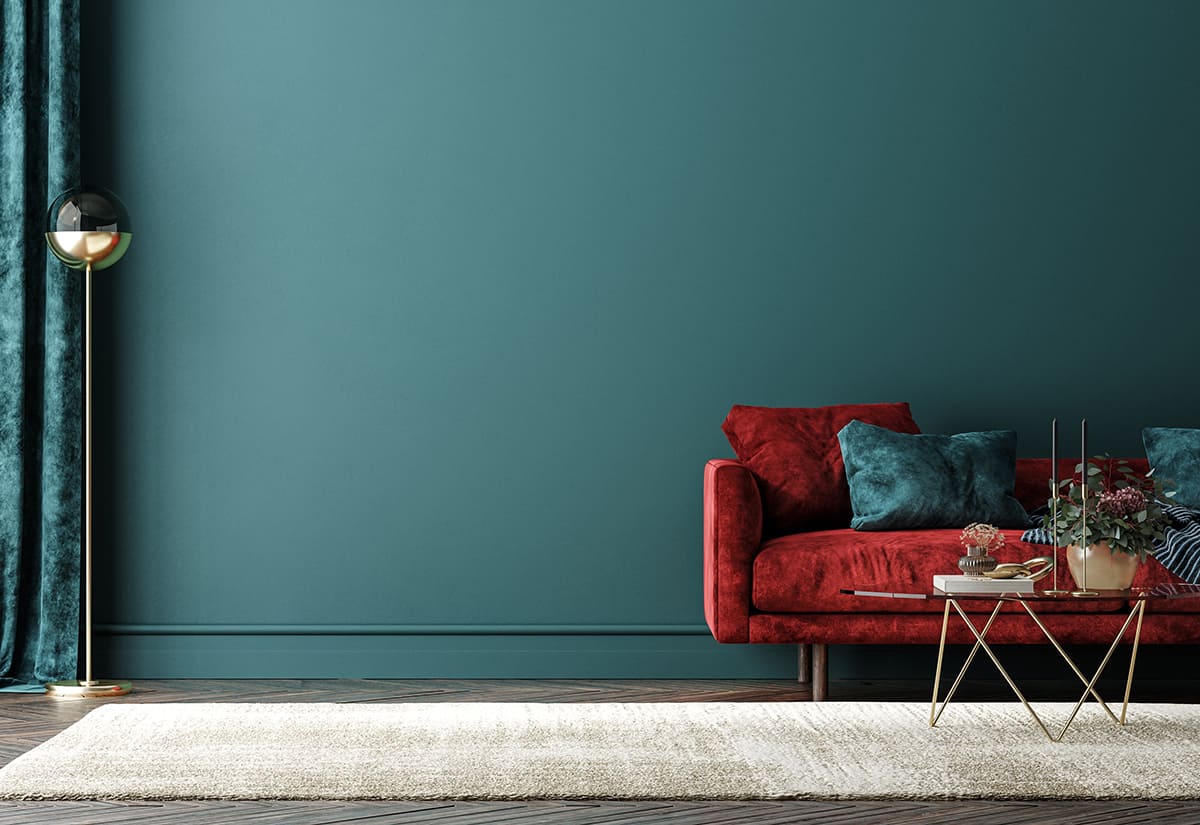
Orange and blue
Orange and blue sit directly opposite each other on the color wheel. Orange is a secondary color, and blue is a primary color. Since orange is created by mixing two primary colors that do not include blue (red and yellow), there is not a hint of blue in orange. As a result, orange is a very warm color, while blue is a cool color.
This contrast of warm and cool creates a striking look in a space, and also means that the room feels neither too warm nor too cool, and instead is nicely balanced. You can use this color scheme in a muted way to achieve an atmosphere that doesn’t feel too intense, by using more diluted or subtle versions of the colors.
For example, sky blue and a pale peachy shade of orange will look sweet and playful next to each other in a child’s nursery or in a teenager’s bedroom. Alternatively, navy blue and a burnt orange color will look vivid and intense while reading as more grown-up and sophisticated. Place burnt orange velvet cushions on a navy sofa or a burnt orange rug on a navy carpet.
Red and green
Red and green are directly contrasting colors, with red being the primary and green being the secondary color. Green is composed of blue and yellow, so it has both warm and cool undertones, while red is a purely warm color. These two colors, as direct opposites, contrast intensely against each other.
Use them in bright and vibrant shades for an explosive look in a room, or opt for more muted tones for a complimentary color scheme that feels more subtle. For example, pair a dark burgundy red with an olive shade of green for a sophisticated, earthy theme in a room, or use cherry red and a soft mint green for a retro, diner-inspired look using primary and secondary colors.
Yellow and purple
Yellow and purple are the final example of primary and secondary colors which can be paired together for a complimentary color scheme. As opposites on the color wheel, they can contrast heavily when used in their most vibrant shades, or subtler tones will give a more muted contrast.
In a floral-themed space, opt for lemon yellow and lilac for a country-cottage feel, or for a more glamorous appeal, use a medium shade of rich purple with gold or brass accents.
Analogous Theme
Analogous themes are created using three colors which are all next to each other on the color wheel. They will usually involve one primary color, one secondary color, and one tertiary color, or two tertiary colors with either a primary or secondary color. Examples of analogous color schemes include green (secondary), blue-green (tertiary) and blue (primary), or red-orange (tertiary), orange (secondary), and orange-yellow (tertiary).
These color schemes create a more tonal look in a room, with colors that look good together without being contrasting. These color schemes work well in rooms where you don’t want the eyes to feel overwhelmed and prefer a more calming feel, for example, in bedrooms, bathrooms, or meditation rooms.
Secondary Color Moods
Secondary colors are made up from mixing two primary colors, and the concentration of the colors used, along with the colors themselves, will play a big role in determining the resulting mood of the secondary colors. Secondary colors can be cool or warm, or a combination of both.
Here we explore the moods associated with secondary colors to gain an understanding of the types of atmospheres they will create in interior design.
Green
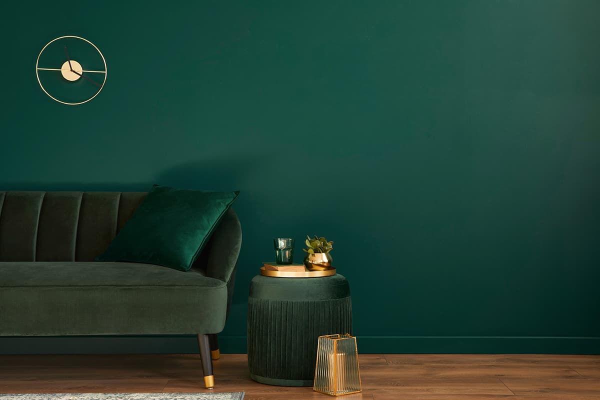
Green is created by mixing the primary colors blue and yellow. Since blue is a cool color, and yellow is a warm color, green can read as warm or cool depending on the proportion of blue and yellow used in the making of the color. If balanced levels are used, i.e 50% blue and 50% yellow, then the resulting green color will tend to lean more towards cool, because blue is a more dominant shade than yellow. However, if you increase the amount of yellow used to create a green shade, then you will end up with warmer shades of green like olive green and lime green. When the proportion of blue is increased, the resulting color will be much cooler. As a fairly balanced color, green works well in rooms where you want to create a soothing feel. Bright shades of green can also read as fresh and inspiring, especially when they are linked to the natural world and used to bridge the space between indoors and outdoors.
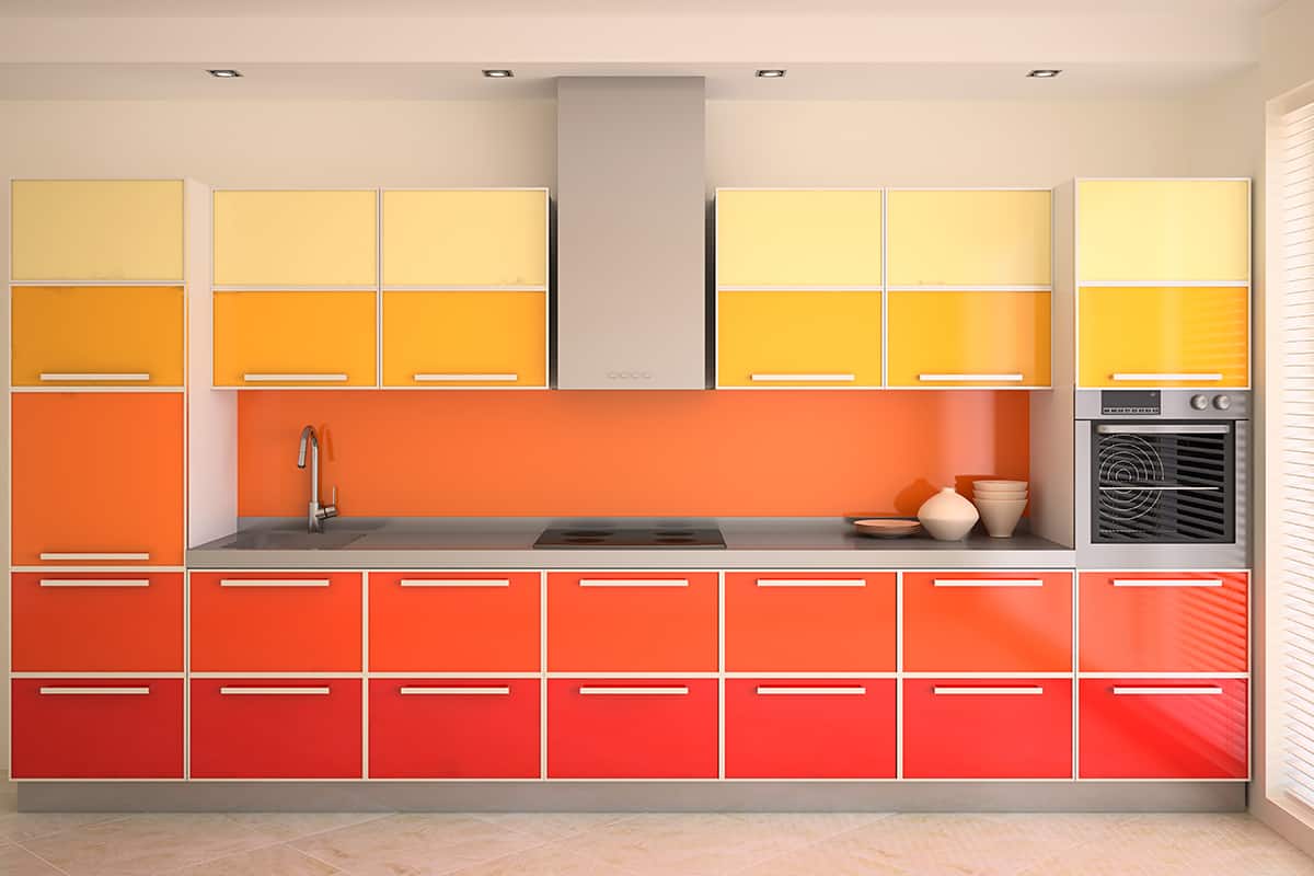
Orange
Orange is a very warming color, since it is a result of mixing red and yellow. Orange reads as lively and creative, and has distinctly positive vibes thanks to the sunny undertones of yellow. It works well as an accent color but can feel too overwhelming as a main color in a color scheme, due to how intense it can be.
Purple
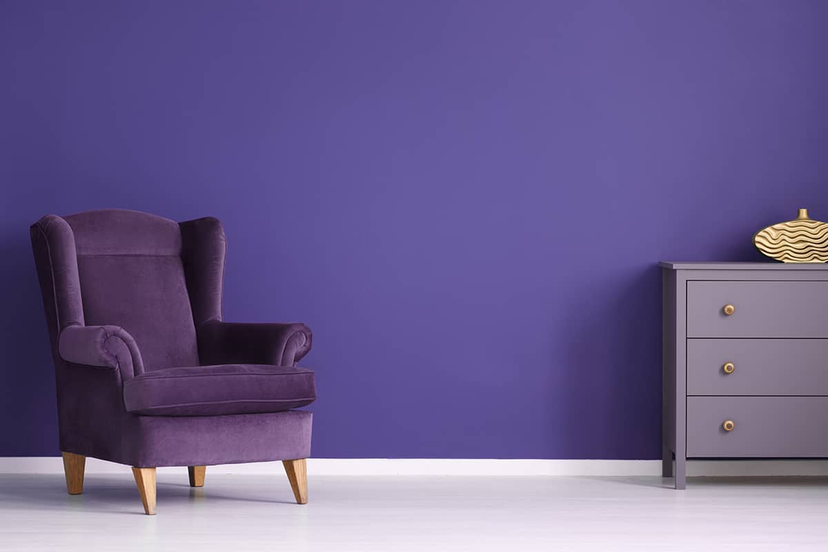
Purple is made from blue, a cool color, and red, a warm color. However, the resulting effect of purple tends to be more cool than warm, though this can be altered by altering the proportions of red and blue in the blend. Purple is a regal color that can be used to create an elegant feel in a space, but it can also be a good alternative to pink when you want a feminine space that isn’t based on predictable pink.