
Primary colors are something most of us learn the basics about as children, but there’s so much more to primary colors than you might think.
Having an understanding of primary colors can benefit anyone working in design or anyone who is transforming the decor in their home. Here we explore primary colors, the history of their paint pigments, and how to use them in home decor.
Table of Contents
What is a Primary Color?
The definition of primary colors is a group of colors from which all other colors are made. There are three primary colors. These are red, blue, and yellow. You can use red, blue, and yellow in varying proportions to create all other true colors. For example, red and yellow will make orange, or blue and yellow will make green. The colors which result from mixing two primary colors together are known as secondary colors.
Throughout history, some have argued that black and white should also be considered primary colors, such as mathematician François d’Aguilon. He believed that because black and white were also needed to make chromatic colors, they should count as primary colors. However, it is widely accepted today that there are only three true primary colors; red, blue, and yellow.
How to Make Primary Colors?
The very definition of a primary color is that it cannot be made by mixing other colors together. Instead, the primary colors are those that are used in the making of all other colors. This means if you want primary red, blue, or yellow paint, then you’re going to have to buy it because these colors can’t be made from other colors of paint that you already have.
As these colors are not created by mixing other colors, they have to be made from pigments. Throughout the ages, the pigments for red, blue, and yellow paints or dyes were sourced naturally, for example, from organic minerals or even from insects. Today, most pigments used to create primary color paints are made synthetically.
Pigments for Blue Paint
The earliest pigment used for making blue paints was lapis lazuli. This is an intensely blue-colored rock that was mined out of what is now Afghanistan as early as the 5th century. This was an extremely expensive color of paint and dye and therefore was reserved for the wealthy or special occasions.
In 1789 Cerulean blue was created by a chemist, and in 1803, cobalt blue was synthetically created as an alternative to expensive natural pigments. Other blue pigments include Egyptian blue, Prussian blue, and azurite. Today, a synthetic process is used to create blue paint.
Pigments for Yellow Paint
The oldest pigment used to make yellow is called ochre, a natural pigment made from a mixture of ferric oxide, clay, and sand. The Ancient Egyptians were responsible for finding a more brilliant yellow pigment for making paints and dyes, known as orpiment. This is an arsenic sulfide mineral that forms around hot springs and volcanic regions. Indian Yellow was also popularly used in paintings from the 16th to 19th century.
This was made from the dried urine of cows who were fed on a diet of only mango leaves and water. The hard yellow balls which resulted from this were known as ‘purree’. Today, yellow paints are made from synthetic pigments, including Hansa yellow, nickel aso, and quinacridone burnt orange.
Pigments for Red Paint
One of the oldest ways to make red paint was with a type of red clay known as red ochre, which was colored by a mineral called hematite. There is evidence that people as early as the Late Stone Age were grinding red ochre clay to paint their bodies.
In Ancient Egypt, the same pigment was used as a type of cosmetic product amongst women to paint their lips and cheeks red. Other types of red pigment used throughout history include carmine, made from tiny scale insects that live on cacti called cochineal.
What are the Primary Colors?
The primary colors are red, blue, and yellow. These are considered to be ‘true’ versions of themselves and have not been altered with the addition of any other colors.
Red
Primary red is a color that is associated with love, romance, and passion, but it can also be representative of blood, violence, and danger.
The colors that primary red is paired with will help to determine what type of vibe the color gives off. For example, when used with green, primary red will look festive and evoke a Christmassy feel. When used with pink, red will come across as lusty and passionate. It is more likely to be synonymous with violence and horror when paired with black.
Yellow
Yellow is a bright and sunny color that brings to mind feelings of joy and light-heartedness. It is strongly connected with the sun and, therefore, can be used to make people feel warm and energetic. Yellow pairs well with purple, as this is the contrasting color to yellow.
Blue
Blue is the only cool primary color, and it is synonymous with the sky and the ocean. Blue has a soothing and relaxing effect and is more popular than any of the other primary colors in both home decor and fashion.
Decorating with Primary Colors
Red Color Schemes
Red, white, and blue
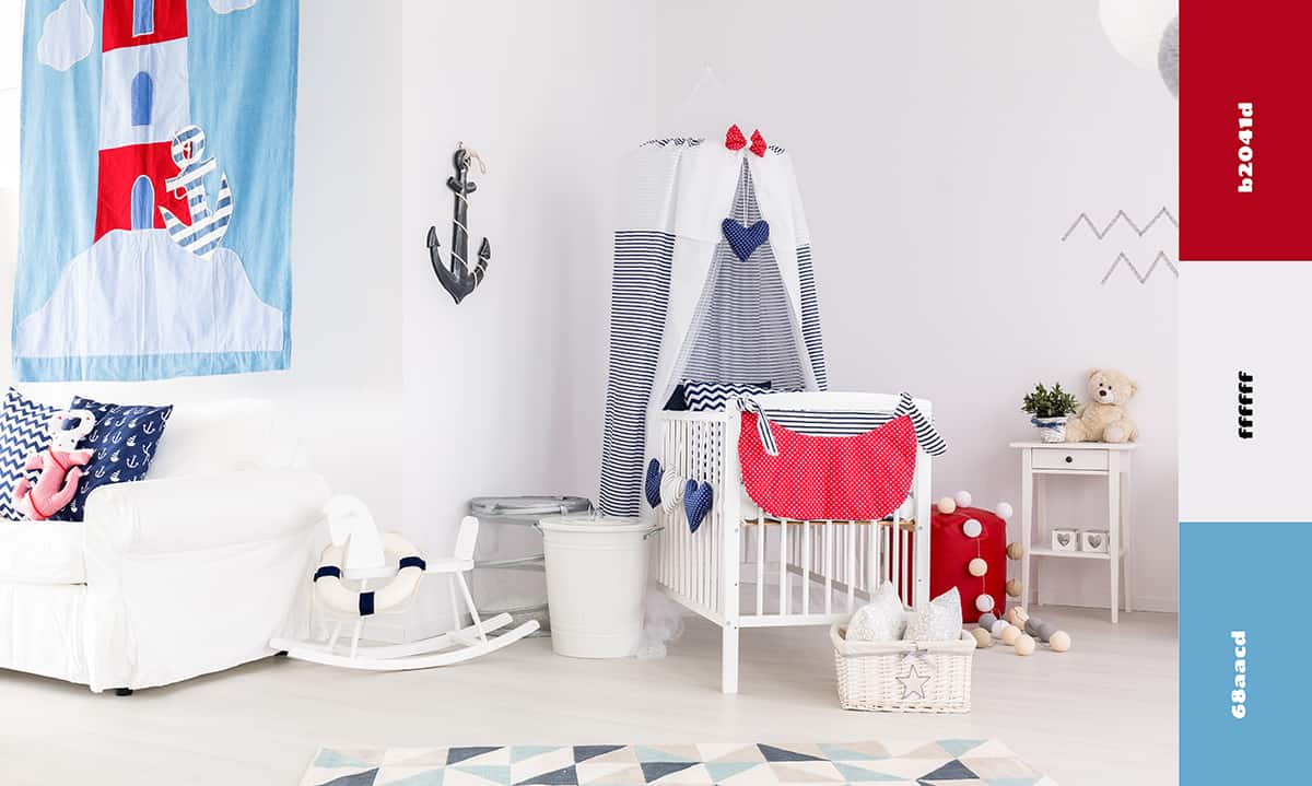
This is a color scheme that is used in Americana-themed spaces, as it uses the colors from the Star-Spangled Banner. It can also be useful in creating a nautical look, using red and white as the color of lighthouses and lifebuoys and blue as the color of the ocean.
Red and blue are not directly contrasting colors. However, they do present a contrast because red is warm and blue is cool. In this color scheme, use a dark shade of blue along with pure white and primary red.
Red, green, and gold
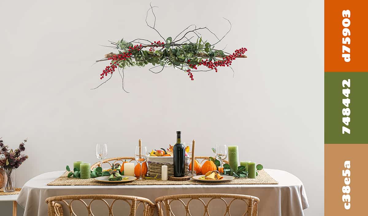
A red, green, and gold color scheme is synonymous with winter and the festivities of Thanksgiving and Christmas, so it works really well for dressing a table at this time of year.
However, this is also a color scheme that will work all year round, especially in traditional or antique-style spaces. For example, paint walls in a dark shade of wine red and choose forest green upholstered furniture such as a velvet green sofa with gold legs.
Red, tangerine, and blush pink
This is a warm and playful color scheme that would work well in a bedroom. The colors are analogous because they all sit next to each other on the color wheel. This means that there is no strong contrast, and instead, the overall feel will be of continuity and consistency.
Paint the walls of a bedroom in a soft shade of blush pink, then add bright pops of tangerine and red in the form of soft furnishings such as a rug, curtains, bed linen, and throw pillows.
Yellow Color Schemes
Yellow, lilac, and green
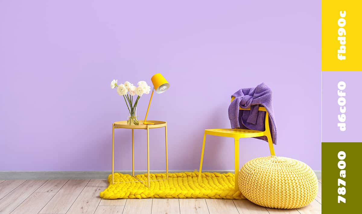
Yellow and purple are contrasting colors, so they will always look appealing in the same space. In this color scheme, opt for a soft lilac shade of purple with yellow to avoid the contrast becoming overwhelming, and add accents of olive green to hint at a botanical theme. This color scheme would look fresh and reminiscent of spring in a kitchen or a bedroom.
Yellow, blue, and gray
Yellow and blue are not directly contrasting colors, but they do contrast somewhat because yellow is warm while blue is cool. The addition of gray to this color scheme adds further contrast because yellow and gray bounce well off one another. This is an ideal color scheme for modern loft spaces or contemporary living rooms.
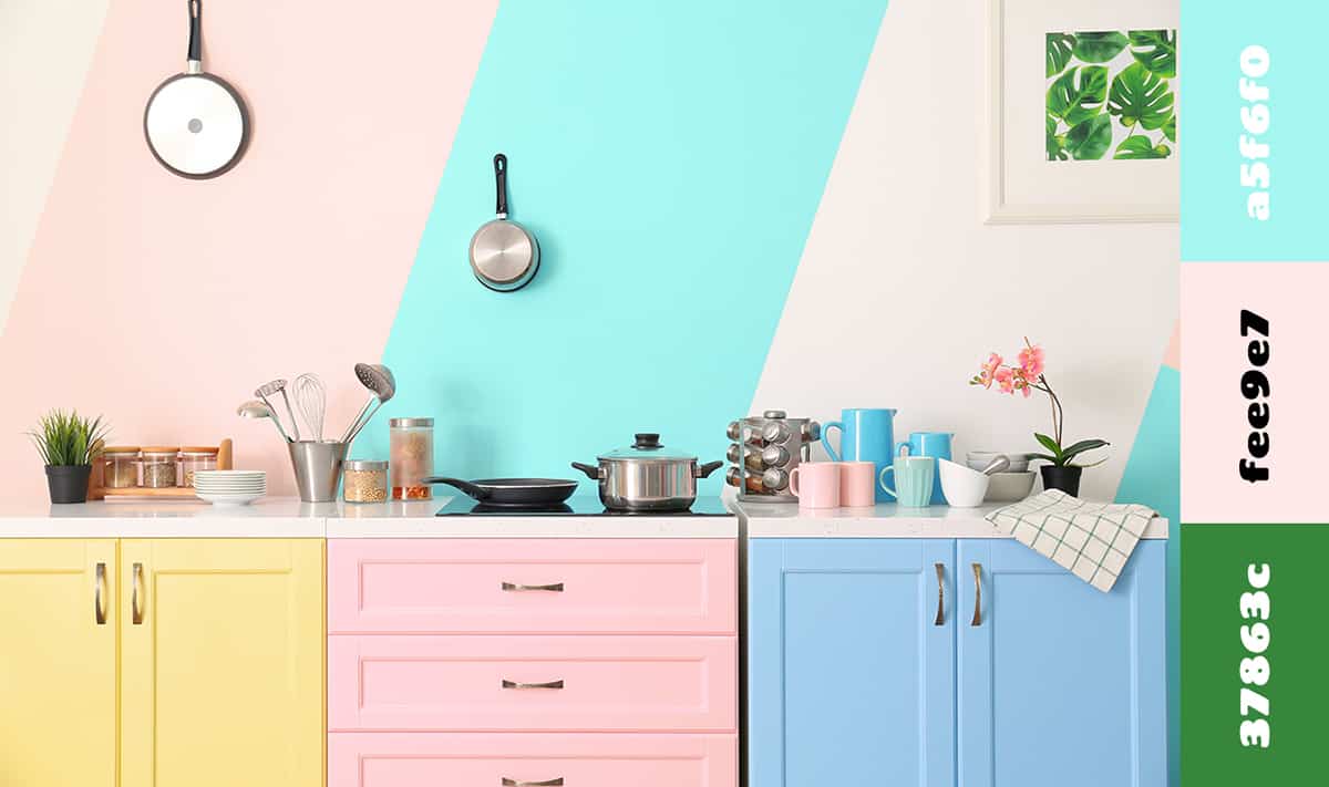
Yellow, pink, and lime
This is a vibrant, almost exotic color scheme that can create a tropical vibe in a room. Paint the walls yellow and add soft furnishings and accessories in bright fuchsia pink and lime green.
Blue Color Schemes
Blue, brown, and beige
As a cool color, blue can be balanced out by neutral warming shades such as brown and beige. In this color scheme, the brown and beige will make a space feel comfortable and cozy, while the addition of blue will maintain a somewhat cool and modern edge. Consider painting the walls in light beige, using brown furniture such as a brown leather sofa and a brown stained hardwood floor, along with blue cushions and blue curtains.
Blue, pink, and green
Blue, pink, and green are a timeless combination of colors. They are all cool shades, and yet they still make a room feel welcoming. In the living room, paint the walls emerald green and select a dusky pink sofa topped with sapphire blue cushions.
Blue, white, and coral
This is a color scheme that will work well for a casual style in a beach house or in a coastal-themed space. Use white or off-white on the walls and opt for blue soft furnishings with coral-colored accessories. Coral is a pink-orange color that will create a nice contrast against blue and bring lively and fun energy to an otherwise relaxing and soothing space.